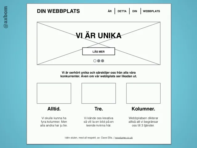
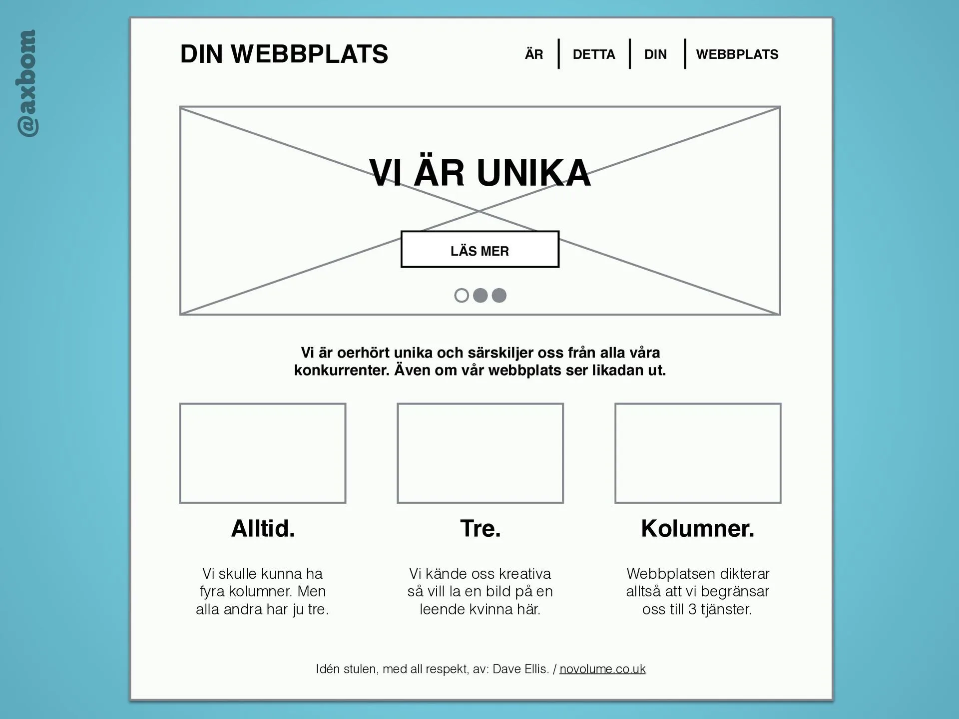
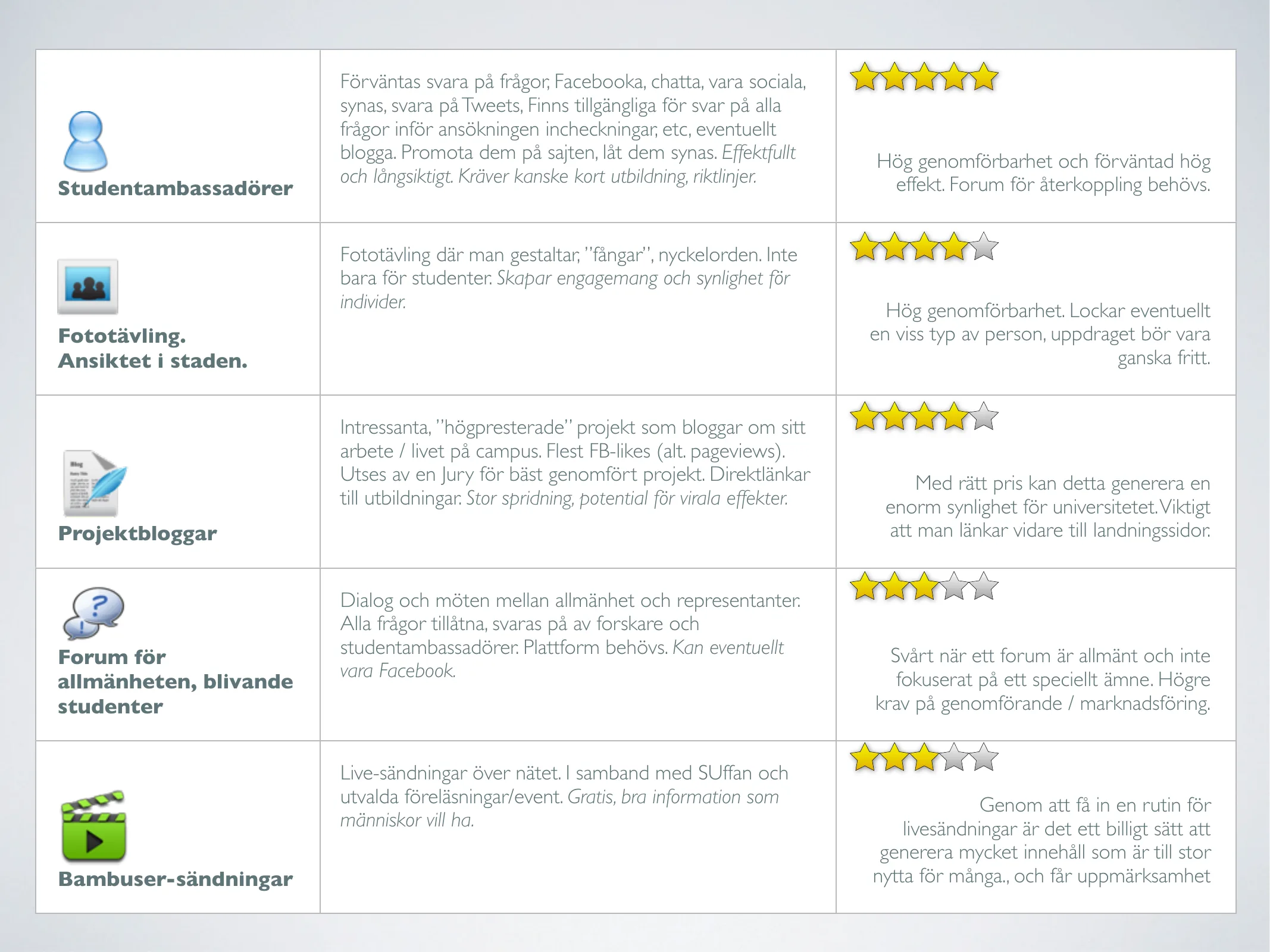
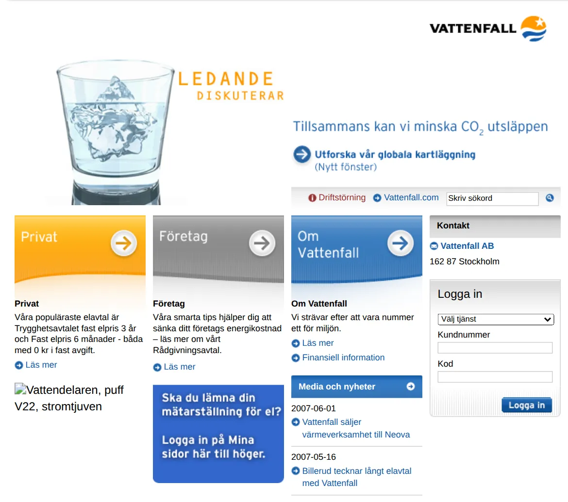
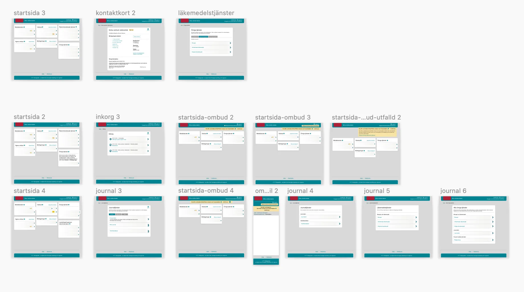
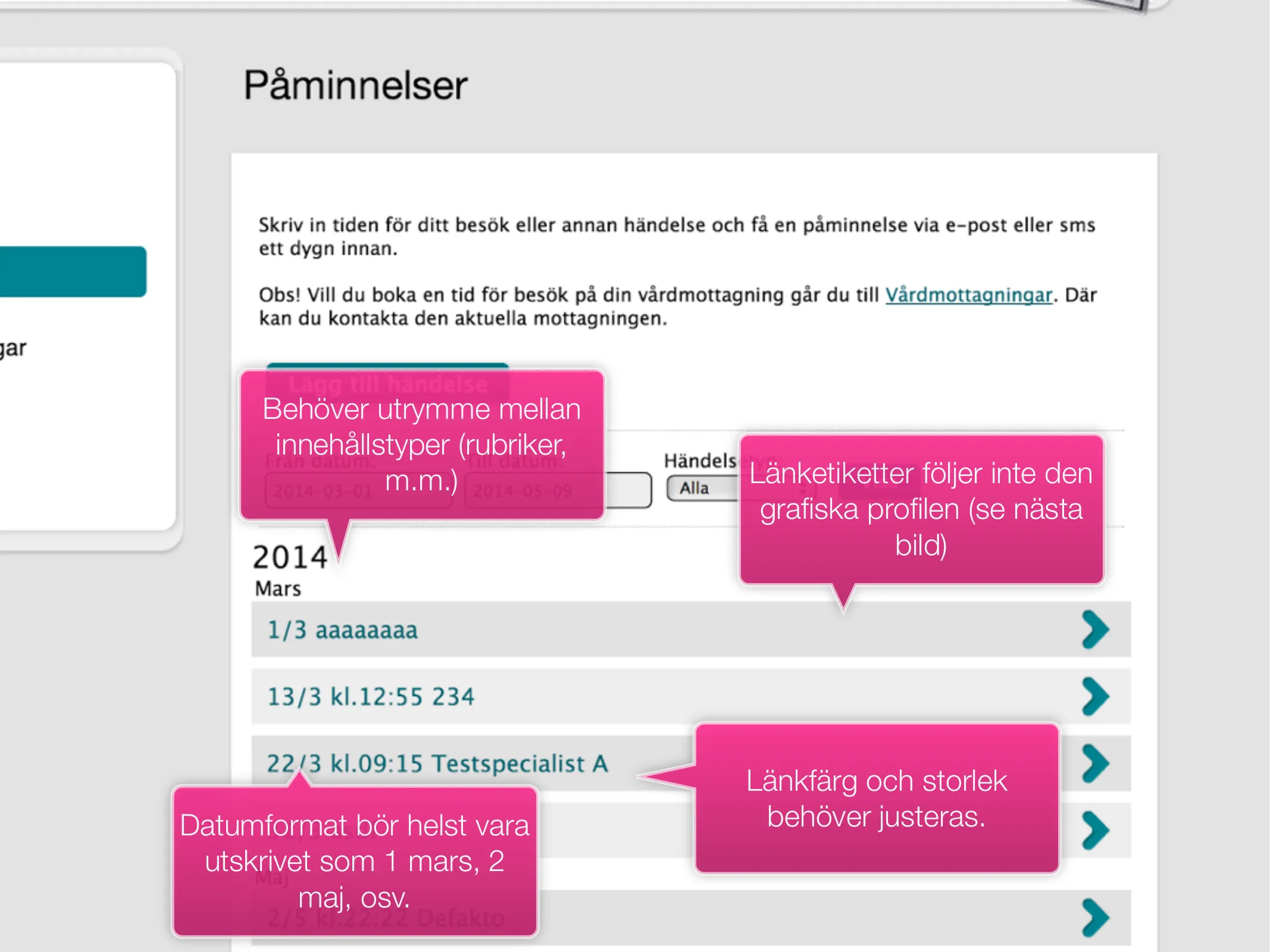
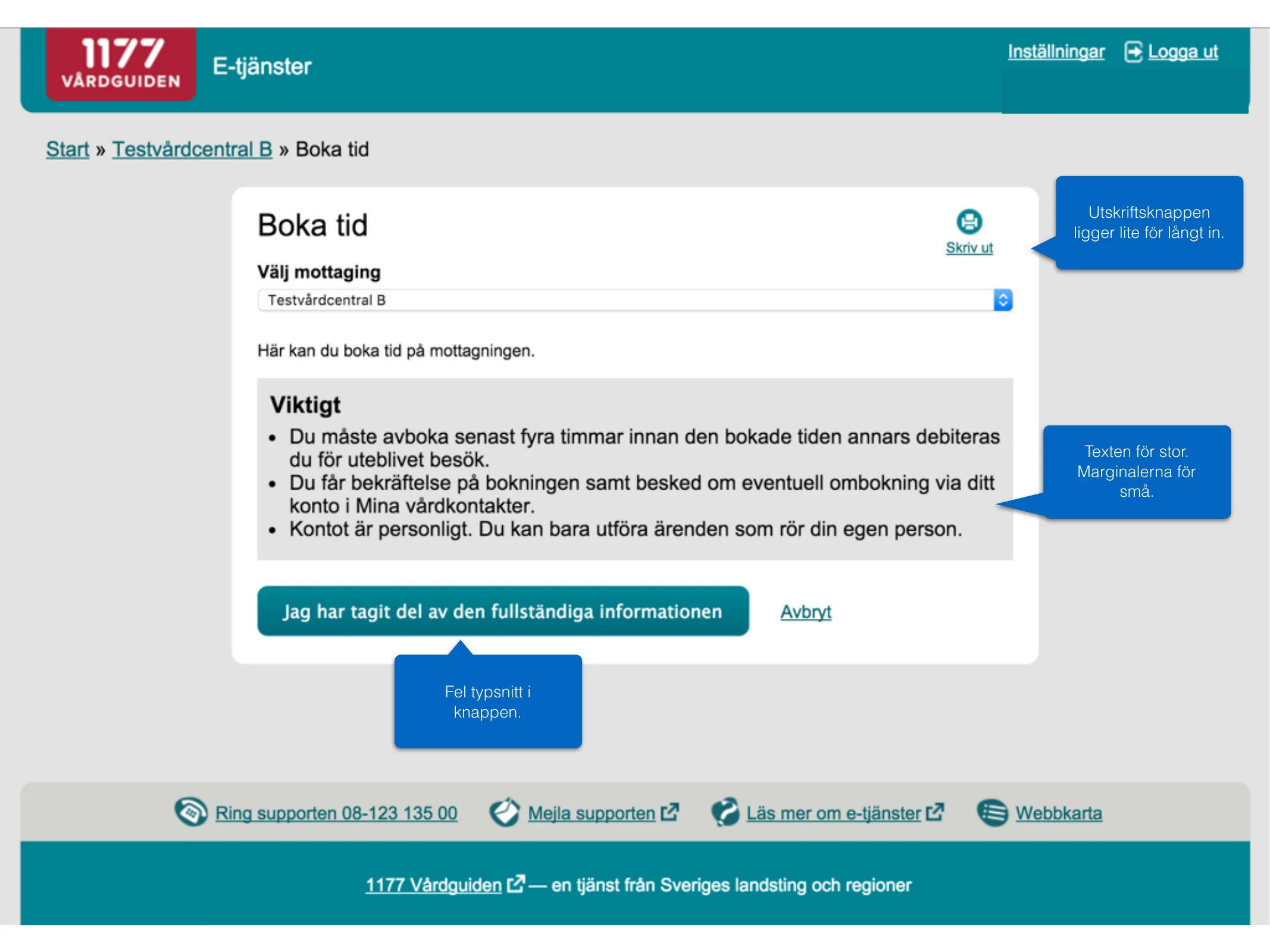
View larger: We are uniqueA wireframe for “Din webbplats” (your website) with a carousel and the heading VI ÄR UNIKA (we are unique), the text “We are tremendously unique and stand out from all our competitors. Even though our website looks the same.” and three columns: Always. Three. Columns. The idea borrowed, with respect, from Dave Ellis.
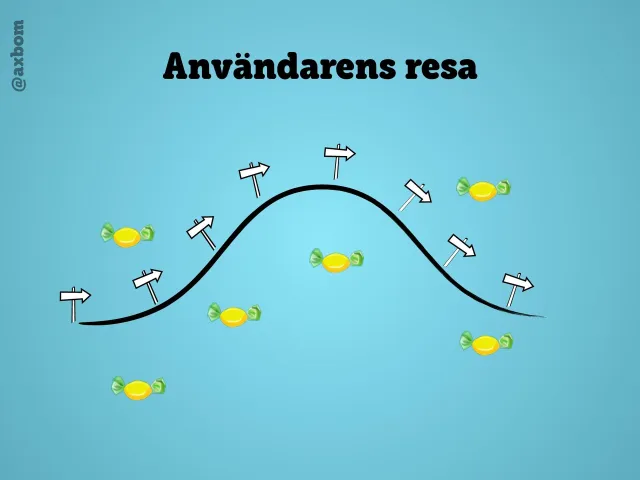
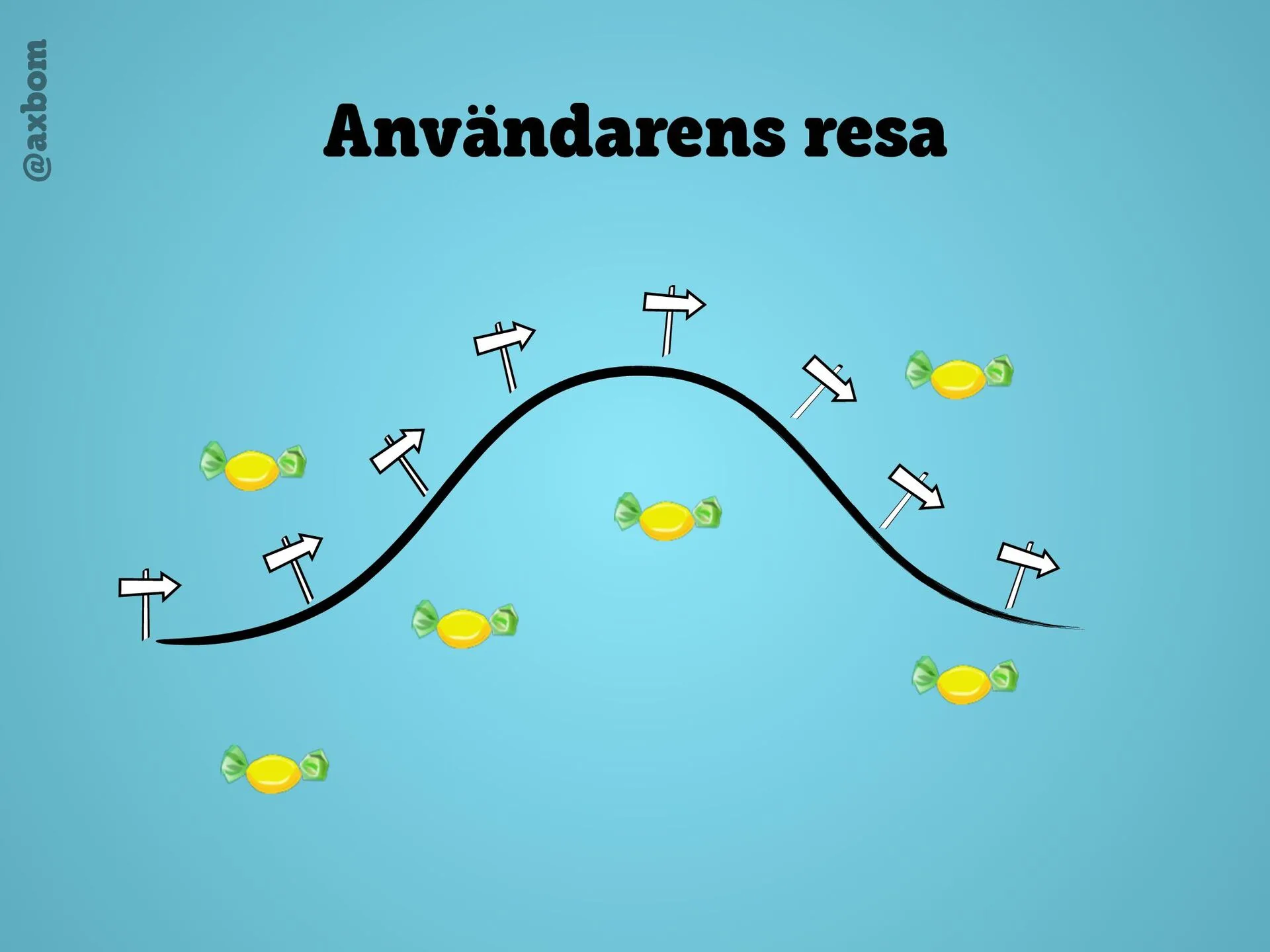
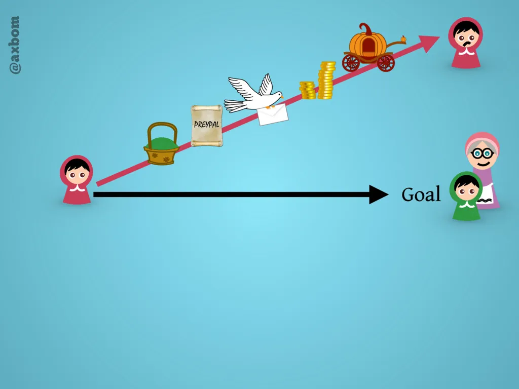
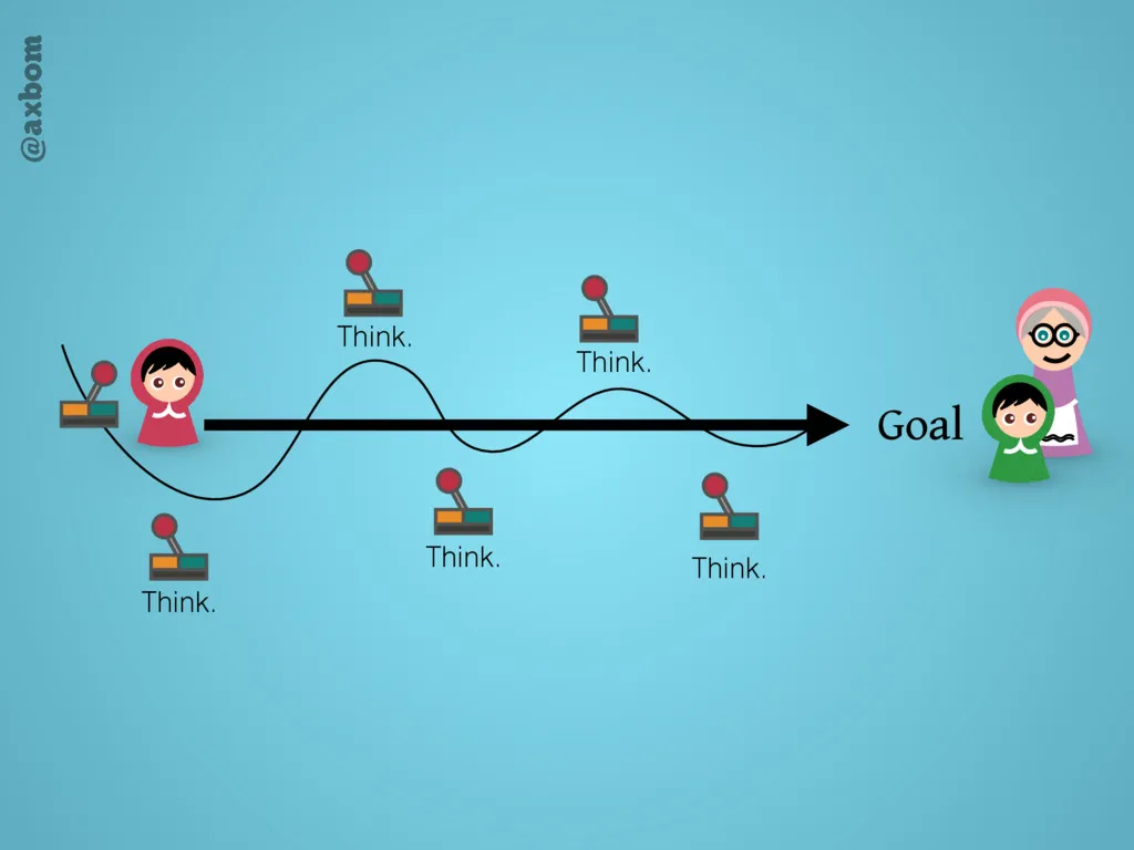
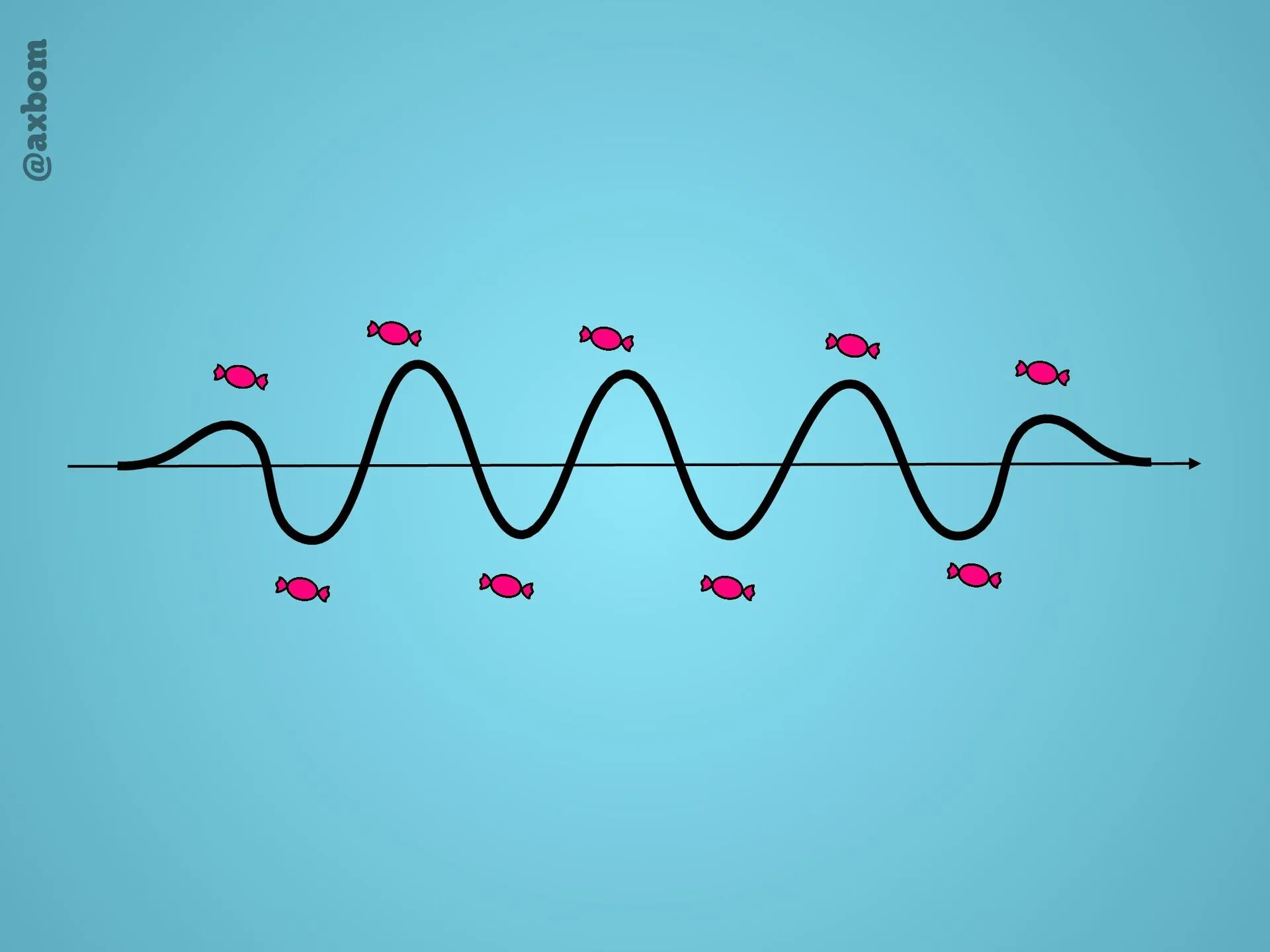
View larger: The user’s journeyA curve from start to goal with signposts along the way and sweets scattered around it – our job is to put up the signposts, but we’ve become experts at laying out sweets.
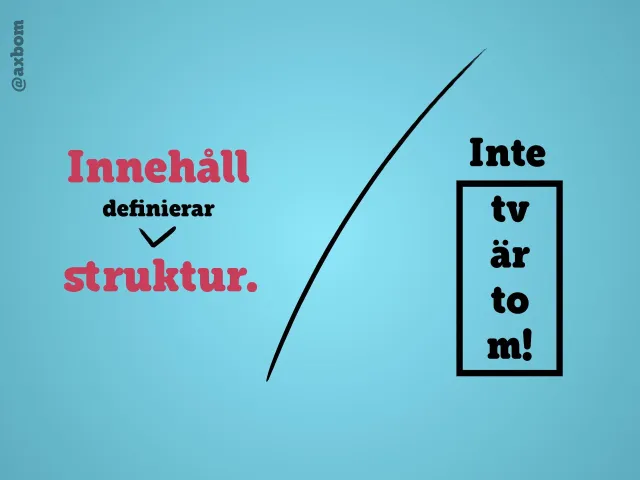
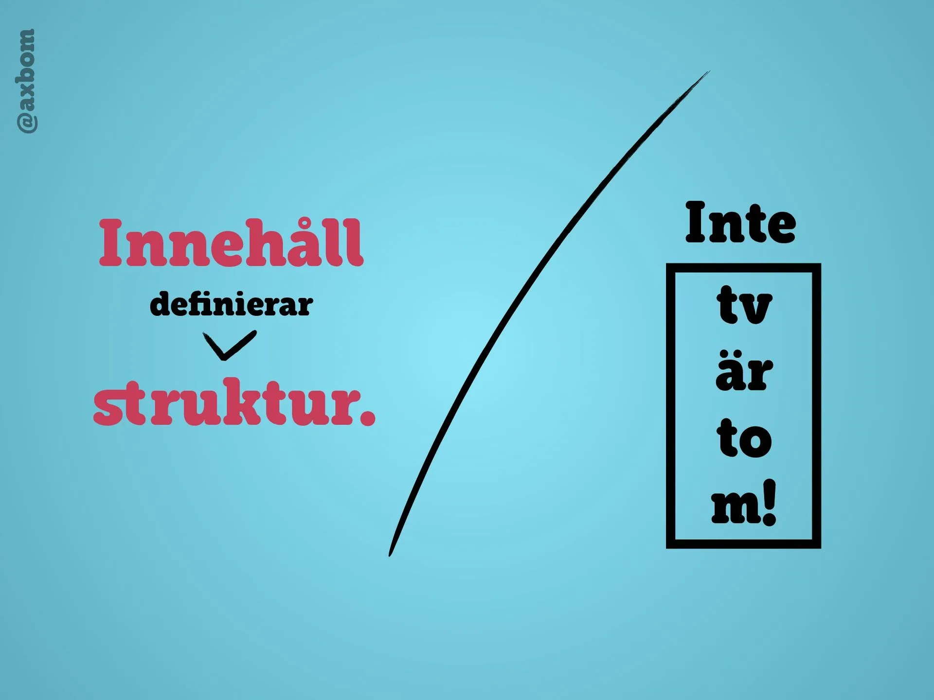
View larger: Content defines structure“Innehåll definierar struktur.” (Content defines structure.) Beside it: “Inte tvärtom!” (Not the other way round!) – its letters squeezed into a narrow box.
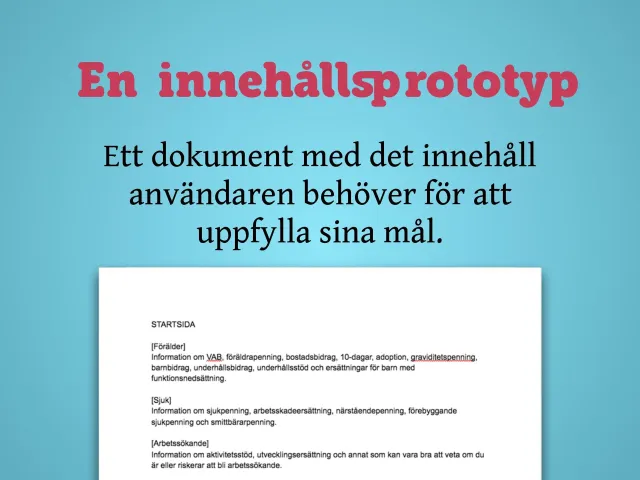
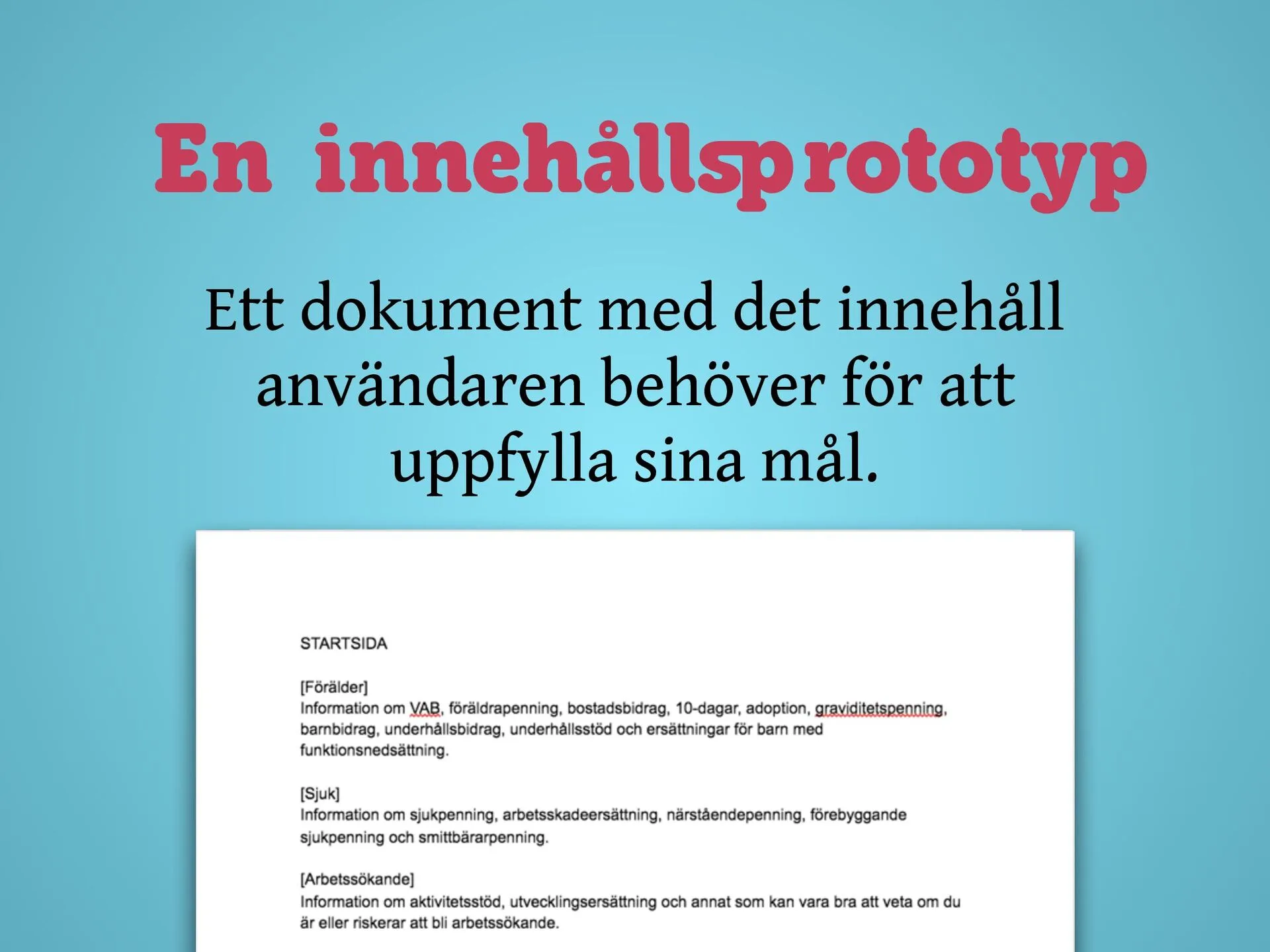
View larger: What is a content prototype?“A content prototype: a document with the content the user needs to achieve their goals.” Below, a text document with the start page content: Förälder (parent), Sjuk (ill), Arbetssökande (job seeker).
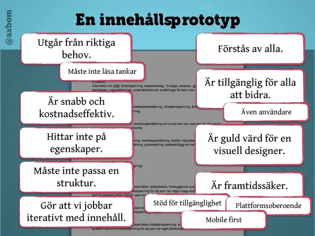
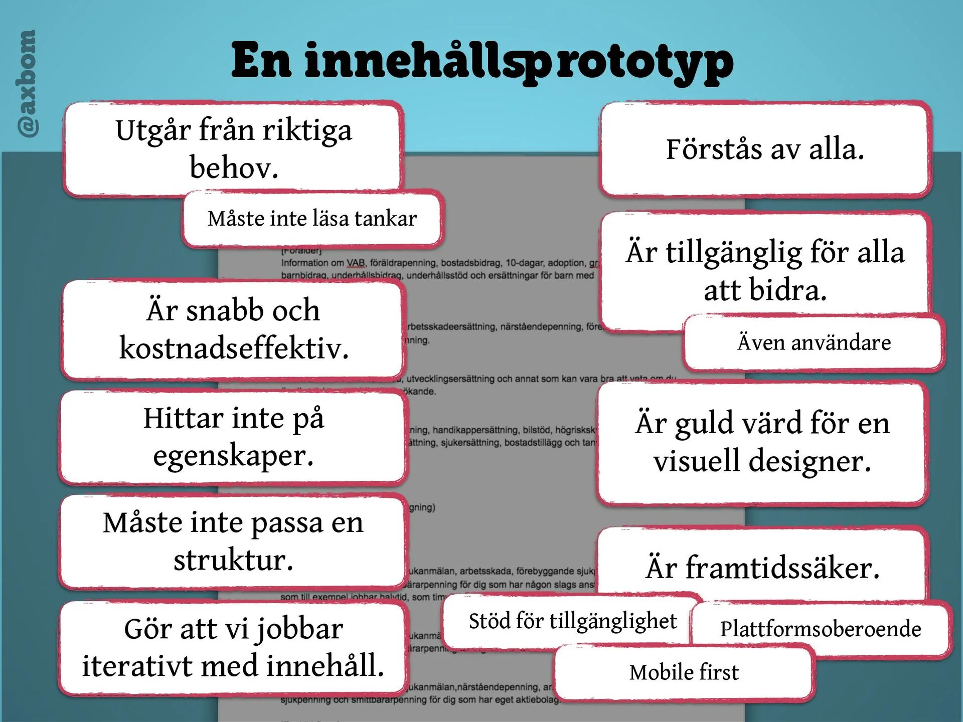
View larger: The qualitiesNotes around a document: based on real needs, quick and cost-effective, doesn’t invent features, doesn’t have to fit a structure, makes us work iteratively with content, understood by everyone, open for everyone to contribute (users too), worth its weight in gold to a visual designer, future-proof – support for accessibility, platform independent, mobile first.
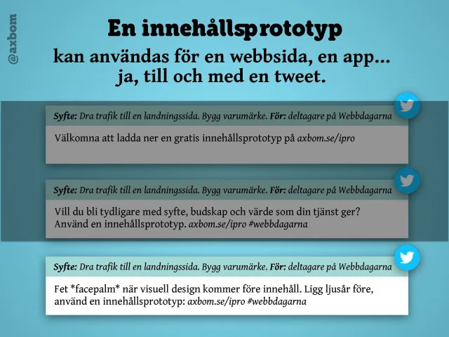
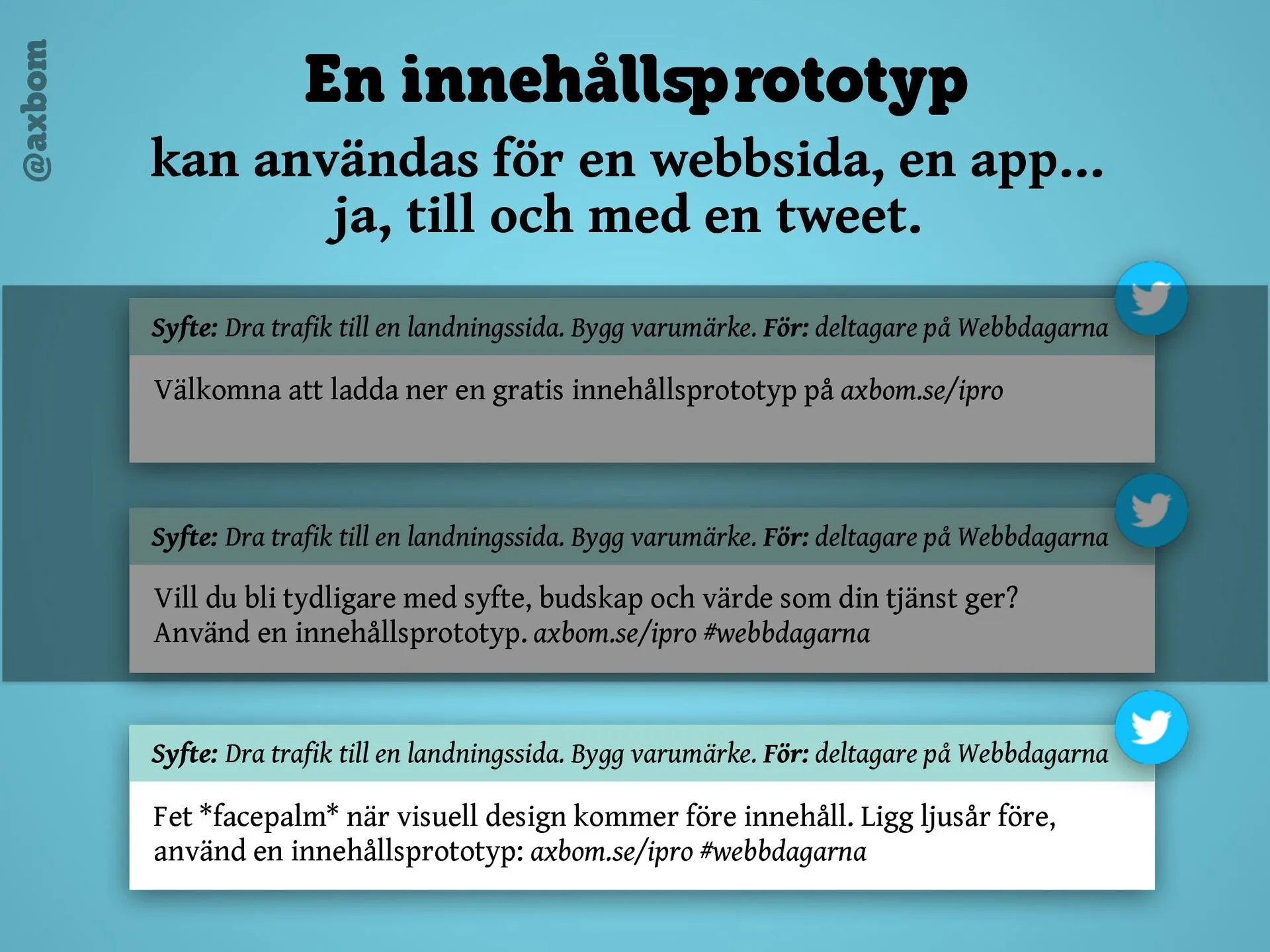
View larger: Even a tweet“A content prototype can be used for a web page, an app… yes, even a tweet.” The same purpose and audience, and three versions of the text that get clearer with each round.
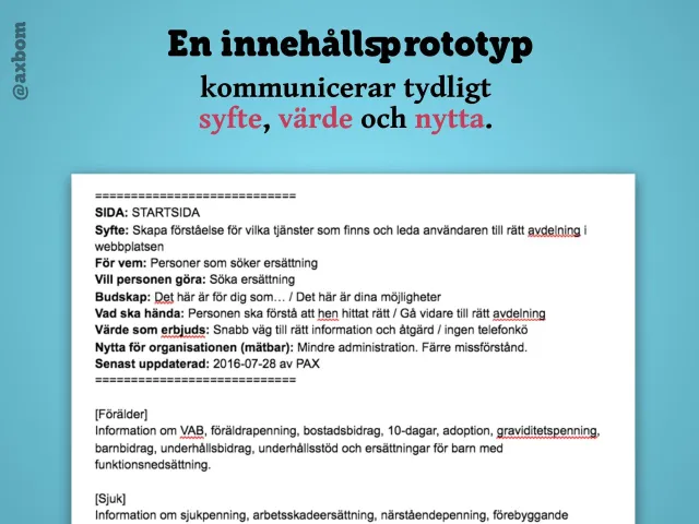
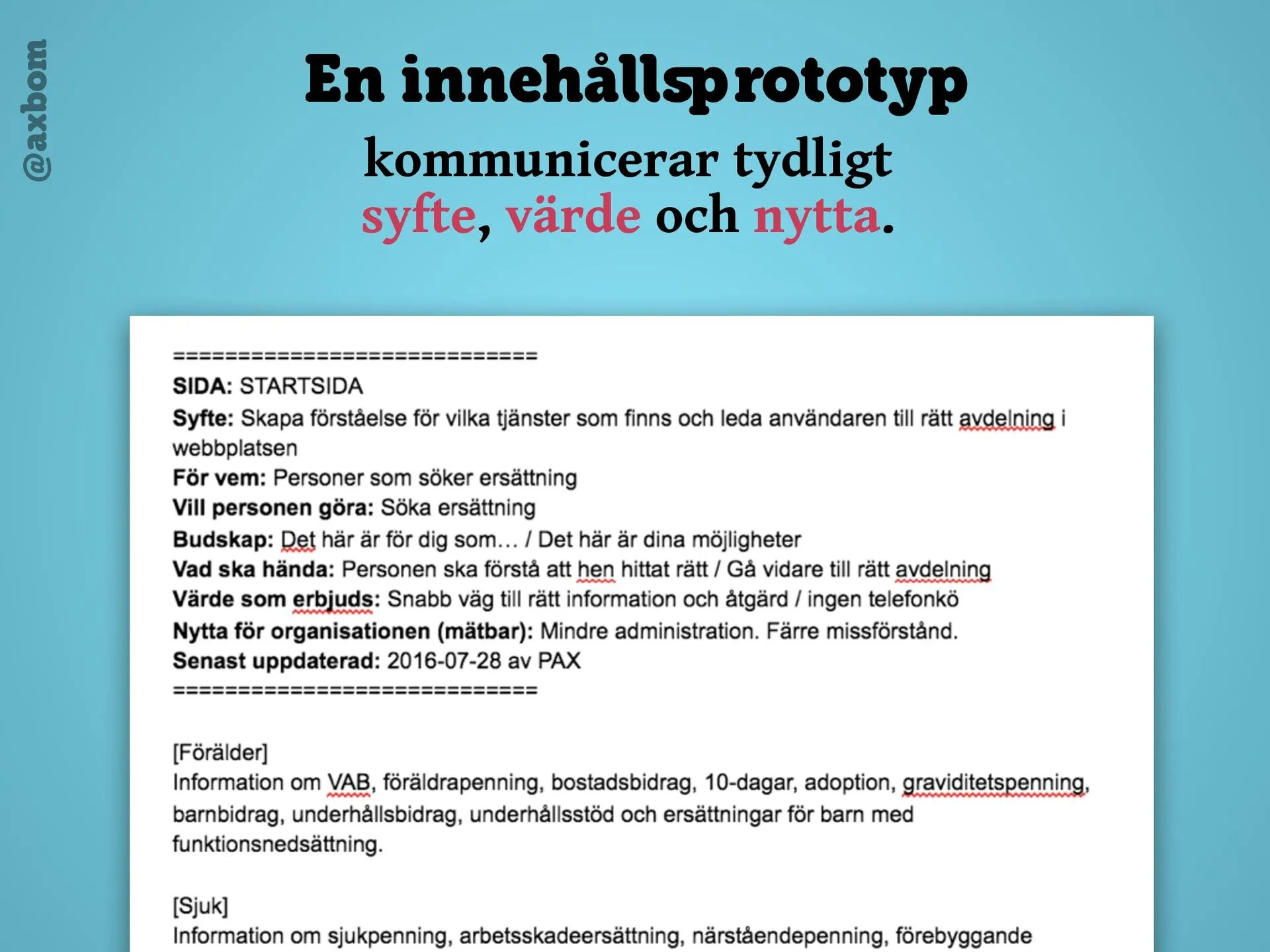
View larger: Purpose, value and benefitThe header of a content prototype: page, purpose, for whom, what the person wants to do, message, what should happen, value offered, measurable benefit for the organization and last updated – above the page’s content.
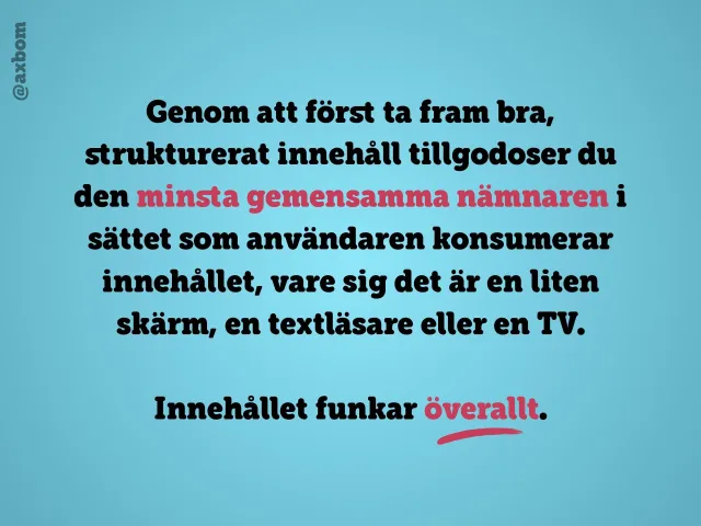
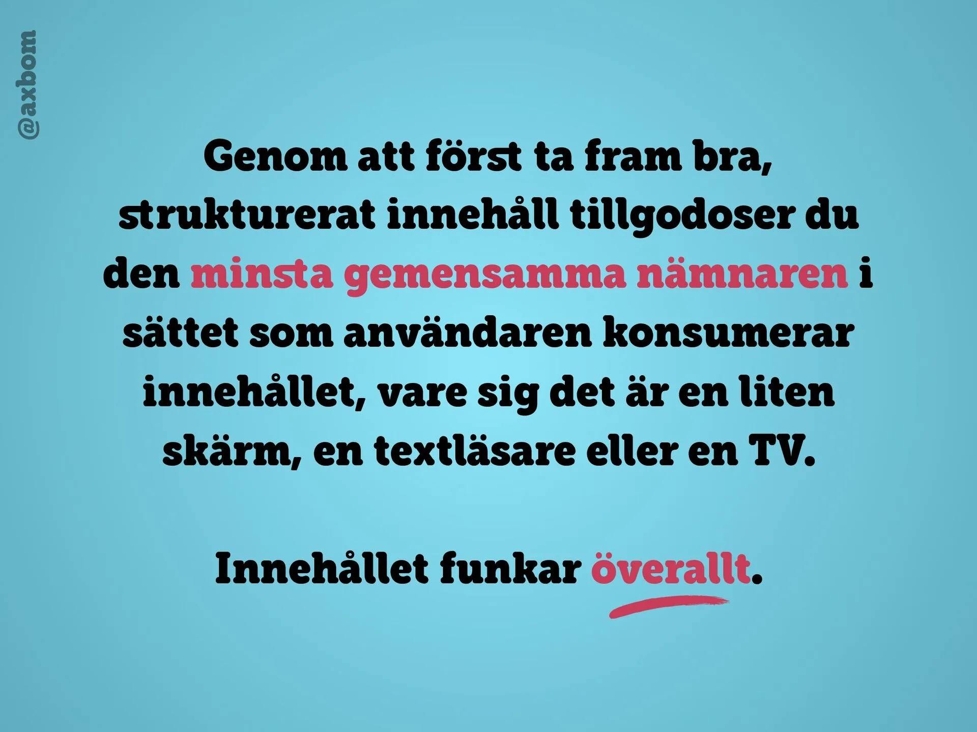
View larger: Content works everywhere“By first producing good, structured content you cater for the lowest common denominator in how the user consumes it, whether that’s a small screen, a screen reader or a TV. The content works everywhere.”
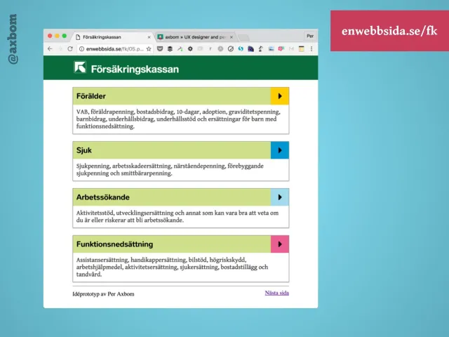
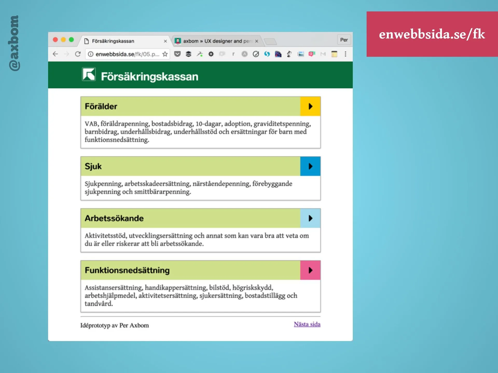
View larger: From prototype to formMy idea prototype at enwebbsida.se/fk, built from the content: Försäkringskassan’s four areas – parent, ill, job seeker and disability – as large tap targets, each with its own colour.
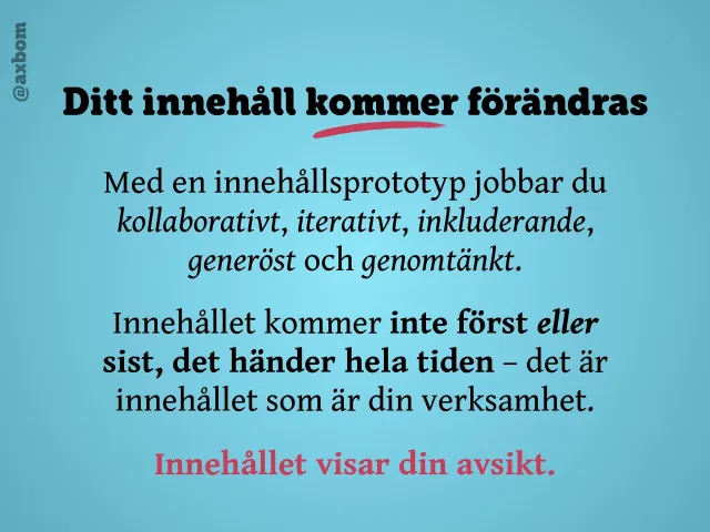
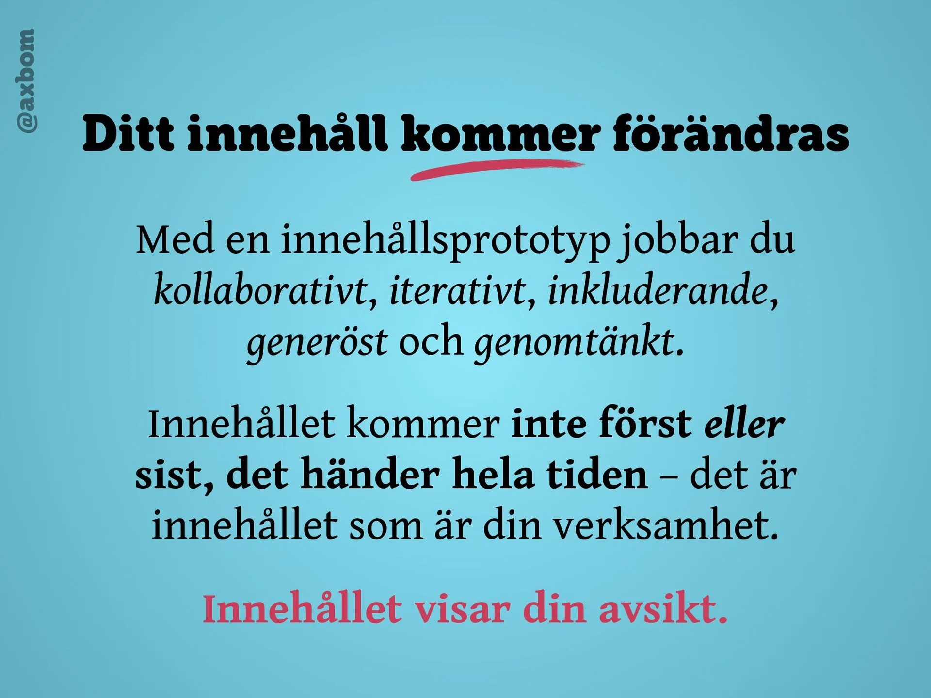
View larger: Your content will change“With a content prototype you work collaboratively, iteratively, inclusively, generously and thoughtfully. Content comes neither first nor last, it happens all the time – the content is your business. The content shows your intent.”
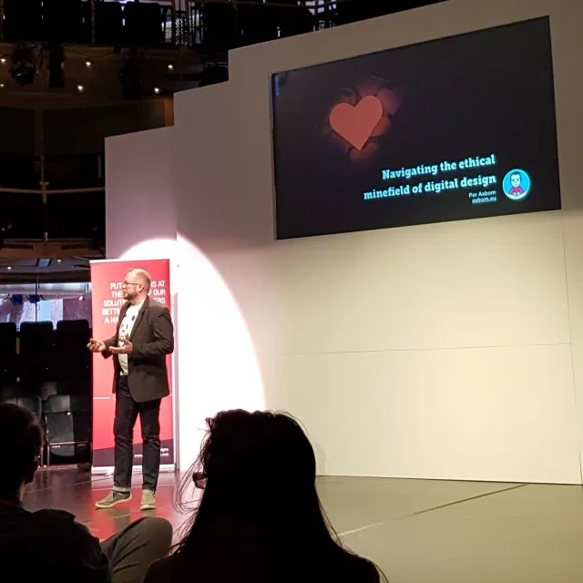
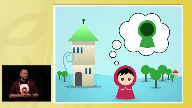
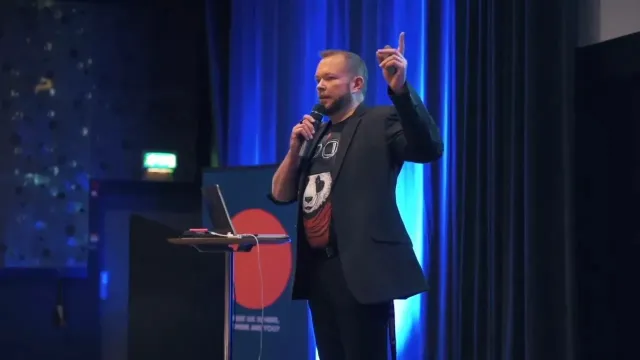
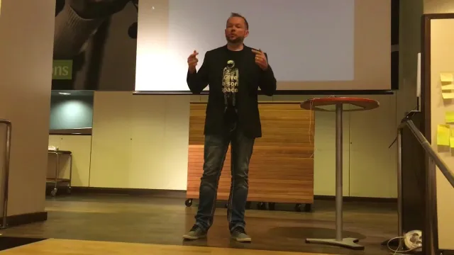
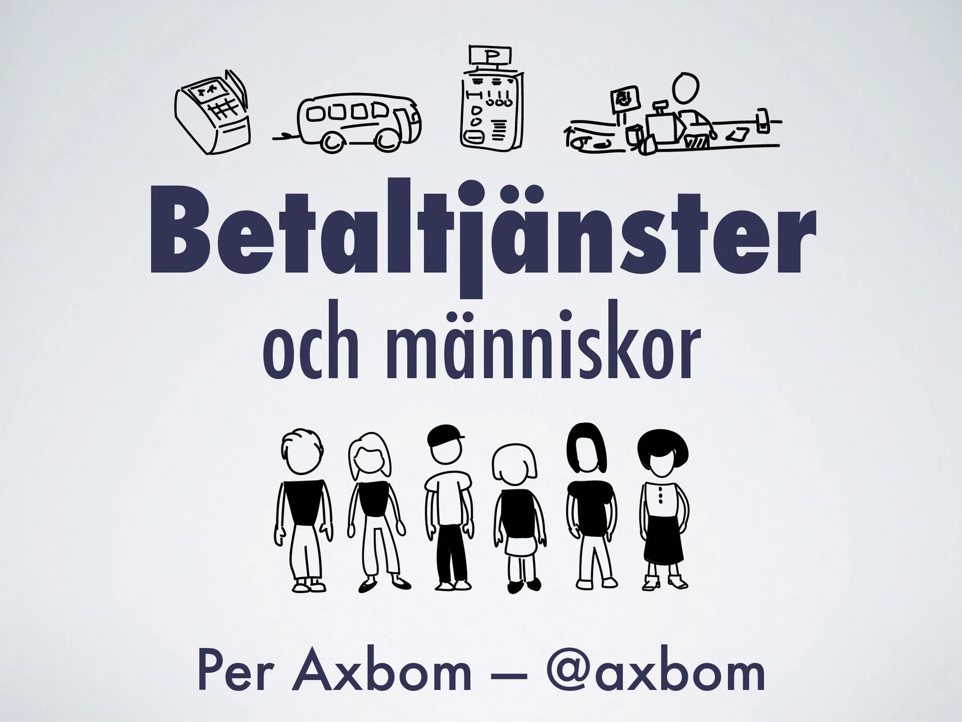
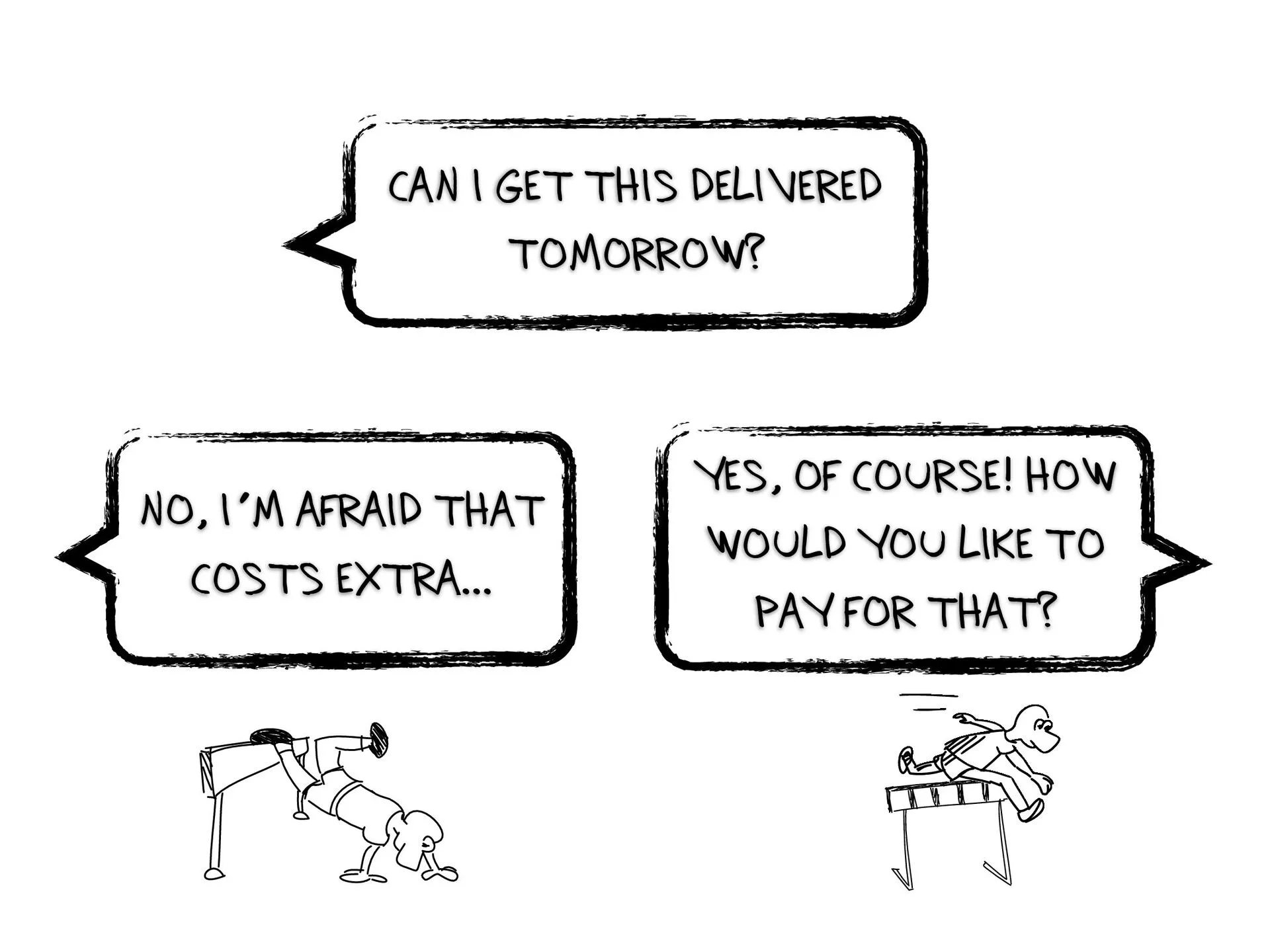
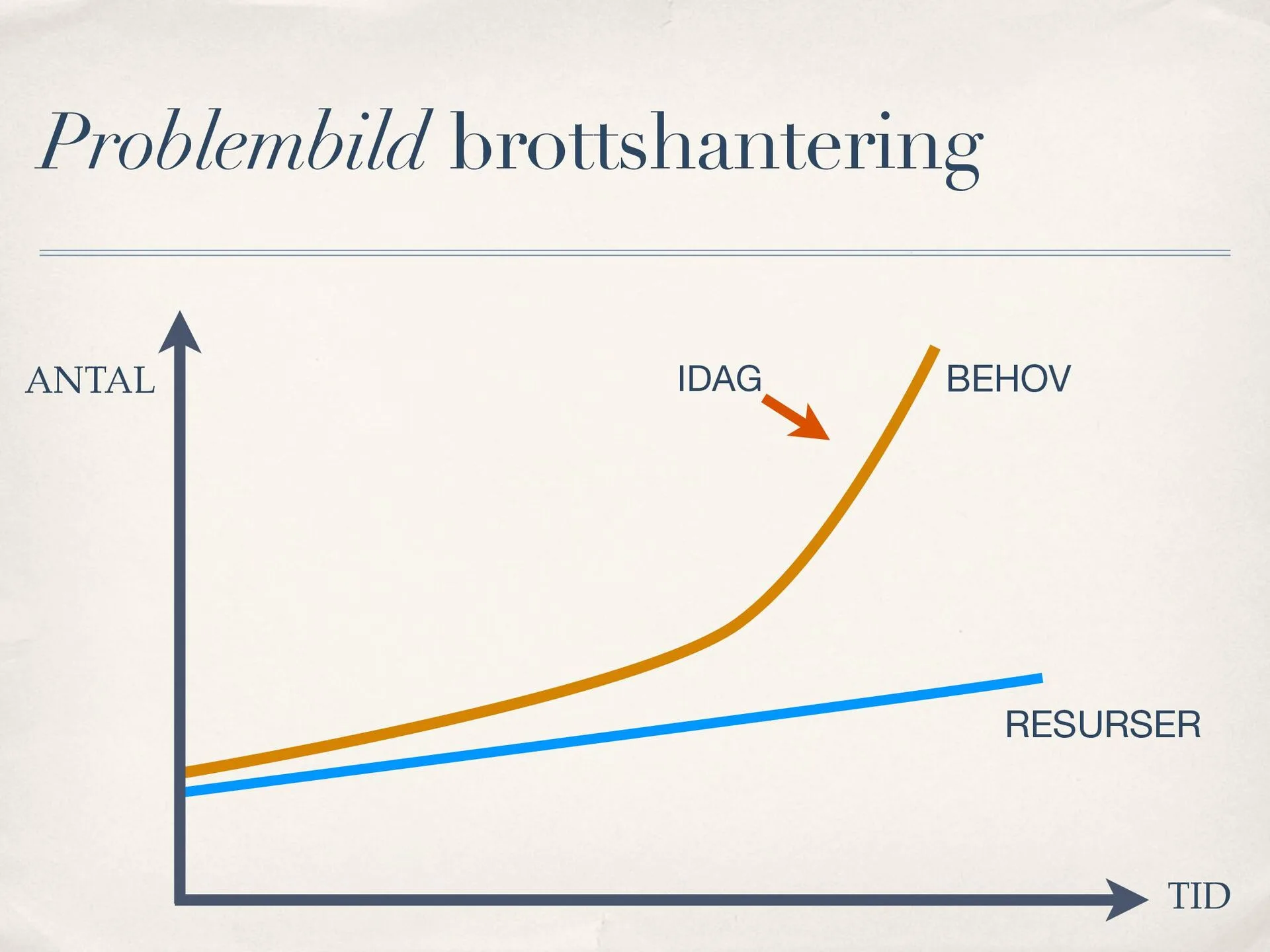
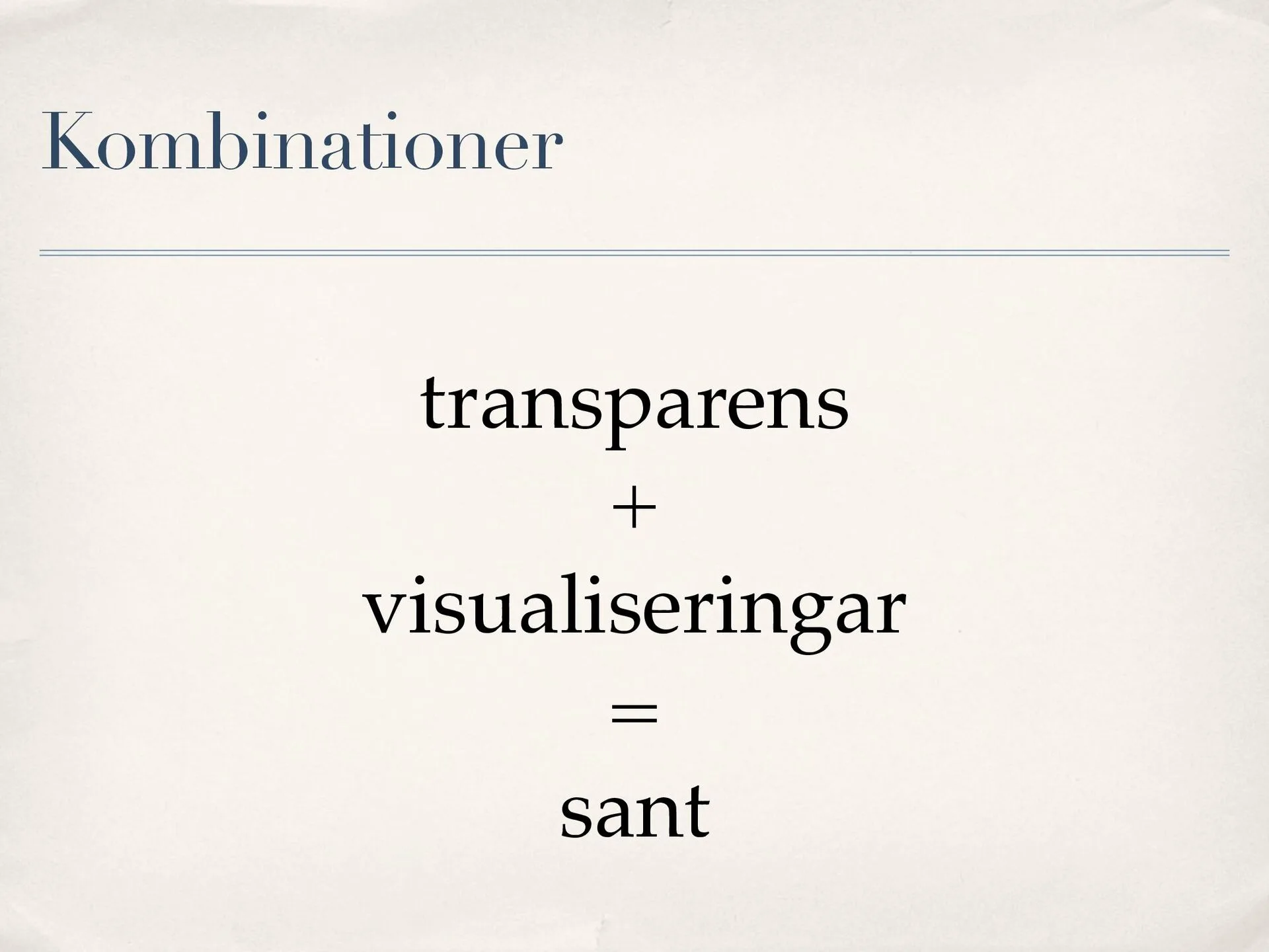
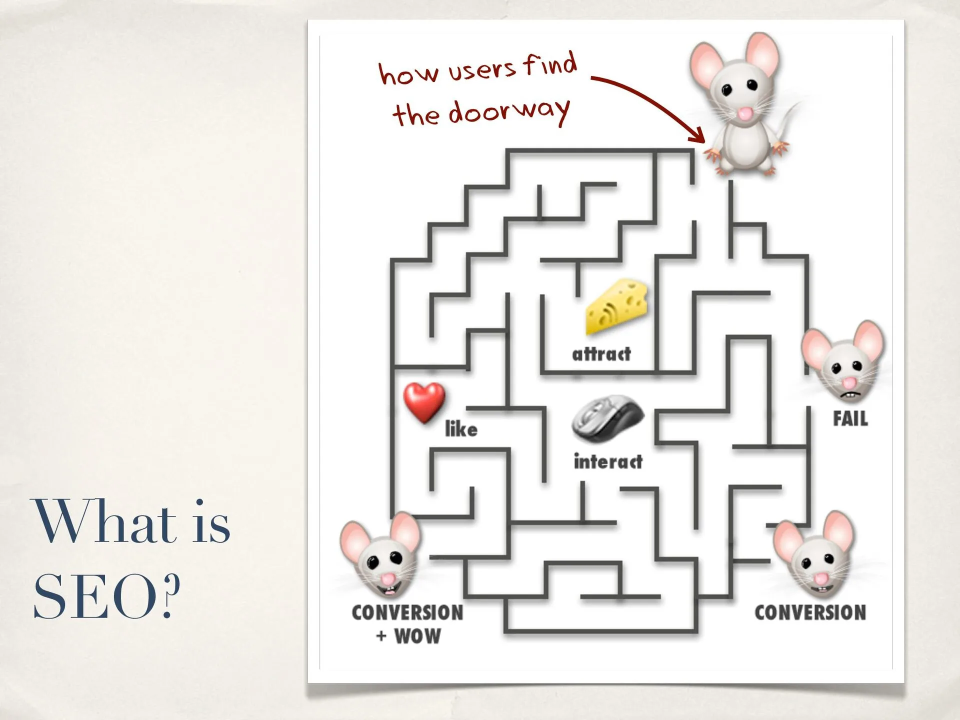
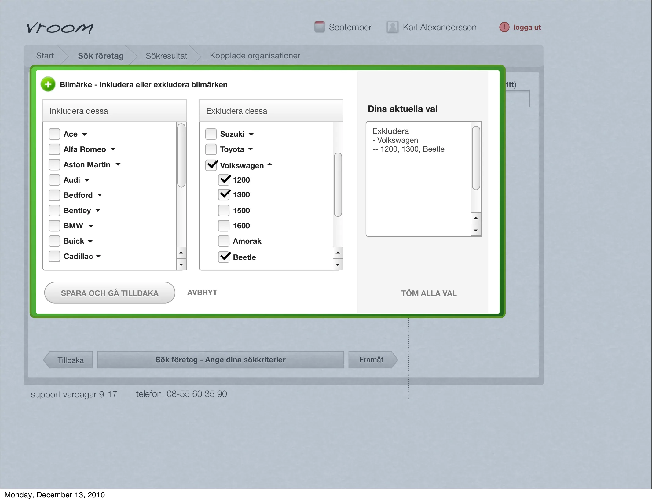
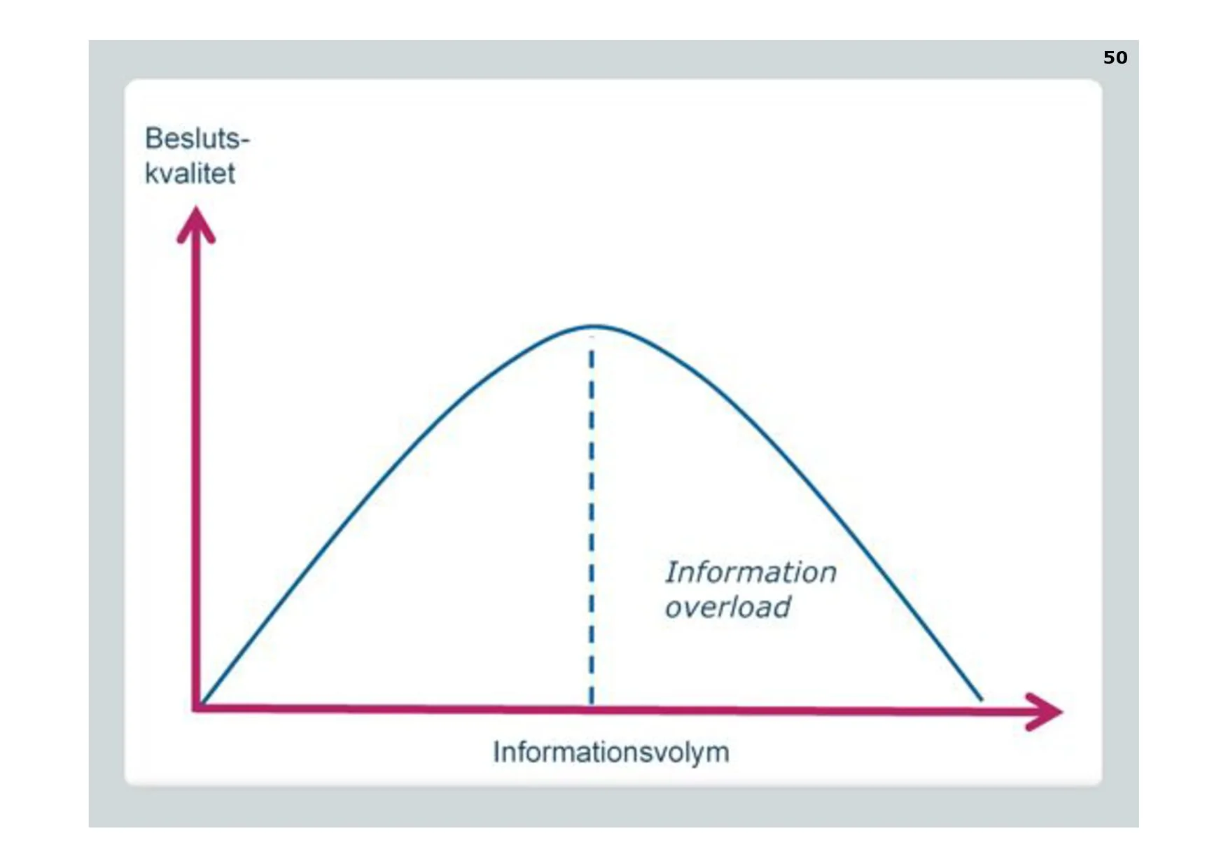
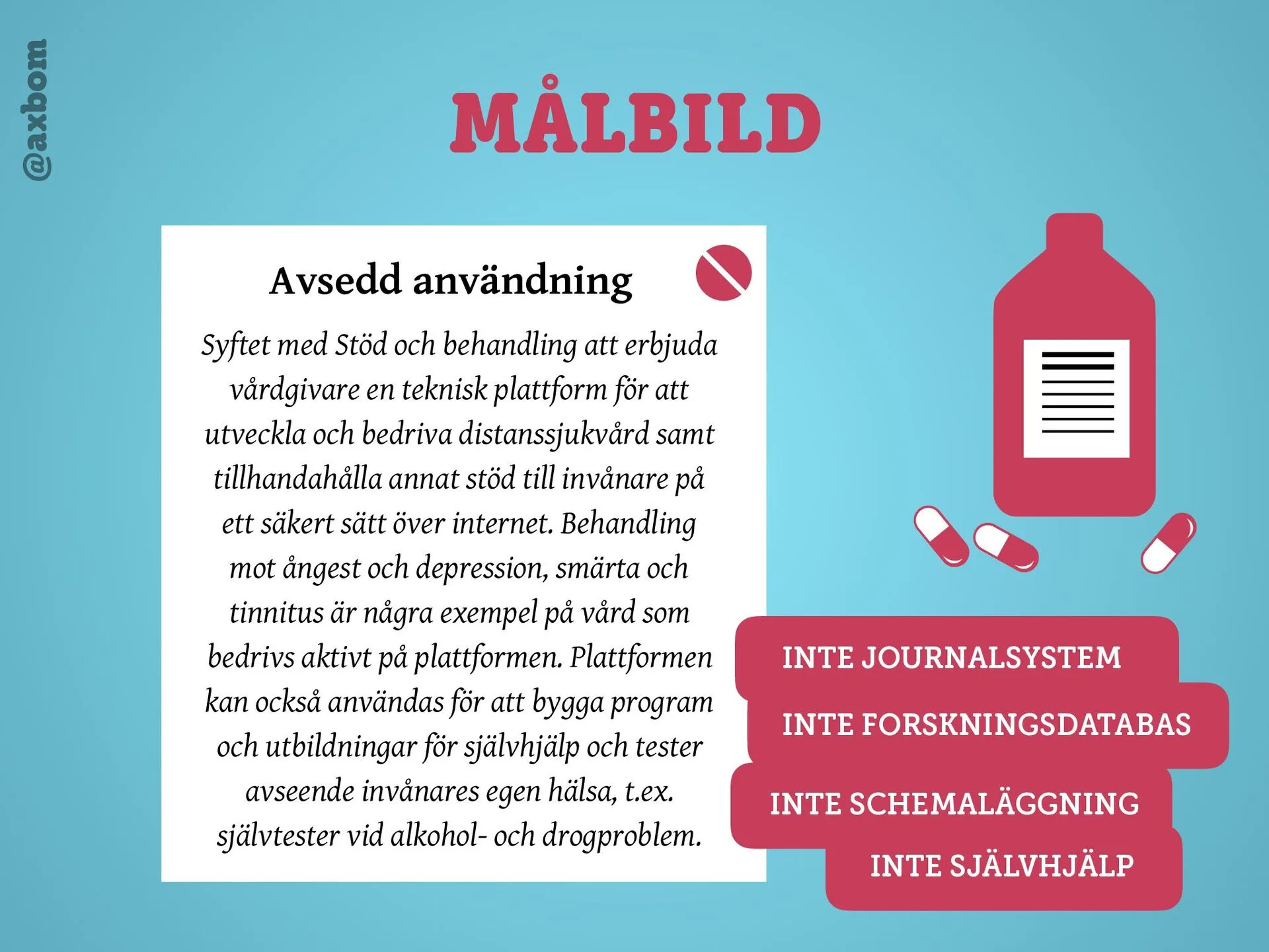
On the problem of producing visual design before the content is ready, so the content has to be squeezed into an ill-fitting suit. The solution: start with a content prototype that gives the visual form something to build on. In September 2016 I showed how far you can get by working with text alone as design material, together with all the stakeholders. The talk was in Swedish.
Read more
I opened in lorem ipsum. Nobody shoots Stranger Things and adds the dialogue afterwards, and nobody builds GTA without a script. Yet websites often get approved, built and tested before anyone has written a word.
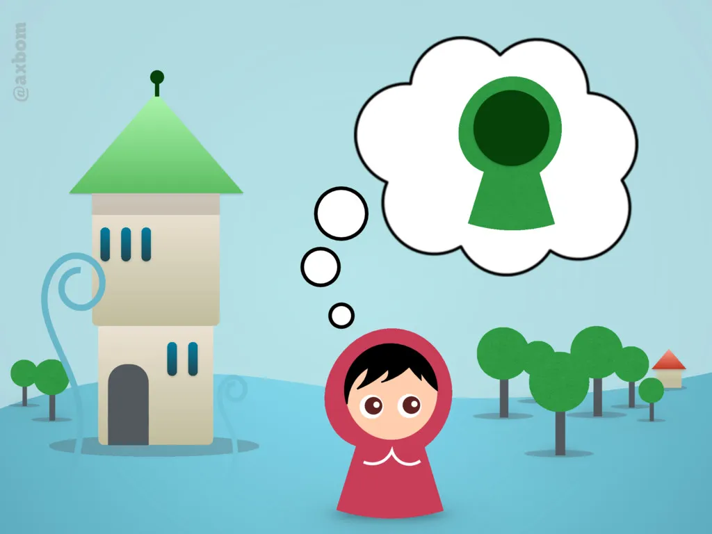
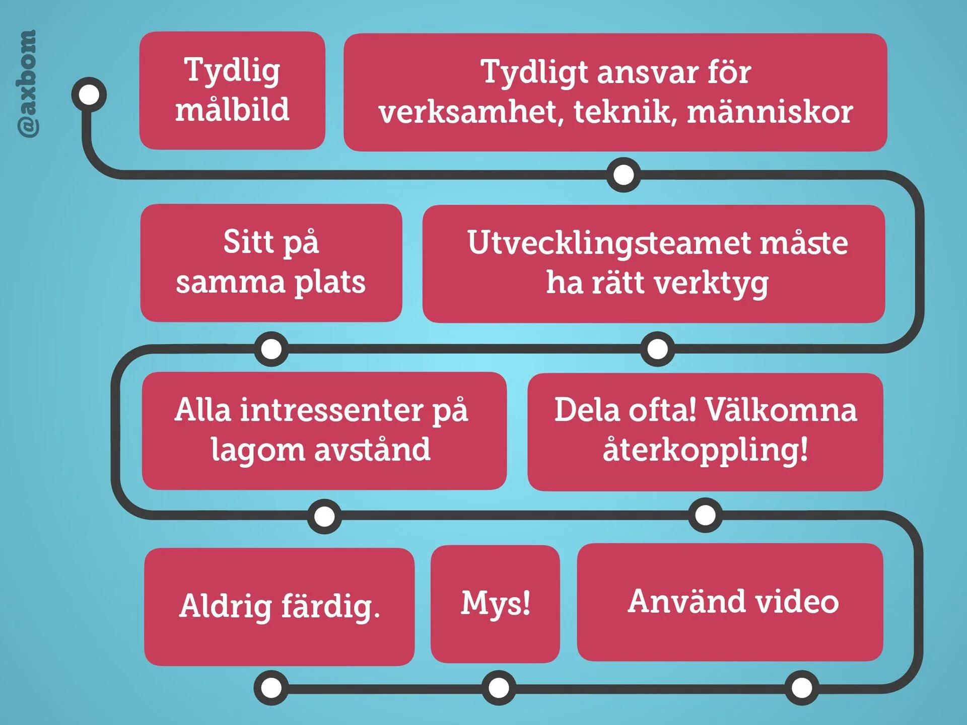
The user’s journey needs signposts, not sweets – teasers, icons and ads that distract. Like an agility dog getting lost among the treats.
Content defines structure, not the other way round. Otherwise you get right-hand columns that editors have to fill just to keep the page looking balanced.
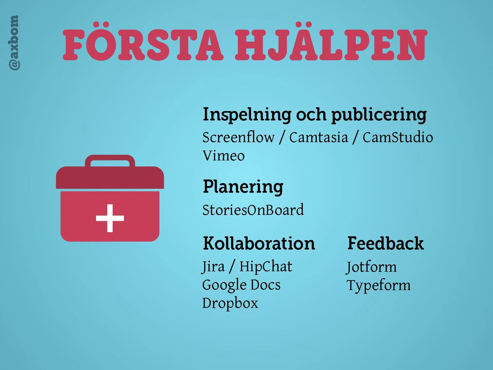
The content prototype: a shared document, often in Google Docs, with the content users need to reach their goals. Quick, cheap, understood by everyone and testable with users – and good for accessibility, with mobile first thrown in.
Purpose, message, value and benefit written at the top of every page, and the text rewritten iteratively – as when I improved a tweet live on stage.
A worked example with Försäkringskassan’s content (the Swedish Social Insurance Agency): design that reinforces the content instead of being filled with it. Colour rather than icons for the areas, full news headlines and large tap targets on mobile.
“There is always content” – the old site, the competitors’, or start writing. “If you don’t have an intent and can’t communicate it in text, you’re just very good at wasting money.”
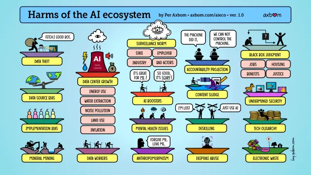
A visual aid for discussions and learning about the impact of AI development on everything from individual to global to planetary wellbeing. Free to use in your own presentations, training and meetings, and to download as PDF in English, Swedish and French.
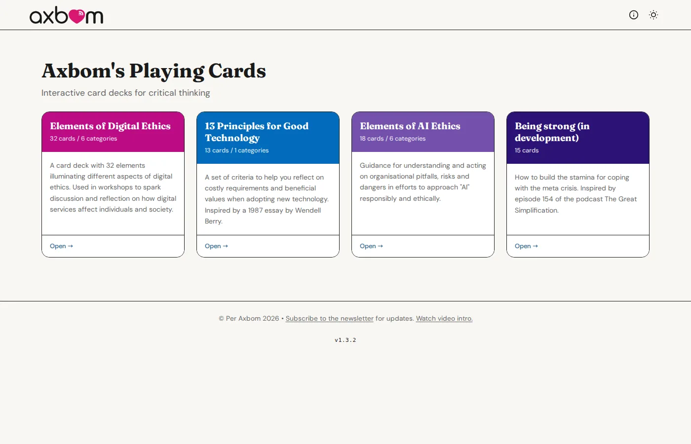
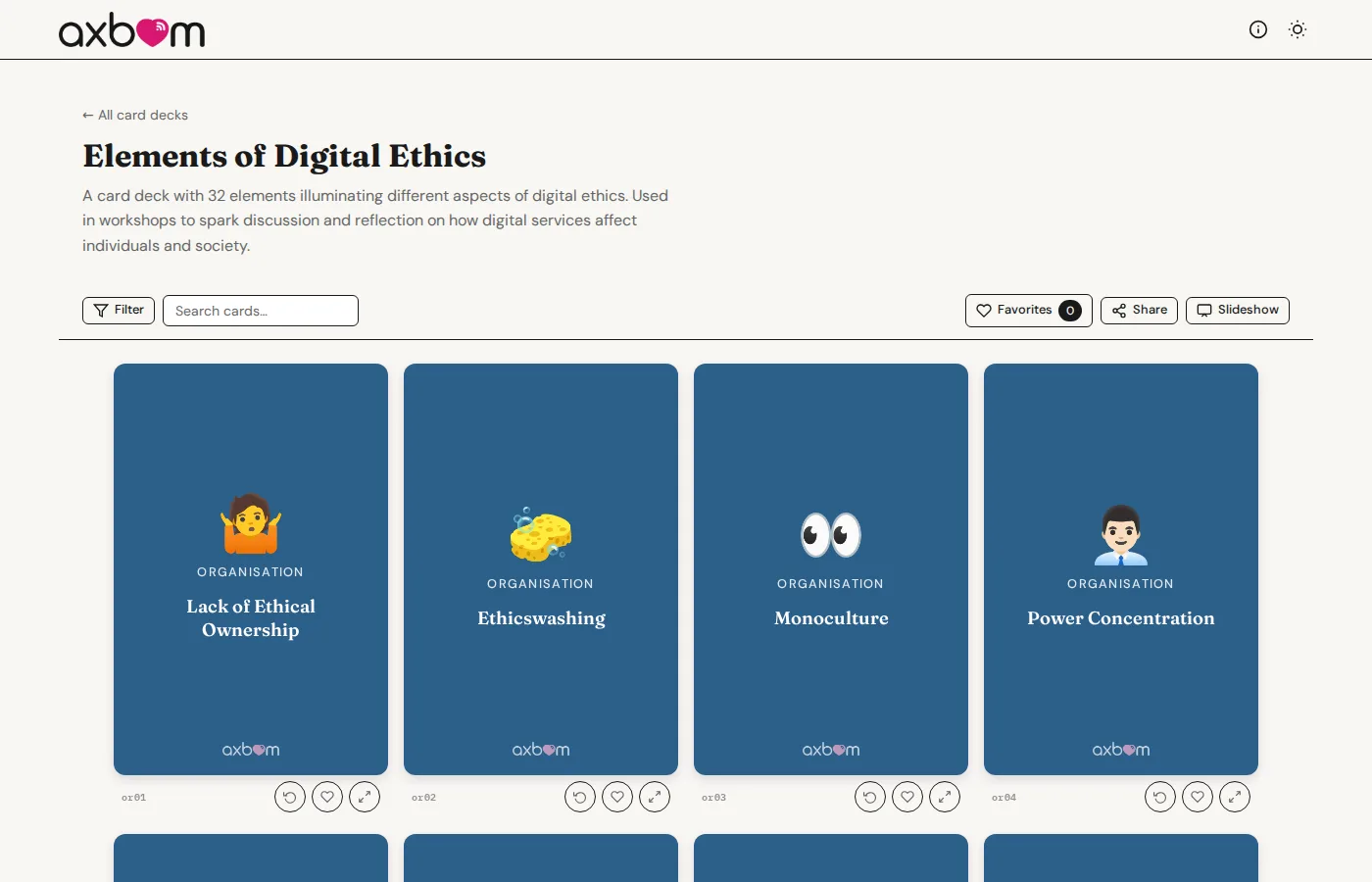
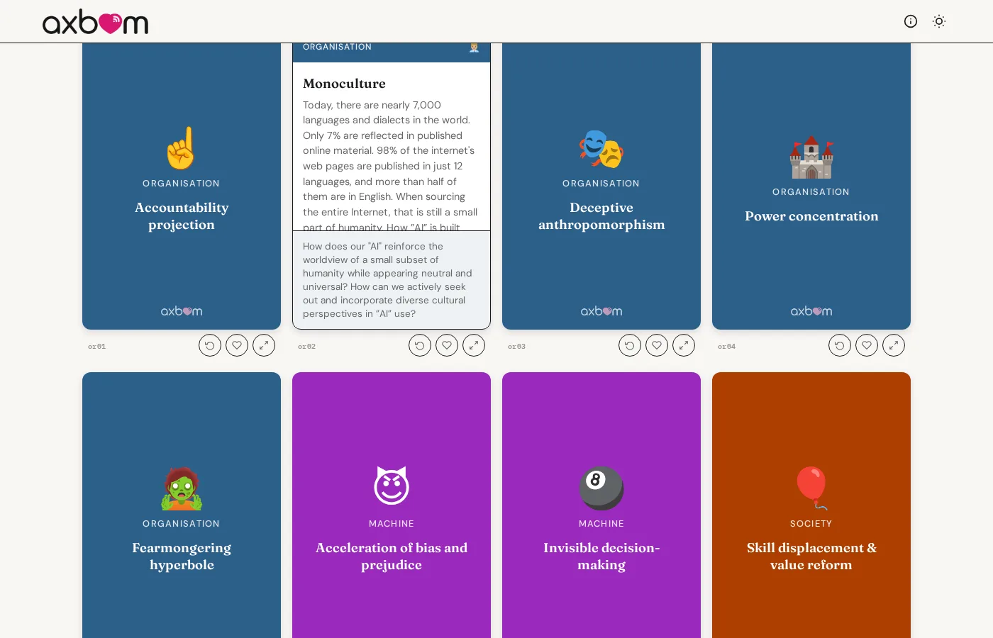
Interactive card decks for critical thinking, free to use in work meetings, workshops and teaching: topics, challenges and questions that support better decisions in digital development. In English on cards.axbom.com and in Swedish on kort.axbom.se.
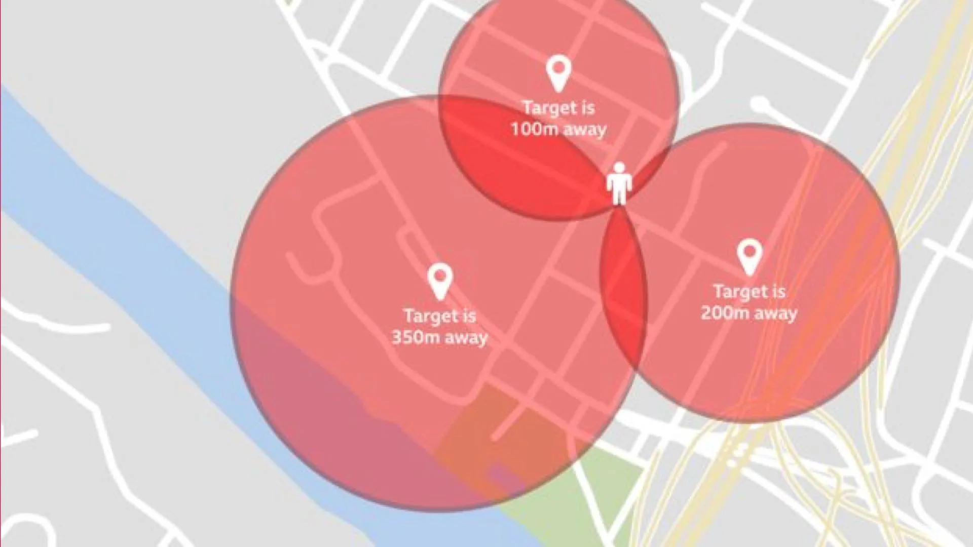
Closing keynote at Camp Digital on 3 July 2025, at the Royal Northern College of Music in Manchester: a brand new talk on how maps and models simplify the world in dangerous ways, and what gets lost when we trust them too much.
Folkets AI-kommission (The People's AI Commission)
In 2025 I was part of Folkets AI-kommission, a newly formed network that wants citizens to have much more participation and influence over the ambitions to shape the future with new technology. On June 4, 2025 we submitted our consultation response to SOU 2025:12, the Swedish AI Commission's “Roadmap for Sweden”.
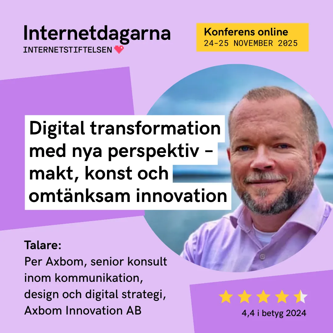
Talk at Internetdagarna on 25 November 2025, in the session “Digital transformation with new perspectives – power, art and caring innovation”, put together by Terese Raymond of Digidel, putting me alongside Simon Lindgren and Anne Kaun, moderated by Johanna Koljonen. Starting from ego depletion, I used smart lamps to show how digitalization multiplies the micro-decisions and worries of everyday life – and how efficiency and simplicity often turn into their opposite.
A Swedish conversation about bias in generative AI: why AI is so often seen as objective, how it reinforces and recreates prejudice, and how we can stay critical of the AI that increasingly affects important decisions.
242. Digital etik | Per Axbom, rådgivare digital etik | Möjligheter och risker med AI
A Swedish conversation about digital ethics at a time when everything spins faster: exploitation as the basis of the technology, copyright as a coming battleground, and why AI is more than just a hammer.
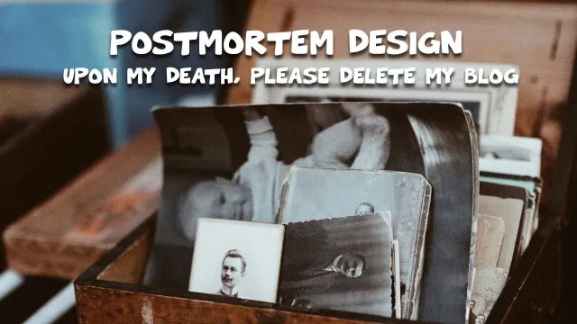
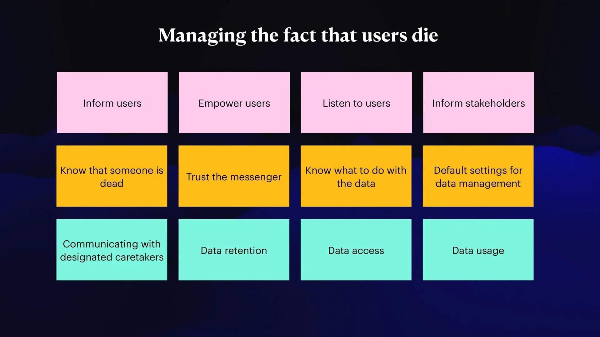
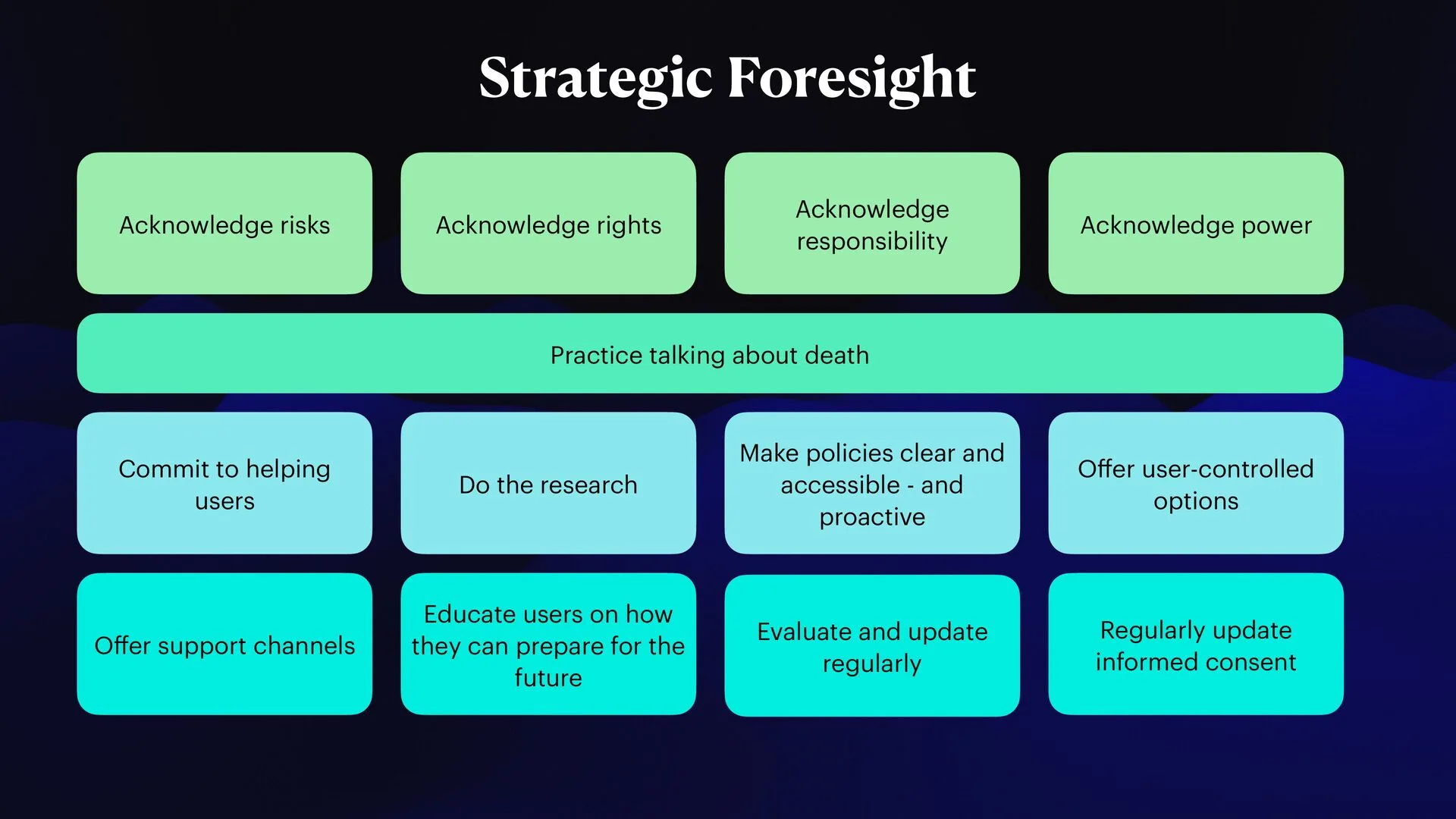
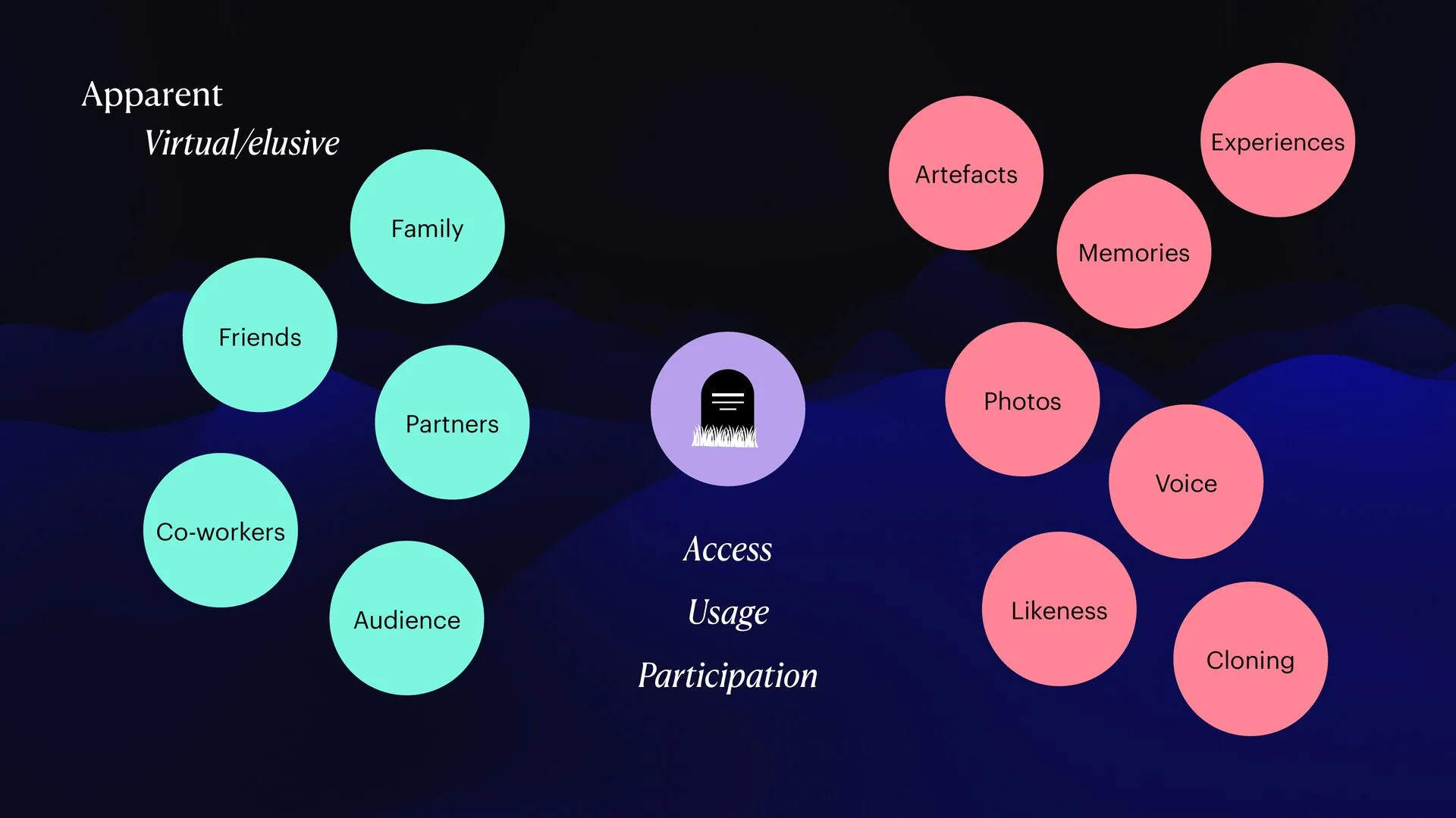
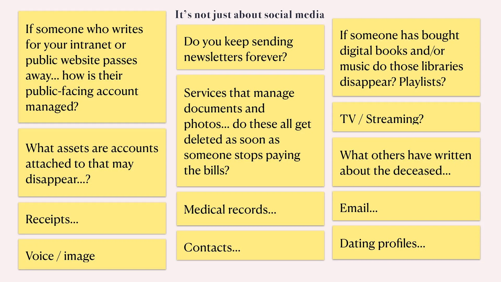
A 90-minute interactive guest lecture at Berghs School of Communication, in Joe Macleod’s course built around his concept Endineering. He asked me to talk about data, privacy and the importance of deletion and endings. I focused on designing for the fact that users die: how information can be managed, accessed and treated with care after someone passes away, how people can get more control over their content, and how the needs of close relatives can be met.
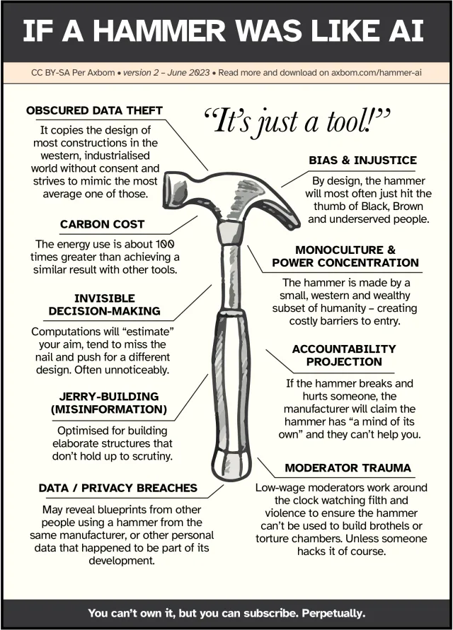
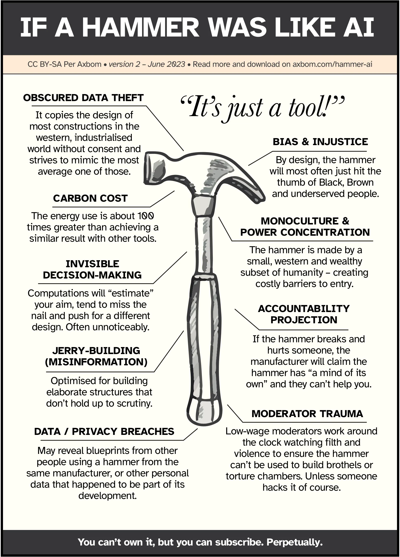
A poster answering the claim that AI is “just a tool”, no different from a hammer. Nine harms of generative AI and deep learning, shown as a hammer you would never buy. The page explains every topic and has the poster as PNG and PDF. Free to use under CC BY-SA.
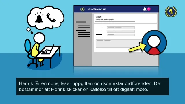
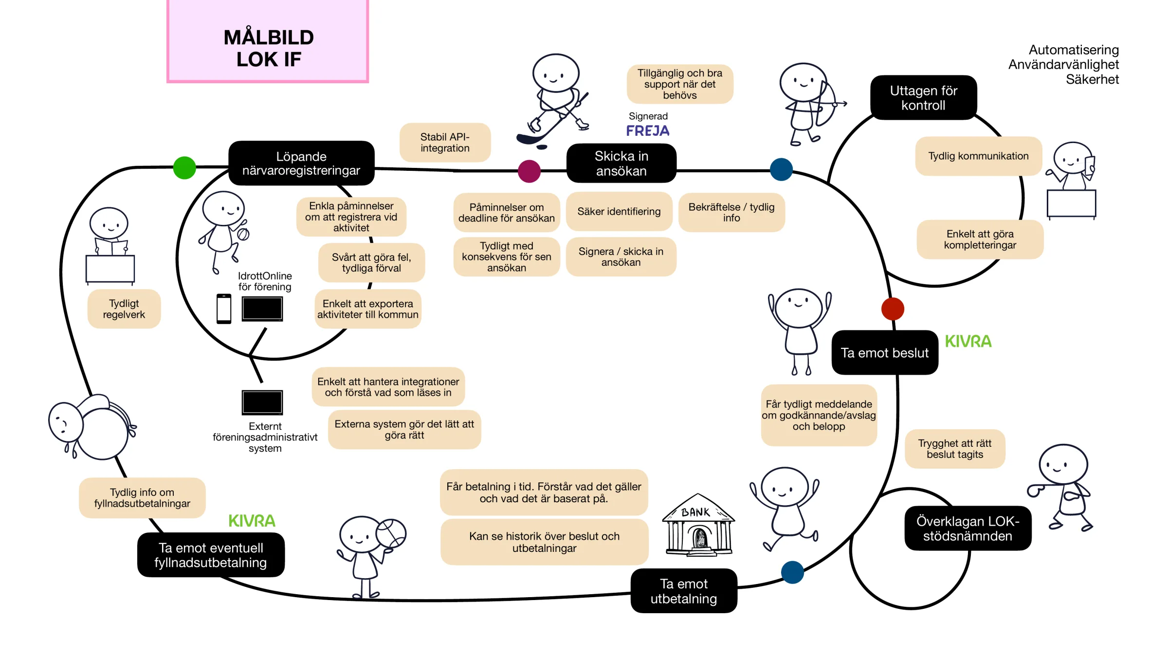
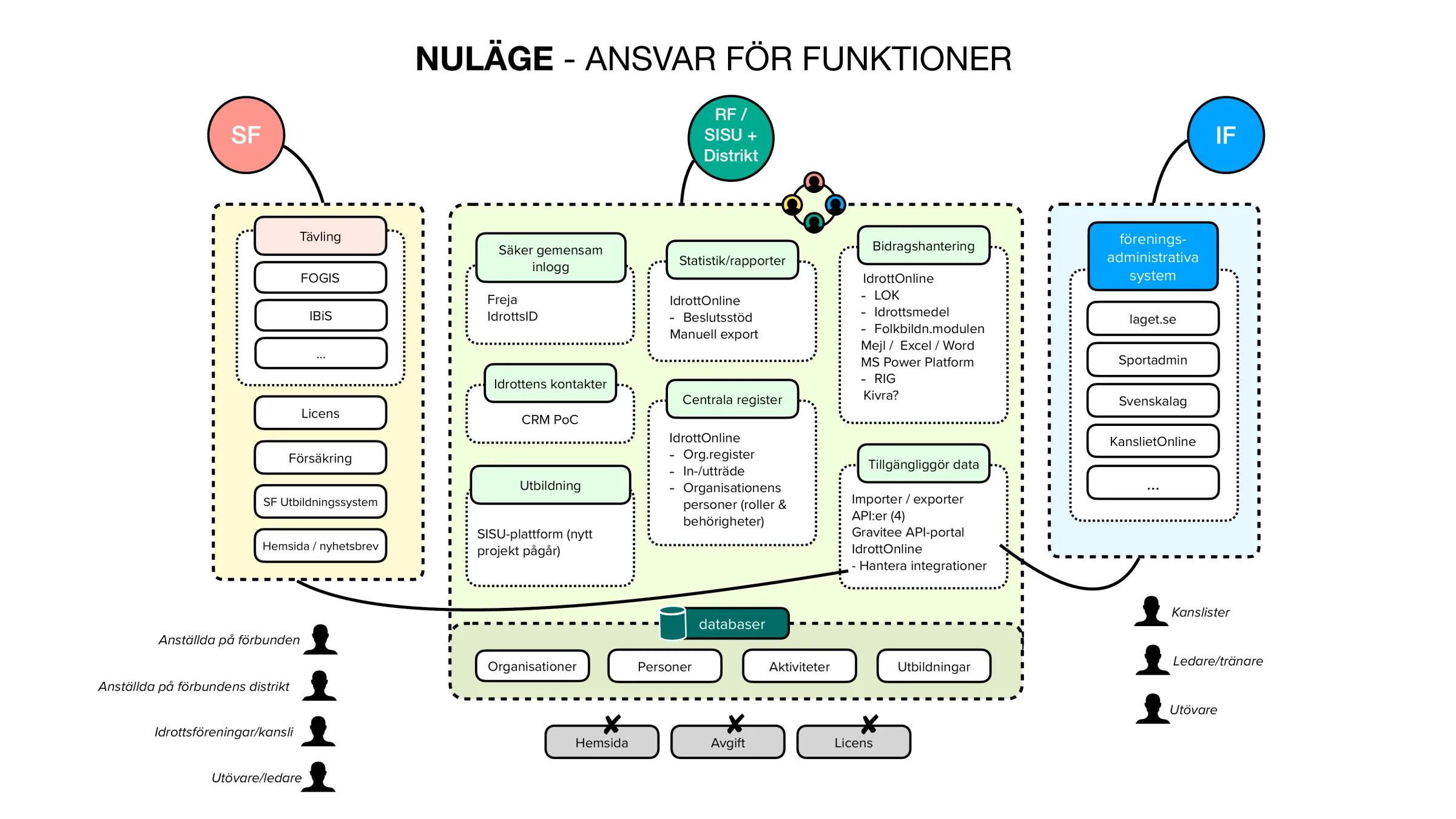
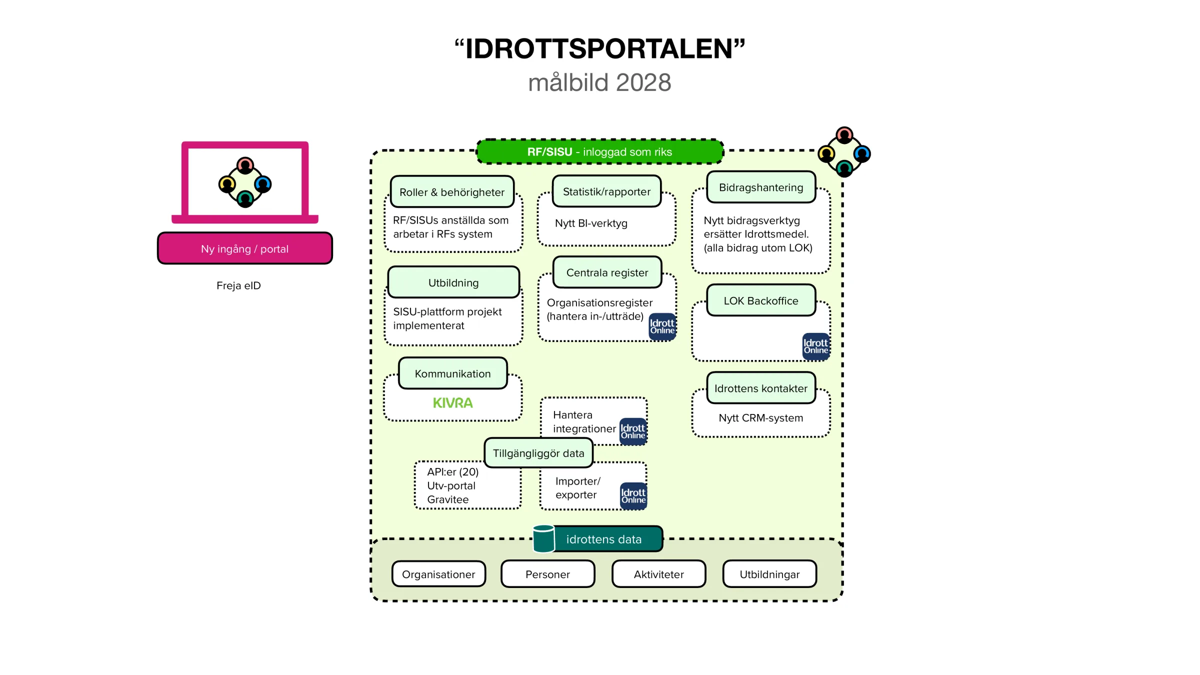
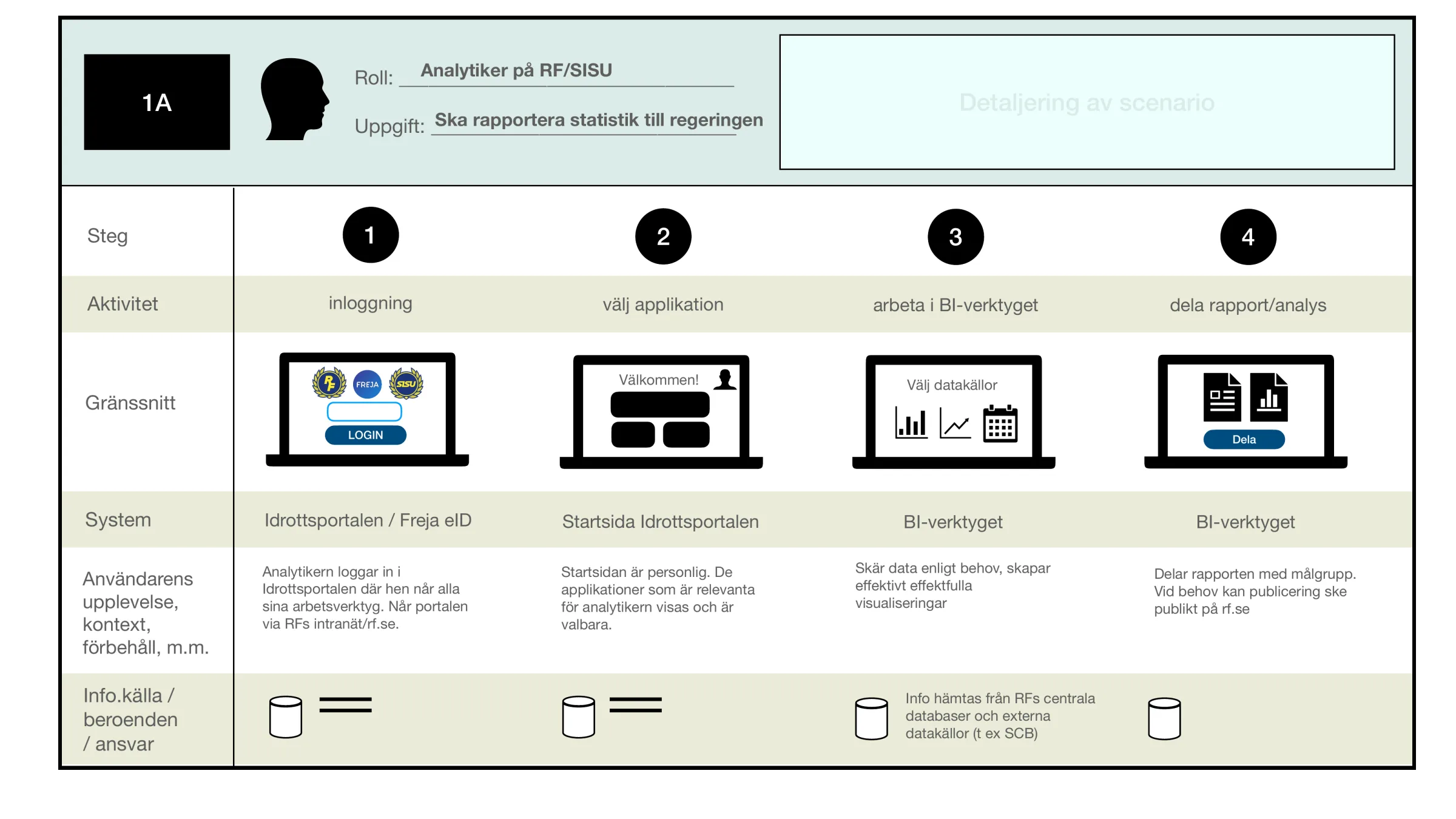
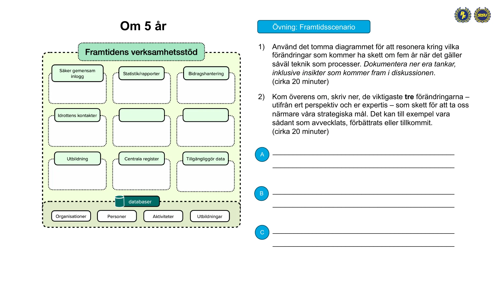
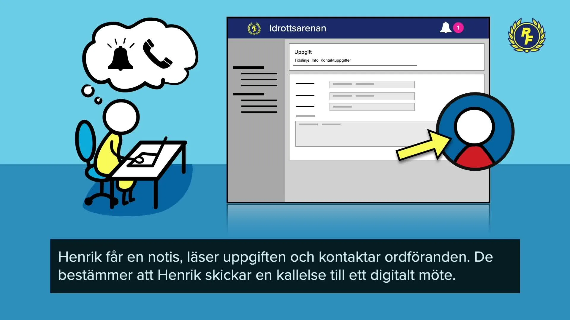
UX strategy and design for Idrottsarenan, the Swedish sports movement’s new operations system, which replaces IdrottOnline in November 2026. It brings together member and organization data, popular education, analysis and financial grants for 72 national sports federations, 19 districts and around 18,000 clubs with some 3.1 million members.
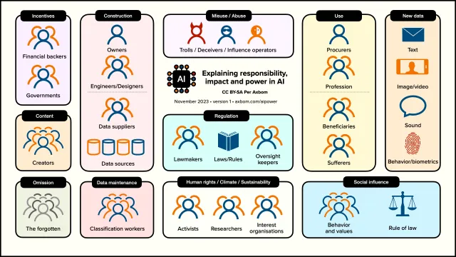
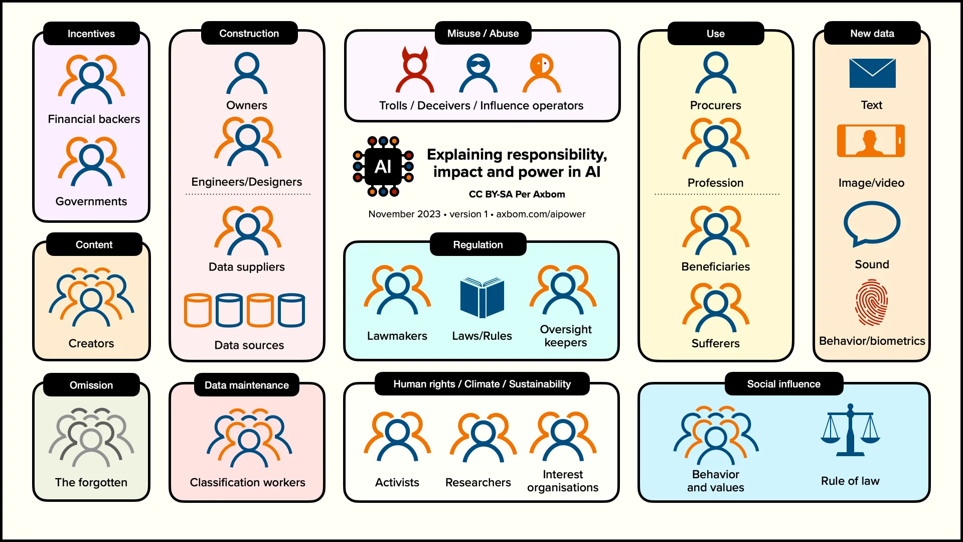
A diagram showing the relationships between everyone involved in developing and using AI: who finances the systems, who builds and feeds them, who regulates them, and who benefits or suffers. Something to point at in discussions. The page explains every group and has the diagram as PDF. Free to use under CC BY-SA.
A Swedish software company in the finance sector, via Ambition Group · Sweden
The company was aware of digital accessibility, but it wasn't yet a capability built into its services as part of everyday work processes. Together with Ambition Group, we proposed four steps on “the road to improved digital accessibility”. Step 1, an initial review, was to provide a basis for improvements and build awareness of strengths and weaknesses that would help adjust future ways of working.
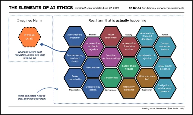
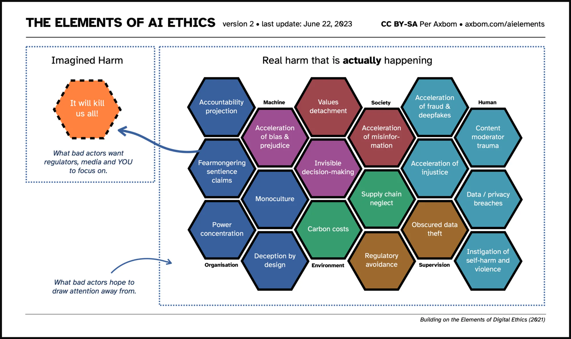
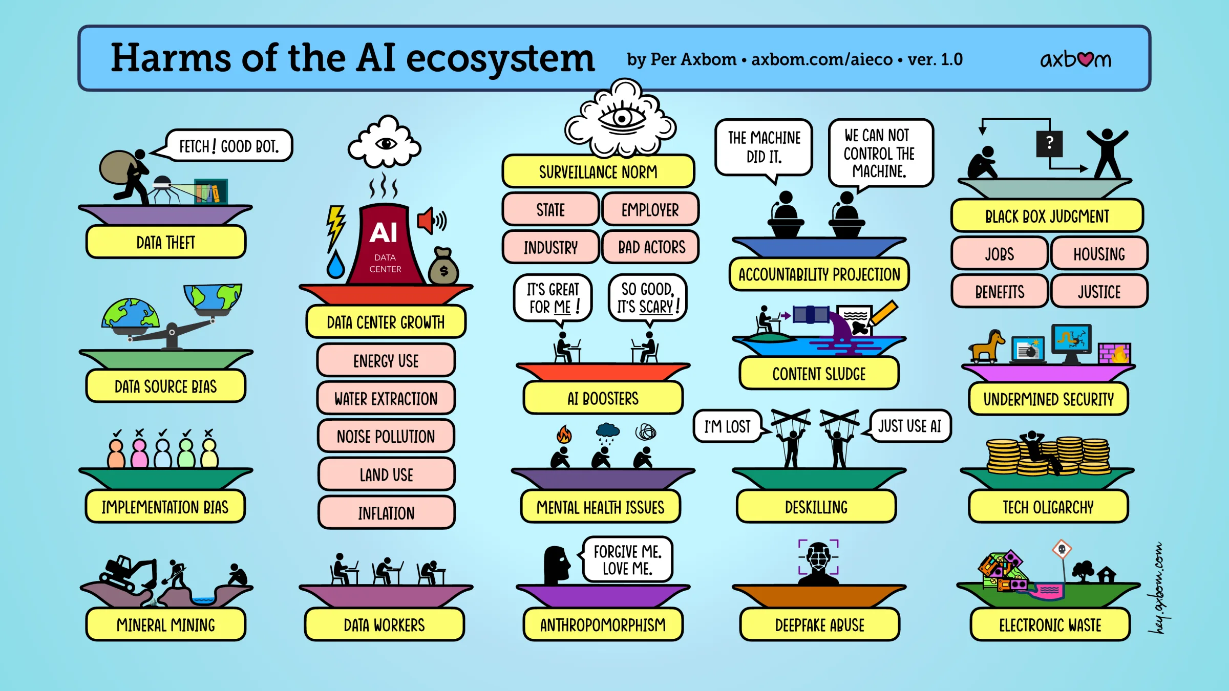
A chart of 18 harms that we are already seeing with AI, to help teams prioritize their work with “smart” tools and plan how to mitigate harm. The page explains every element and links to a PDF. Free to use under CC BY-SA.
Internetdagarna (Internetstiftelsen) · Internetstiftelsen, Stockholm (broadcast online)
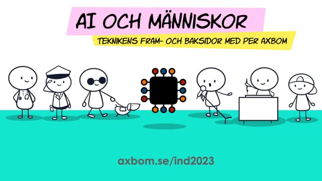
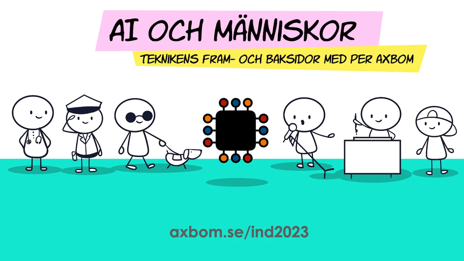
AI och människor – teknikens fram- och baksidor
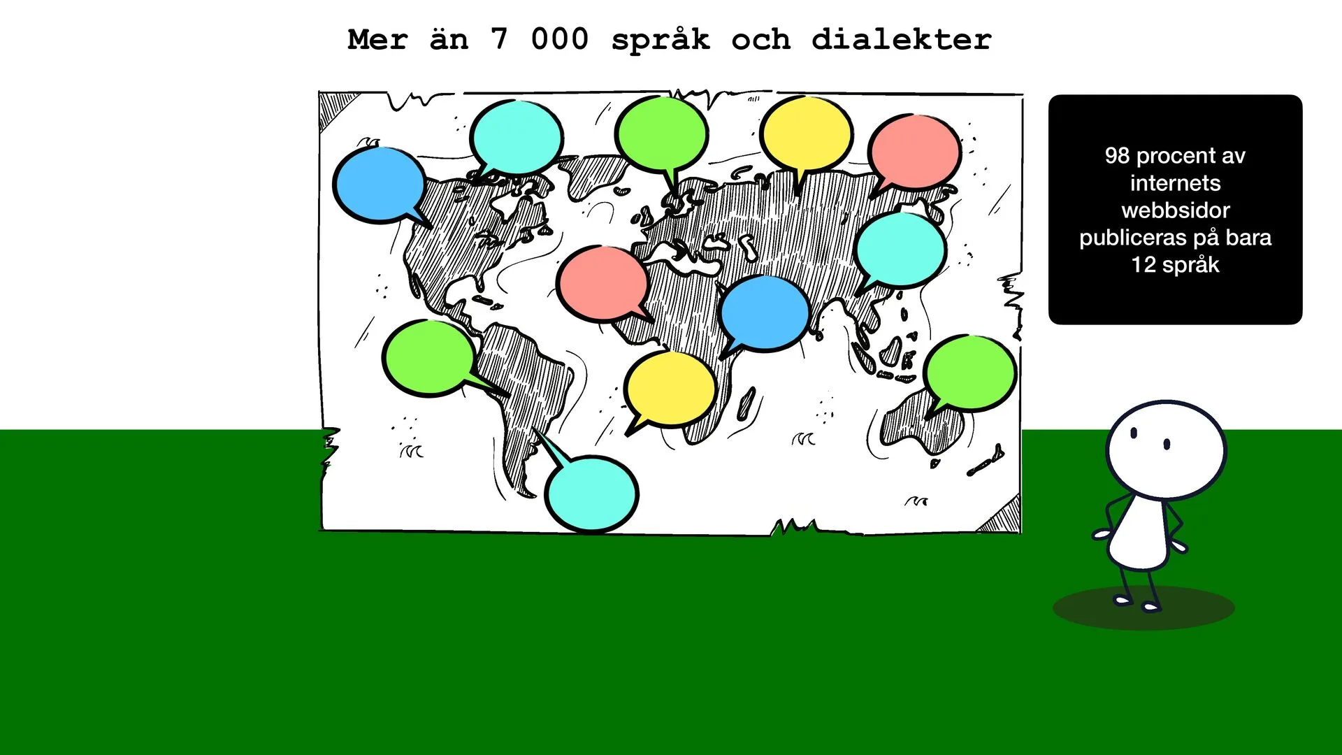
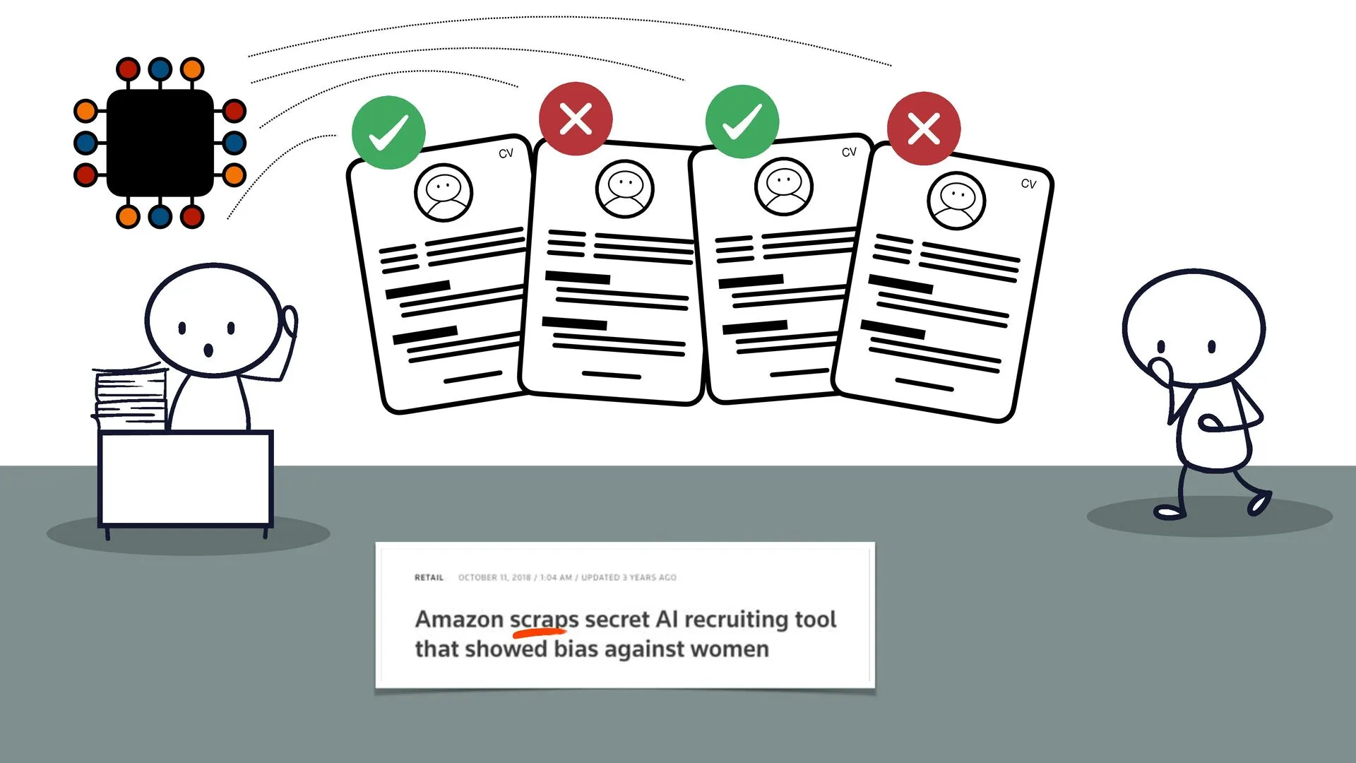
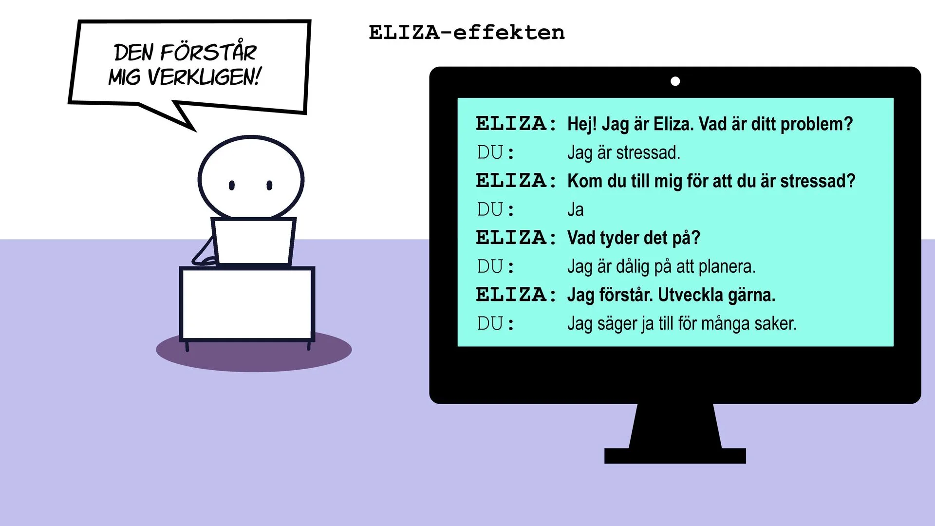
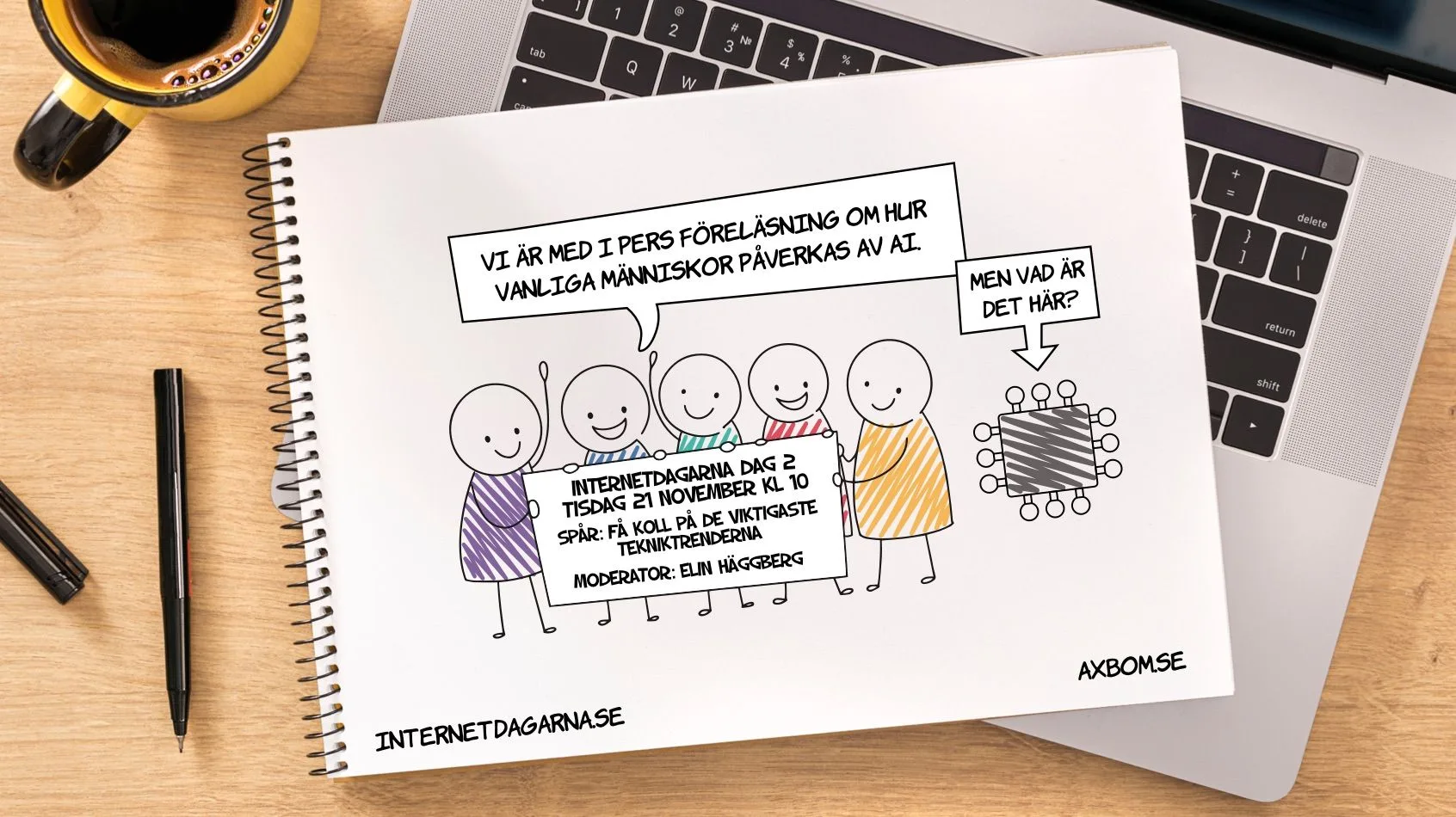
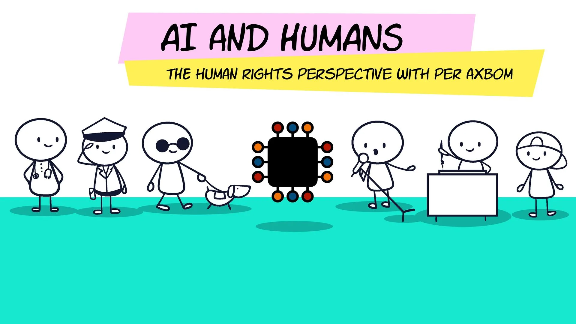
A talk at Internetdagarna 2023, Sweden’s big internet conference, given on location at Internetstiftelsen and broadcast to the online audience, in the track “Get to know the most important tech trends”: how ordinary people are affected by AI, what tools like ChatGPT actually are, and how to avoid creating new problems while trying to solve others.
My first assignment for Riksidrottsförbundet, from autumn 2023: the overall strategy for a new operations system for the sports movement, and specifically a plan for the future of grant management (Ekonomiska stöd) – how federations, districts and clubs apply for, receive and report on grants.
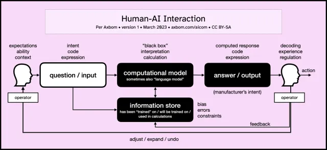
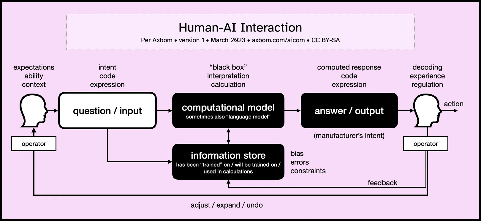
A communication model for human-AI interaction: what shapes the input from a person, the output from the computer, and what the person then does with it. Useful in implementation planning, design decisions, communication and training. The diagram is free to download as PDF or PNG, and to use under CC BY-SA.
A Swedish conversation, just as the whole country went ChatGPT-crazy, about what the problem with ChatGPT really is: an AI bot that talks to you like a human and can write anything from business plans to school essays.
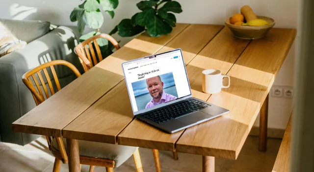
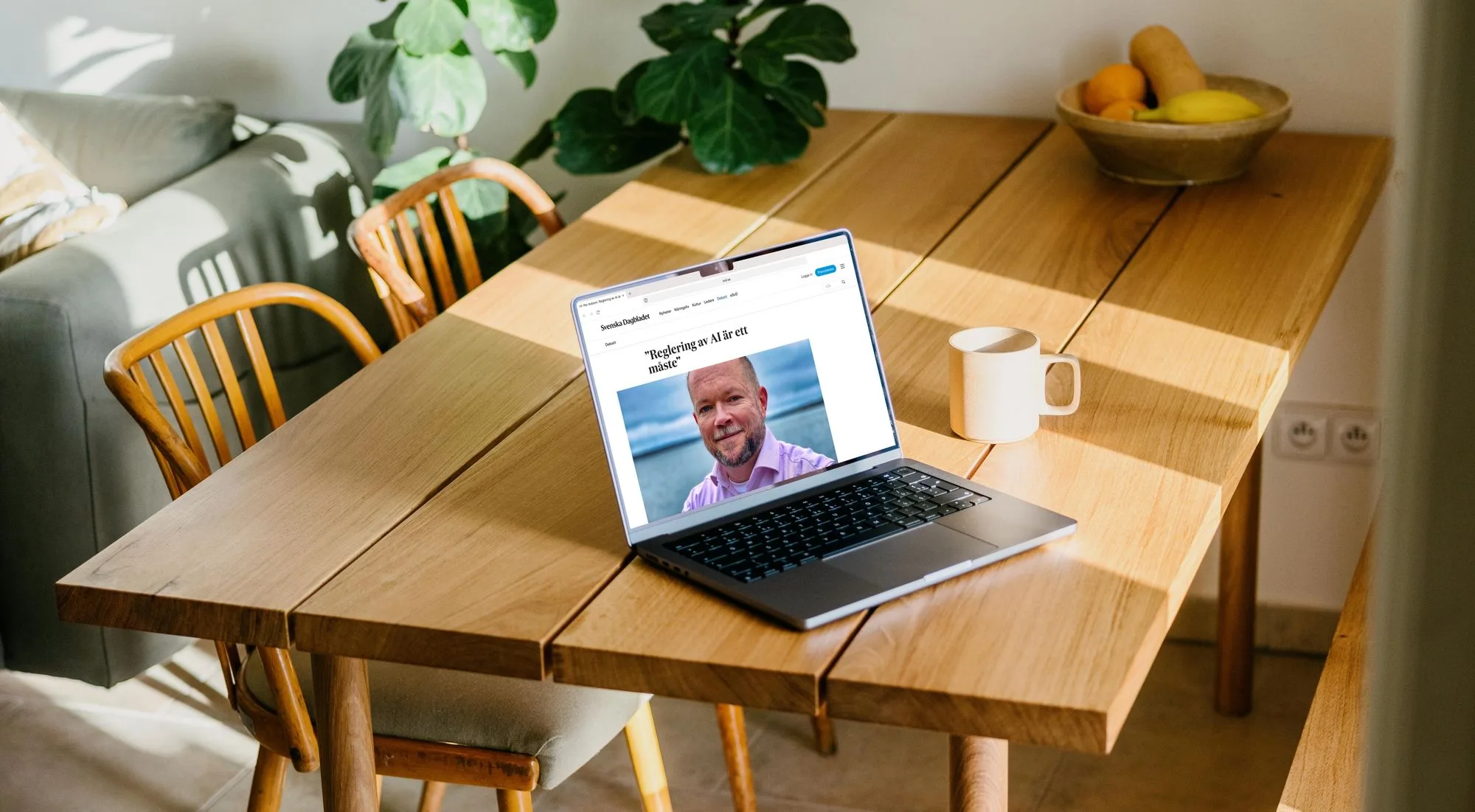
My reply on SvD Debatt on 9 July 2023 to Mathias Sundin's “Vi behöver inte någon AI-paus” (“We don't need an AI pause”): it is not written in stone that the benefits of AI will outweigh the drawbacks. That is why we need regulation – to set a direction that mitigates harm and creates value for the many, not the few.
Writing
Digital ethics
Responsible AI
Quote
2023
The power we wield as digital creators is significant, as is the potential for harm. By taking responsibility for our power we can not only mitigate negative impact but also build knowledge for advancing our digital services in novel and caring ways.
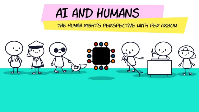
An online talk for Vattenfall on 14 November 2023, through my own company – back with the energy company where I had worked as a consultant from 2005 to 2010. The human rights perspective on AI: what can go wrong, who is responsible, and how to ensure safe and beneficial use.
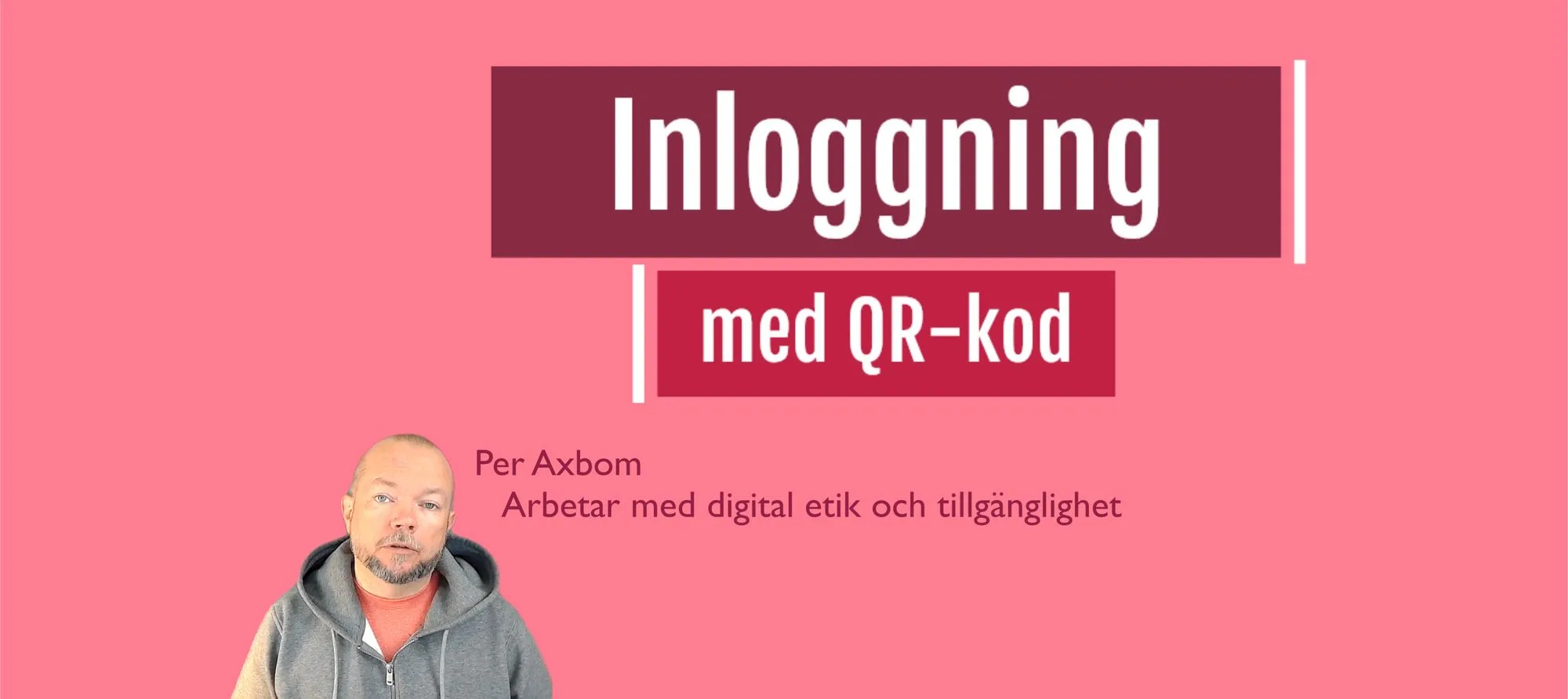
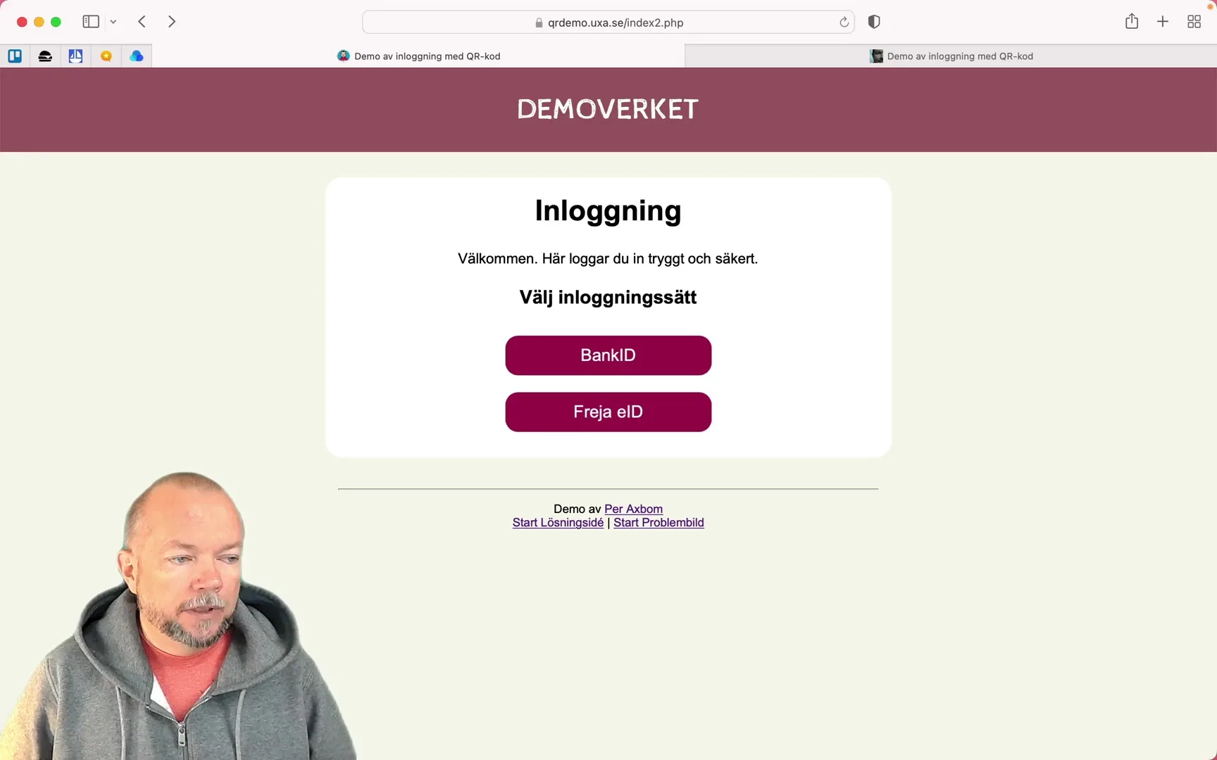
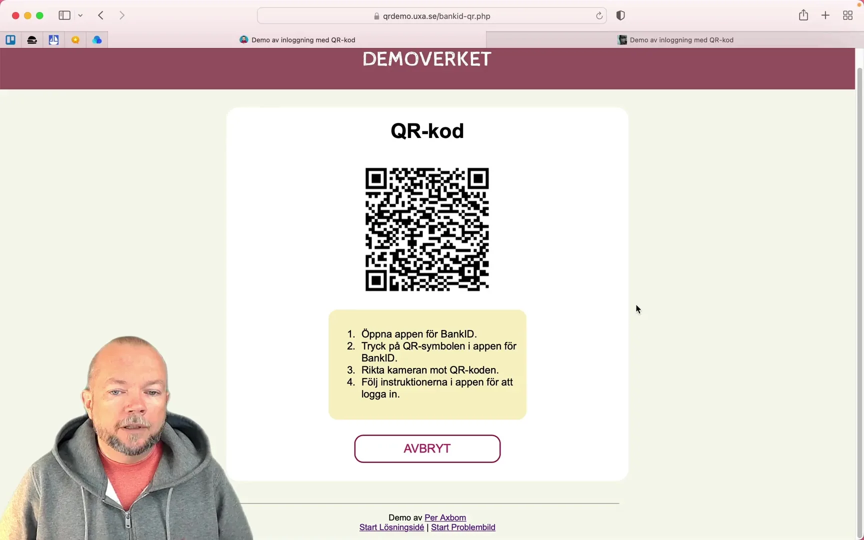
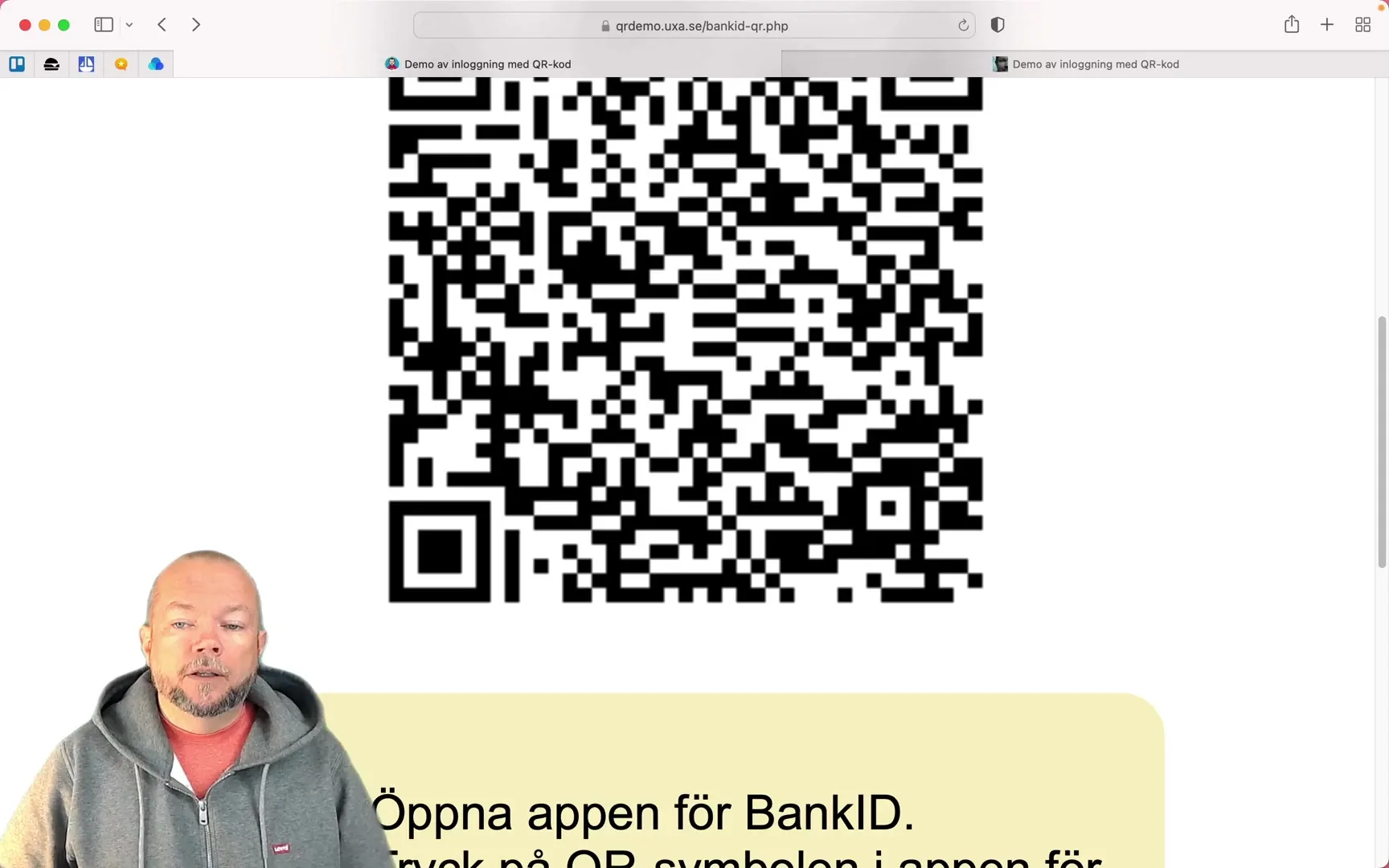
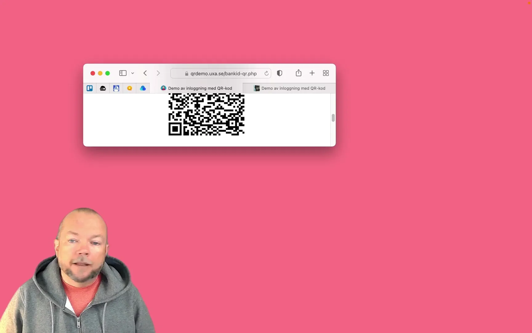
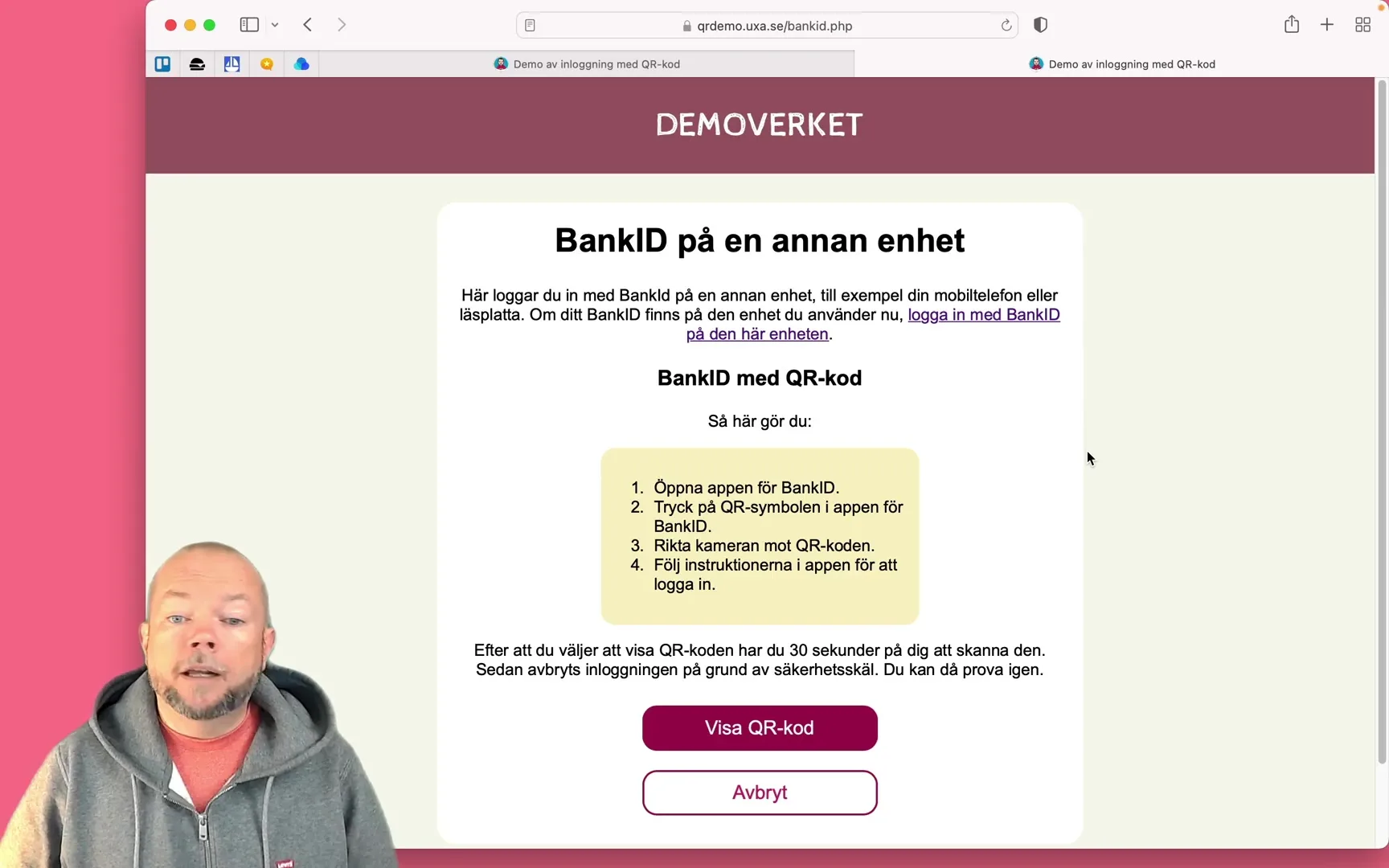
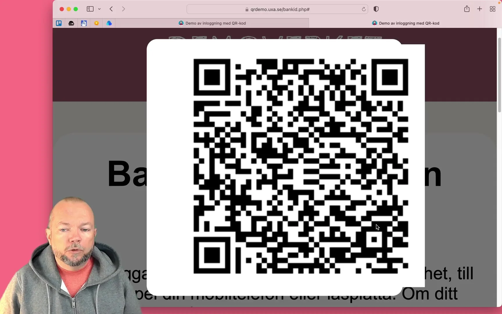
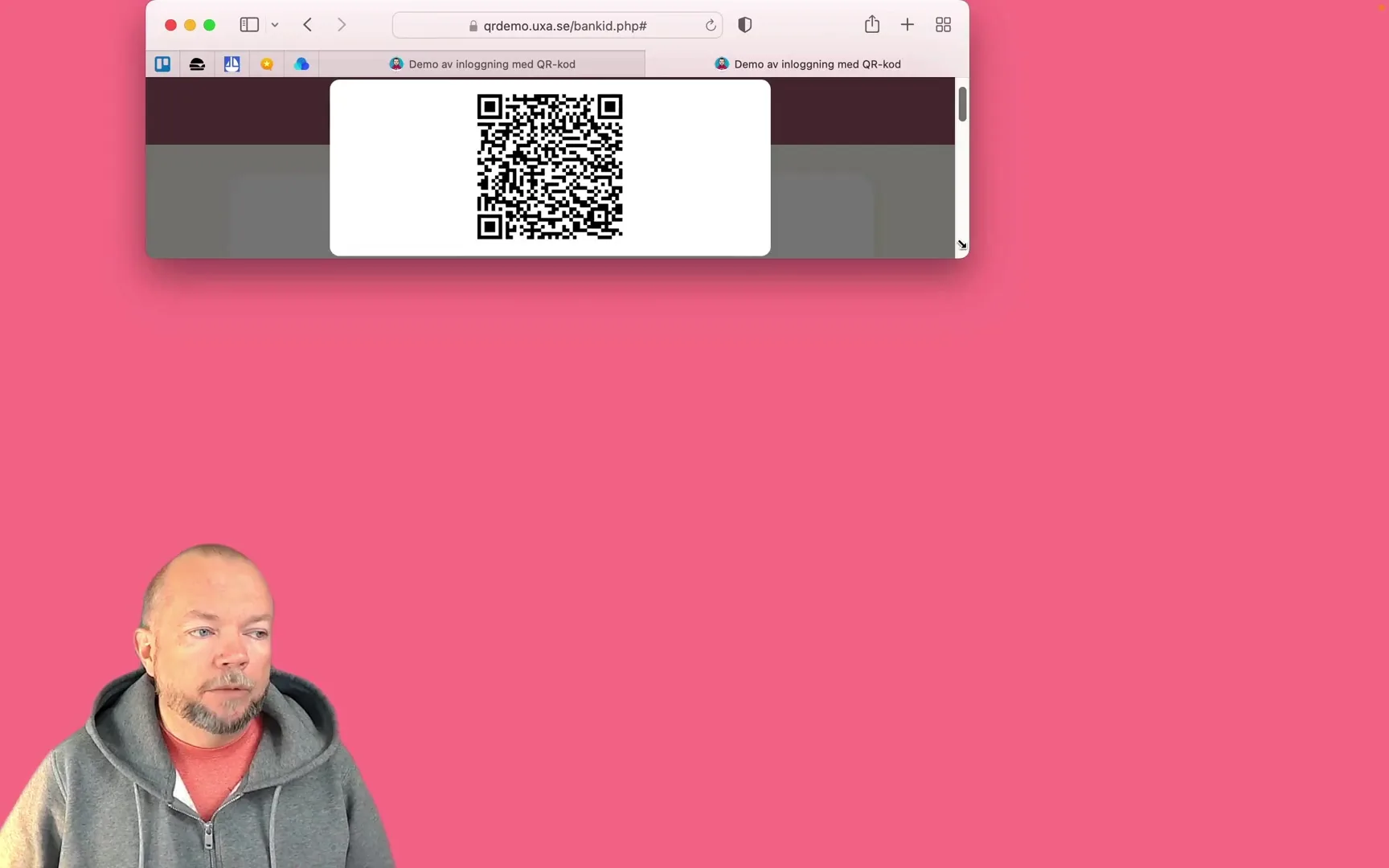
My own initiative: a solution for making QR-code login (BankID, Freja eID) work for people with visual impairments. In a film I show the problems and a possible solution, with a clickable demo – the idea can be put to use today. After this, many variations of the solution started being implemented across many sites.
Why I left algorithm-based social media and what happened next
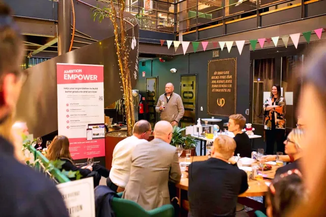
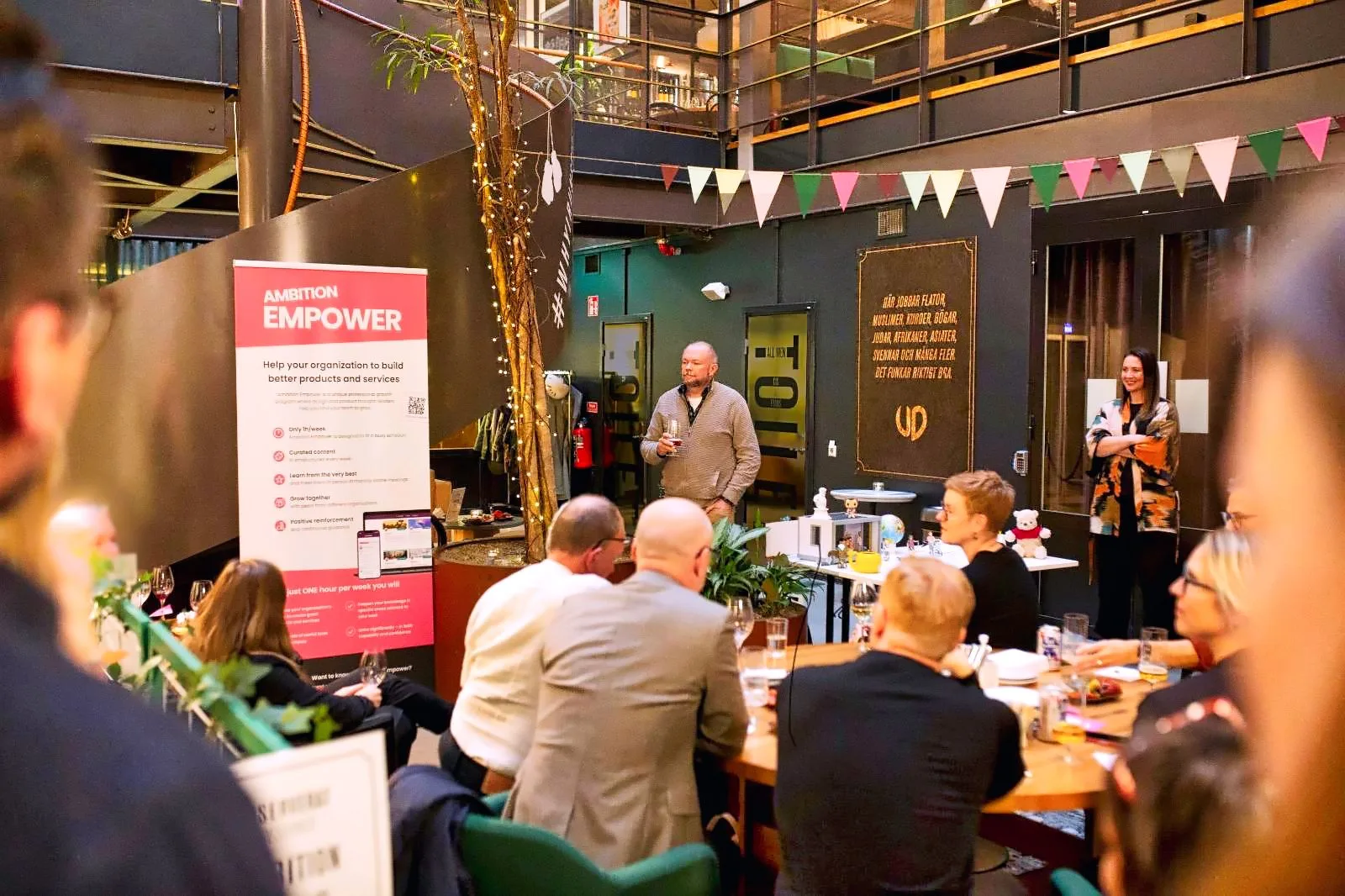
A 15-minute talk at an Ambition Empower event in 2022, after I had left Facebook, Instagram, Twitter and LinkedIn: why I left algorithm-based social media, and how that works for a small business owner. Told with a dollhouse full of figures – and a Winnie-the-Pooh.
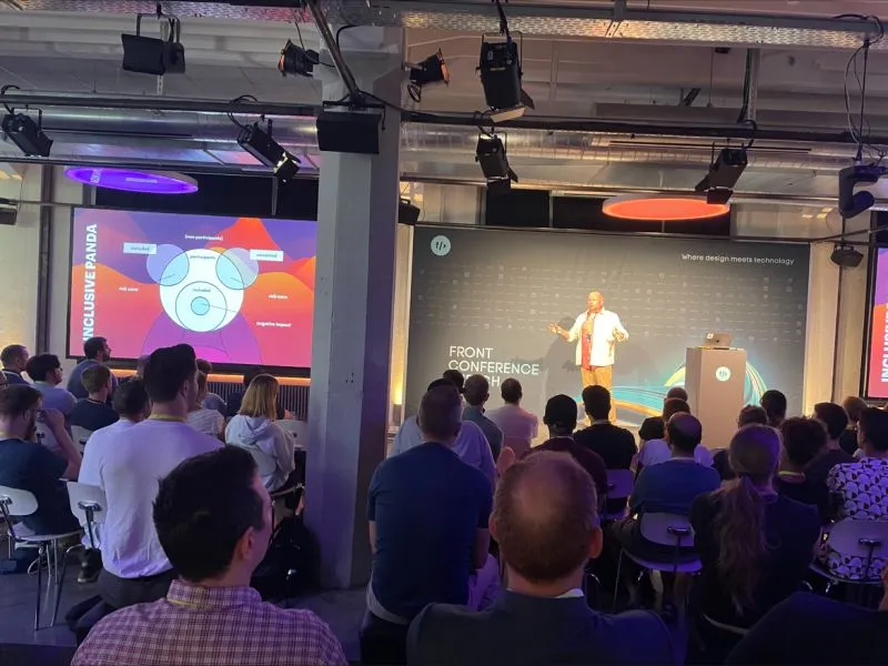
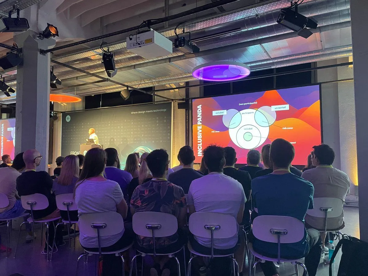
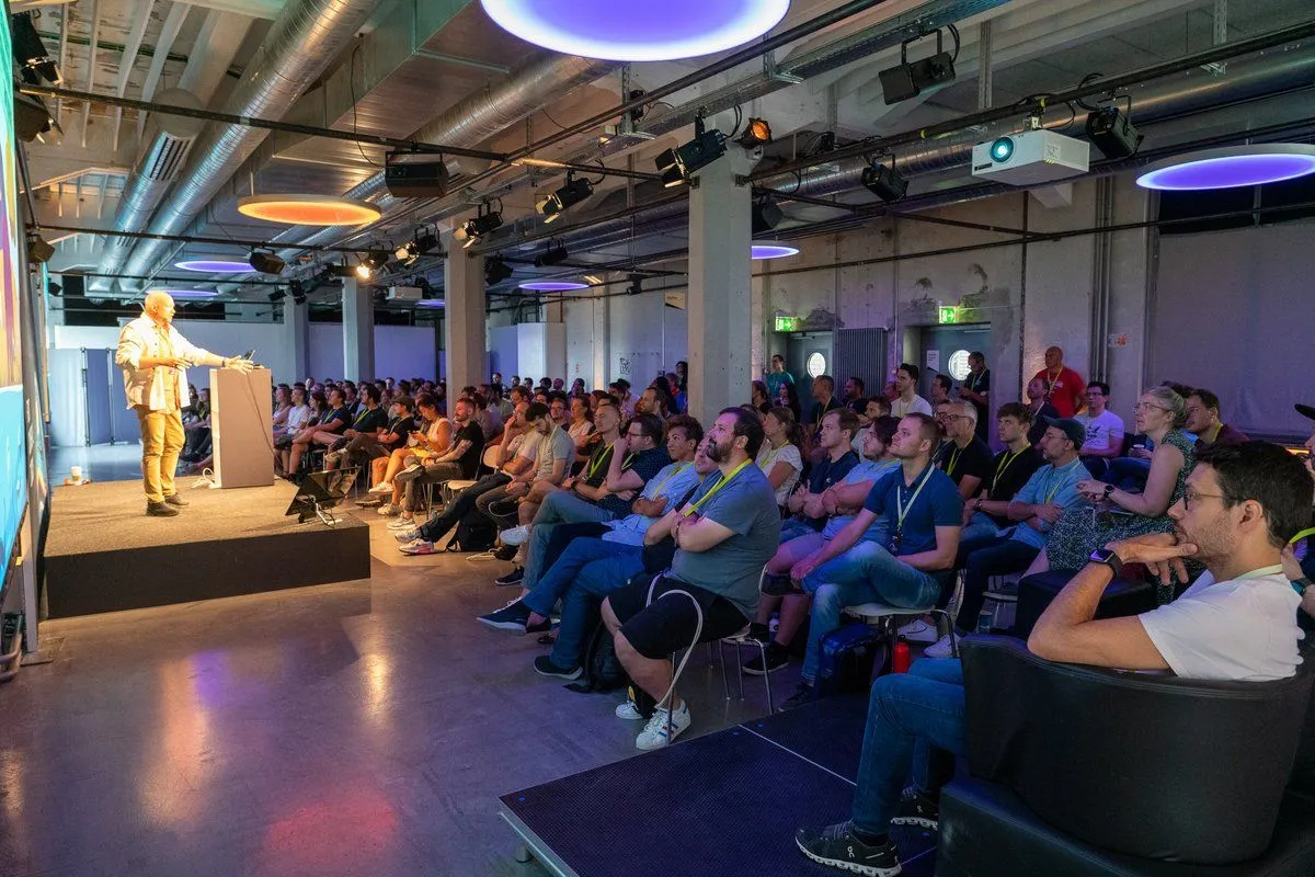
Keynote at Front Conference in Zürich on 26 August 2022: a practical, concrete introduction to digital ethics and responsible innovation for everyone who designs and builds digital products.
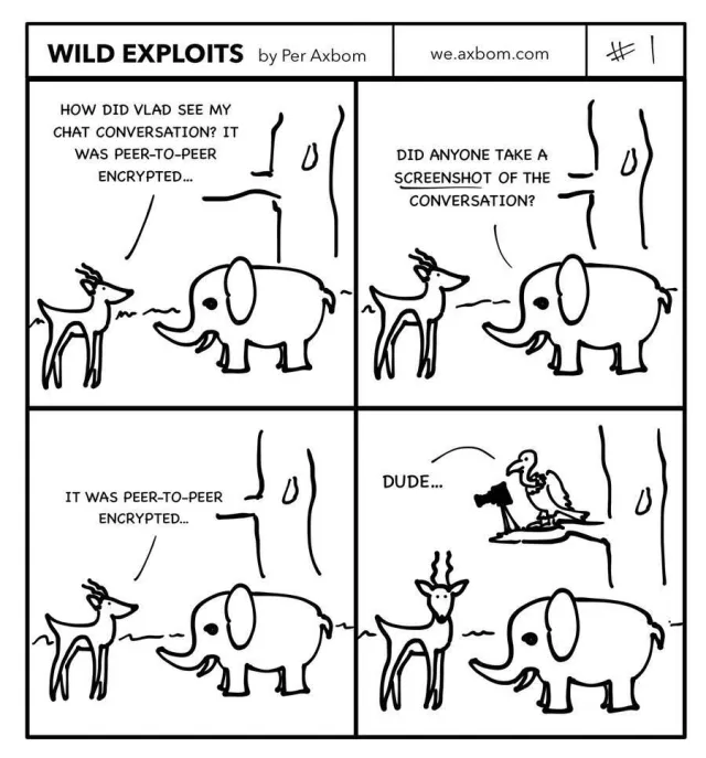
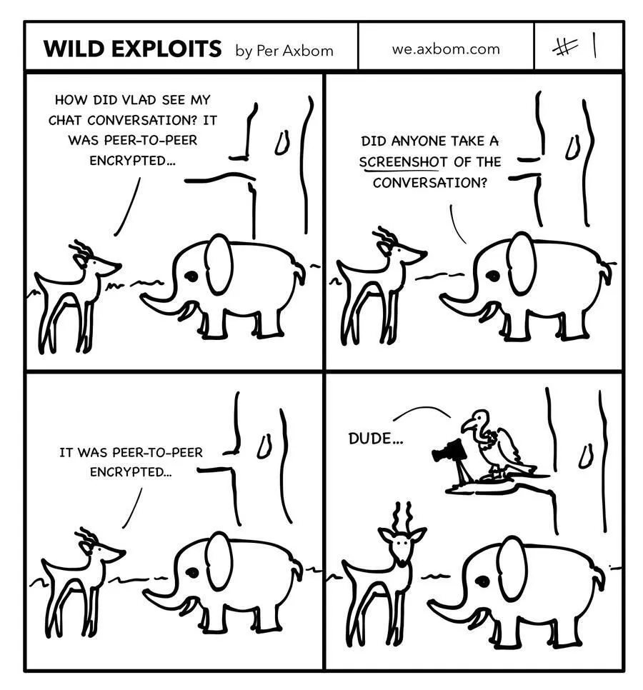
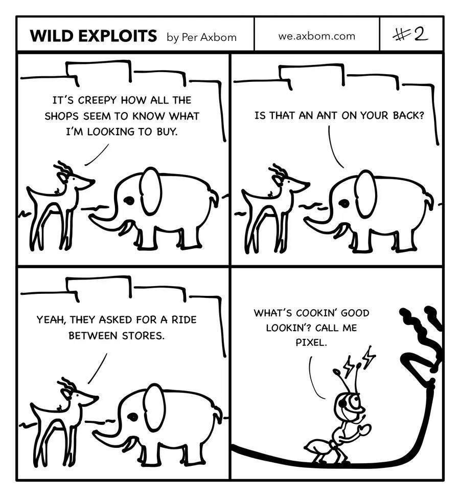
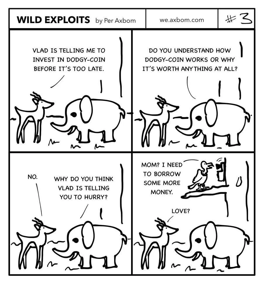
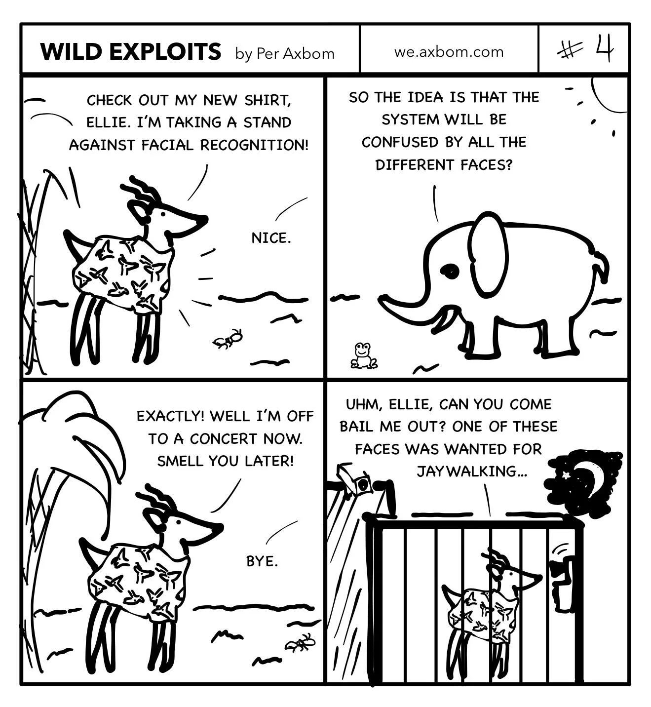
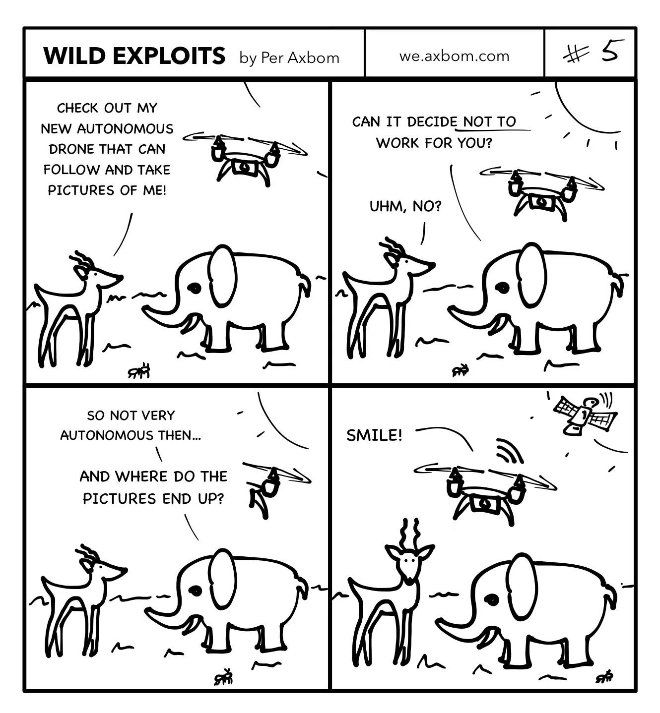
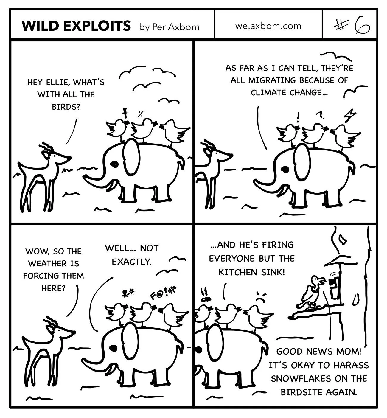
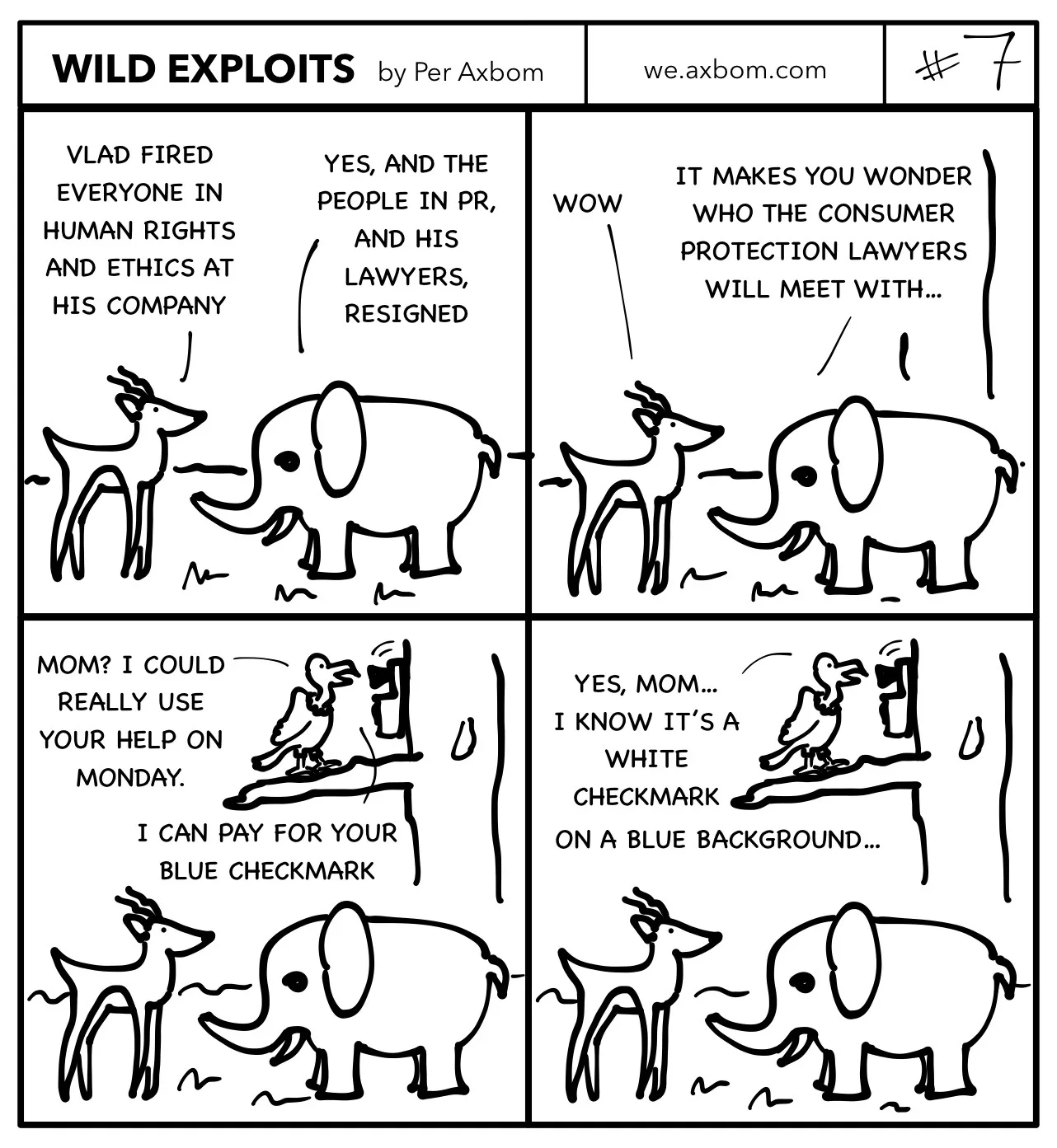
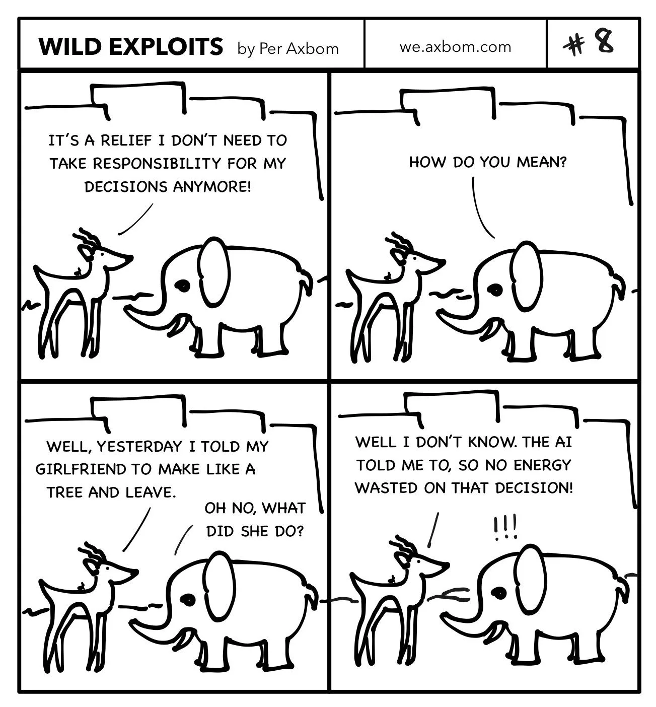
A free, independent comic I drew and self-hosted from May 2022 to June 2023: Pala the impala and Ellie the elephant talking about technology, while Vlad the vulture watches from a tree. Eight four-panel strips – each with a full image description – about surveillance, crypto, facial recognition, “autonomous” devices, the bird site and AI.
An interview for the Slovenian podcast Citizen D, about ethical tech development and promoting design ethics. Citizen D features experts on pressing topics in the information society and media.
Altitude Meetings and the Raoul Wallenberg Institute · Stadshallen, Lund
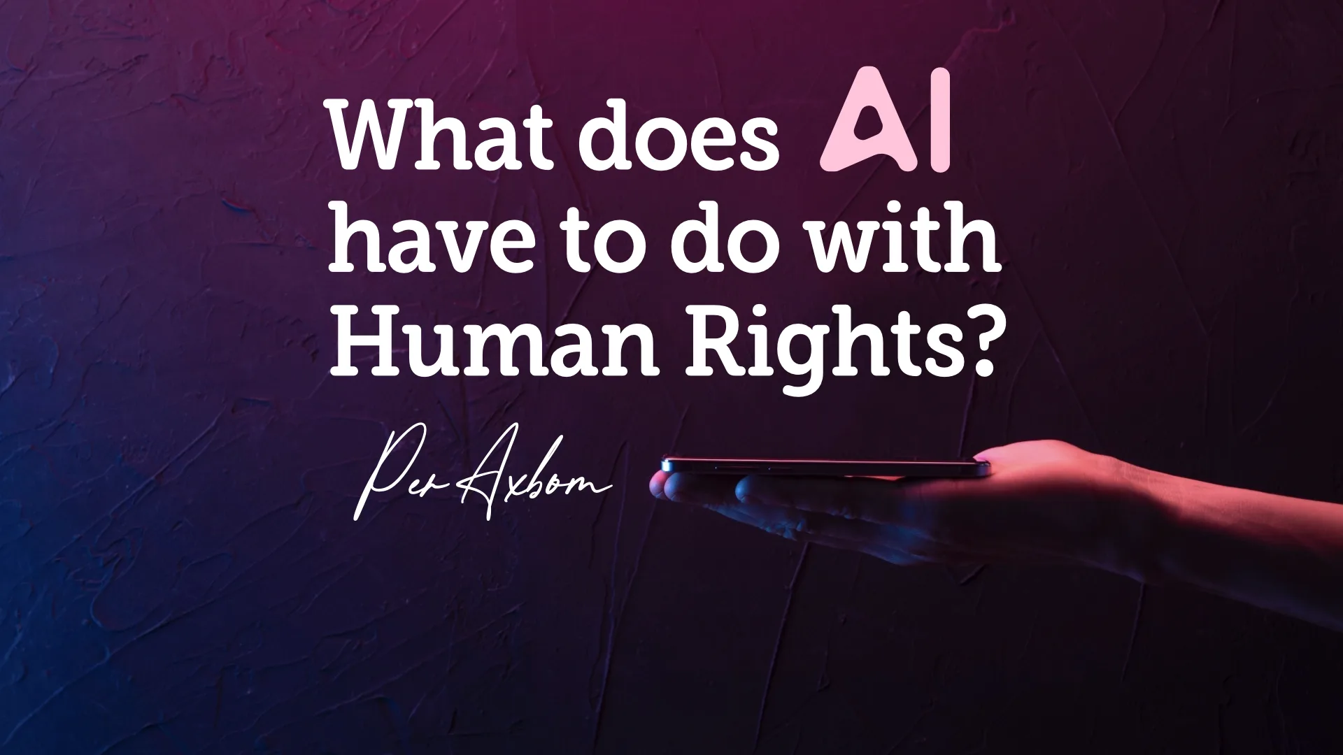
What does AI have to do with Human Rights?
The first speaker in Raoul Wallenberg Talks, a lecture series on human rights at the new Stadshallen in Lund, on 20 January 2022. Technology is often the driving force that keeps society moving – so what does it have to do with human rights, and how is it being used to hold human rights back?
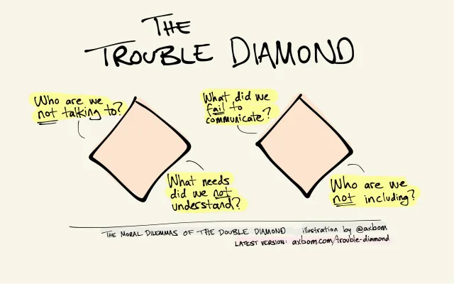
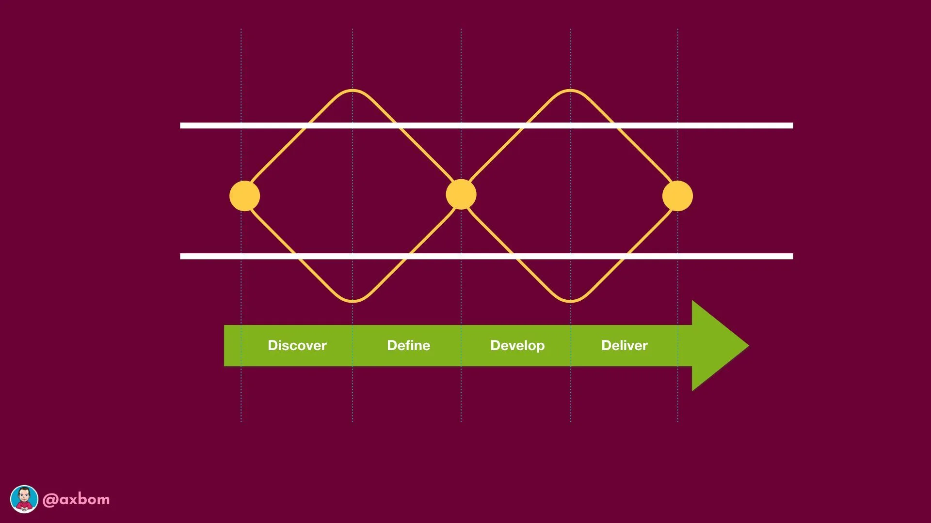
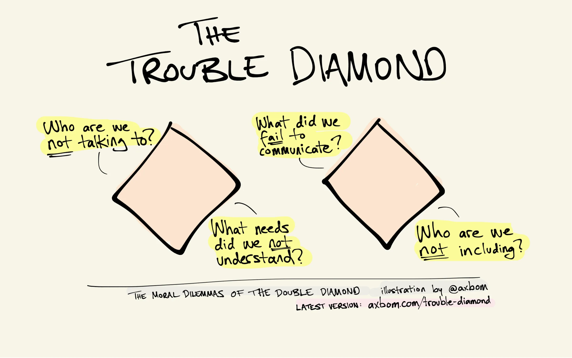
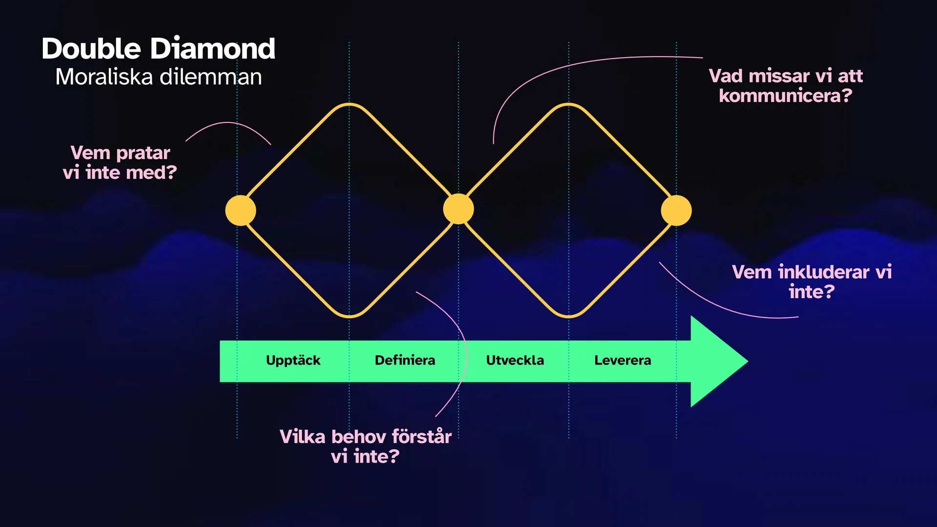
Asking the right questions for moral management at each stage of the design process. The Trouble Diamond makes ethics assessment a natural part of the Double Diamond, with one question per stage. Download it as a PDF or high-resolution image, and put it up on the wall.
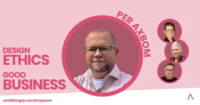
Track leader for “Design Ethics = Good Business” in Ambition Empower, a year-long professional development program in bite-sized steps, from August 2021 to June 2024 – alongside Kim Goodwin, Susan Weinschenk and Chris Noessel, who led the other tracks.
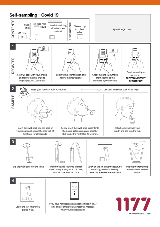
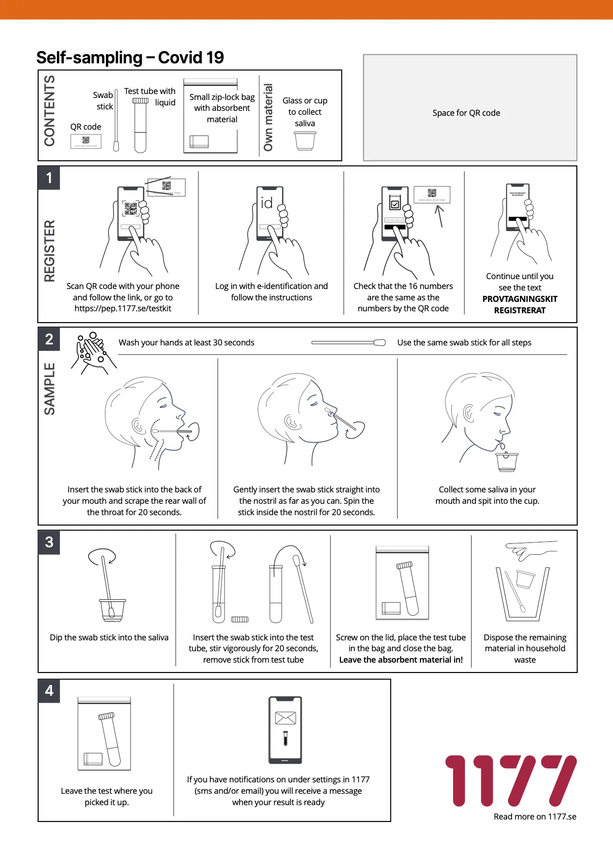
Responsible for user experience (UX), workflow descriptions, and instructional materials (both digital and printed) for the “Self-sampling” service during the covid pandemic.
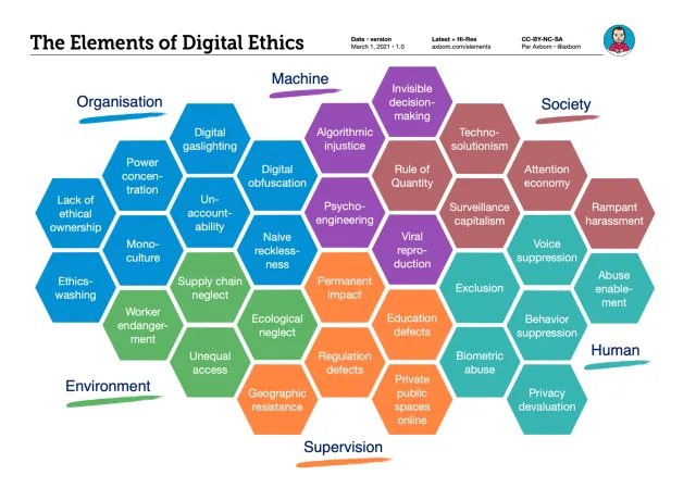
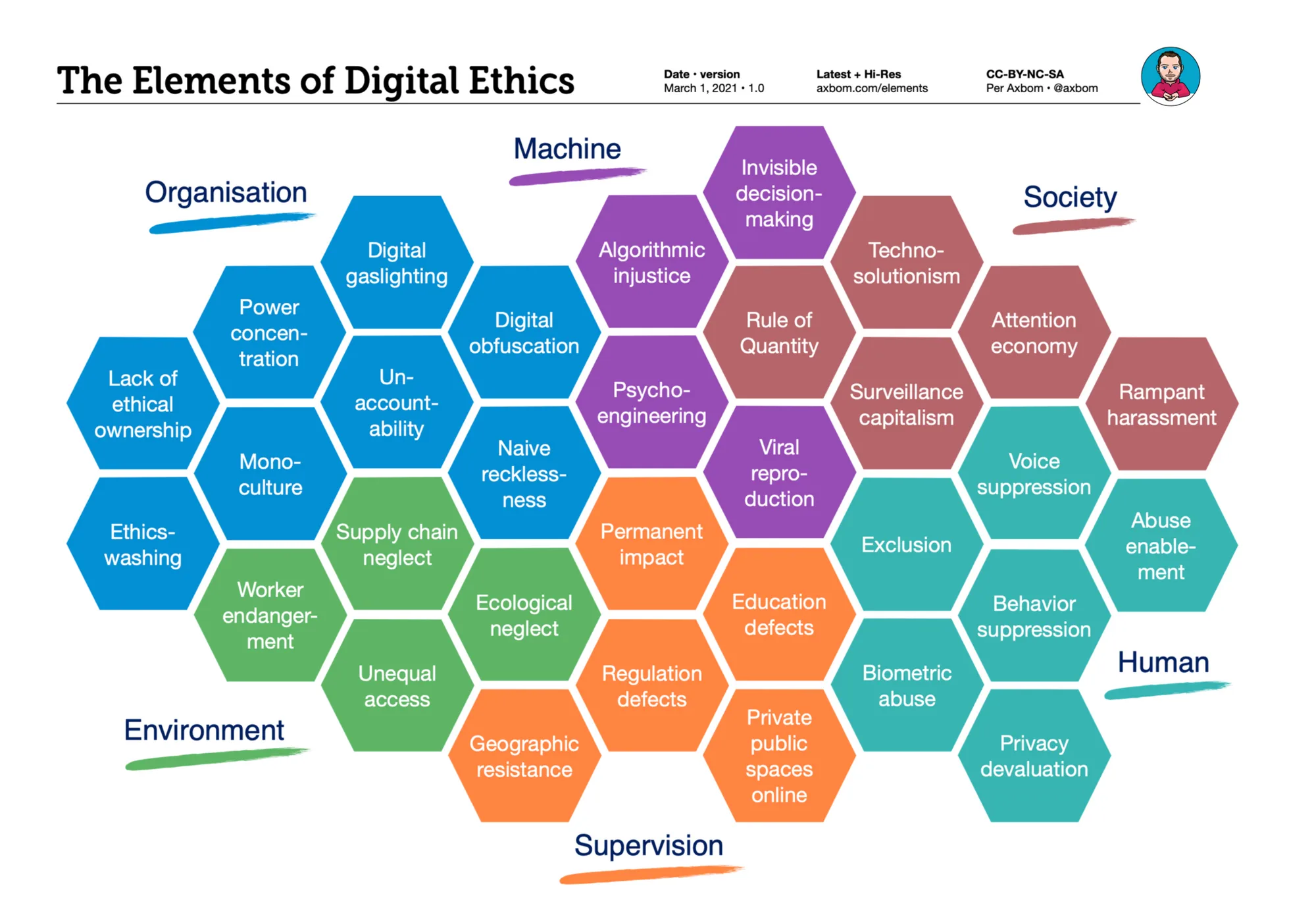
A chart of 32 elements in six sections that sum up the many ways digital can cause harm, to support moral considerations in the tech space. The page explains every element, and links to a high-resolution PNG and PDF. Free to use under CC BY-NC-SA.
Lisa Welchman and Andy Vitale talk with me about my research and work in design ethics, my first computer, and my experiences on Clubhouse, one of the newer social media platforms at the time.
Hur arbeta tillgängligt när teknik och digitalisering utvecklas fortare än lagen?
A recorded expert lecture in Swedish that opened one of the theme tracks at Digin, PTS’s network day on digital inclusion and accessibility, in spring 2020. I talked about the challenges, pitfalls and risks – and the opportunities – when technology changes faster than legislation. Then I took part live as the participants continued the discussion.
My personal podcast about new technology and human rights: selected blog posts read aloud and enhanced with sound effects and source material, so the writing reaches people who prefer to listen. A Swedish twin, Omtanke med Per Axbom, carries the Swedish posts.
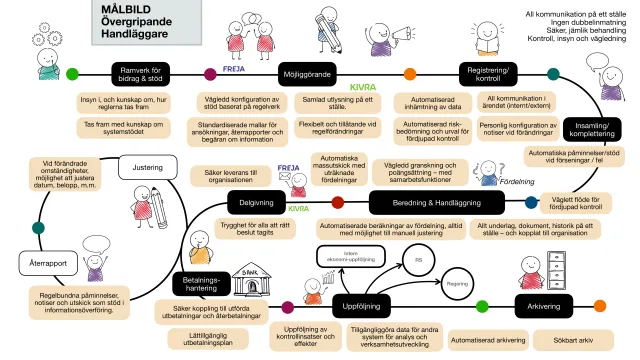
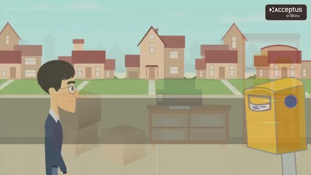
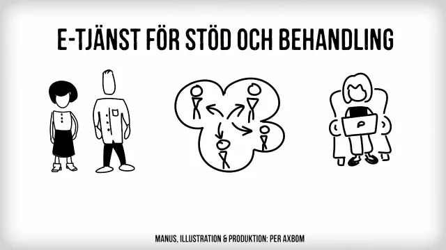
An animated explainer film (in Swedish, 2:50) for Acceptus' service e-Brev: healthcare providers send patients' appointment letters digitally, straight from the TakeCare medical records system, via Kivra. Patients who don't use Kivra get the letter as ordinary post, without anyone having to do anything extra. First version 2020, updated 2024.
A Swedish conversation about digital compassion, the idea behind my book Digital omtanke: taking responsibility for what you create by understanding everyone it affects, not only the intended users.
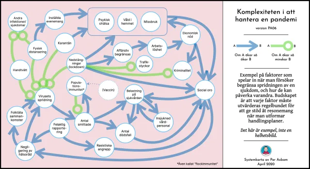
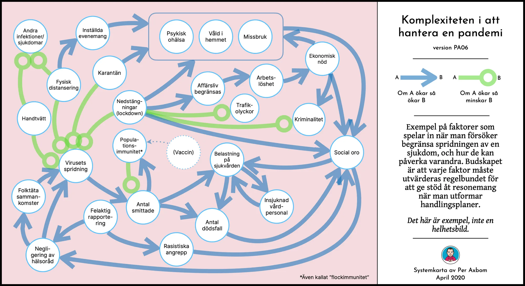
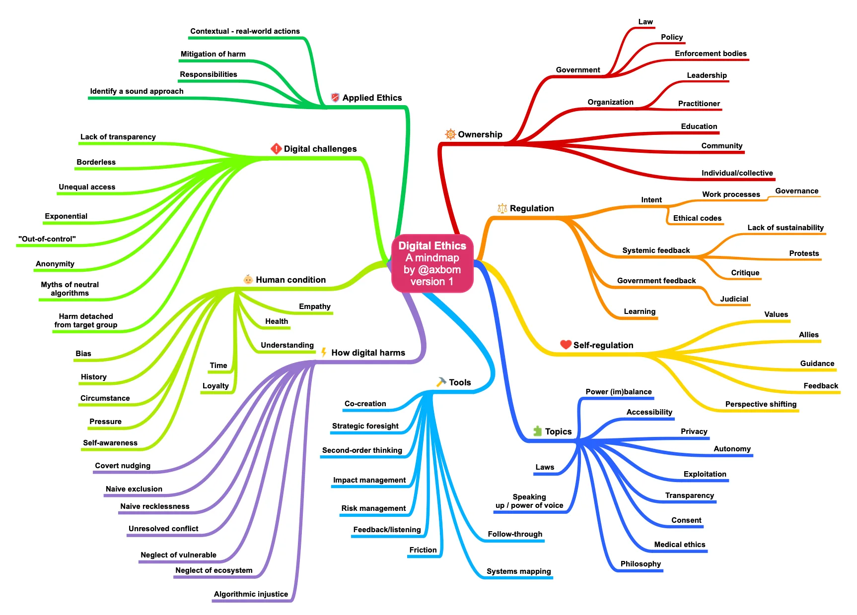
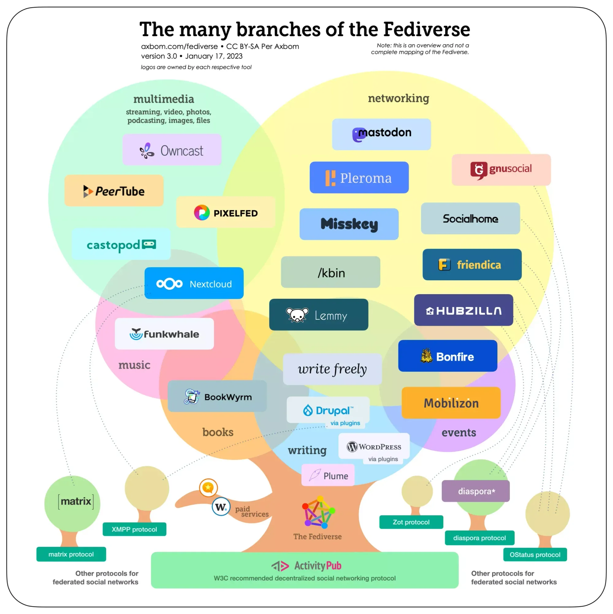
Drawing to understand, and to help others understand: systems maps, mindmaps and models I have made and shared freely – from the complexity of managing a pandemic to the many branches of the Fediverse. More of them have their own cards.
#30 Uncut: ”Vi skulle egentligen behöva pausa”. Per Axbom om ansvar och etik inom digital utveckling
A Swedish conversation about responsibility and ethics in digital development: who is responsible when something goes wrong, the people who built it or the people using it? And how can those of us in UX, often first to notice, raise it in a team or organization?
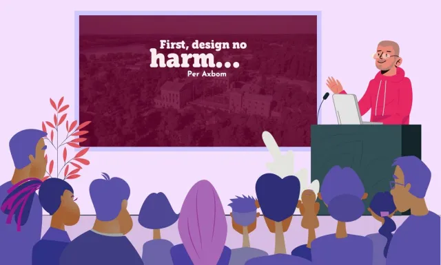
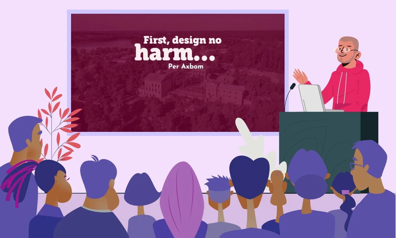
First, Design No Harm (What Design Can Learn From Medical Ethics)
An emotional talk at UX Copenhagen 2020, held online because of covid. It starts in a story of abuse – hazing at a boarding school – and the systems that support it. As designers we have the power to abuse; how aware are we of when it happens? And what can design learn from medical ethics?
Making Friends With… Per Axbom at UX Copenhagen 2020
A conversation about the complexity of ethics in design, recorded when UX Copenhagen 2020 moved online. The first in Tech for Good Live’s “Making Friends With…” series with the conference’s speakers.
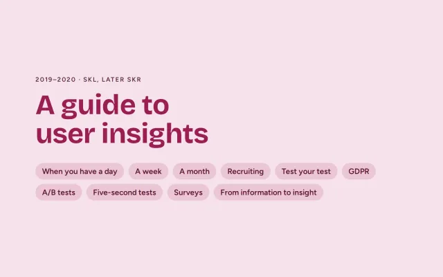
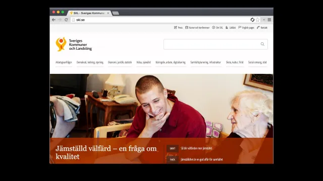
Swedish Association of Local Authorities and Regions (SKL, later SKR) · Stockholm
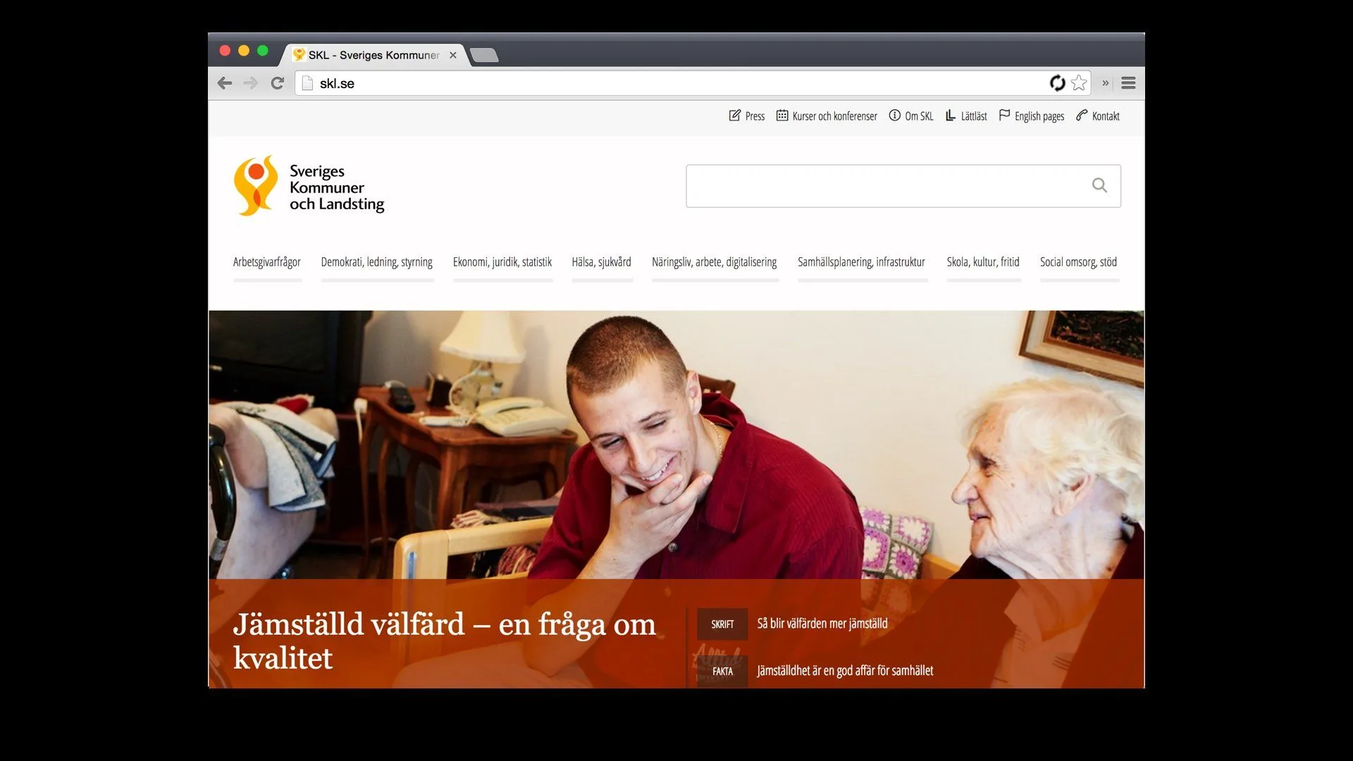
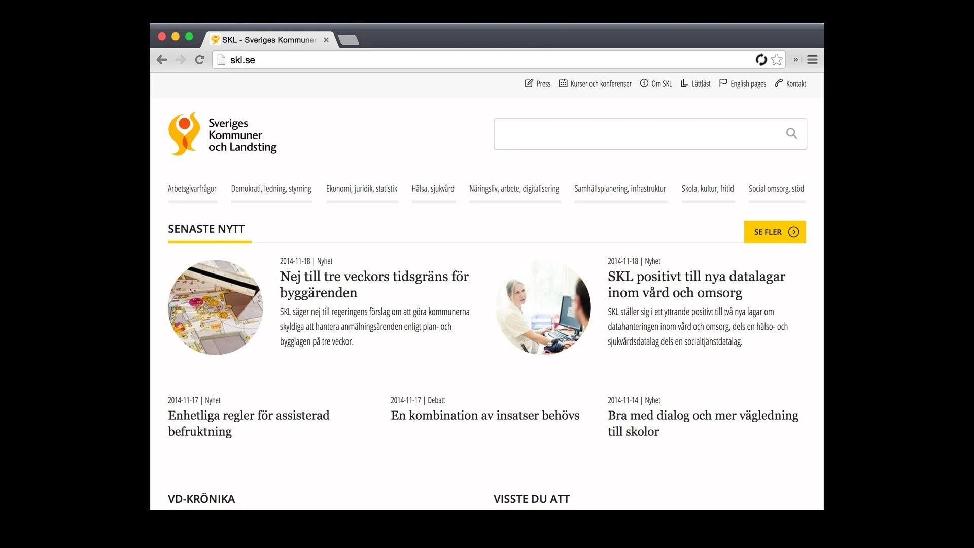
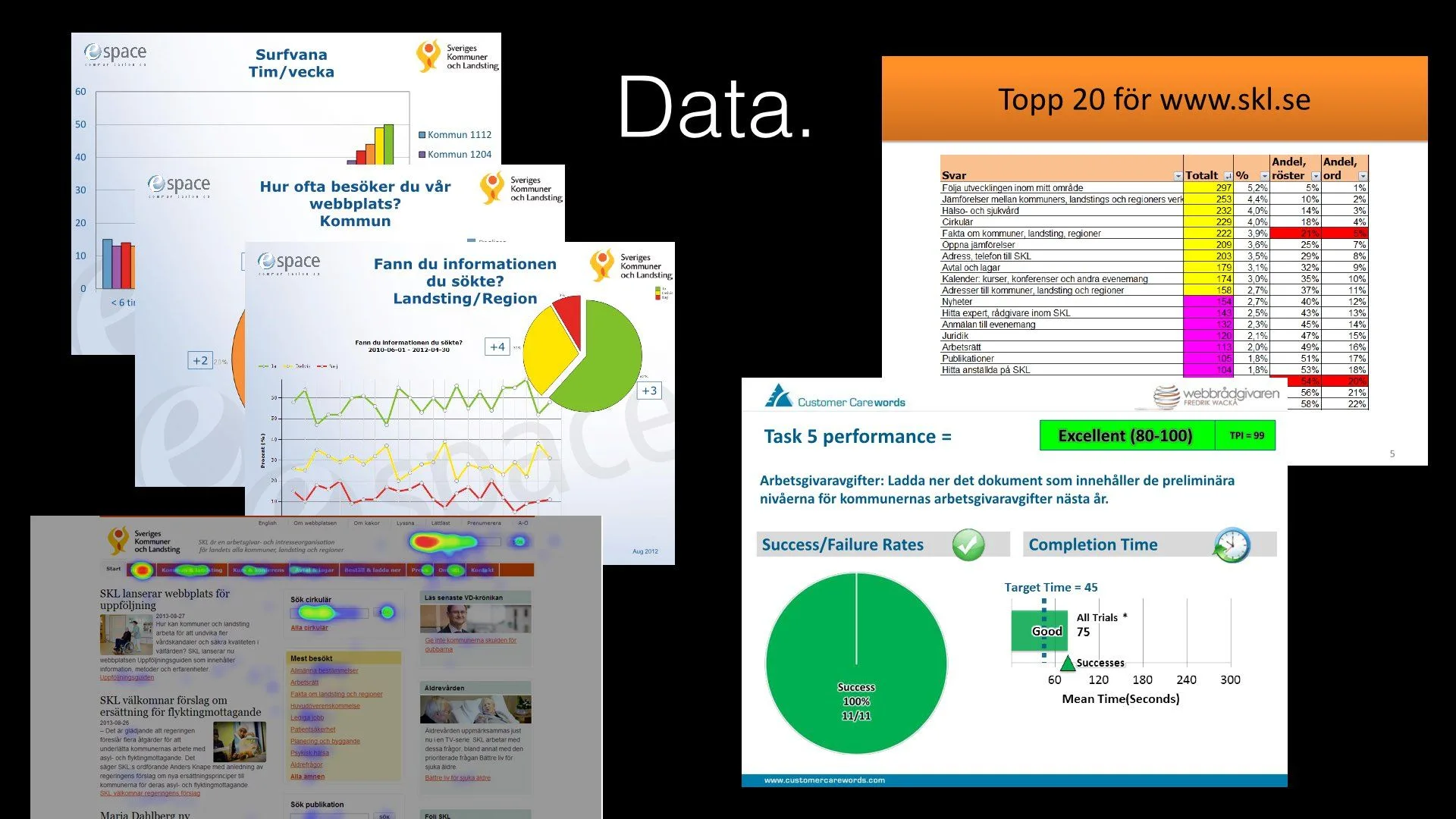
SKL’s web team ran usability tests, but often ad hoc, spending a lot of time working out how. They asked me for a simple manual or checklist to get started quickly. I created a guide to user insights, built as a website: a reference for choosing the right way to gather information for design decisions, hypotheses and evaluations, which could be shared with everyone running digital initiatives in the organization.
A talk tailored for Internetdagarna 2019, in the track on digital ethics and morality, on the invitation of Social by default (Sarah Larsson Bernhardt and Niclas Strandh). It is the most emotionally powerful talk I have composed and given: about what happens when people stop questioning the systems they build – and what it takes to act as a human.
Handbook, published by Eget förlag in English and Swedish
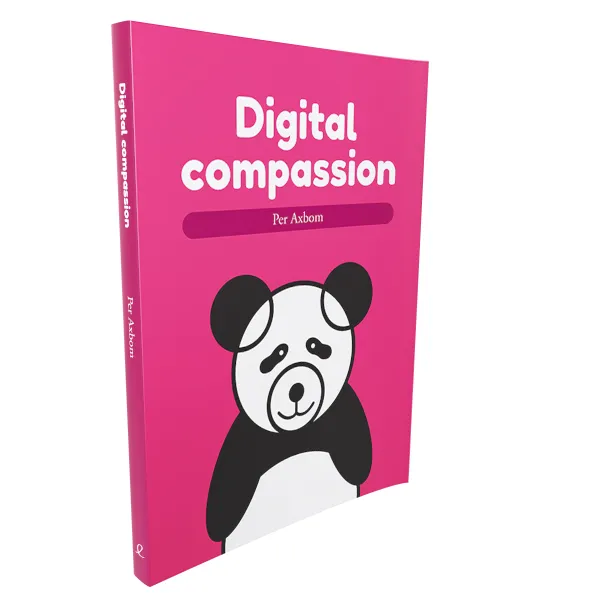
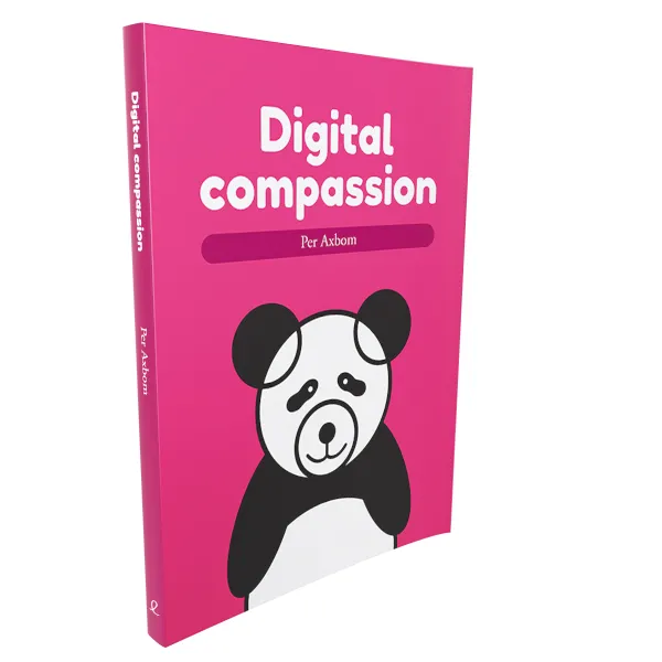
A handbook for everyone who wants digitalization to better address wellbeing, inclusion and social impact – with practical tools to start using in projects right away. Published in 2019 in Swedish, as Digital omtanke in the series Kunskap på nolltid, and at the same time in English, translated by Neil Betteridge.
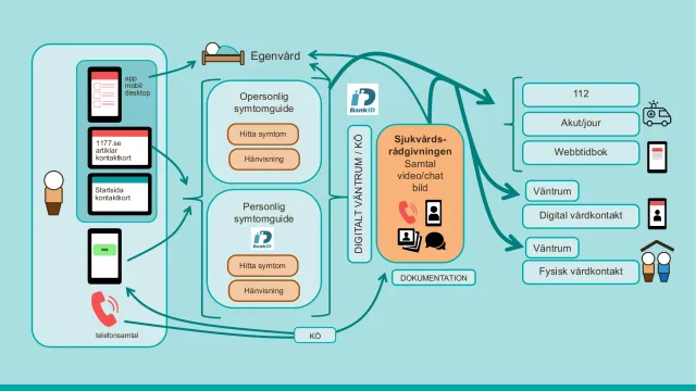
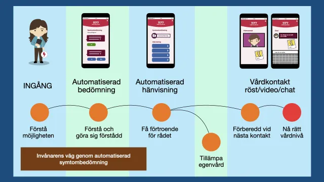
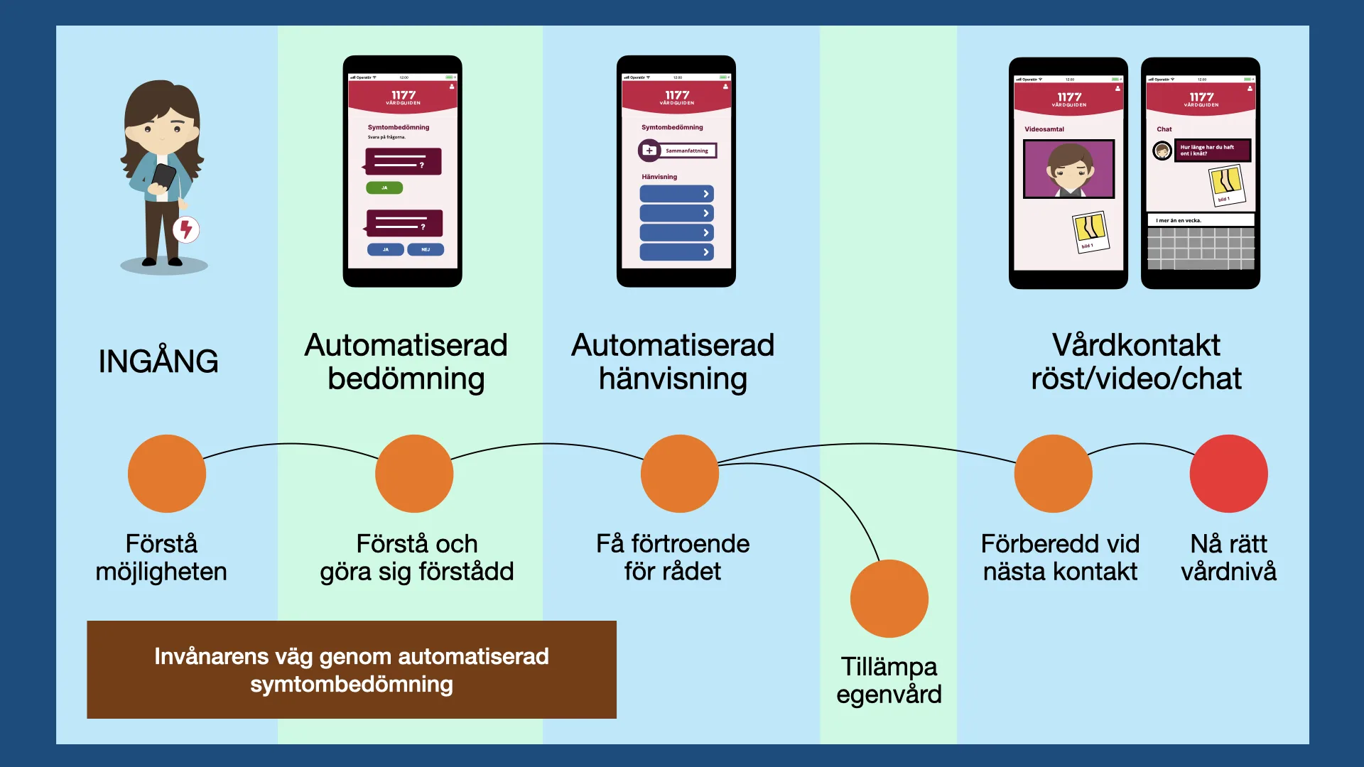
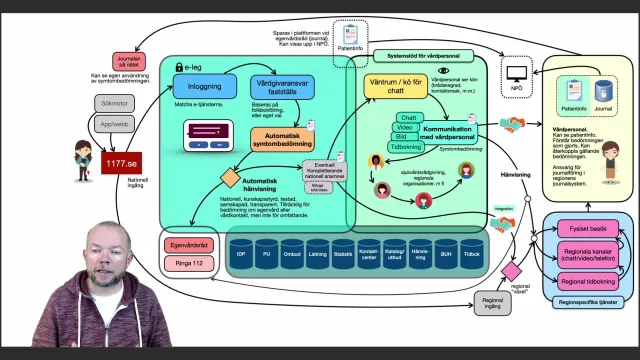
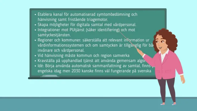
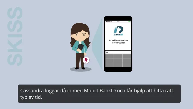
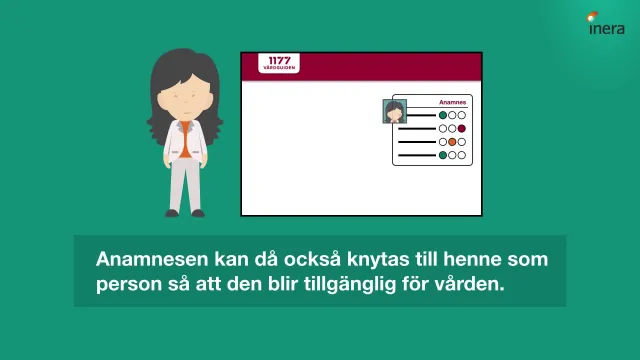
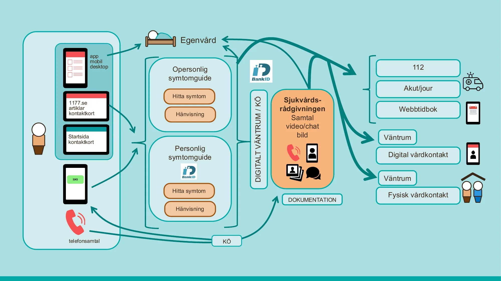
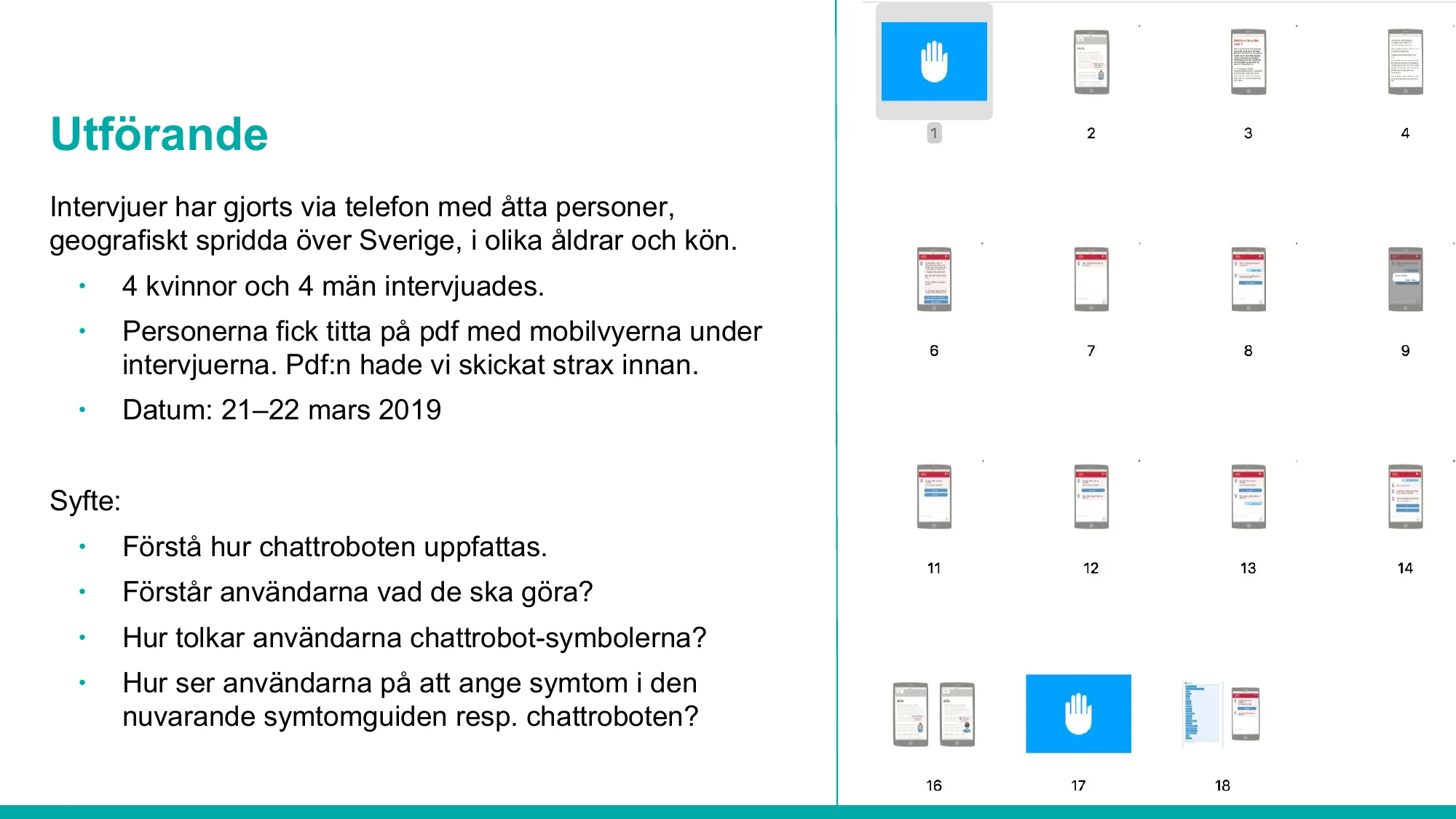
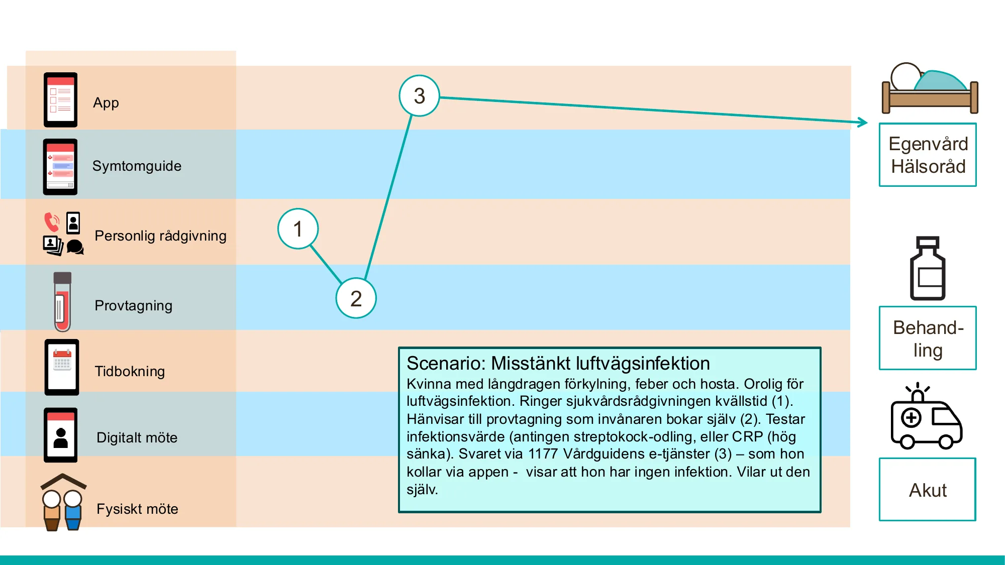
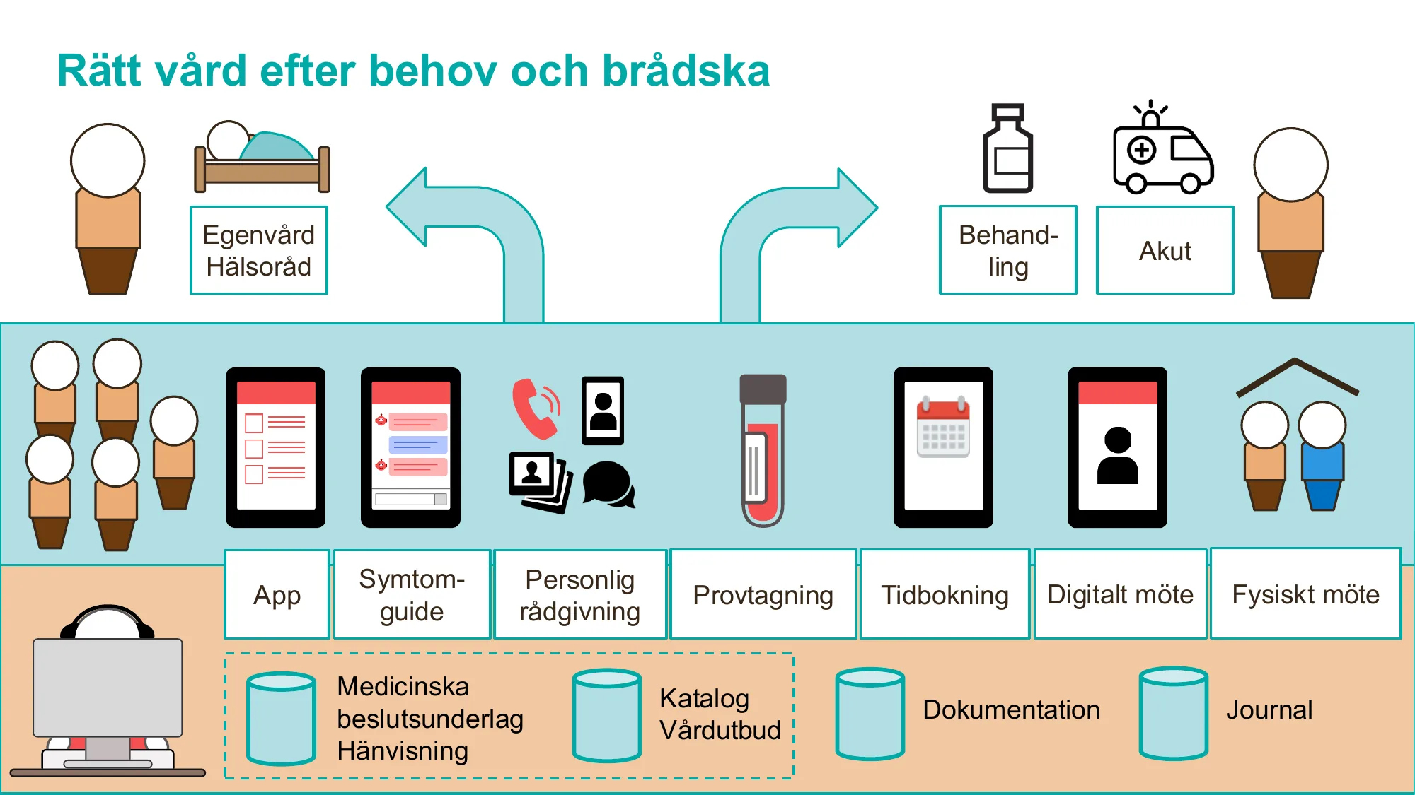
Part of Första linjens digitala vård: a digital symptom guide where people describe their symptoms to a chatbot and are guided to the right level of care – from self-care to 112. In 2019 a first proof of concept was built and tested with people across Sweden.
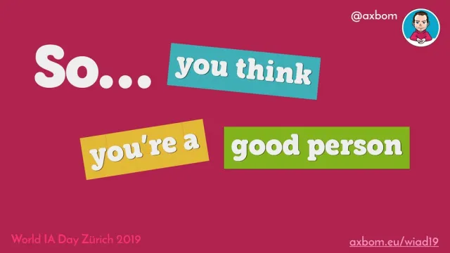
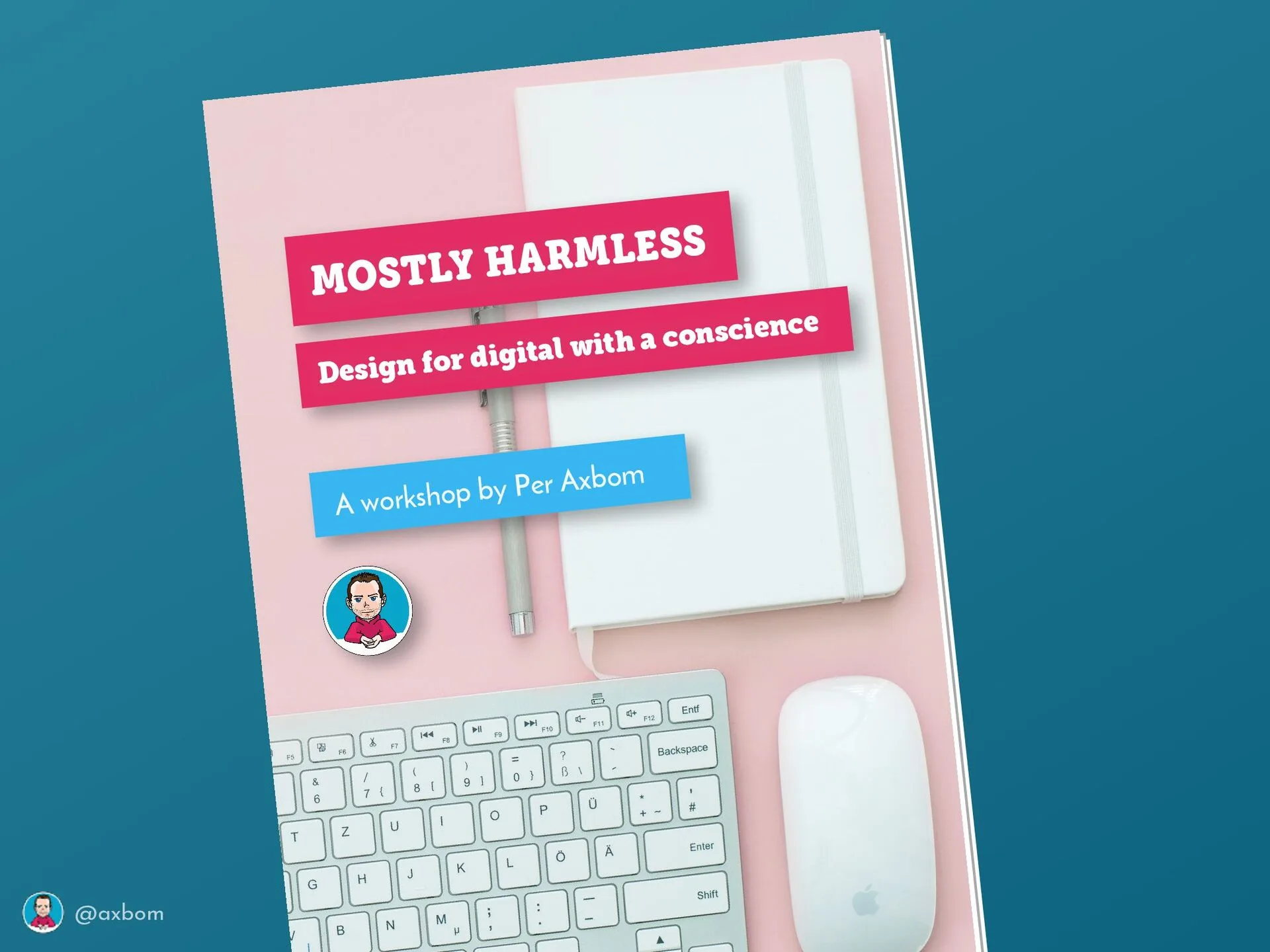
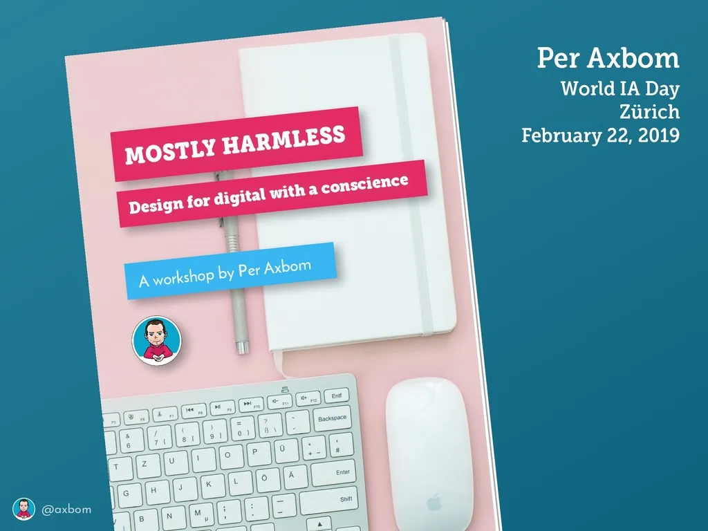
Two days at World IA Day Switzerland, 22–23 February 2019, on the global theme “Design for Difference”: the midday keynote “So… you think you’re a good person” at Zürcher Hochschule der Künste, and the half-day workshop “Mostly Harmless: Design for Digital with a Conscience” the day before. Alongside Sarah Barrett and Jorge Arango, who gave the other keynotes.
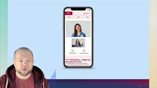
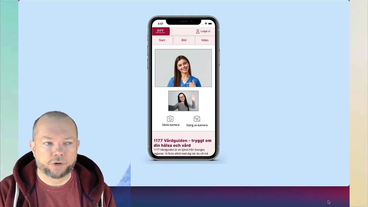
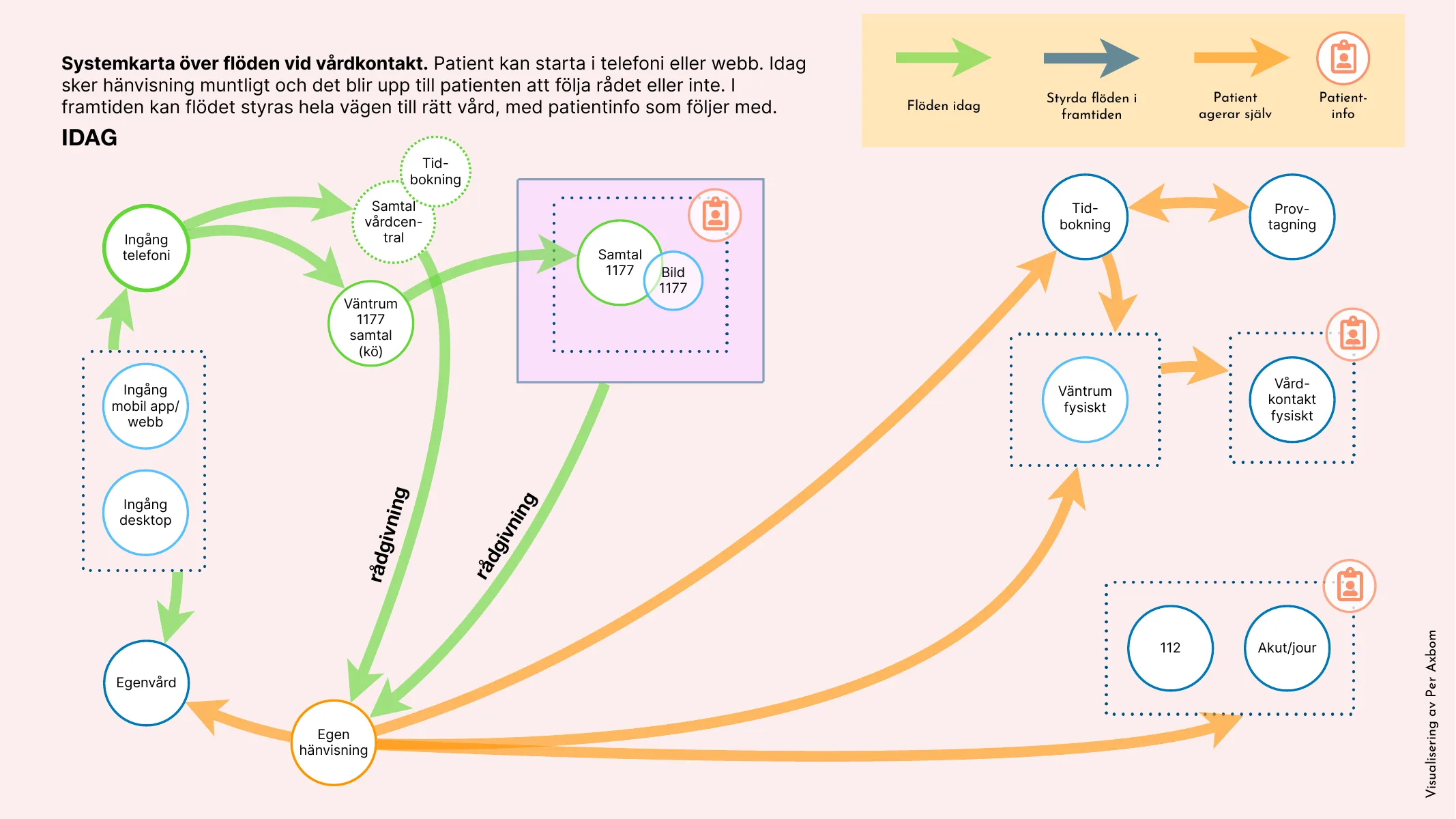
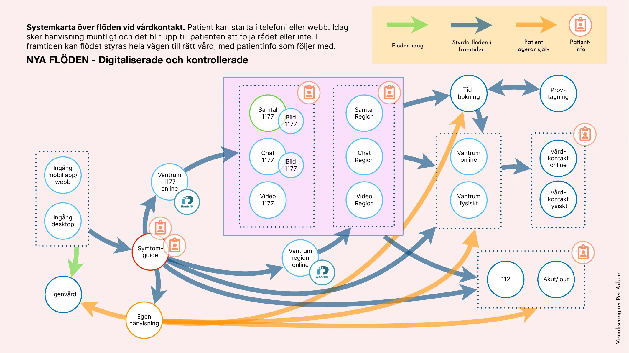
Part of the program for first-line digital care (Första linjens digitala vård): letting nurses at 1177 Vårdguiden på telefon, the healthcare advice line, ask callers to send a photo or start a video call – straight from the call, with the caller logging in on their own phone.
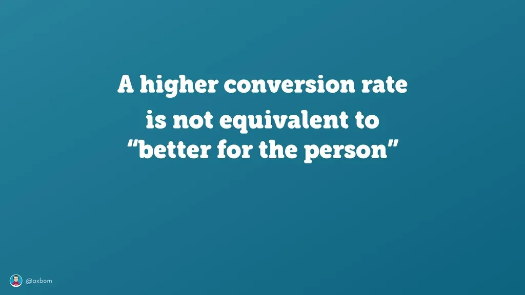
A Swedish conversation about digital ethics in design and UX: the risks of completely frictionless services, built in companies’ hunt for as many conversions as possible, and how to create more inclusive services.
Mostly Harmless: Design for digital with a conscience
A workshop at the EuroIA Summit in Dublin on 28 September 2018: how to incorporate ethical, sustainable and inclusive thinking into the design process. I gave “Mostly Harmless” again at World IA Day Zürich in February 2019.
Teacher of design ethics in Nackademin's vocational program for UX designers from 2018 to 2025, with the course Ethics in Design. The Digital Ethics mindmap started out as the syllabus for the course.
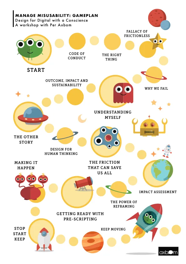
Manage misusability: design for digital with a conscience
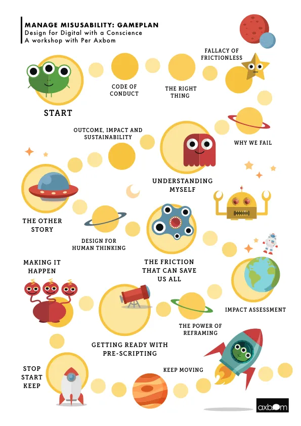
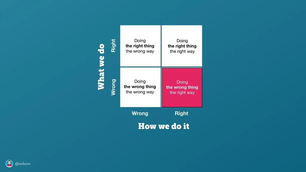
A half-day workshop at Interaction 18, the Interaction Design Association's conference in Lyon, on 5 February 2018: how to incorporate ethics thinking into your current design process in a very practical way – and feel immensely better about the work you do. More than half of it hands-on.
UX lead in Inera's program Första linjens digitala vård (first-line digital care), 2018–2022: design strategy, needs research and analysis, and visual explanations in images, films and prototypes – to help people find the right care, digitally, for their needs and urgency.
Mostly Harmless: Design for digital with a conscience
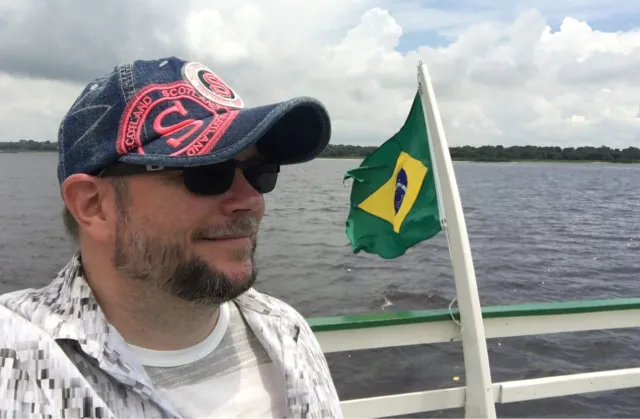
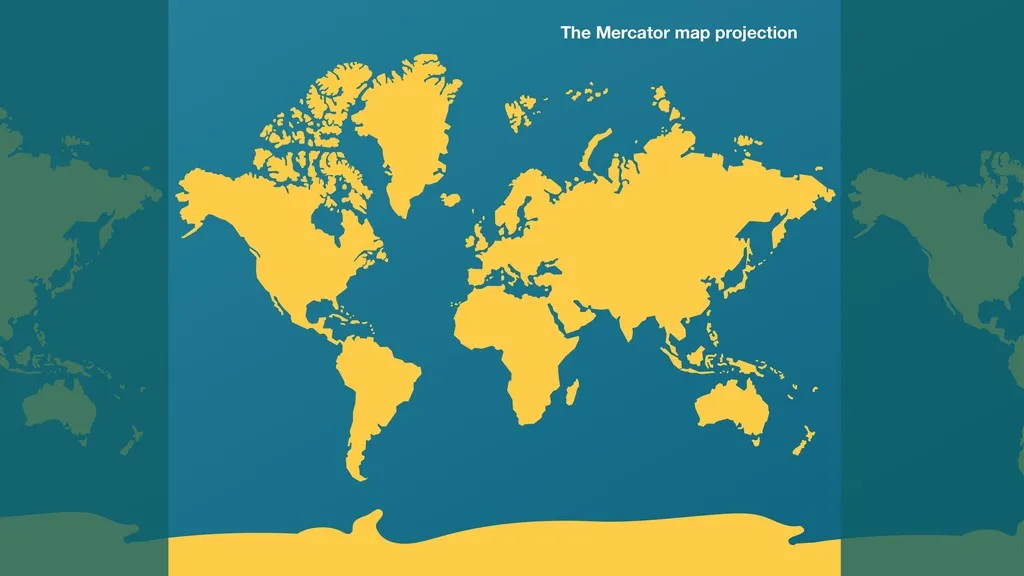
A talk at the first Feira do Polo Digital de Manaus in November 2018, in the middle of the Amazon rainforest: on digital ethics, and why we must re-evaluate the maps we are using if we want to reach the destination we want.
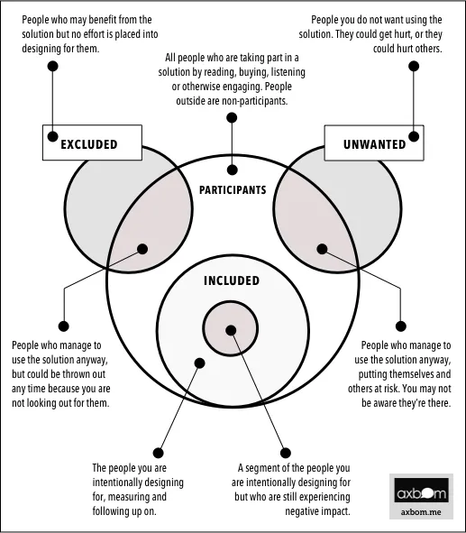
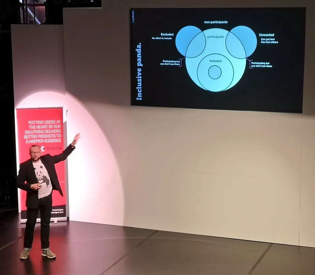
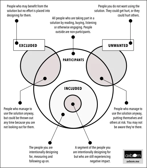
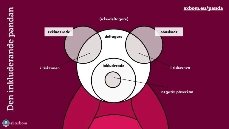
A model for mapping everyone your design affects, not just the people you design for. Drawn as a panda face: participants, included, excluded, unwanted, and the people who are hurt despite your best intentions. Made for my ethics workshops and later part of the handbook Digital Compassion. Free to use, with credit.
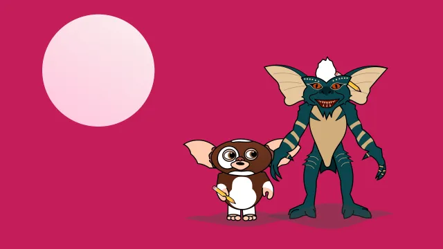
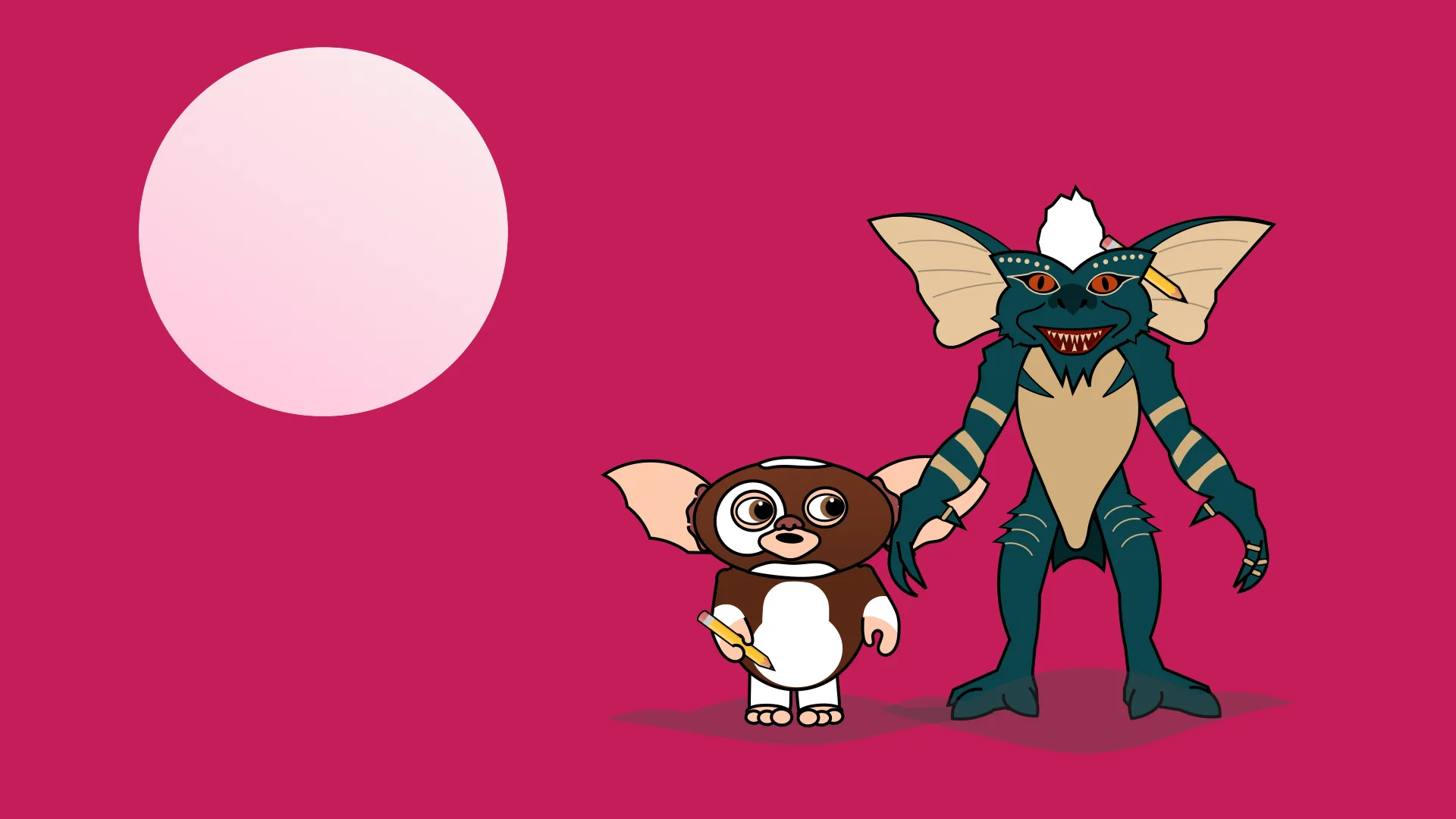
A talk at the first STHLM Xperience Conference, on World Usability Day 2018 and its theme “Design for Good or Evil”. Told with a Gremlins theme – Gizmo and Stripe, which I drew myself in Keynote with the path tool.
#200 Retrospective with James Royal-Lawson & Per Axbom
For UX Podcast’s 200th episode the tables were turned: Lisa Welchman and Anna Dahlström hosted, and my co-host James Royal-Lawson and I were the guests. Almost five days of podcast content, recorded over seven and a half years.
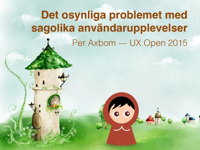
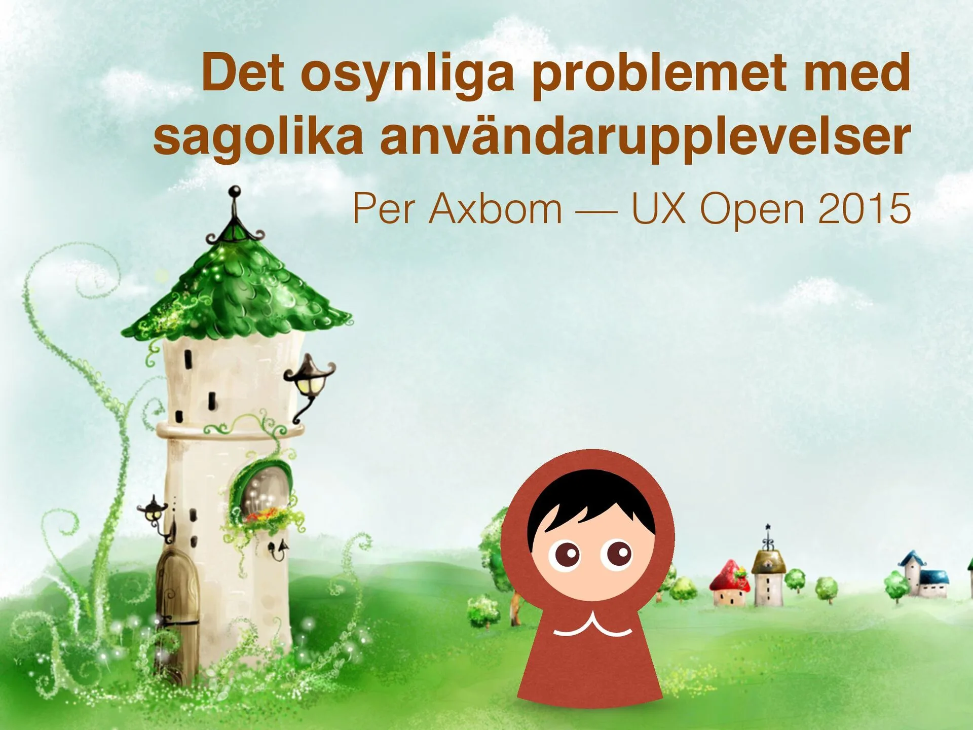
Det osynliga problemet med sagolika användarupplevelser
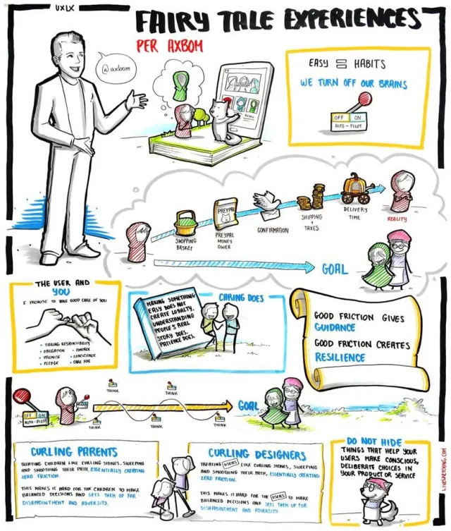
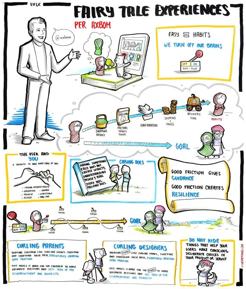
A talk at WSA-dagen, the Web Service Award day, on 31 January 2018: inspired by behavioral science, digital designers have become ever more focused on steering people to act as we want them to. But when we remove every barrier and deliver the fairy-tale experience that takes minimal brain power to move forward, we abandon our promise to help people choose what's best for them.
Talks, lectures and training sessions for companies, agencies and schools – from podcasting and design thinking to accessibility, inclusive design and the ethics of AI. The larger conference talks have their own cards.
A talk on ethics in design at the EuroIA Summit in Stockholm in September 2017. Sixty years after Vance Packard's classic The Hidden Persuaders exposed “motivation research”, many of the same techniques are used without hesitation to make users of digital products subscribe, click, scroll, buy and invite.
Member of the steering committee (ledningsgrupp) for Nackademin's vocational program for UX designers, 2016–2022 – helping shape what future UX designers learn. I also taught design ethics in the program from 2018 to 2025.
A talk at UXLx in Lisbon on 26 May 2016, the English version of a talk that began as a lightning talk at UX Open in Stockholm: when we remove every barrier and design the fairy-tale experience, we may abandon our promise to help people choose what's best for them.
Member of the advisory board for a master's program in information architecture at Jönköping University – the university where I took my bachelor's degree in media and communication studies in 1995, and later taught a course in digital communication (2010).
En nationell vårdplattform. Utmaningar & konkreta tips för framgång i stora projekt
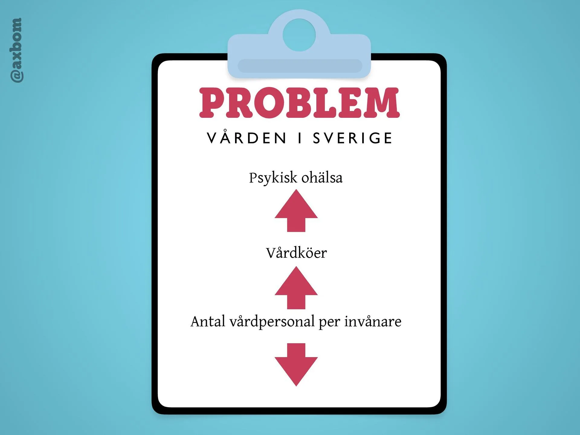
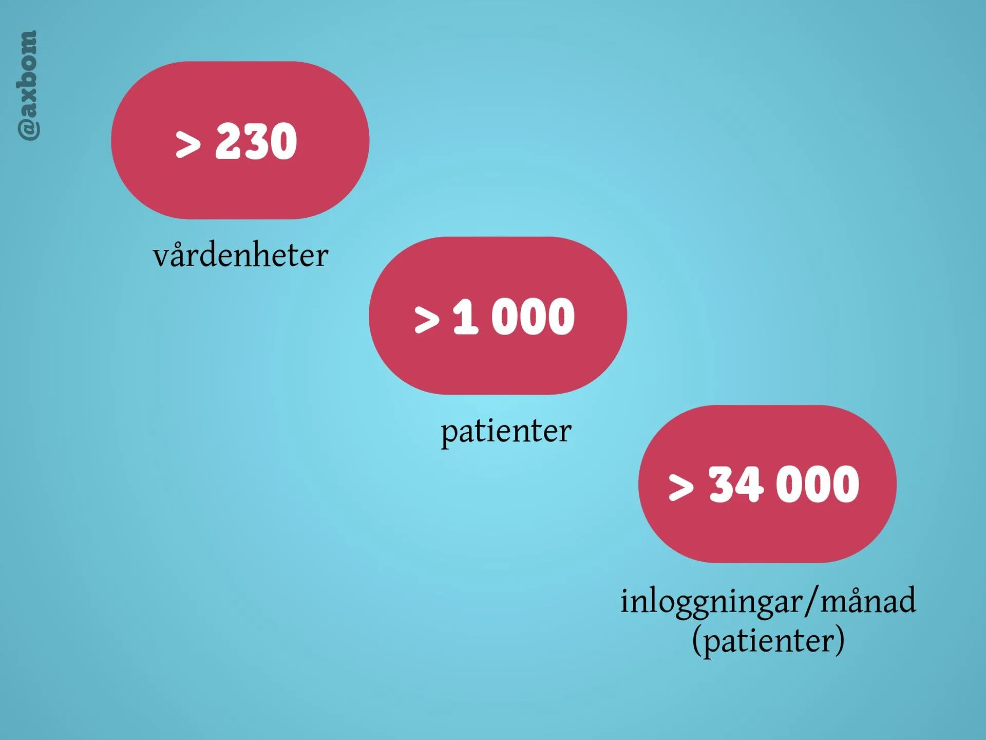
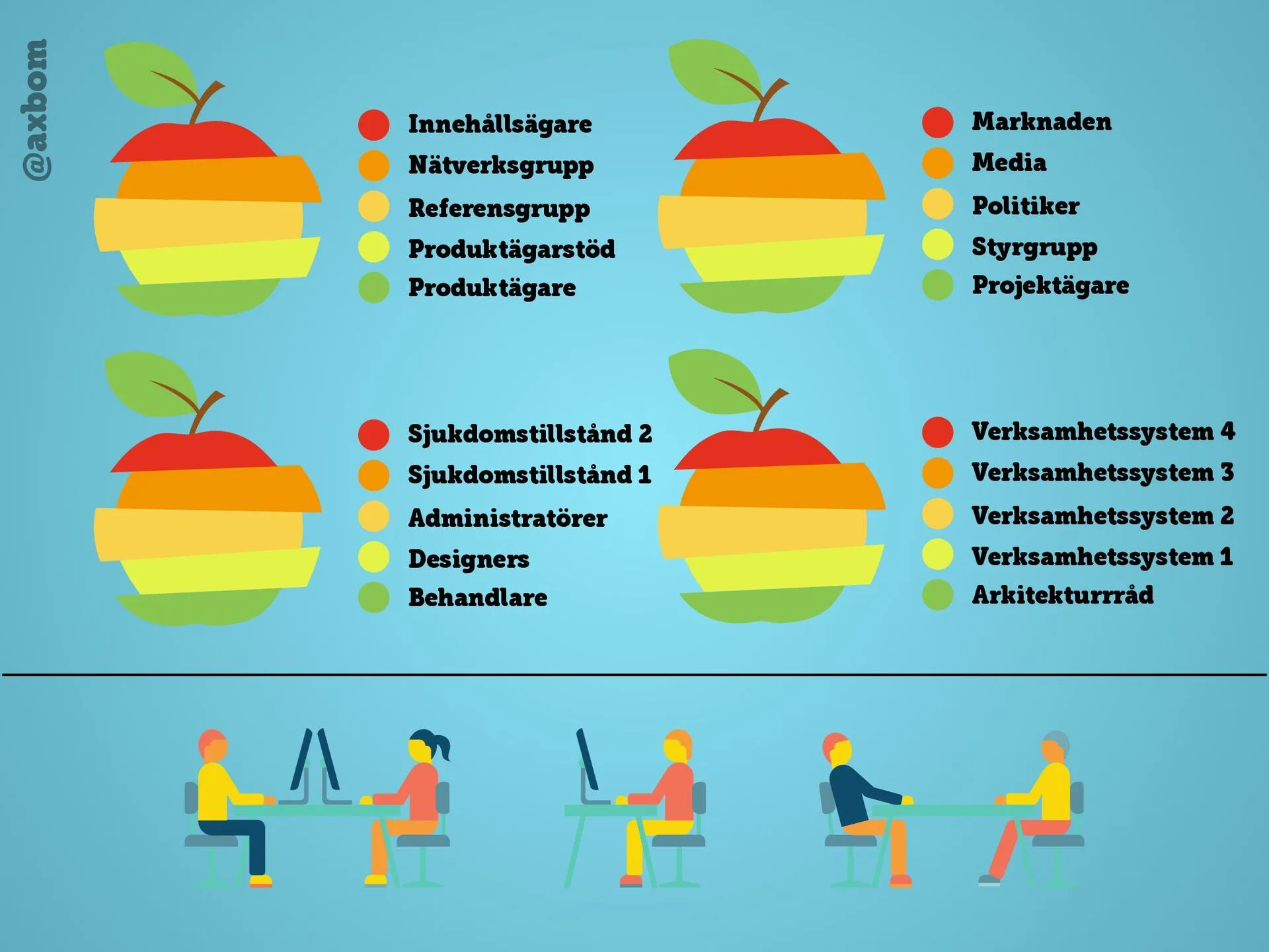
Starting from the development of the new national care platform Stöd och behandling, in October 2016 I shared experiences and tips on how to make big projects work over time and become truly user-centred. The talk was in Swedish.
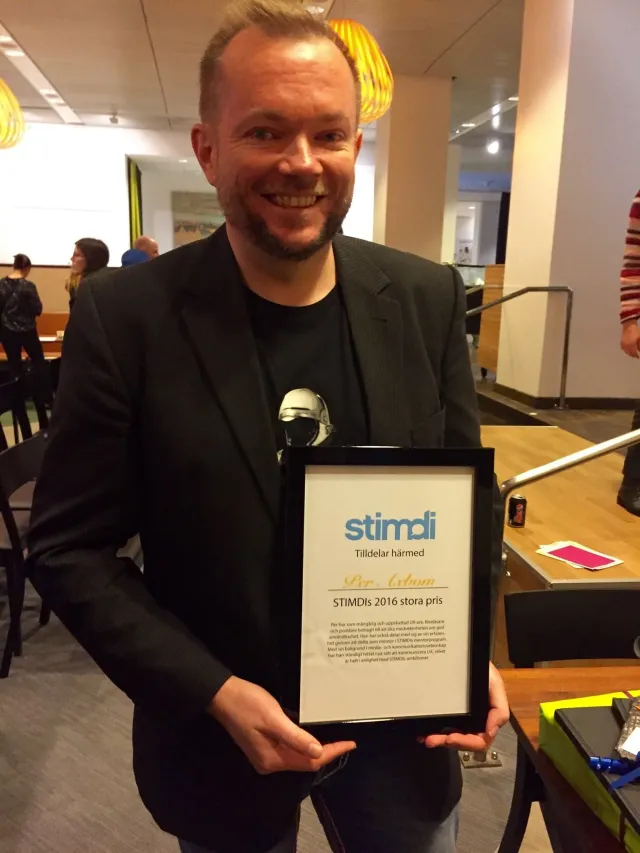
STIMDI, the Swedish interdisciplinary society for human–computer interaction, has awarded its Grand Prize since 1997 – earlier recipients include Jonas Löwgren, Kia Höök and Jan Gulliksen. I received it on World Usability Day, 10 November 2016, two minutes after stepping off stage from a talk on ethics.
On the problem of producing visual design before the content is ready, so the content has to be squeezed into an ill-fitting suit. The solution: start with a content prototype that gives the visual form something to build on. In September 2016 I showed how far you can get by working with text alone as design material, together with all the stakeholders. The talk was in Swedish.
Public speaking
Writing
Interaction design
Testimonial
2016
“You can't ask for a better outside perspective than you get from Per Axbom.
You can't ask for a better outside perspective than you get from Per Axbom. He's been extraordinarily helpful to me in providing the type of insight that only someone with his particular mix of real-world experience and natural inquisitiveness can.
A talk – or rather a rant – on ethics at STIMDI's World Usability Day evening in Stockholm on 10 November 2016, about the ethical responsibility of the people doing UX work. Two minutes after I stepped off stage I was awarded STIMDI's Grand Prize.
Trained as a coach in Leapfrog’s ACC-accredited coaching program. I coach individuals and teams, in leadership as well as junior positions, working by the ICF (International Coach Federation) code of ethics.
Det osynliga problemet med sagolika användarupplevelser
A lightning talk at UX Open, an unconference for the UX community in Stockholm, on 16 October 2015 – one of 16 lightning talks in front of 180+ participants. The start of the fairy-tale talk: when we design away every barrier, we may stop helping people choose what's best for them.
Stockholm County Council, as subcontractor to Softronic
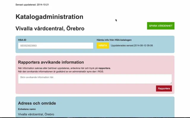
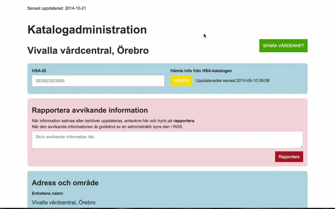
A clickable prototype for Katalogadministration, which became a real tool: the view where a care unit – here Vivalla vårdcentral in Örebro – keeps its details up to date, fetching data from the national HSA directory and reporting information that is wrong or missing. In the film I explain the prototype myself (in Swedish, 8:43).
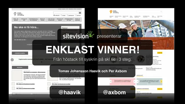
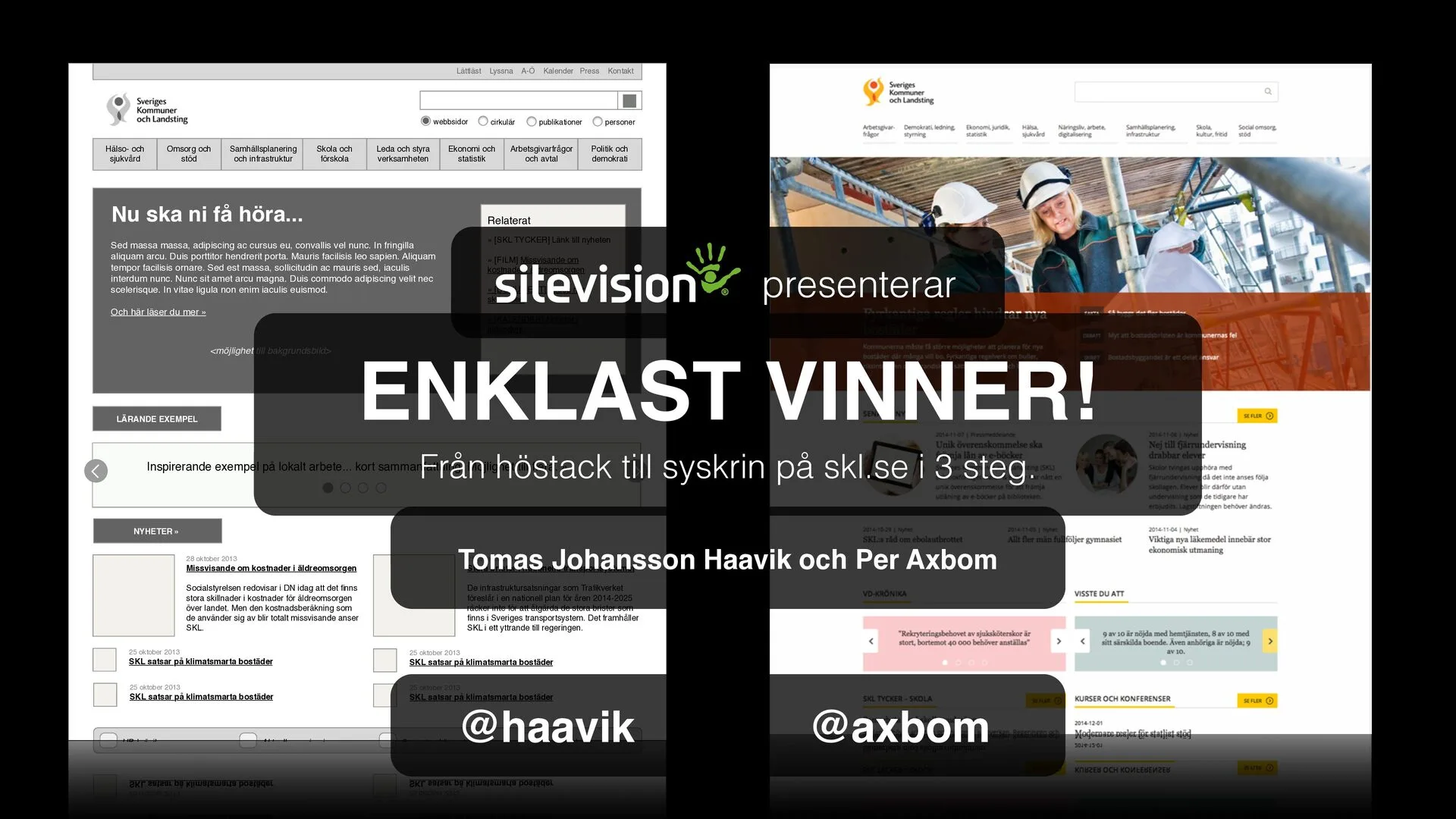
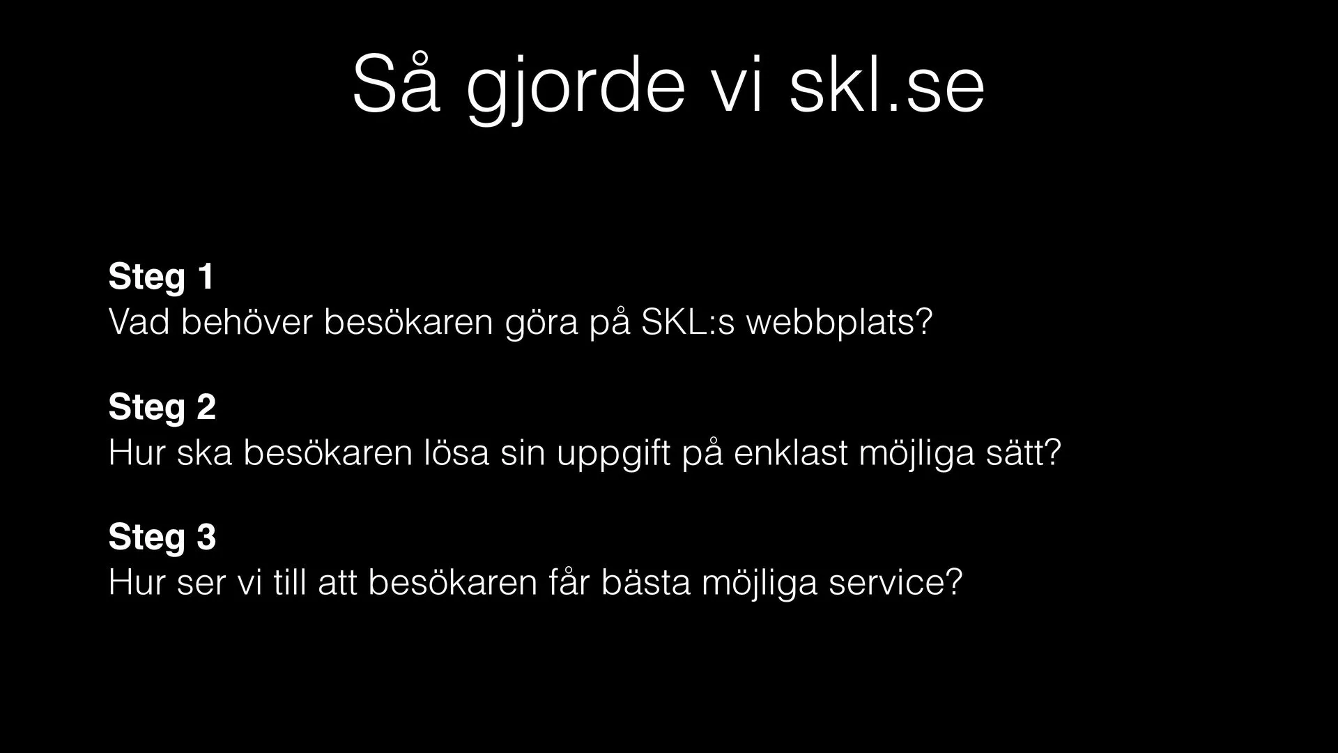
Enklast vinner! Från höstack till syskrin på skl.se i 3 steg
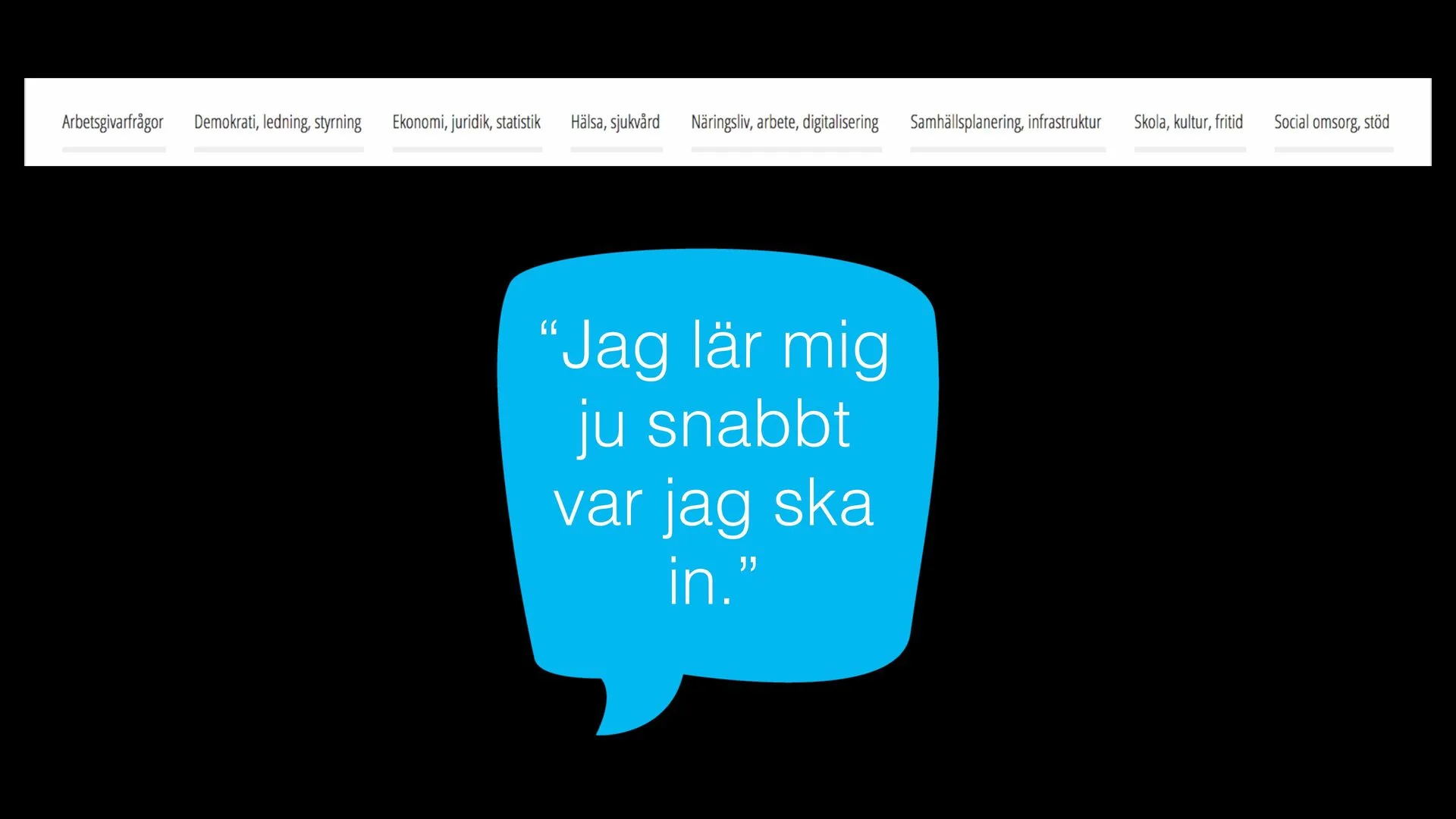
On 27 November 2014, Tomas Johansson Haavik, web strategist at SKL, and I presented the new skl.se, which I was lead designer for, and how we worked strategically with content and design to give users what they need. Sitevision gave us the speaking slot after skl.se was named Best public website at the Sitevision Days. The talk was in Swedish.
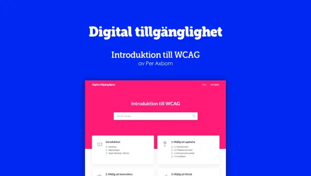
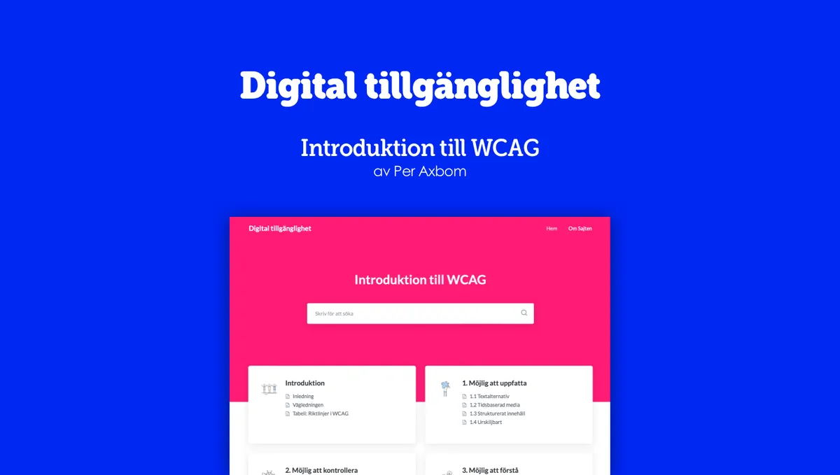
A free Swedish guide to digital accessibility at digitill.se: all 13 guidelines of the Web Content Accessibility Guidelines (WCAG) explained simply, with examples – so anyone can start contributing to more accessible digital services, and make demands on the people who build and maintain them.
Stockholm County Council and Inera – as subcontractor to Softronic, later Omegapoint and HiQ
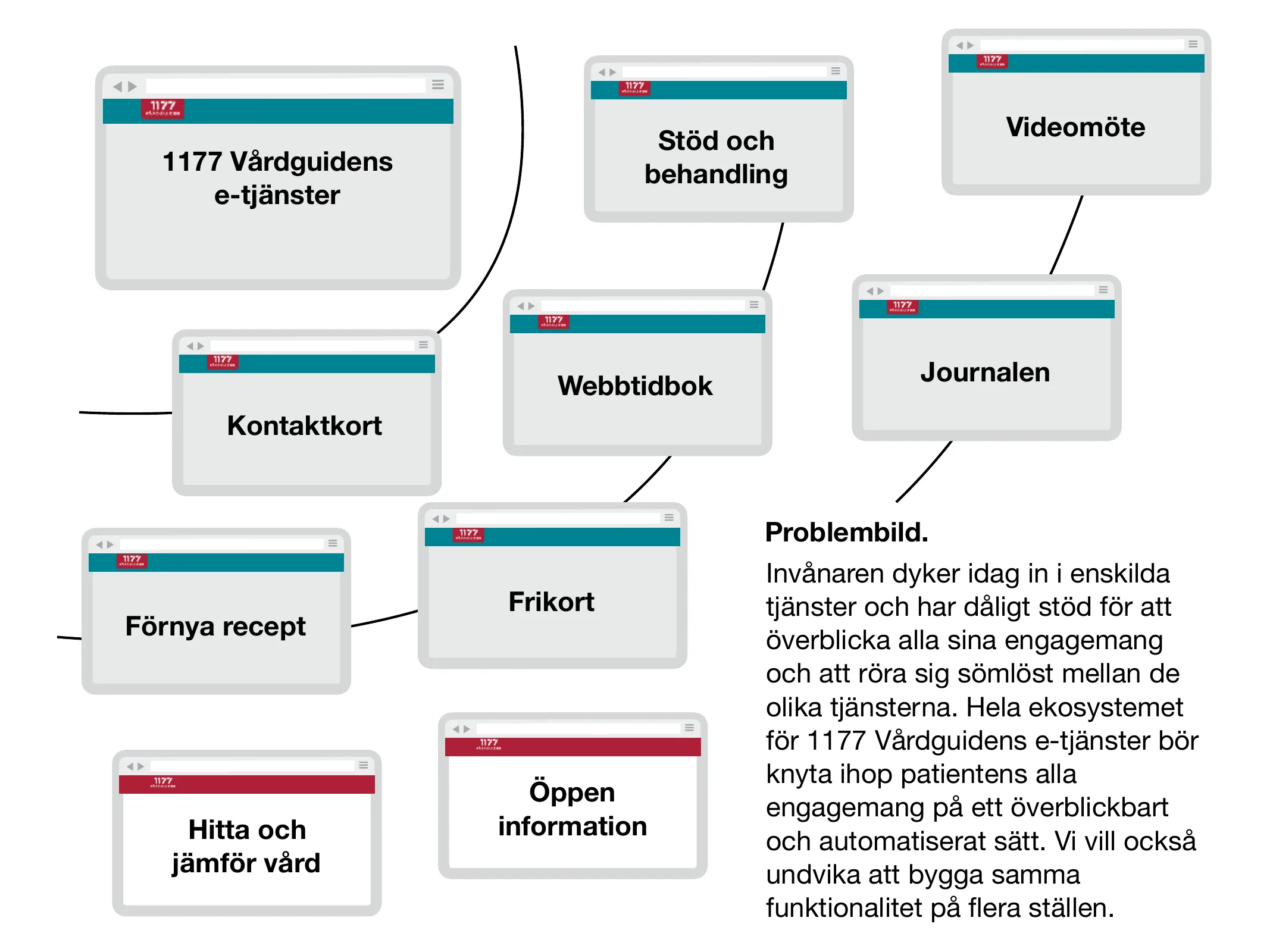
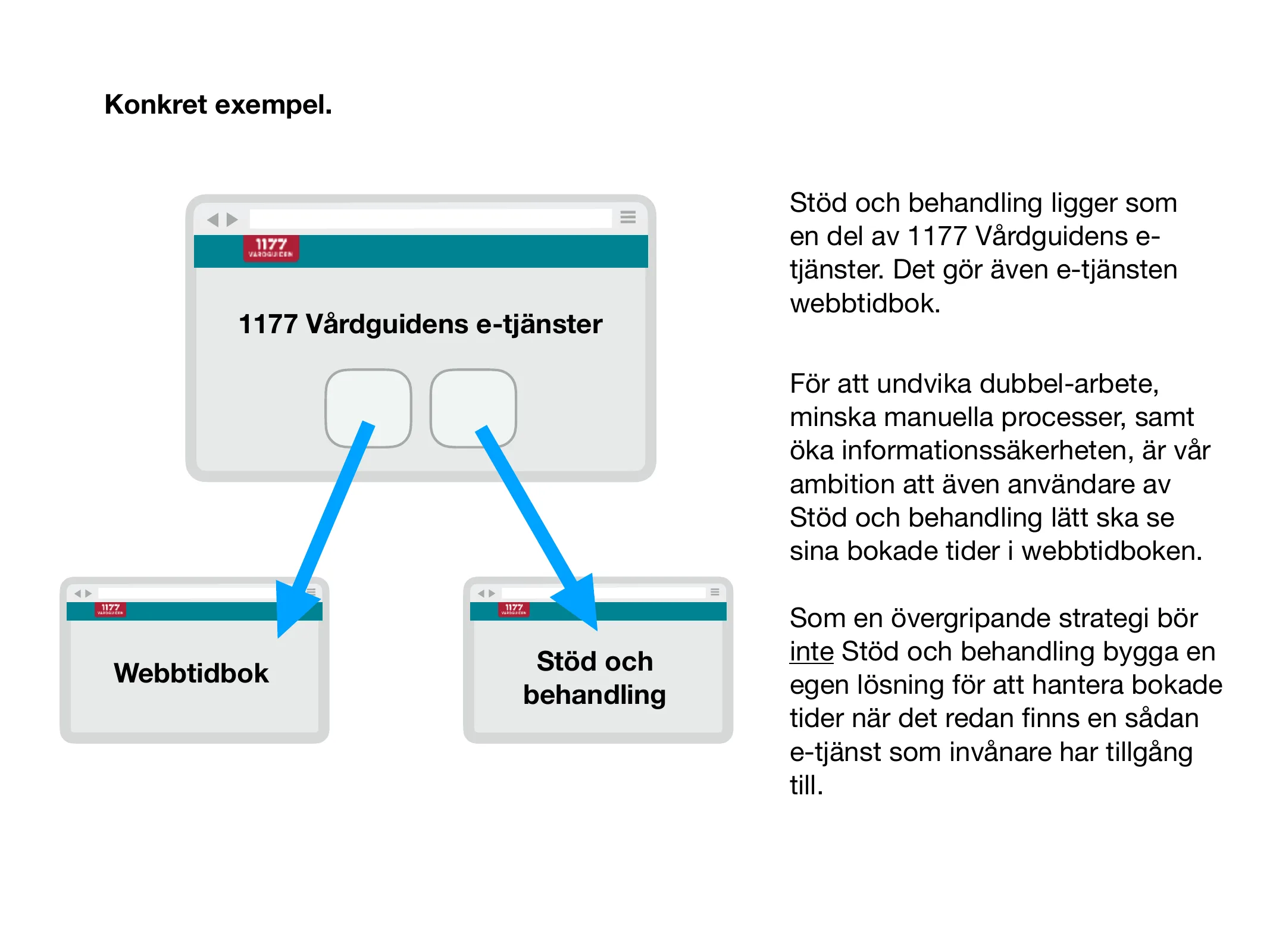
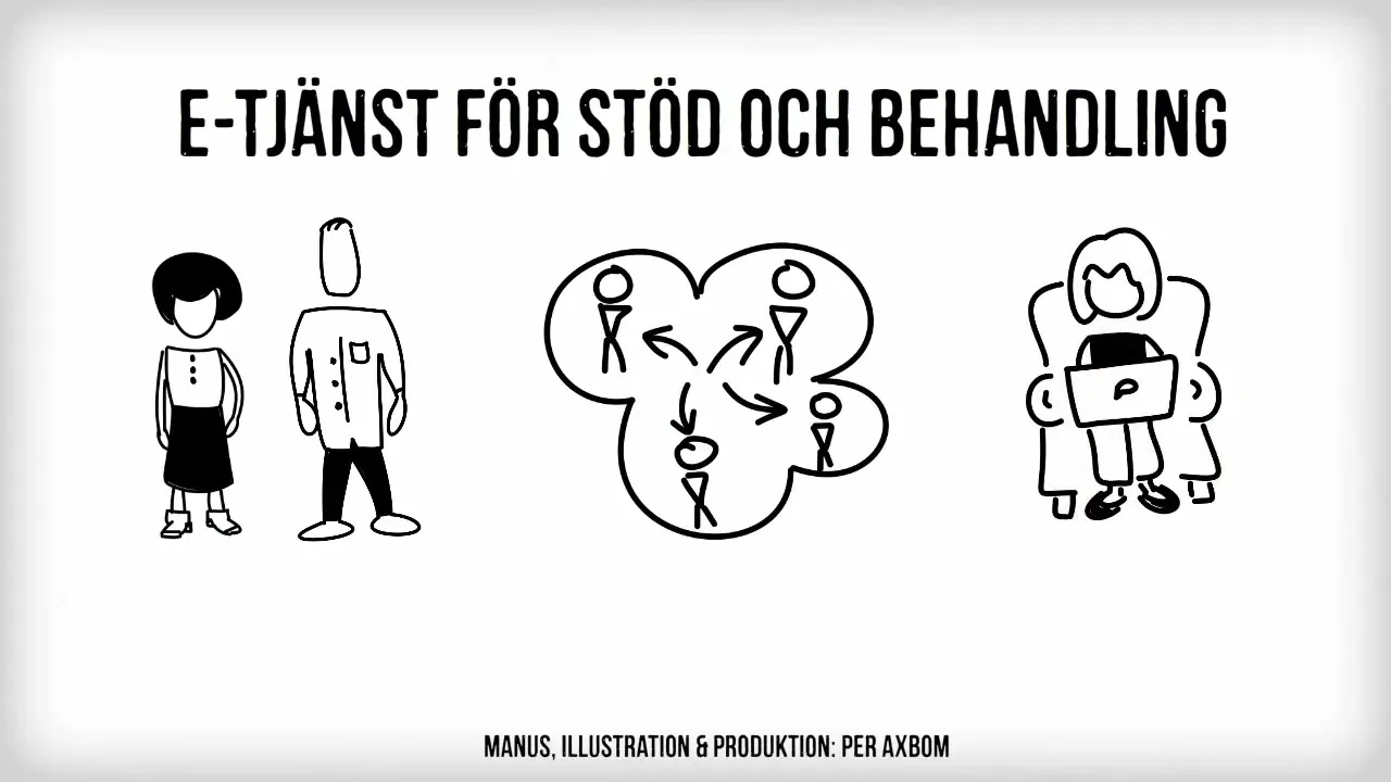
Five years on the national e-service for online support and treatment (Stöd och behandling), from the pre-study in 2013 to launch: a platform where healthcare providers build support and treatment programs, such as internet-based CBT and psychoeducation courses, for their patients. The project that steered me toward digital ethics.
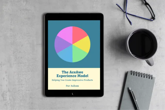
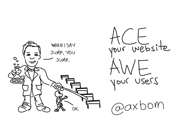
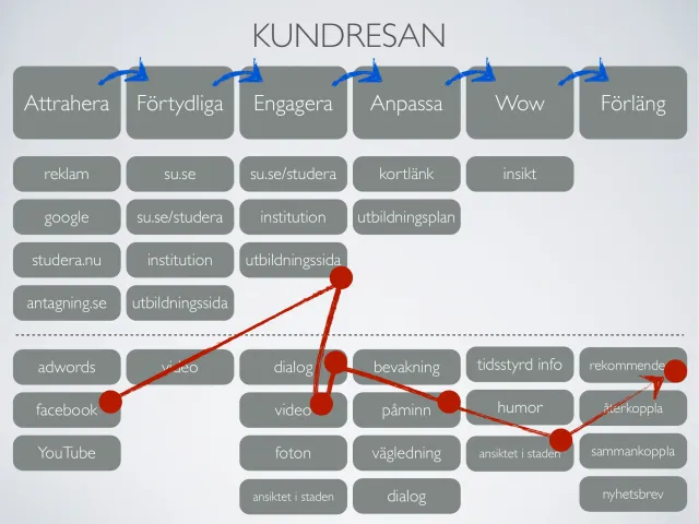
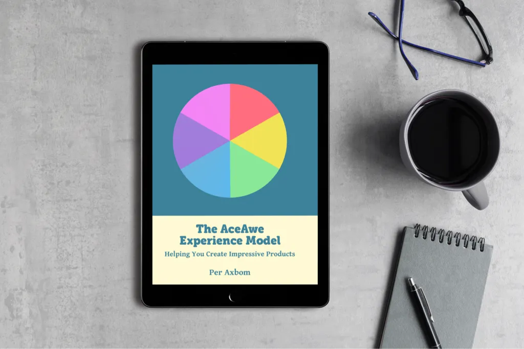
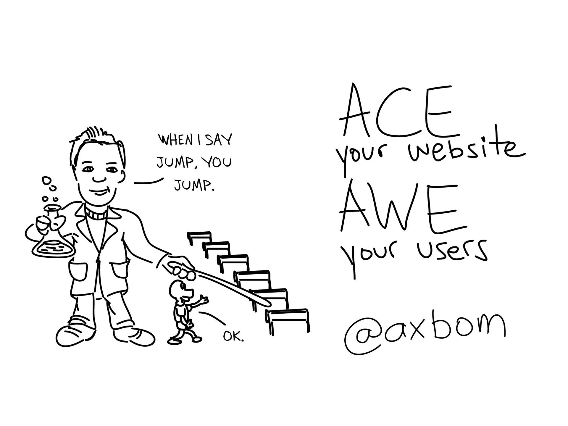
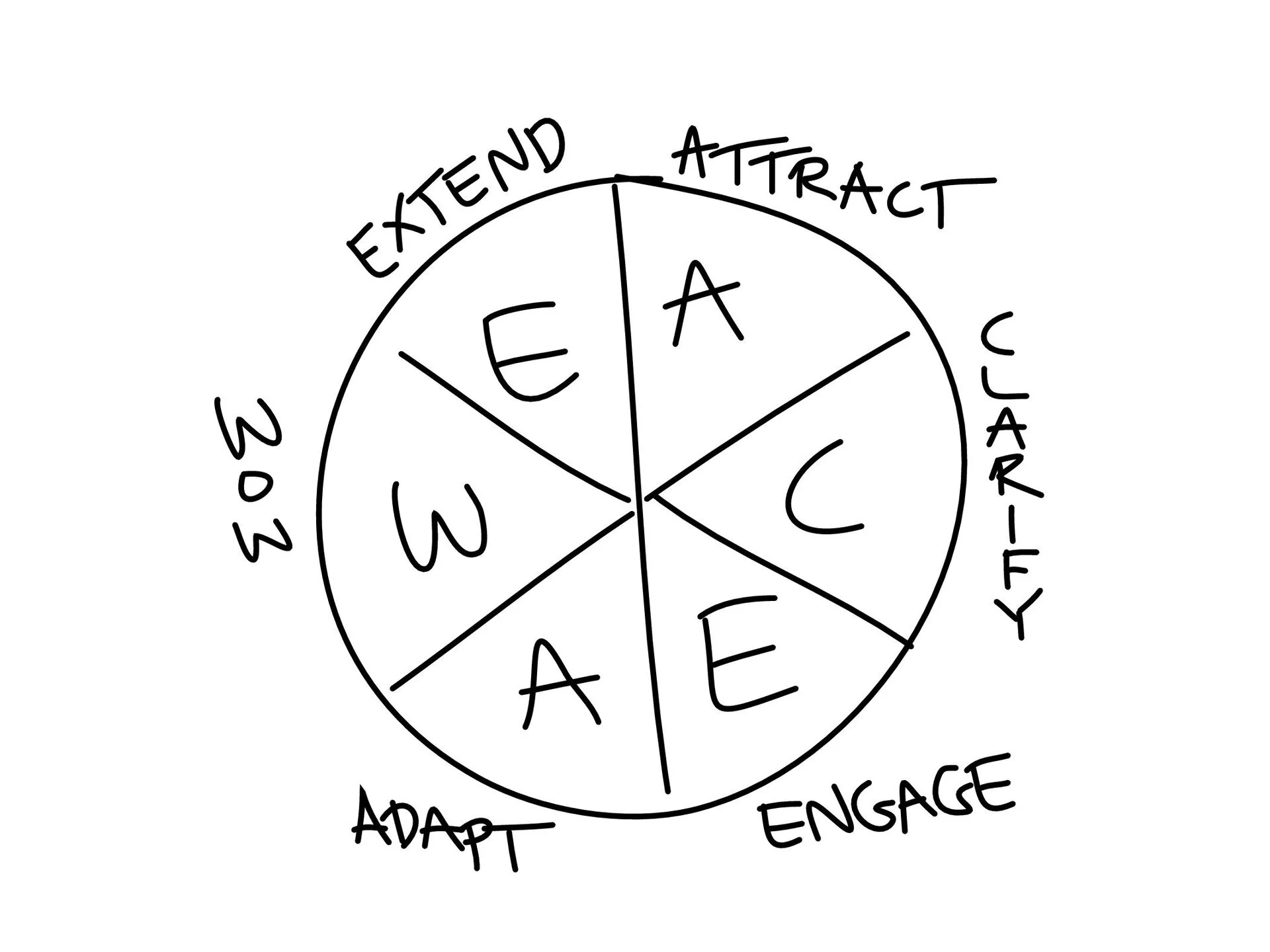
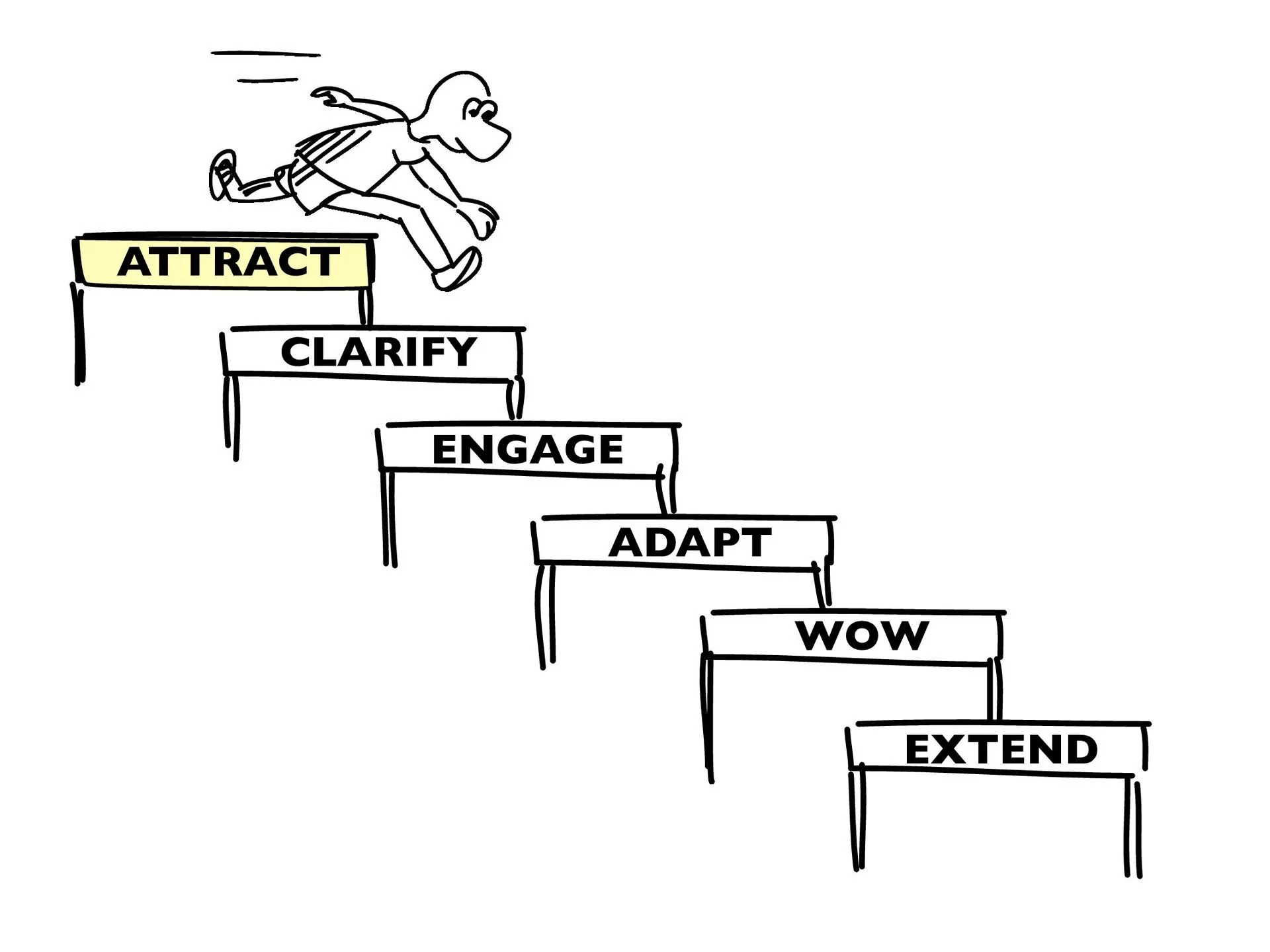
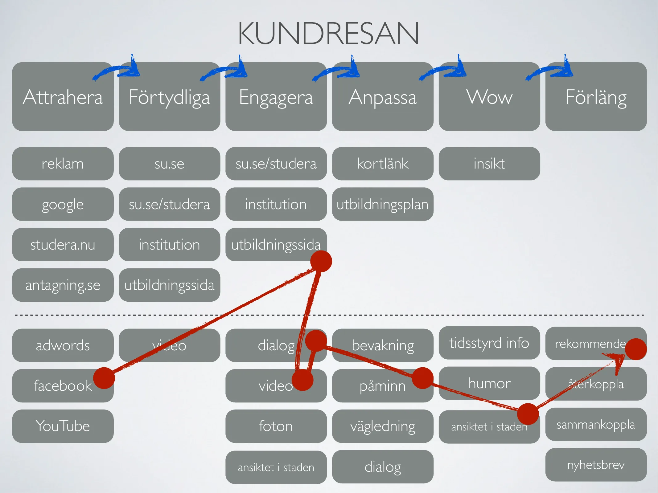
An experience model for designing digital services in a holistic, structured way – by truly helping the people you want to reach. AceAwe (“Ace your service, awe your users”) describes the whole experience as a circle in six steps: Attract, Clarify, Enable, Adapt, Wow and Extend.
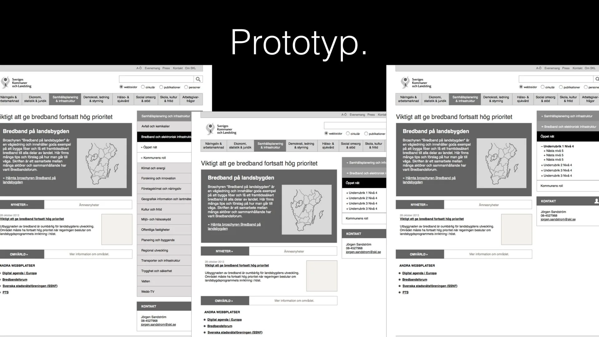
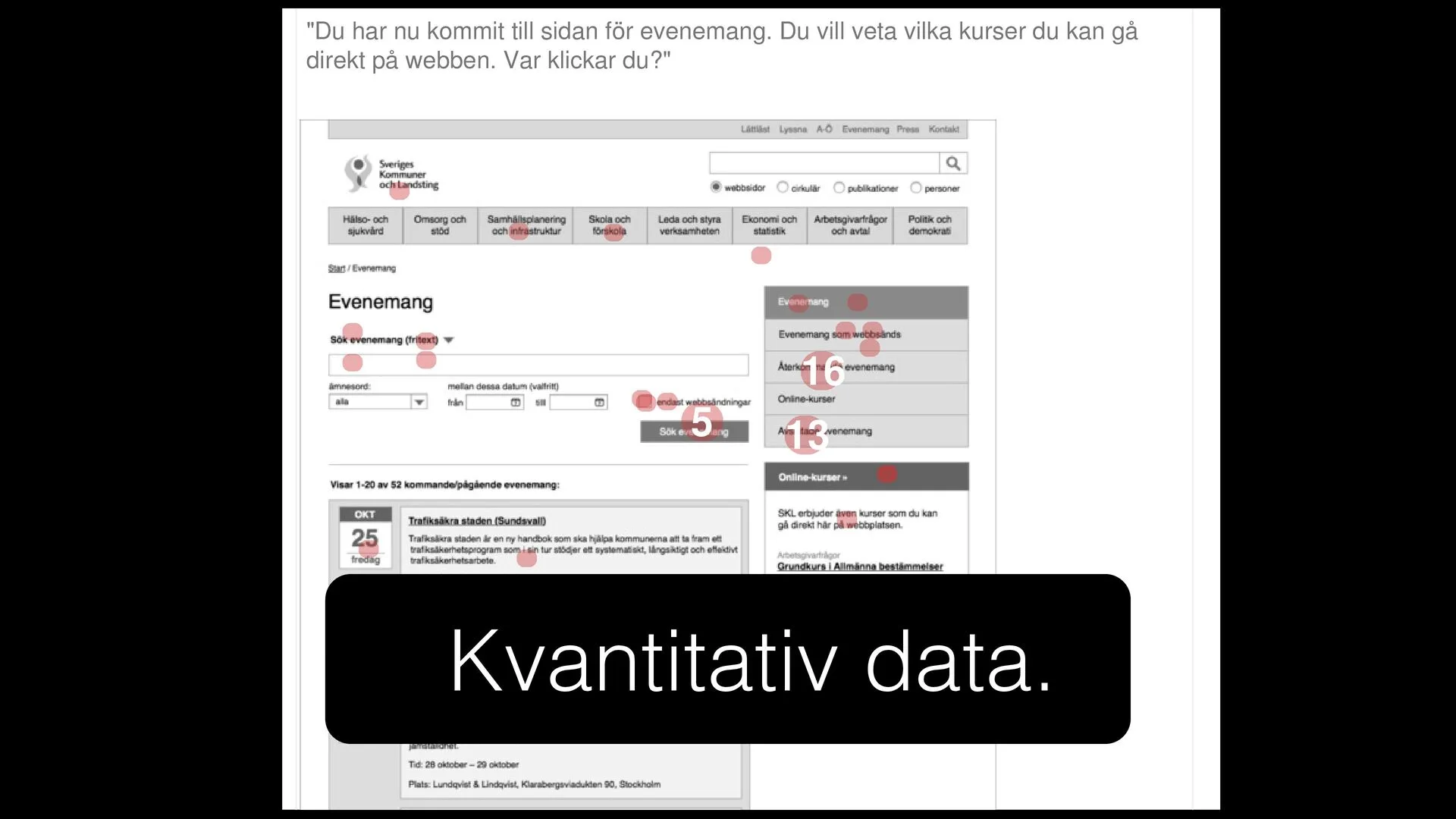
Wireframes and a prototype for SKL's new public website, with usability tests, idea sessions and workshops. The new skl.se was named Sweden's best public website at the Sitevision Days on 7 October 2014.
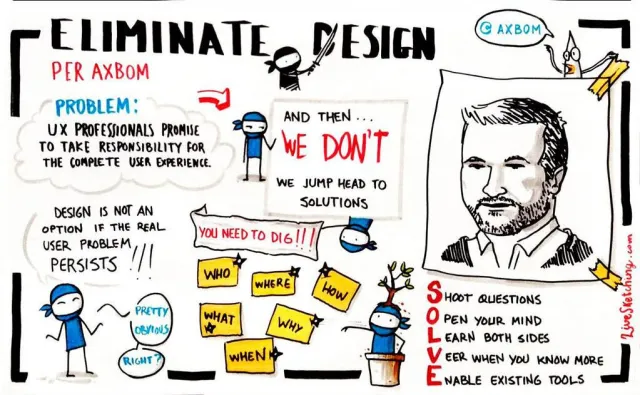
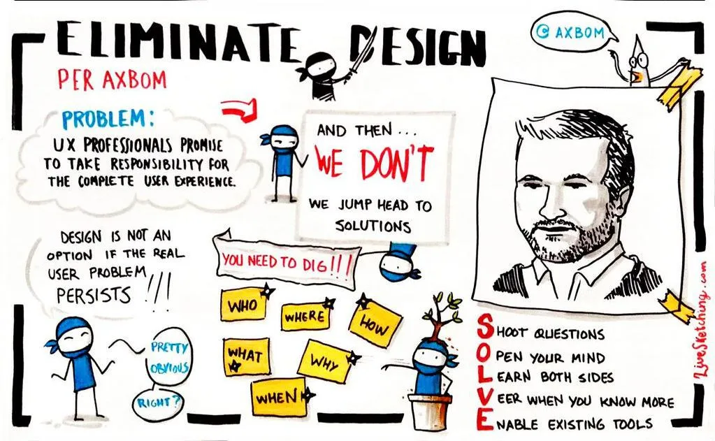
Eliminate Design – a rant about the responsibility of UX professionals
A lightning talk at User Experience Lisbon in May 2013: jumping head first into sketching wireframes makes us fail the user and lose sight of the real problem. The screen should not be singled out as the primary medium for human-centered design – and it is the UX lead's job to make sure it isn't. Recorded on an iPhone from the audience.
Public speaking
UX research
Digital ethics
Testimonial
2012
“Per has an enormous knowledge of usability.
Per has an enormous knowledge of usability. When we were rebuilding our web tool, Per’s input was decisive in creating an easy-to-use experience. If simplicity and intuitive interfaces matter to you, hire Axbom Innovation!
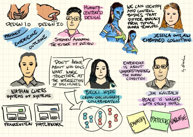
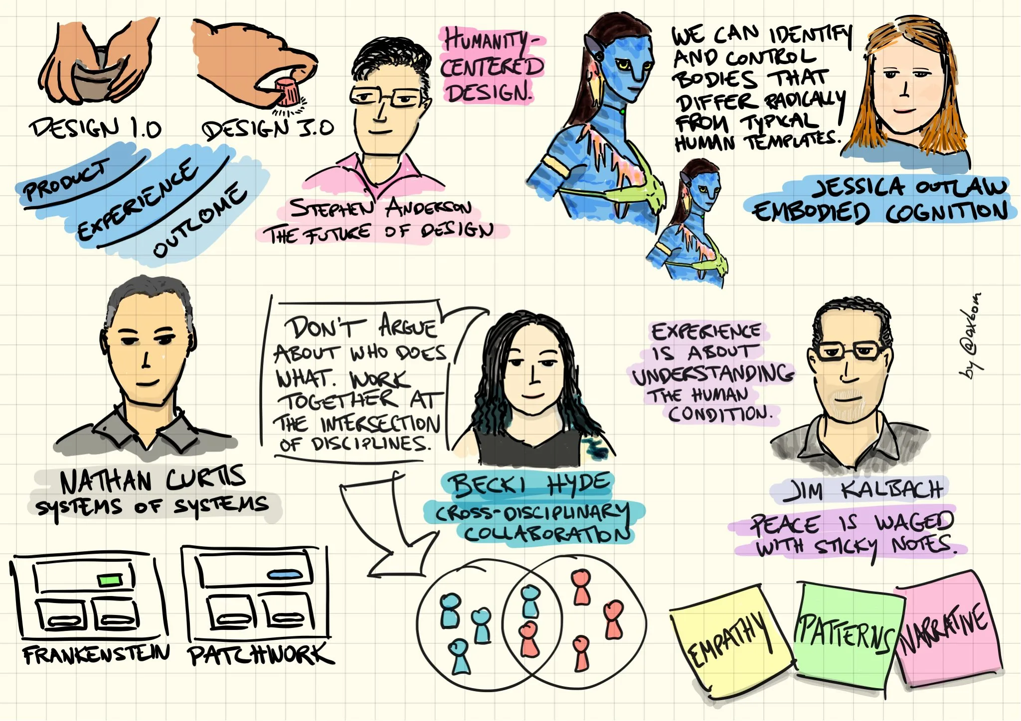
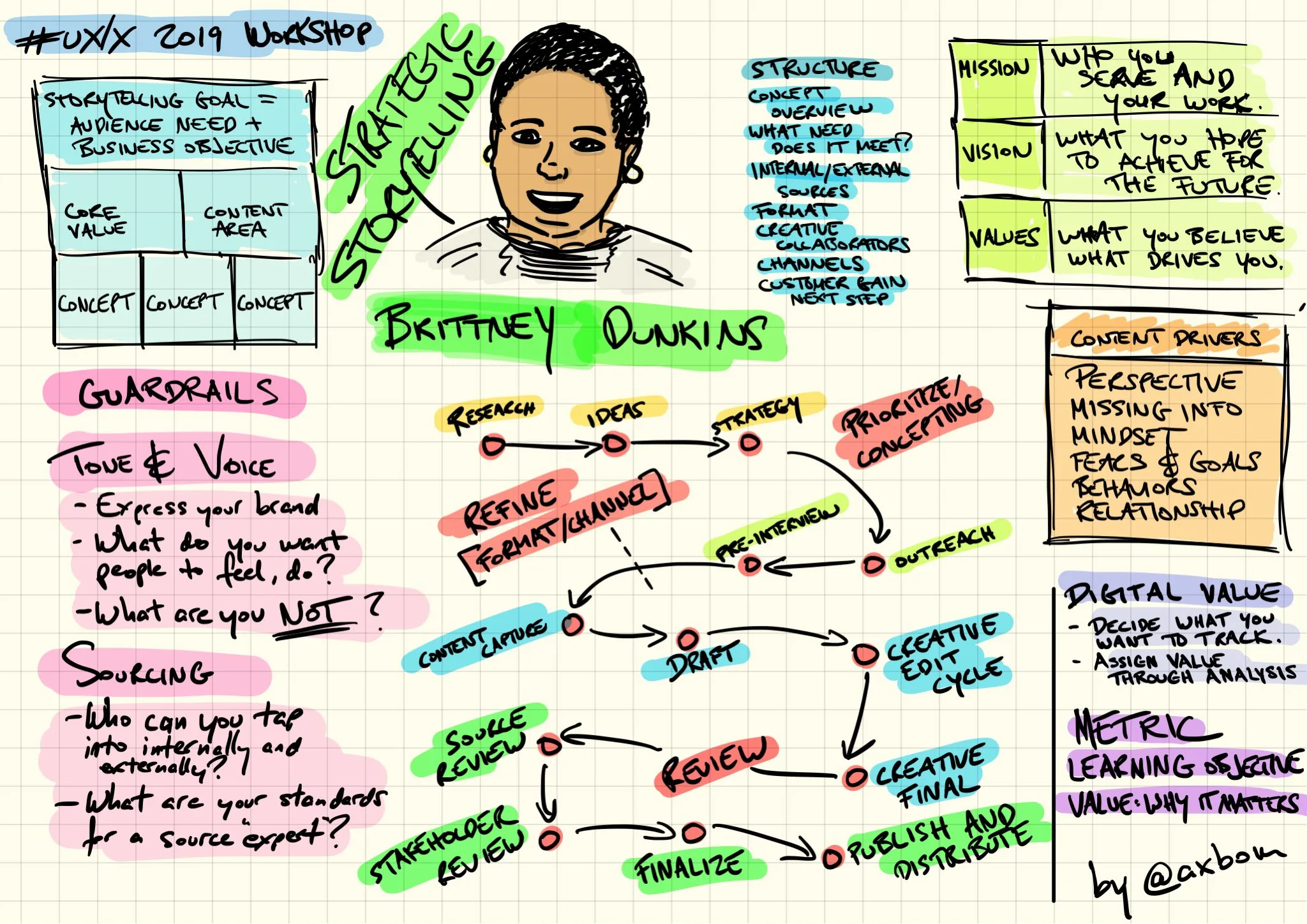
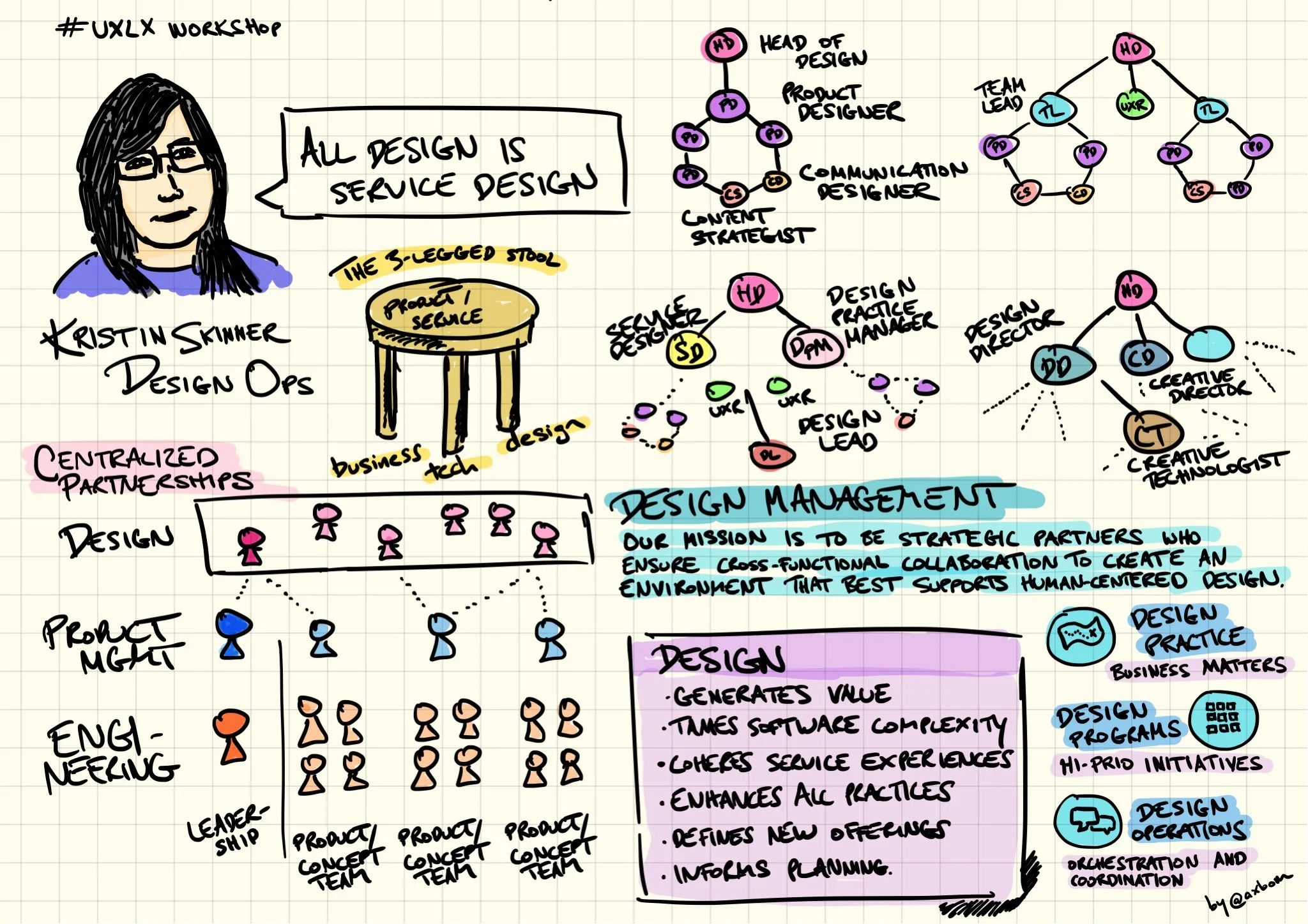
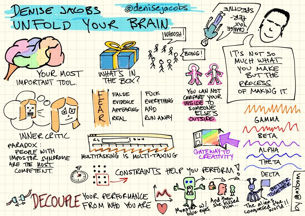
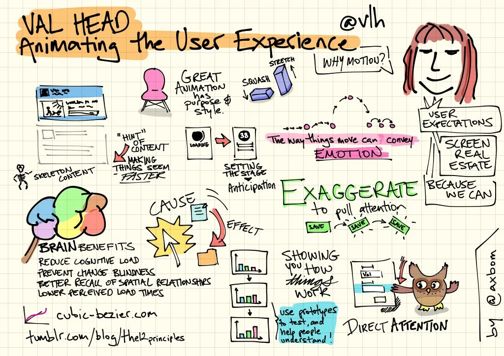
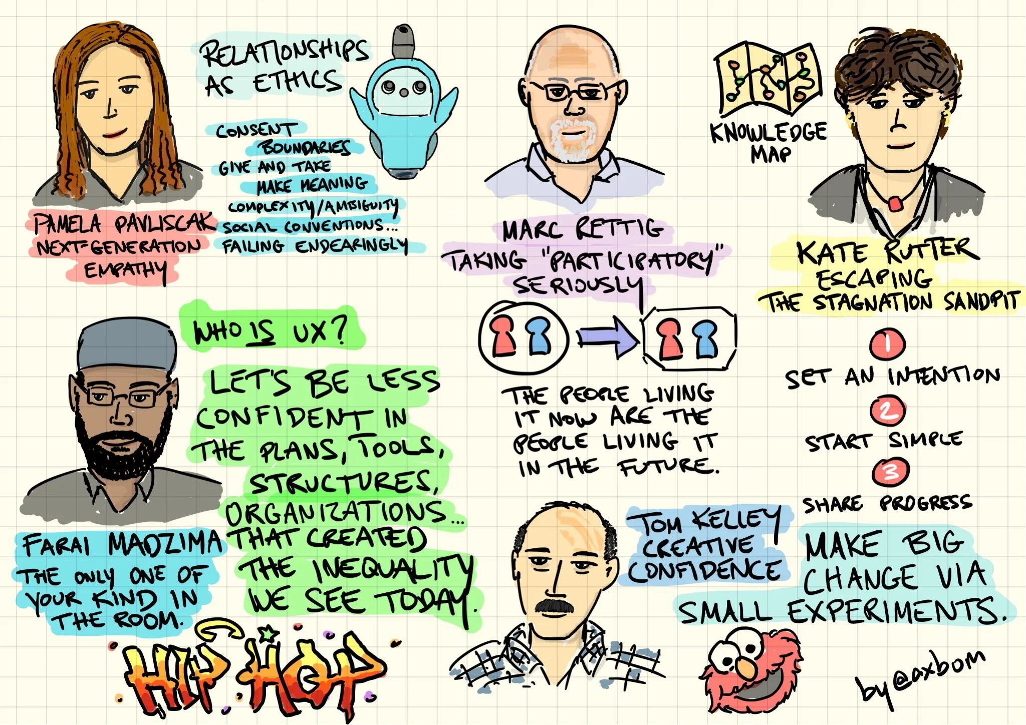
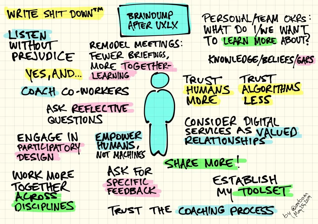
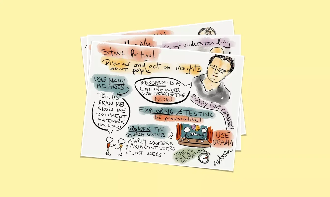
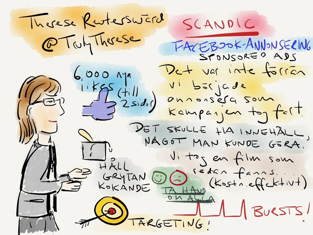
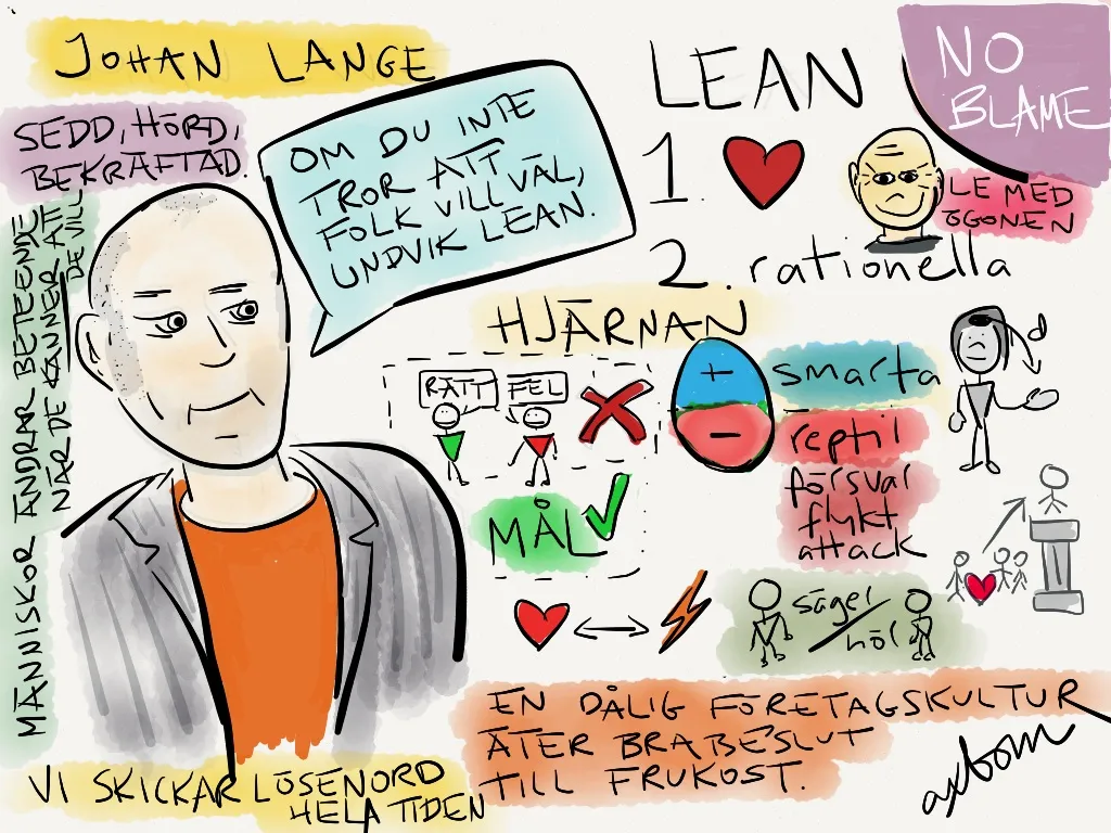
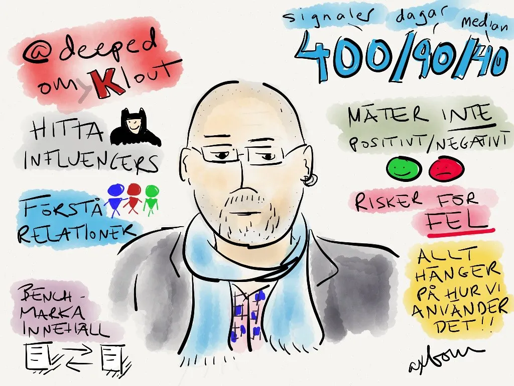
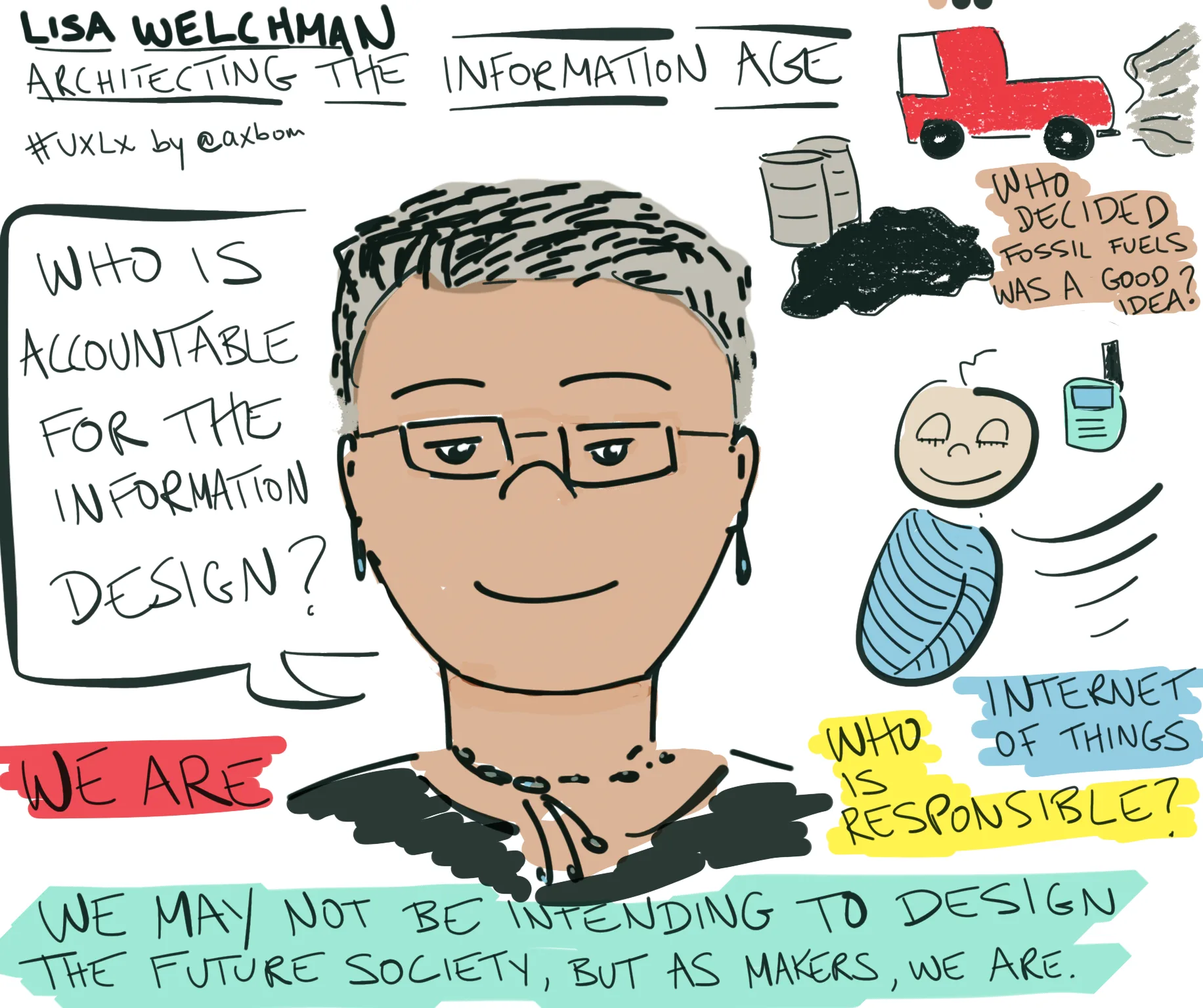
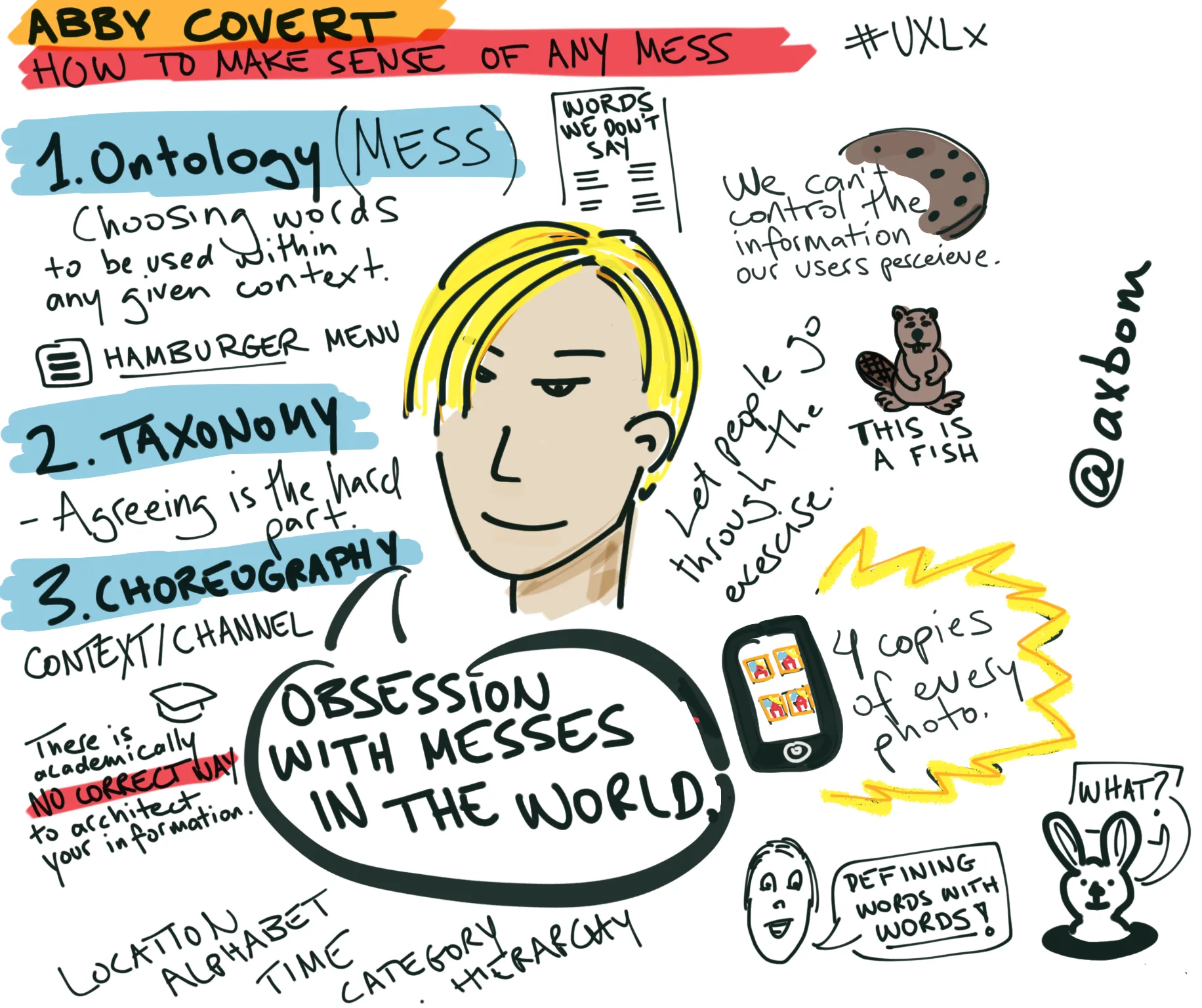
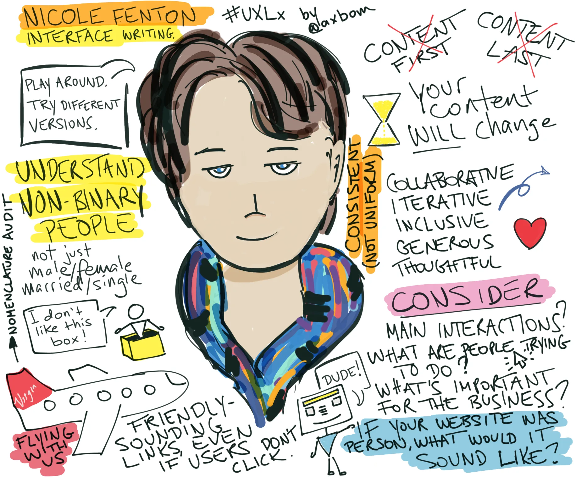
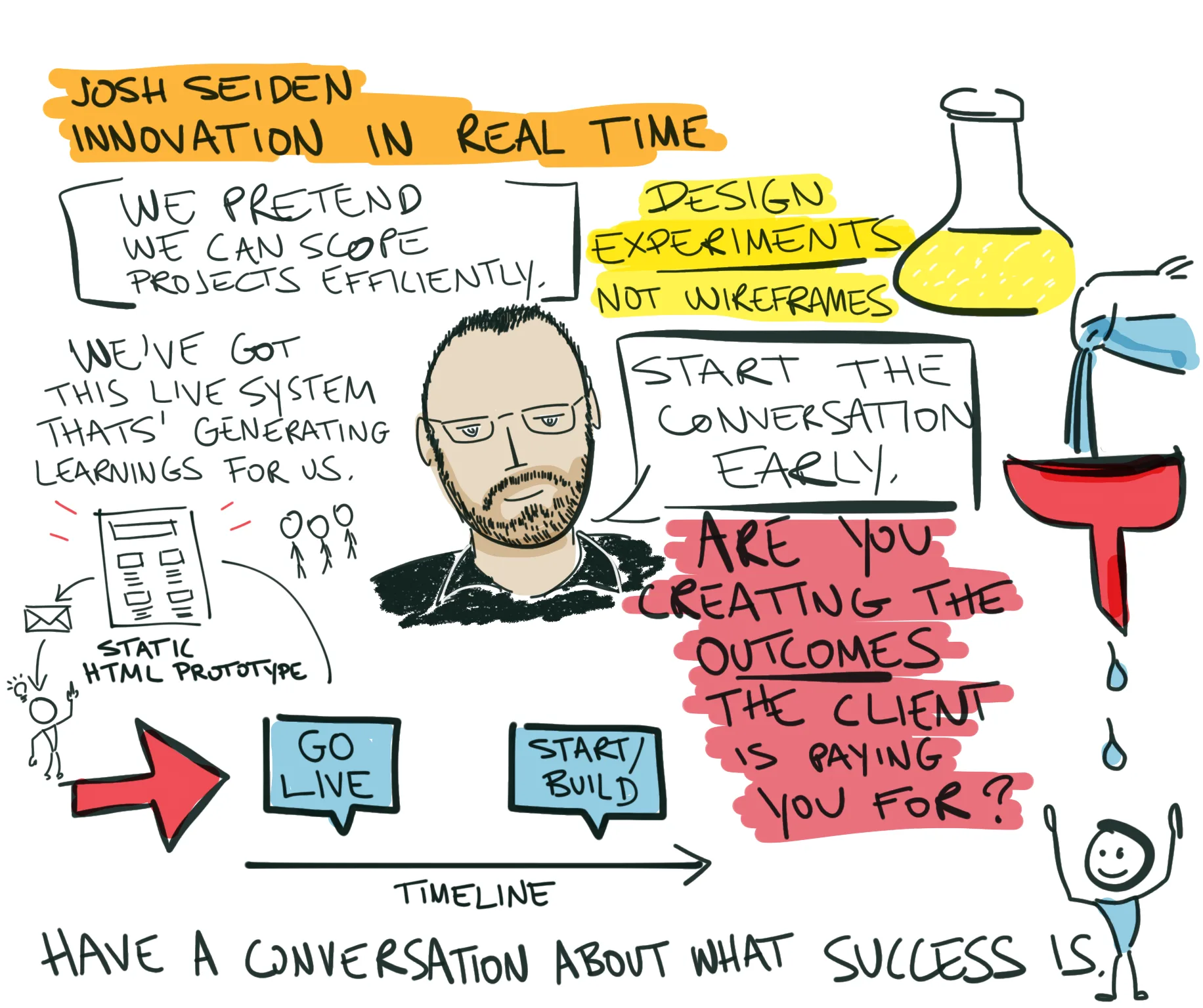
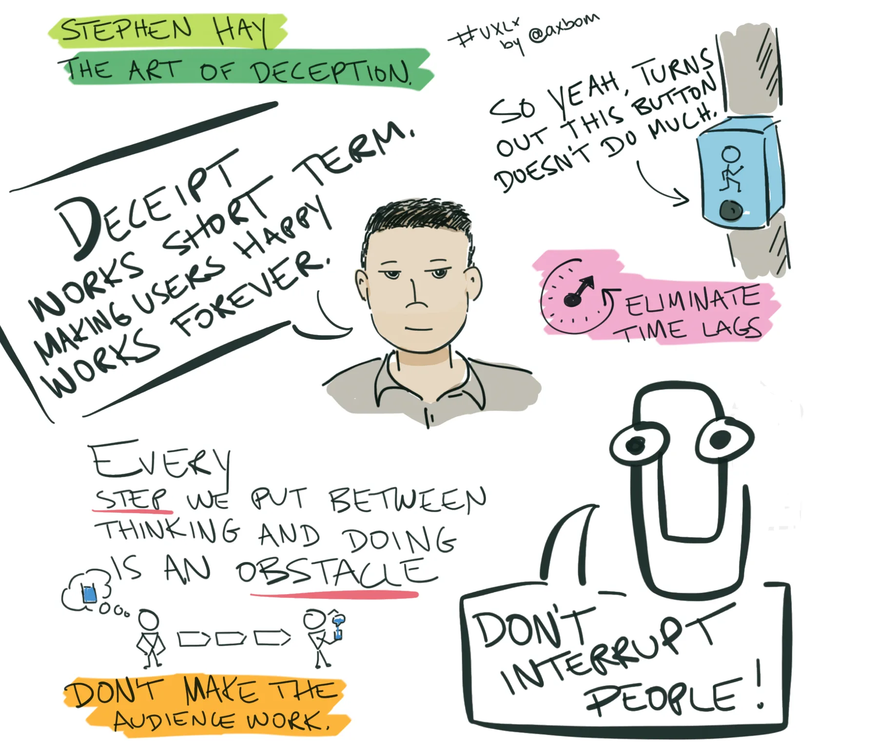
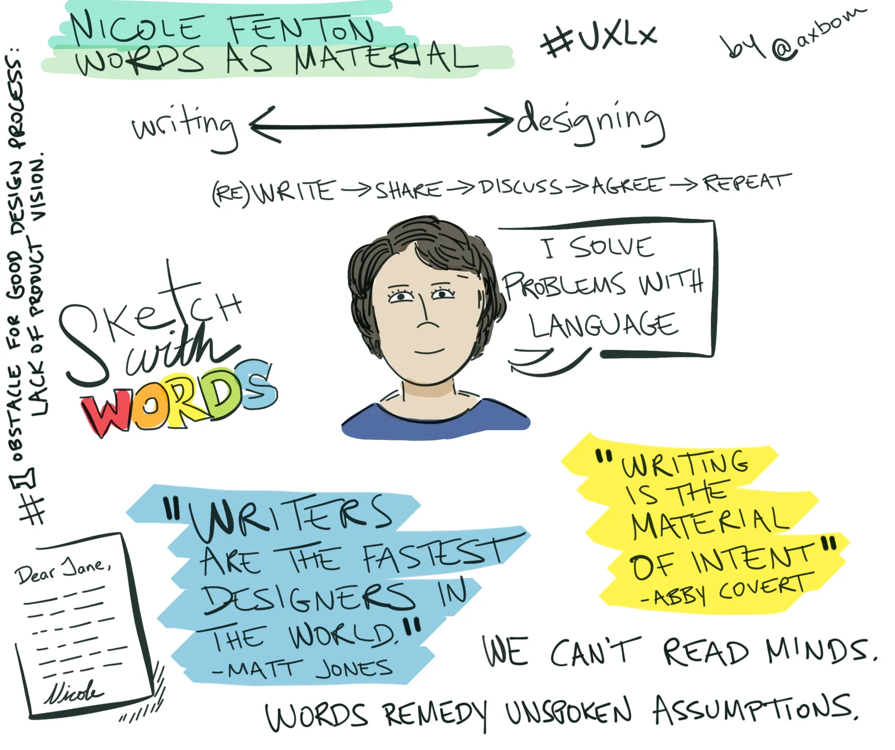
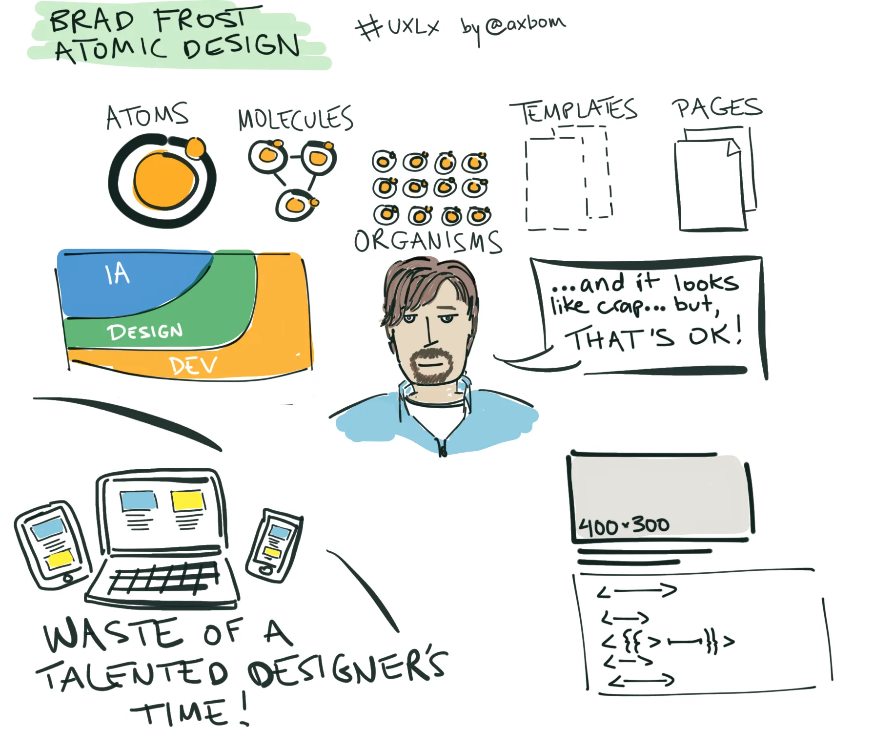
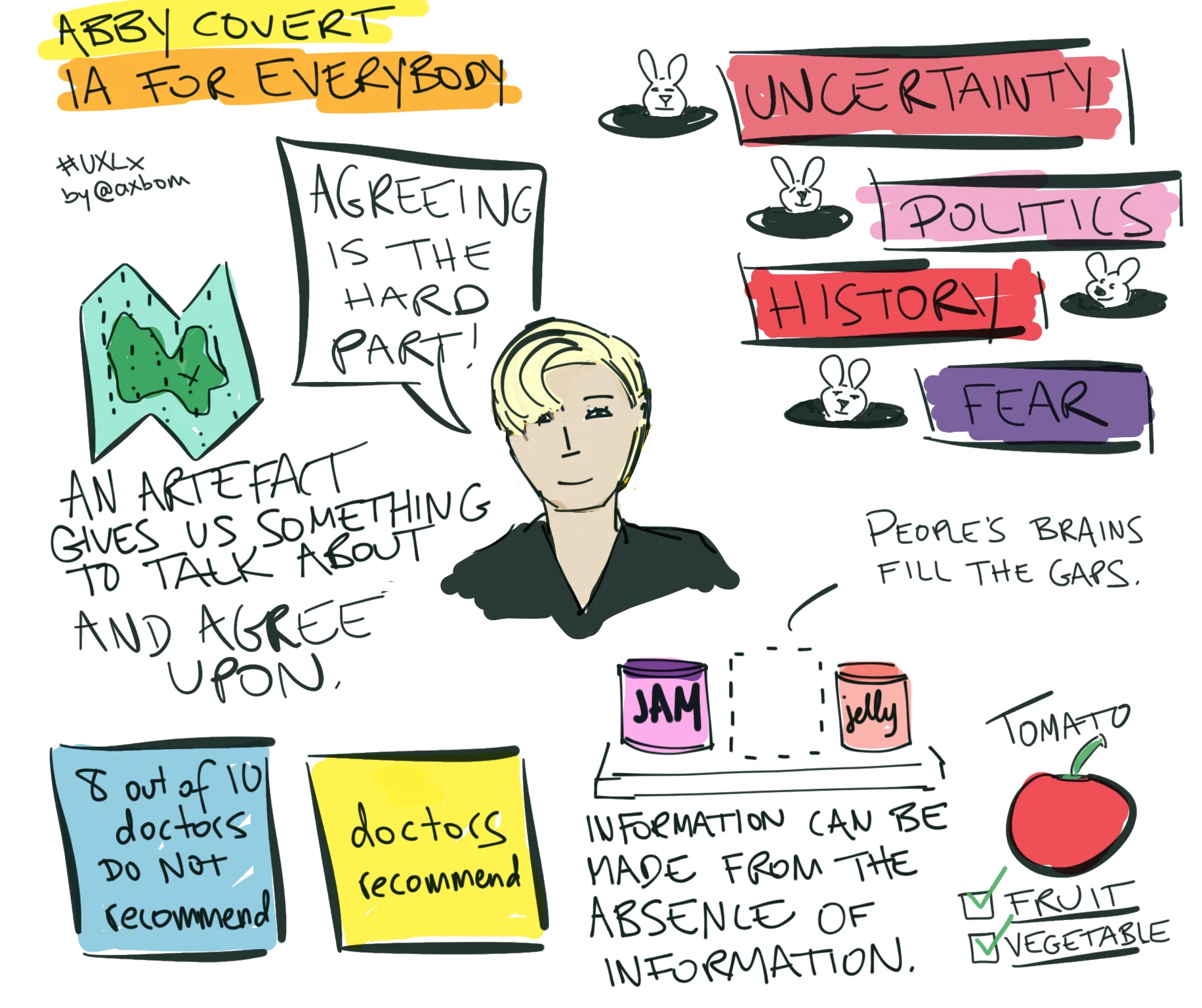
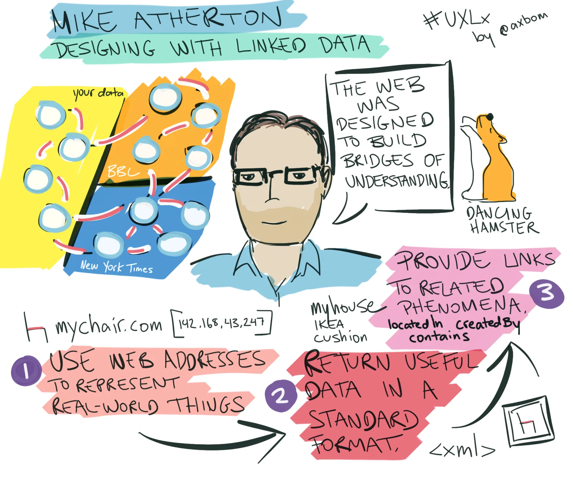
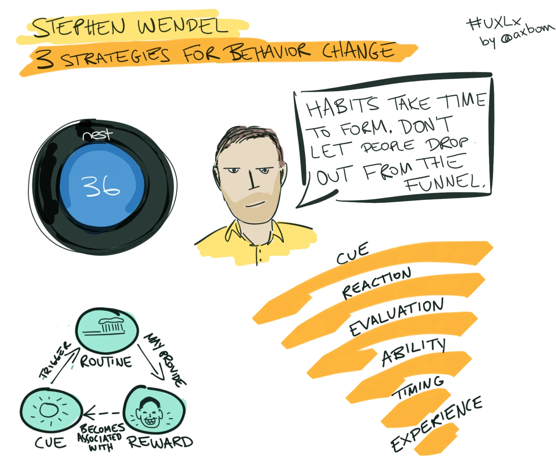
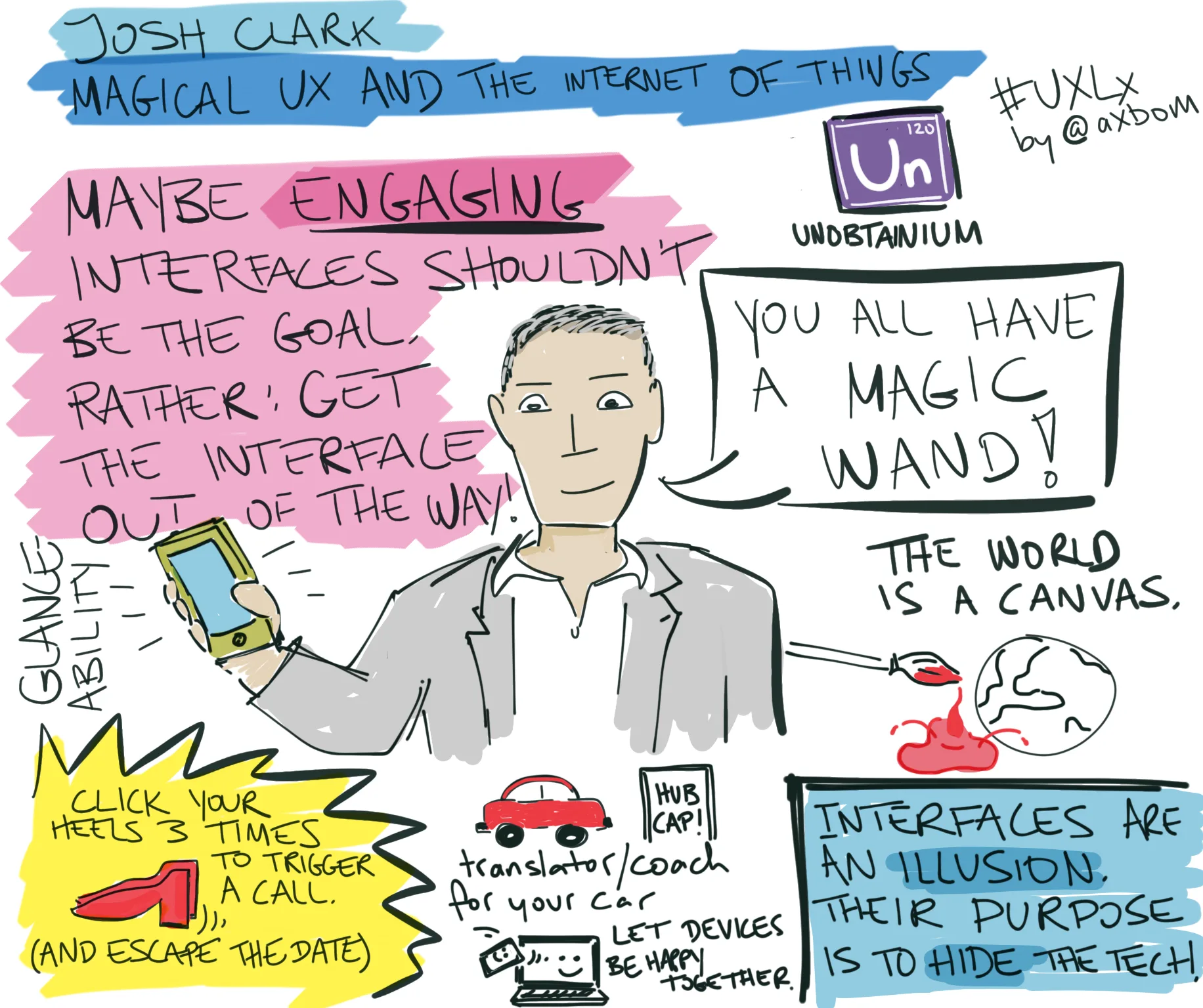
From 2012 to 2019 I drew sketchnotes live at conferences – usually one talk per iPad screen, published straight after the session. The first set, from UXLx 2012, had more than 34,000 views on SlideShare by February 2013. My favorites are the most recent, from UXLx 2019.
Visual thinking & infographics
Workshops & facilitation
Writing
Testimonial
2012
“Last show was probably (one of the) best in show.
Last show was probably (one of the) best in show. Thanks for the book! Will be beside my bed for keeping nightmares away.
— Bettina Braesch, after Scandinavian Developer Conference, April 2012
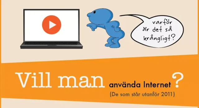
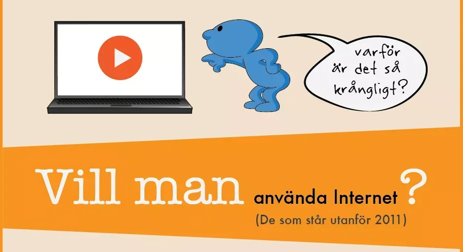
An infographic on the people who stand outside the internet in Sweden – 1.2 million people, 14% of the population over 12 – built on .SE's yearly surveys. My contribution to spreading knowledge about the people who keep risking being forgotten, published with a full image description and free to download, and later commissioned by the campaign for digital inclusion, Digidel 2013.
Visual thinking & infographics
Accessibility
Digital ethics
Testimonial
2012
“Personal, knowledgeable and engaging.
Personal, knowledgeable and engaging. You can always rely on Per, and every time we have worked with him he has delivered beyond expectations.
— Funda Denizhan, Manager User Experience, Valtech
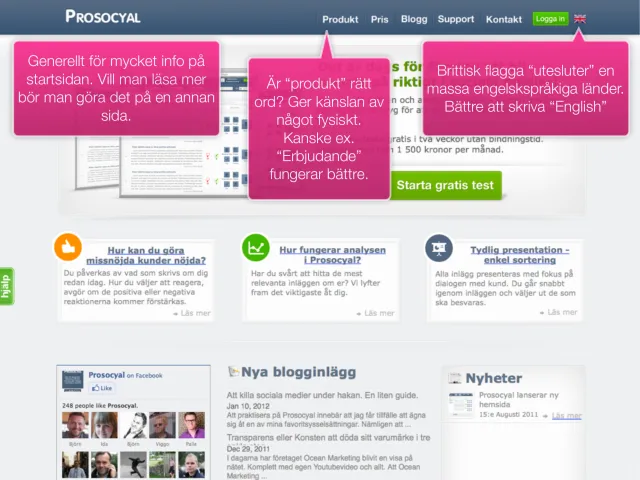
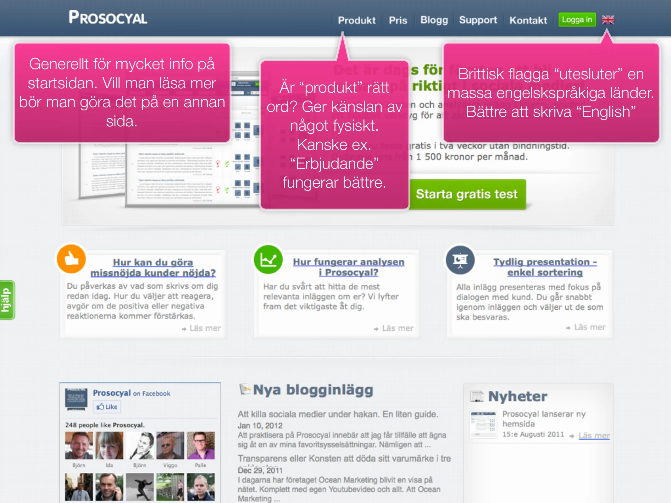
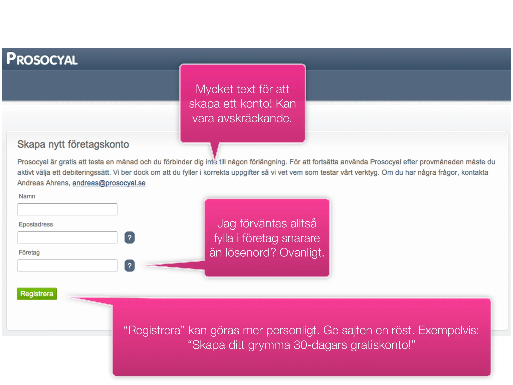
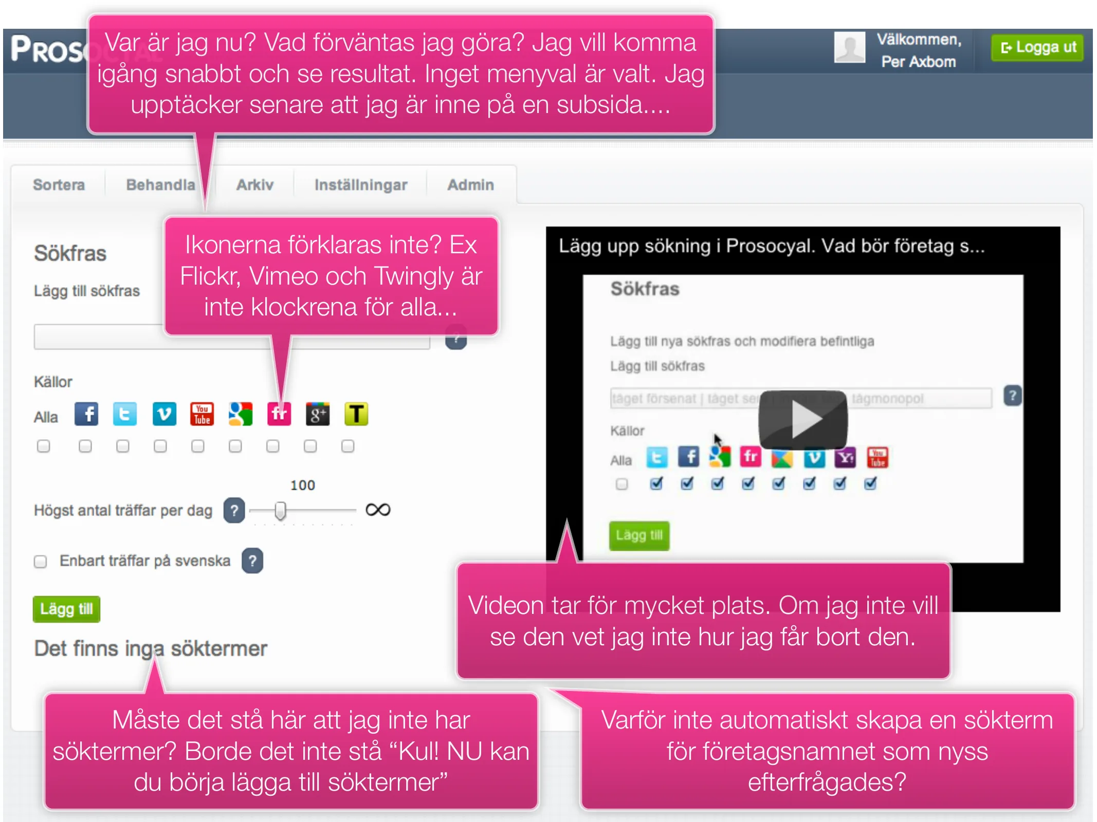
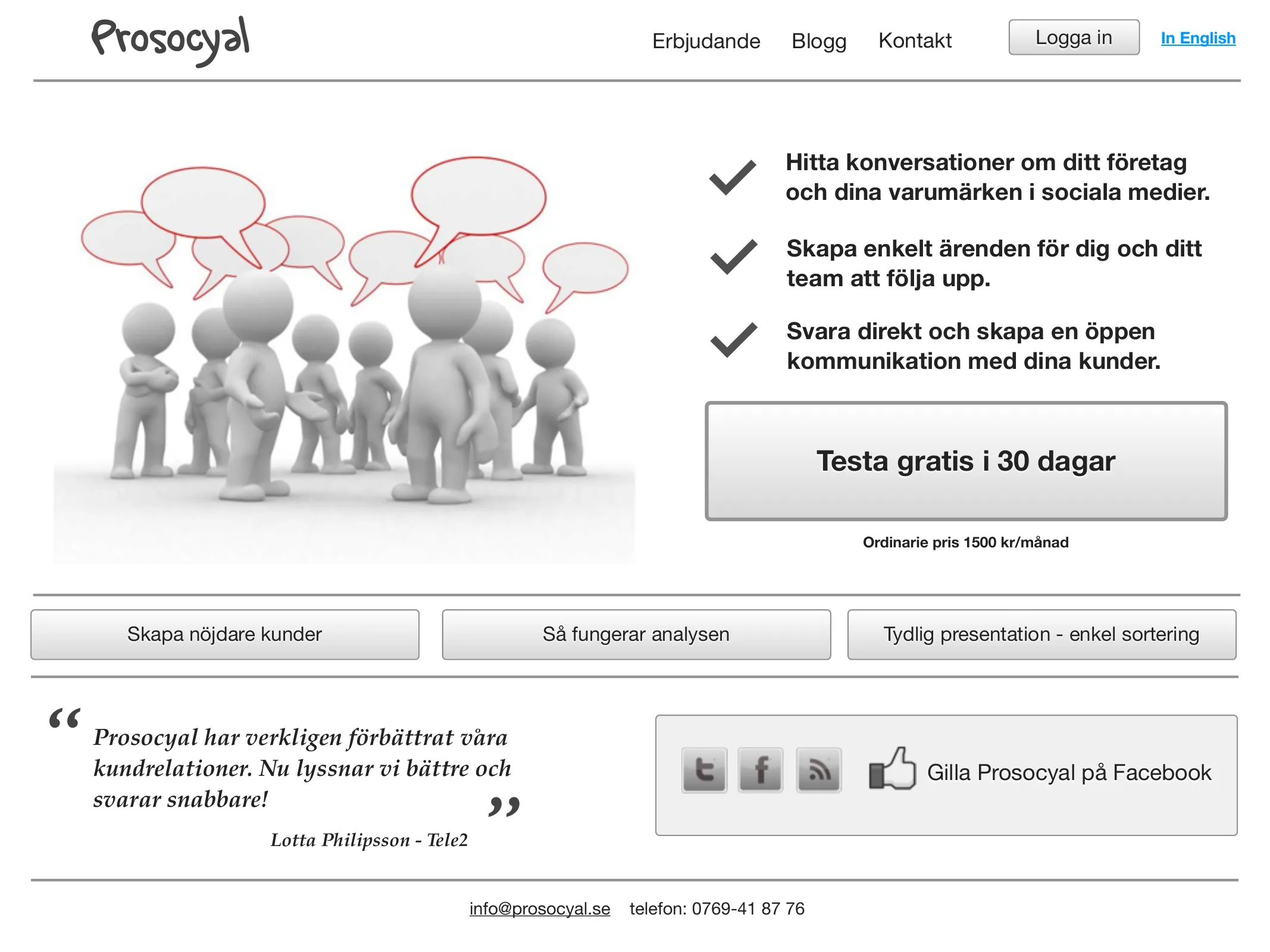
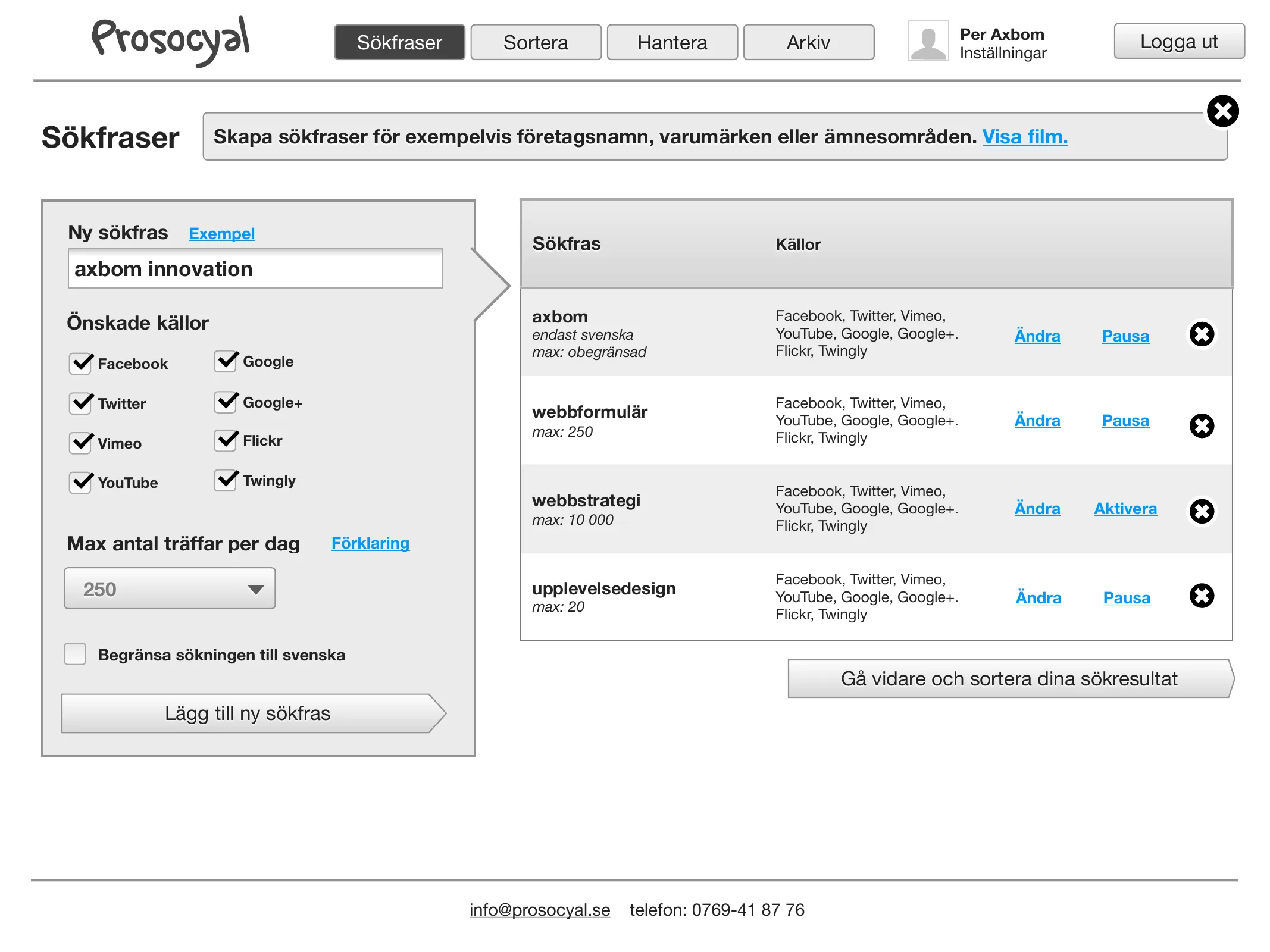
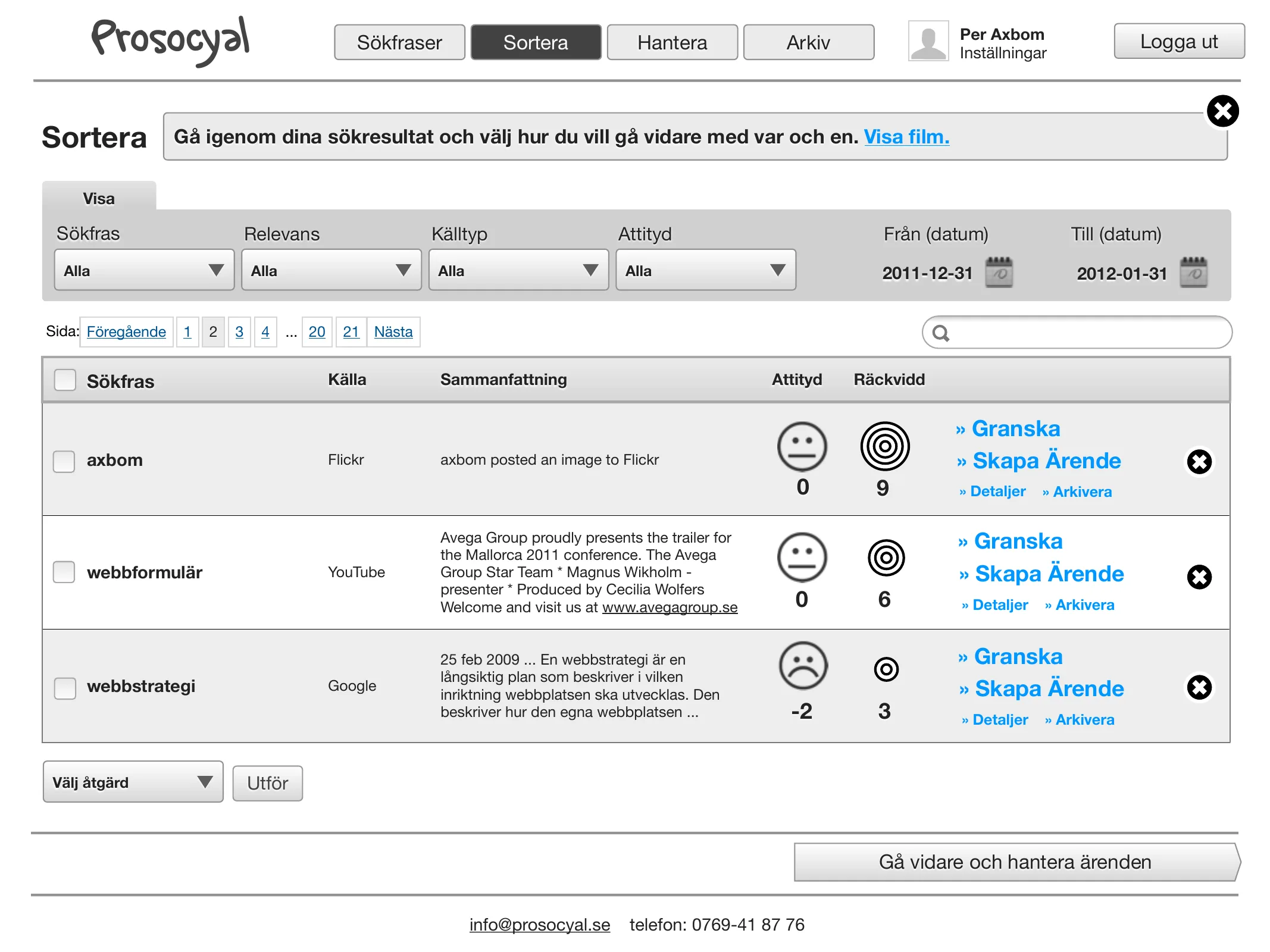
Expert review, new interaction design and an action plan for Prosocyal, a web tool companies used to monitor and manage their social media.
Interaction design
UX research
Visual thinking & infographics
Testimonial
2012
“Over the past year Per Axbom has helped us develop services that make sure…
Over the past year Per Axbom has helped us develop services that make sure people who have been victims of crime get information about their rights. In this work Per has been not only knowledgeable and creative but also deeply committed. We are very happy with his work and warmly recommend him!
— Magnus Lindgren, Secretary General, Stiftelsen Tryggare Sverige
Ace your website. Awe your users. 7 steps to master UX.
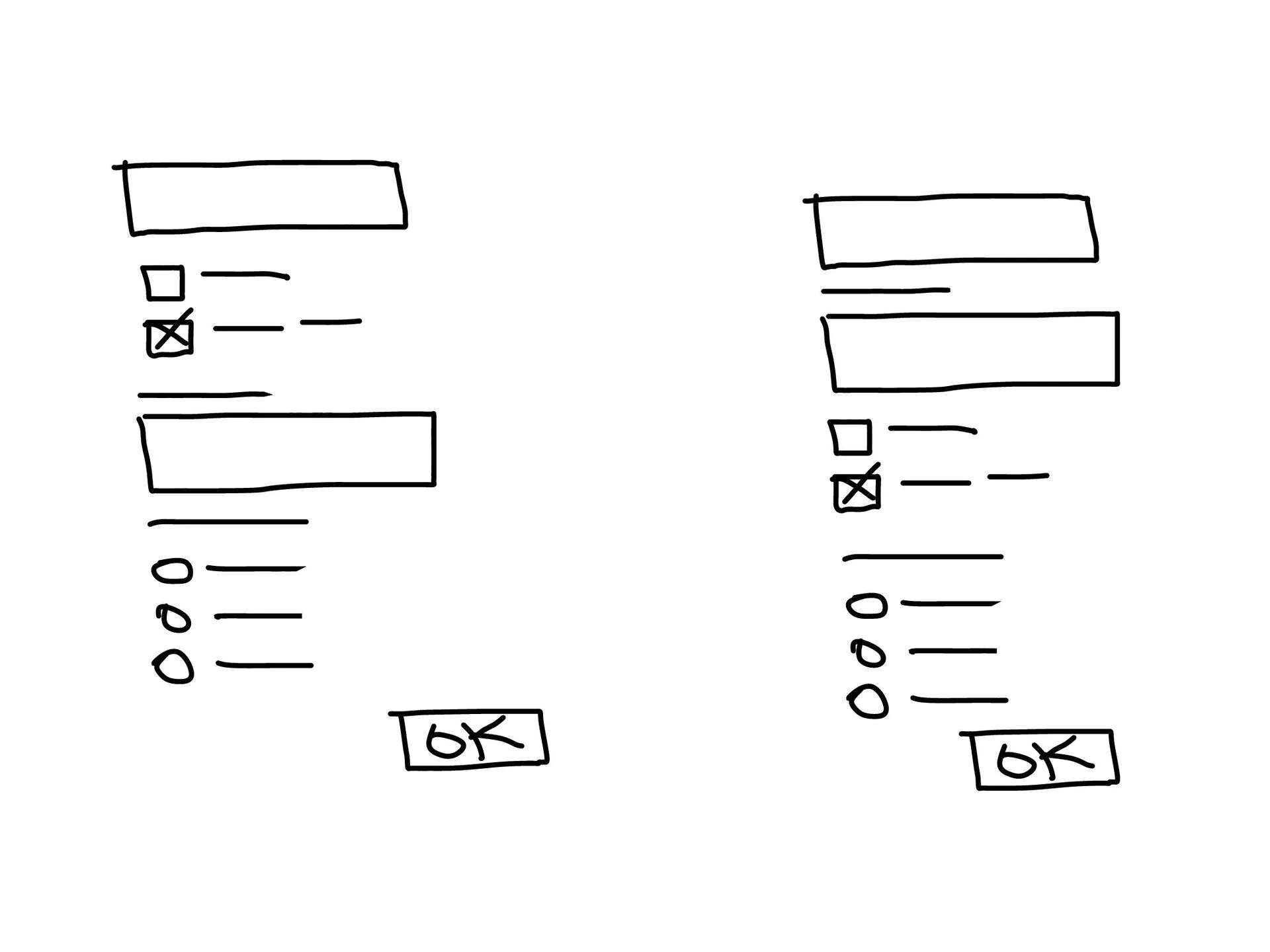
A talk on 16 April 2012 in the new track on usability and interaction design at Scandinavian Developer Conference: getting into the mindset of pleasing the user, so a digital service can become “the beginning of a beautiful friendship”. Built on the AceAwe experience model – six steps and one more – with plenty of web forms as examples.
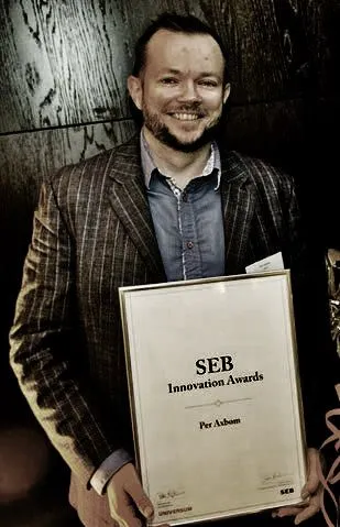
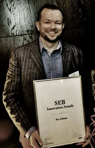
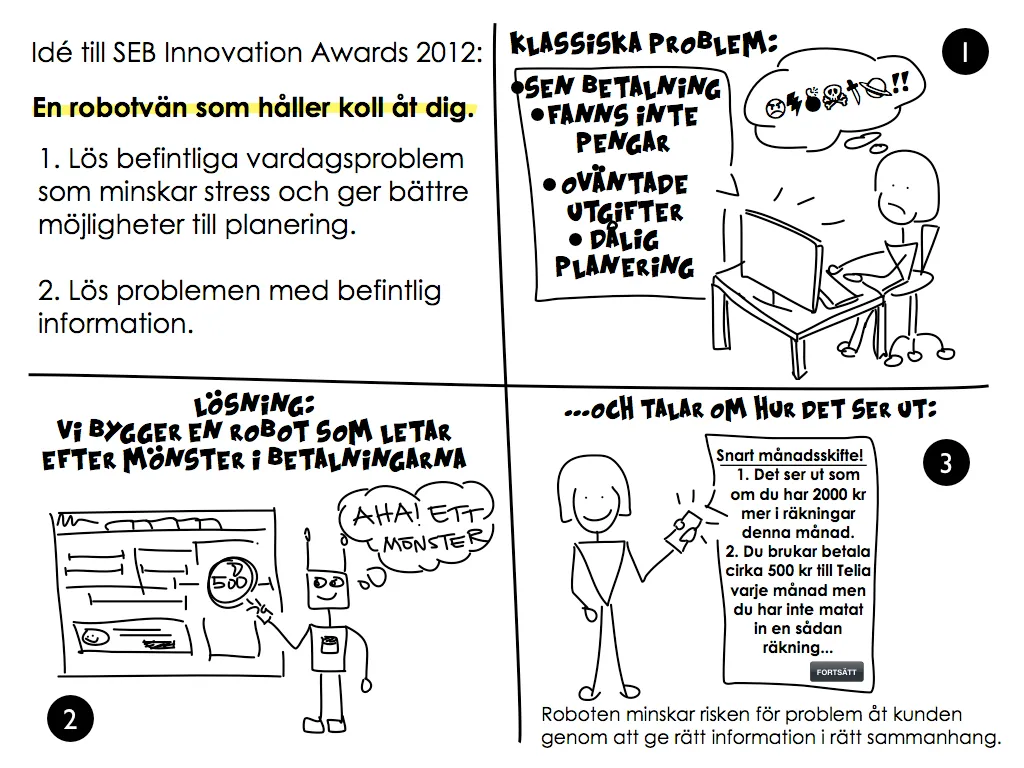
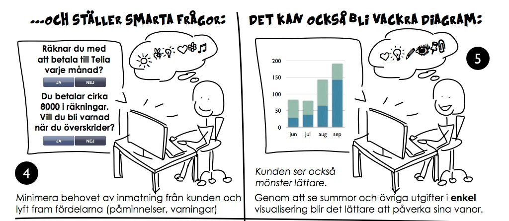
Won SEB Innovation Awards in October 2012 – the bank's yearly award since 2010 for an idea that can develop customer experience in banking. My idea: “a robot friend that keeps track for you” – solve everyday money problems that cause stress, using information the bank already has.
Visual thinking & infographics
Interaction design
Strategic guidance
Testimonial
2012
“I have engaged Per several times as a subject expert when our networks for…
I have engaged Per several times as a subject expert when our networks for owner-managers have taken on social media and communication strategy. Per’s strength is that he listens, reflects and shares his knowledge in a matter-of-fact way. That he does it with a humble manner makes him all the more credible in conveying value.
Inera and Stockholm County Council – as subcontractor to Valtech, Softronic, Omegapoint and HiQ
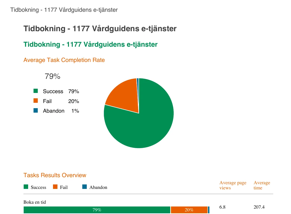
More than ten healthcare projects for 1177 and Inera, including the e-service for online support and treatment (Stöd och behandling), Högkostnadsskydd, Tidbokning and, during the covid pandemic, self-sampling (Egen provhantering).
Interaction design
UX research
Explainer video
Testimonial
2011
“Per Axbom has a rare and valuable combination: he can talk to techies in their…
Per Axbom has a rare and valuable combination: he can talk to techies in their own language while capturing, understanding, translating and conveying the communicators’ perspective. Worth its weight in gold! He is also curious about everything – a cool, decent and competent guy!
— Eva Stattin, Vattenfall AB and Universum Communication AB (has hired me several times)
Swedish Crime Victim Foundation (Stiftelsen Tryggare Sverige) · Stockholm
A new website, new social media channels and training for the team, followed by responsibility for all digital media during the Almedalen political week.
Strategic guidance
Teaching
Writing
Testimonial
2011
“As a consultant, Axbom has brought key expertise to several web projects in…
As a consultant, Axbom has brought key expertise to several web projects in recent years. He has supported and guided development projects and acted as adviser on various web strategy questions.
Co-founder, producer and co-host of UX Podcast with James Royal-Lawson, 2011–2025. 339 episodes and more than 3 million downloads, with interviews with many of digital design’s most interesting minds.
Podcasting
Public speaking
Digital ethics
Testimonial
2011
“We hired Per to review our web structure and recommend improvements in…
We hired Per to review our web structure and recommend improvements in usability, navigation and clarity. Per was an enormously knowledgeable and efficient resource and delivered input of the very highest quality, which has been of the greatest value in our work for change.
Stockholm County Council and Inera – as subcontractor to Valtech, later Softronic
From 2011, via Valtech: a complete review of minavardkontakter.se – the e-services where people log in to contact their healthcare – as part of Virtuell Portal 2.0, the next version of 1177 Vårdguiden's e-services: the start page, booking appointments, logging in, and acting on someone else's behalf.
Interaction design
UX research
Workshops & facilitation
Testimonial
2011
“Easy and uncomplicated to do business with.
Easy and uncomplicated to do business with. Committed, reliable and conscientious. Creative, innovative and healthily questioning.
Hired as the external lecturer when Universum wanted to develop how the whole organization worked with search engine optimization and writing for the web: training for about 40 people, on site in Sweden and by video link to the other markets.
Shorter assignments from around the start of my own company, Axbom Innovation AB (founded 2010): expert reviews, interaction design, workshops and support when buying web services.
Stockholms universitet – through XLENT Consulting Group, then Axbom Innovation AB
Strategist and experience designer for the Faculty of Science, on its printed catalog and on recruiting new students through other channels: I mapped the whole journey of future science students, from fifth grade to admission, and turned it into a strategy and new digital services.
Svensk Byggtjänst – through XLENT, then Axbom Innovation AB
Adviser and subject expert, through my own company Axbom Innovation AB, in recurring workshops and working meetings, supporting web development projects and web strategy decisions.
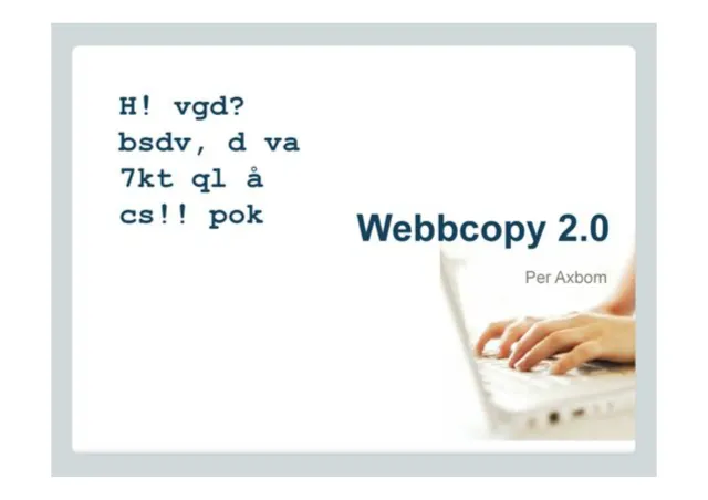
From 2010 to 2011 I was responsible for Webbcopy 2.0, a two-day course in writing for the web given twice a year by the training company Ability Partner. The course was in Swedish.
A new interface for the digital tool that most car salespeople in Sweden used to map customer needs and send out campaigns.
Interaction design
Workshops & facilitation
Strategic guidance
Testimonial
2010
“Per got “top marks” from the university’s web editors and social media editors…
Per got “top marks” from the university’s web editors and social media editors at an internal training within Stockholm University’s communication network.
— Marie Jackalin, Content Manager for su.se, Stockholm University
A fixed-price assignment in 2010: a new WordPress website connected to social media, with image publishing through Flickr – from setup and design to moving the content and the domain.
I planned, taught and examined a 7.5-credit course in digital communication, given in English to 120 students in the Media and Communication Science program. It was the first assignment for Axbom Innovation AB, the company I founded in 2010 – at the university where I took my own bachelor's degree in 1995.
Teaching
Testimonial
2010
“Per has a fantastic ability to think interactively.
Per has a fantastic ability to think interactively. To turn ideas into usable solutions online, and into modern ways of communicating through the noise.
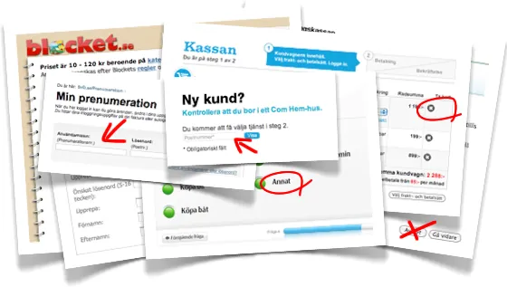
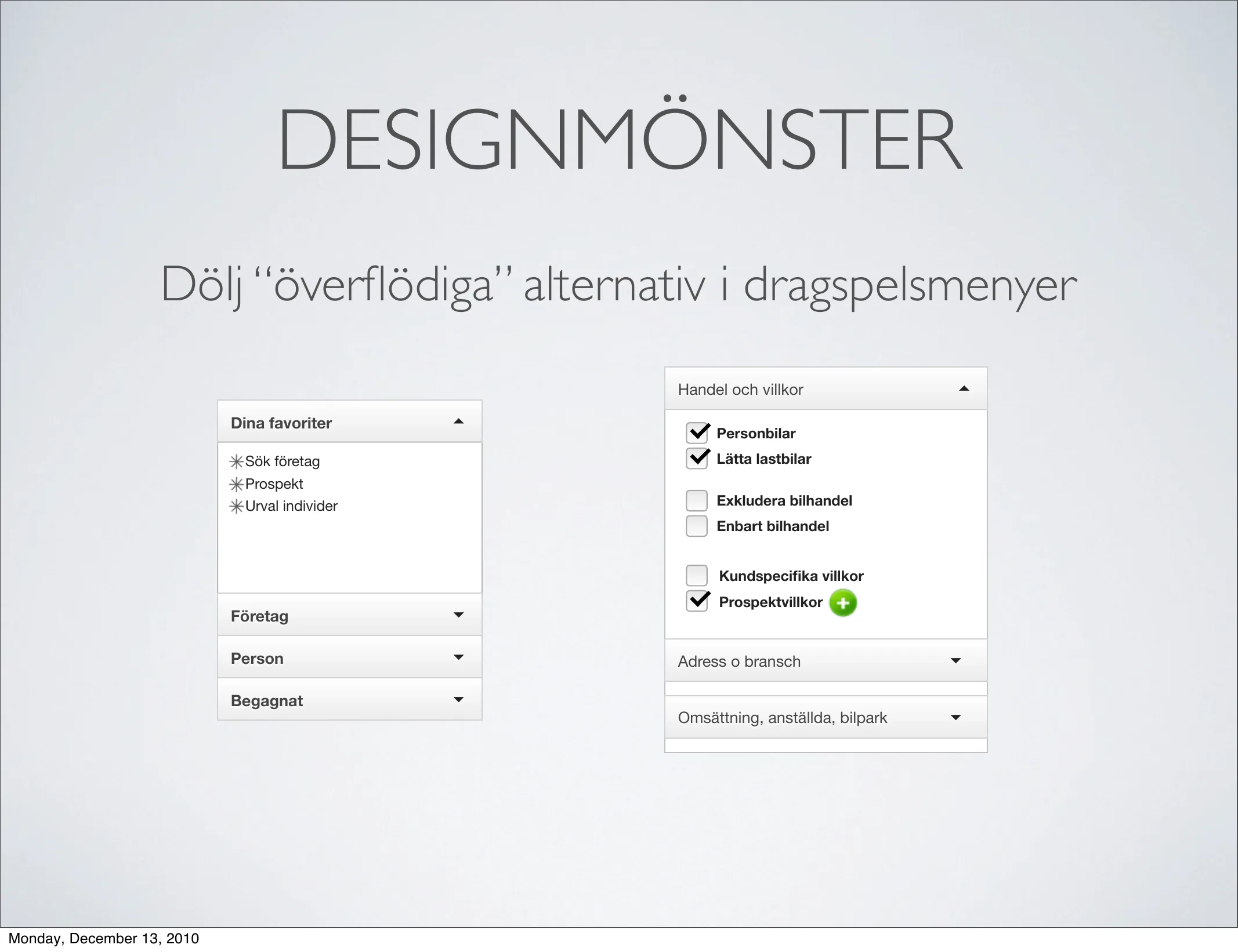
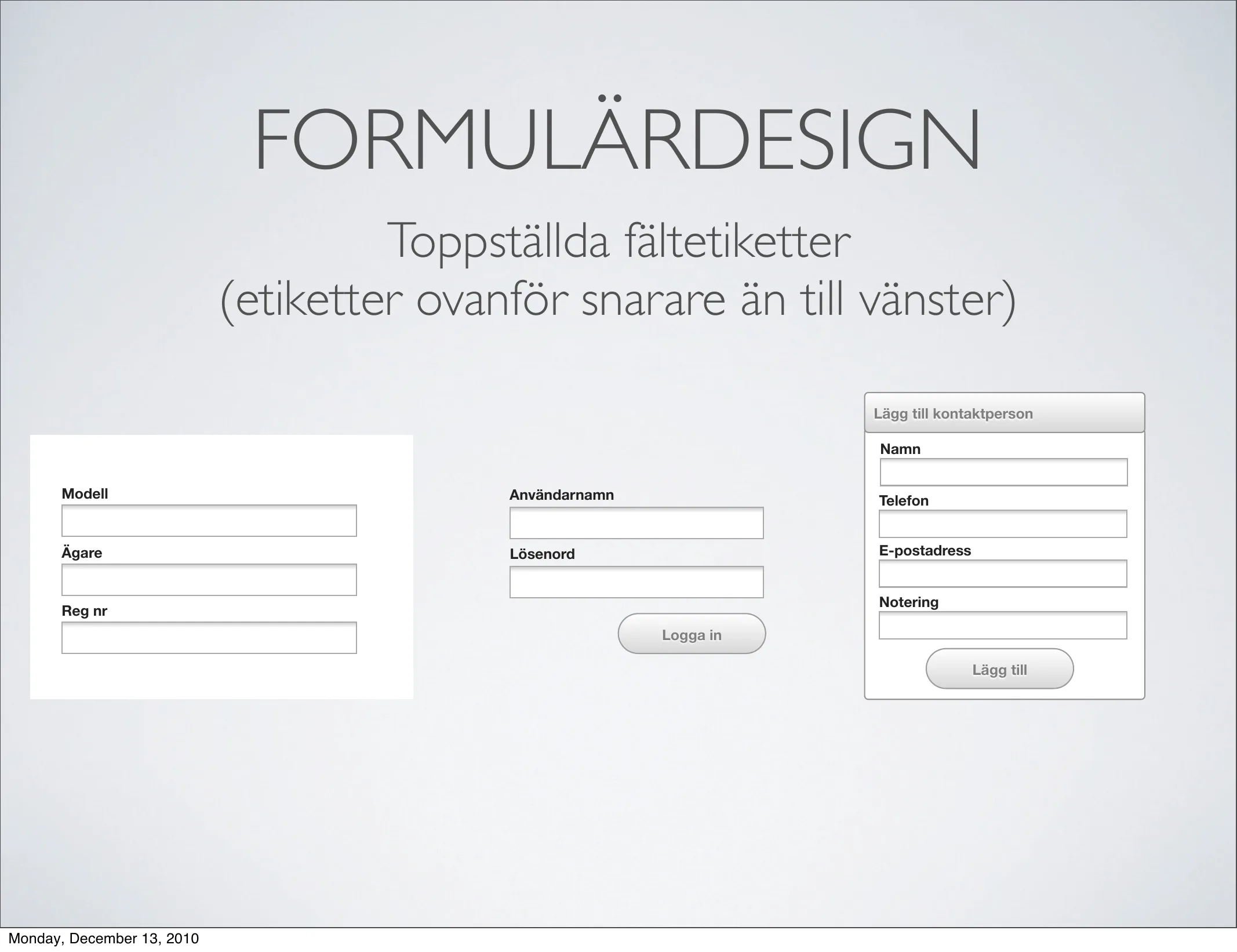
Around 2009–2012 web forms were one of my specialities: the part of a website where a visitor goes from window-shopping to actually doing something – buying, booking, getting in touch. I wrote about them, redesigned them and gave talks on how to design forms so more people fill them in and send them.
My second podcast (2009), in Swedish: every Friday, a short interview with a topical, exciting person “in the bubble” – Swedish internet entrepreneurs, developers and thinkers. The follow-up to Webbtrender, and the step before UX Podcast.
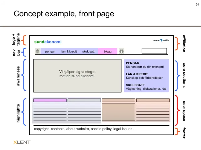
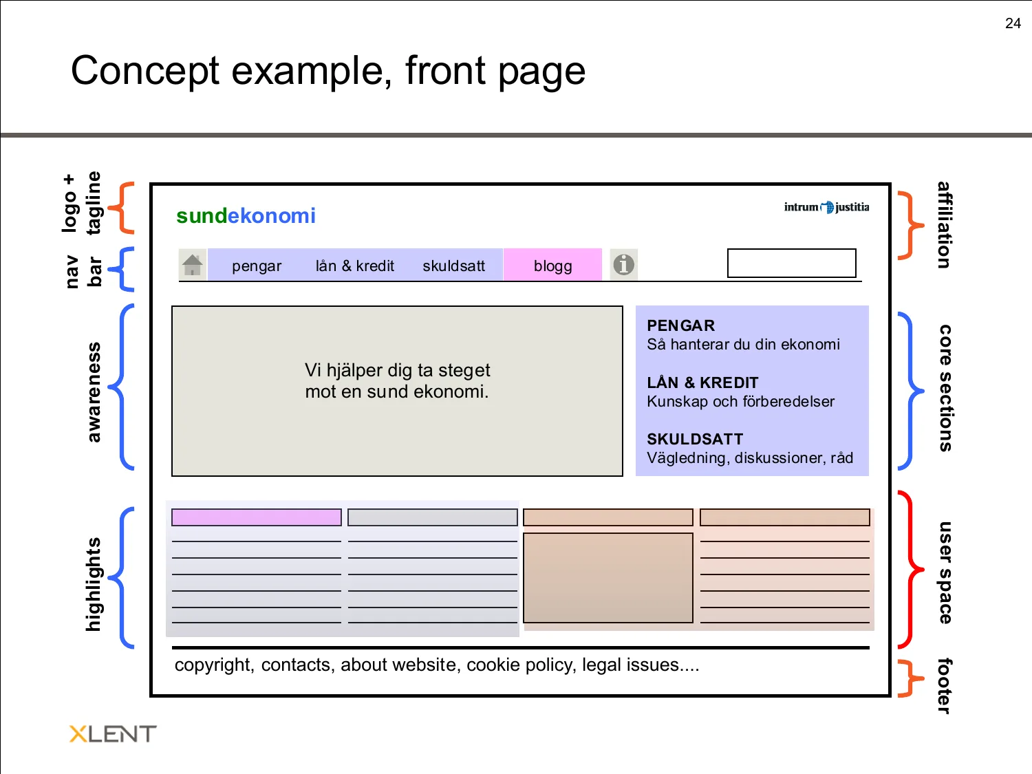
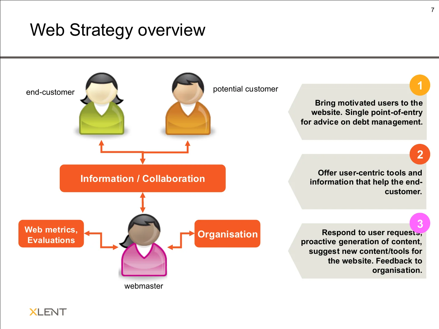
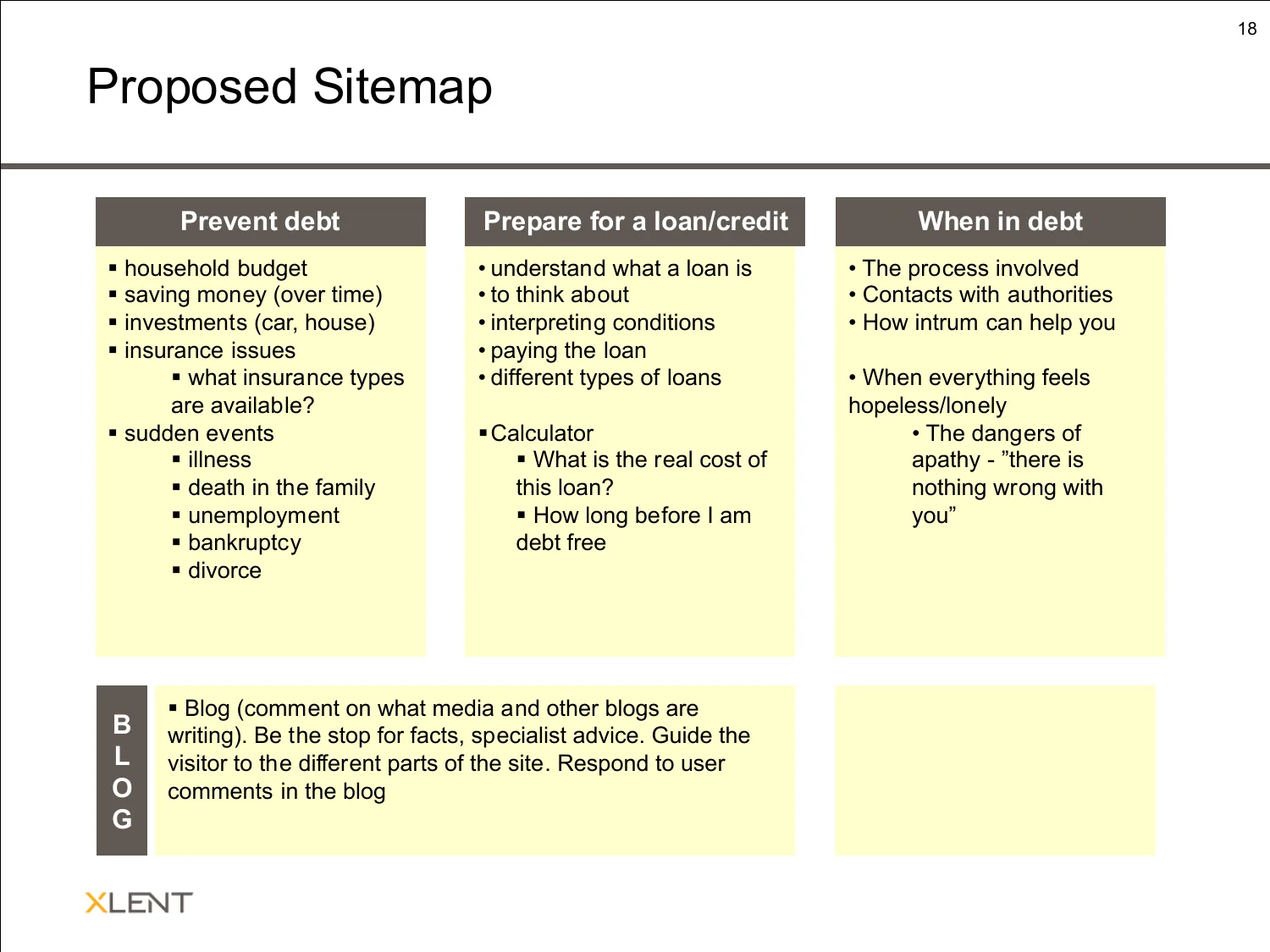
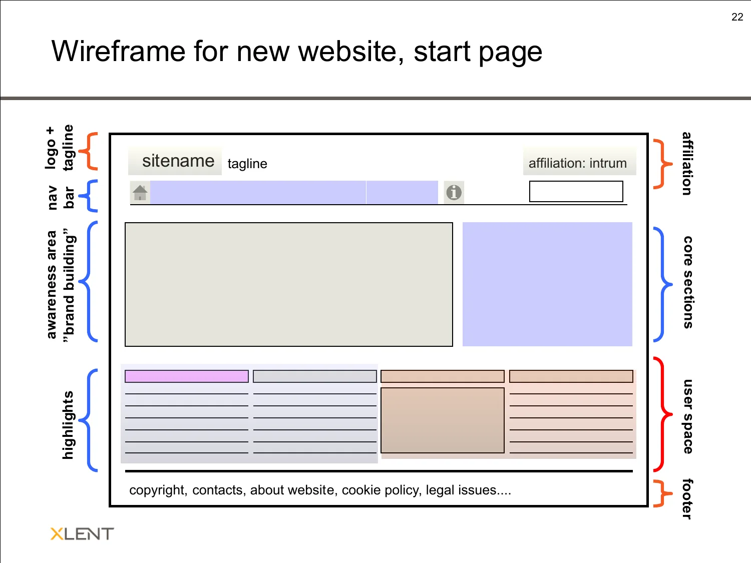
Most visitors to Intrum Justitia's Swedish website were people in debt. In 2008 I did the feasibility study for a new site just for them – about preventing debt, preparing for a loan and coping when in debt – and then supported the project until it launched as My Money (mymoney.intrum.se).
My first podcast (2007–2008), in Swedish: interviews with internet and design profiles about building better experiences on the web, produced and mixed by me.
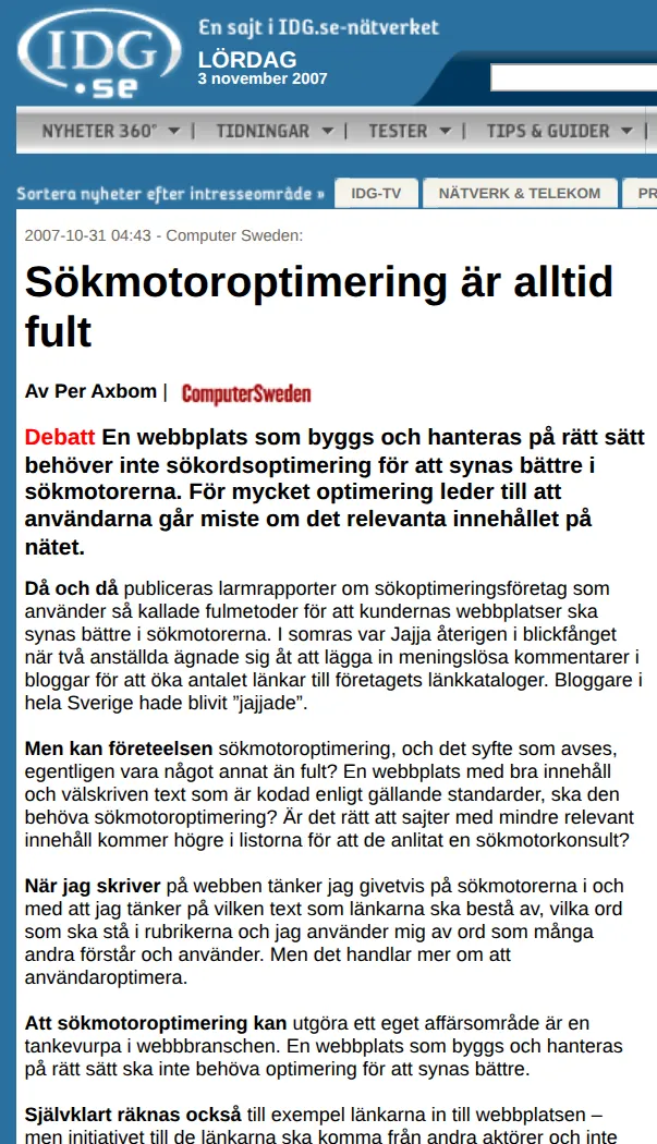
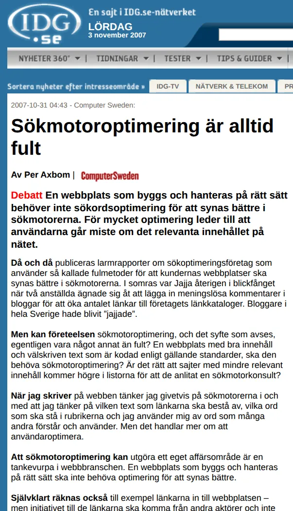
A debate article in the trade paper Computer Sweden, printed on page 2 on 31 October 2007: search engine optimization is ugly, because manipulating results stops search engines from giving people what is most relevant – and risks turning them into just another advertising channel. Usability and accessibility should come first.
XLENT Business Integration / XLENT Consulting Group · Stockholm
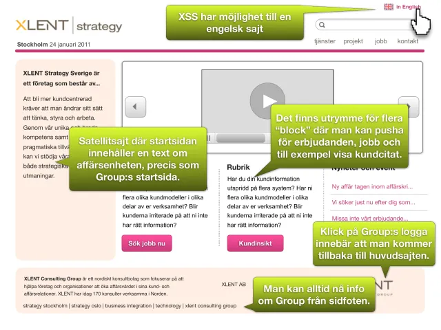
Consultant at XLENT from 2006 to 2010, then hired back as an independent consultant for the strategy and interaction design of the group’s new website (2011).
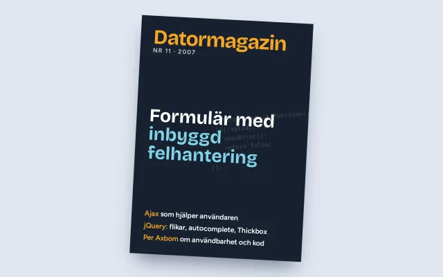
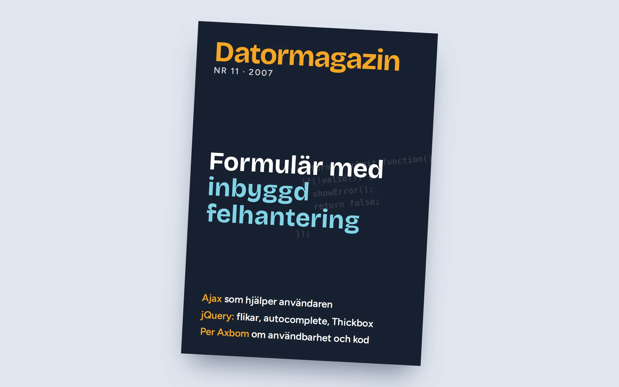
Monthly articles for Datormagazin, Sweden's largest magazine for computer users – the magazine I devoured every month as a young computer nerd in the 1980s. Each article described a current interactive Web 2.0 phenomenon and how to apply it, complete with code examples, and put the Ajax solution in a context that mattered for usability and accessibility.
Vattenfall, Group Communications – through Lumano, XLENT and Axbom Innovation AB · Stockholm
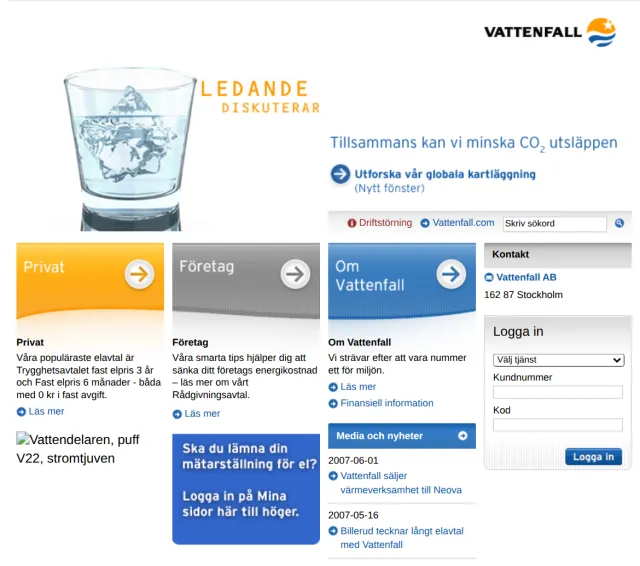
Five years with one of Europe’s largest energy companies: usability and accessibility for vattenfall.com and vattenfall.se, then adviser to Group Communications on web strategy and social media.
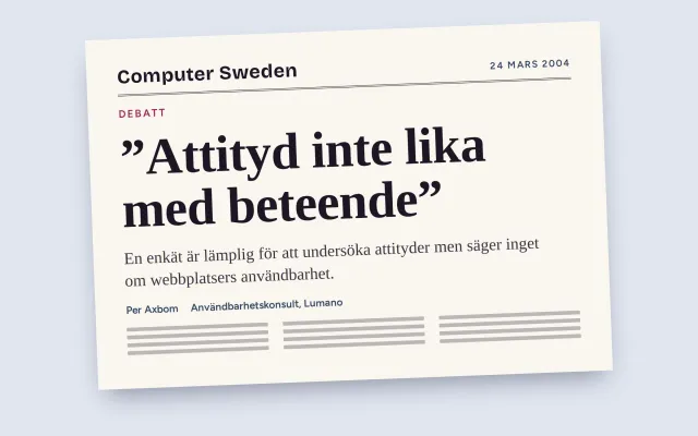
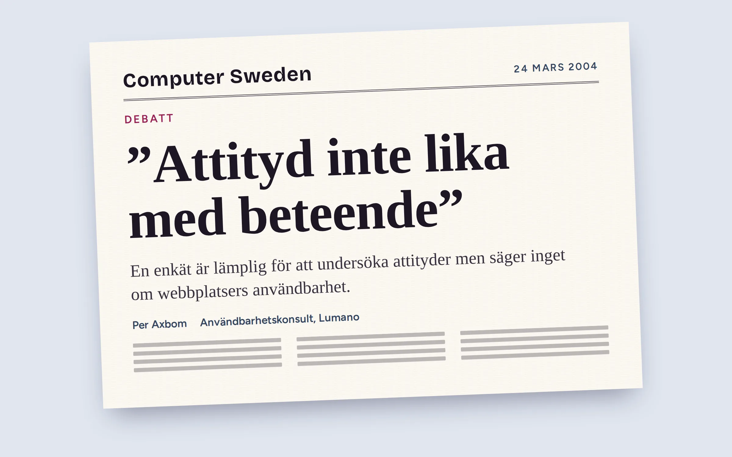
A debate article in Computer Sweden on 24 March 2004: a web survey is good for finding out about attitudes, but says nothing about how usable a website is. When I watched people use a web service, what they said and what they did were often two different things.
Storstockholms Lokaltrafik (SL), through Lumano · Stockholm
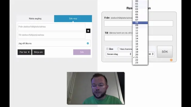
Interaction design of Stockholm public transport’s online journey planner, and interaction design and coding of the web-based planner used by customer service.
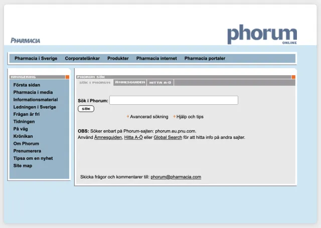
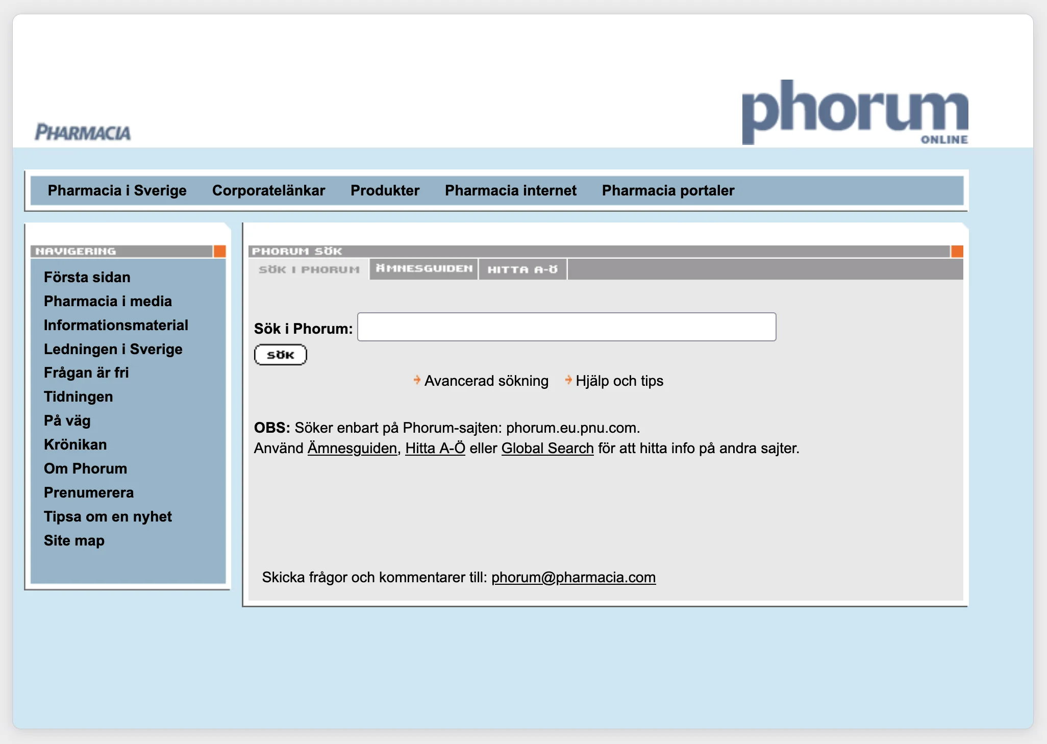
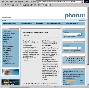
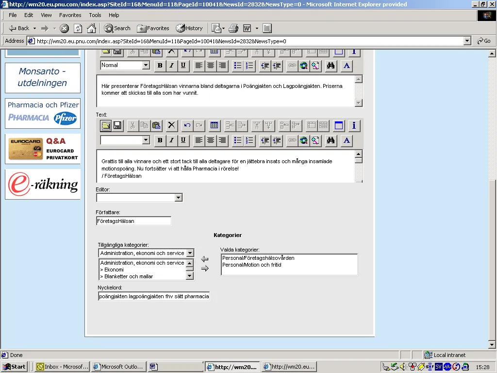
Pharmacia's Swedish operations brought their printed and digital internal channels together in one shared information system, Phorum Cross Media. Together with the client, Lumano helped formulate the project, then start, staff, run and evaluate it.
Ericsson Data and Ericsson Business Consulting · Stockholm
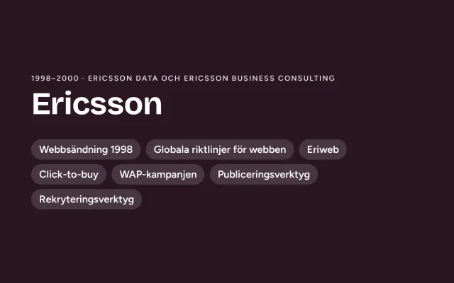
I started as a web designer at Ericsson in 1998: early web work inside the company, including the first time Ericsson streamed its press conference live over the internet.
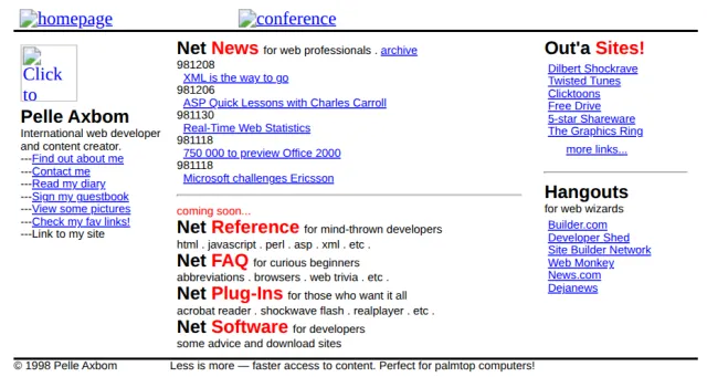
My blog and newsletter on the human impact of tech, with essays on digital ethics, UX, accessibility and the real-world consequences of design decisions. I started writing online in diary form in 1997, a few years before the word “blog” was coined. Today I publish in English (axbom.com) and Swedish (axbom.se), with nearly 1,000 posts between them.
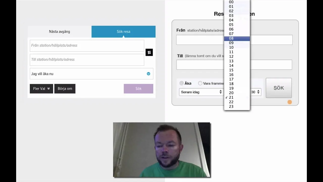
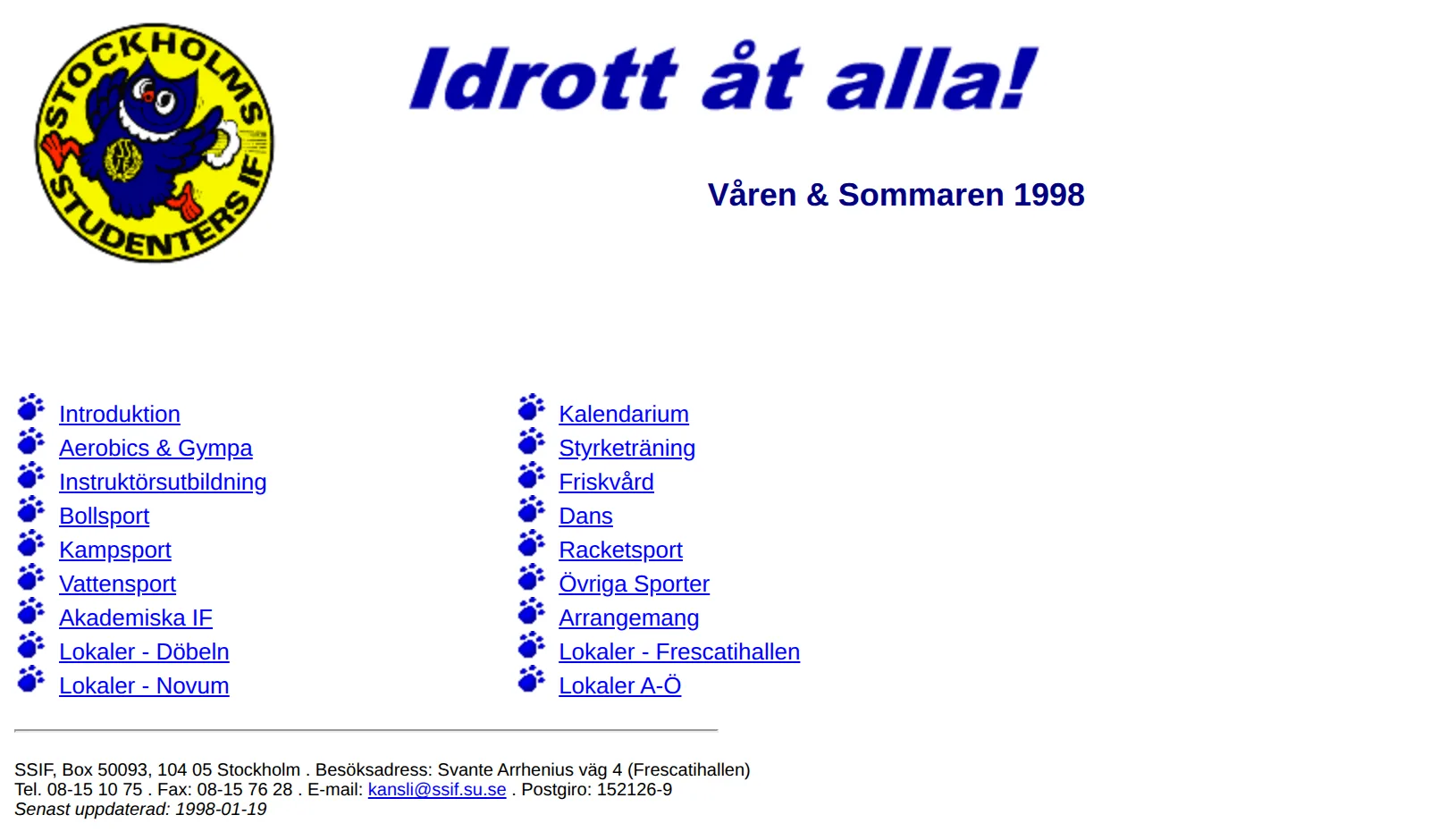
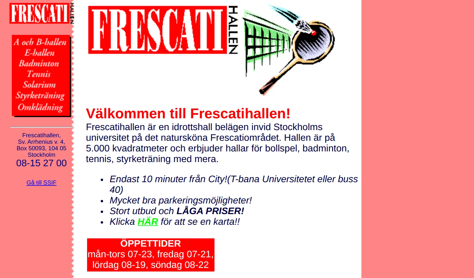
I built the first website for Stockholms Studenters Idrottsförening, the sports association for students in the Stockholm area – on ssif.su.se, with information for 30,000 students, from registering the address to building contact forms and training the people who would publish.
Own business, alongside my jobs as information officer at the Stockholm University student union and at SSIF
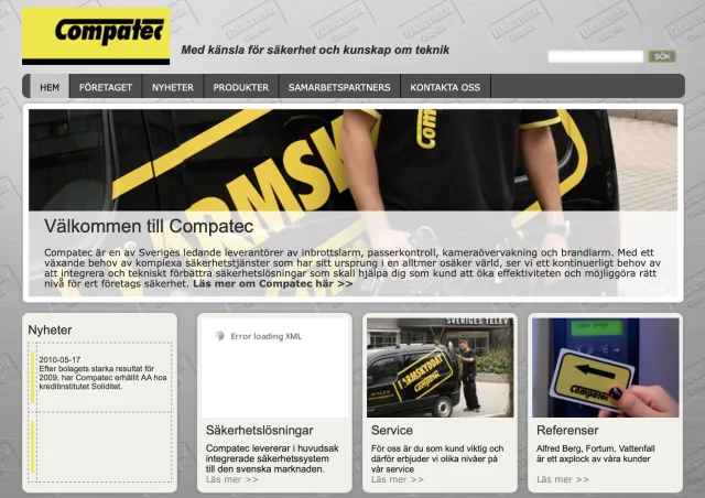
Where it started: a small side business building web pages. Three clients – among them a travel agency and Compatec – whom I helped put their brochure material online.
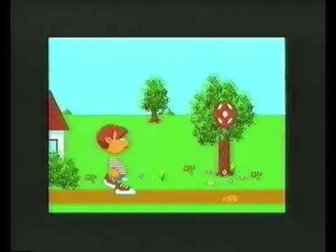
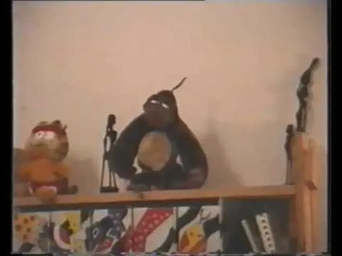
Not work, but a glimpse of how early computers, animation and communication caught my interest: three short films I made as a teenager in 1988 – a stop-motion film starring a stuffed gorilla, and two animations drawn on my Atari 600XL home computer.
Explainer video
Visual thinking & infographics
Nothing matches these filters. Try removing a skill or clearing the search.
An animated explainer film (in Swedish, 2:50) for Acceptus' service e-Brev: healthcare providers send patients' appointment letters digitally, straight from the TakeCare medical records system, via Kivra. Patients who don't use Kivra get the letter as ordinary post, without anyone having to do anything extra. First version 2020, updated 2024.
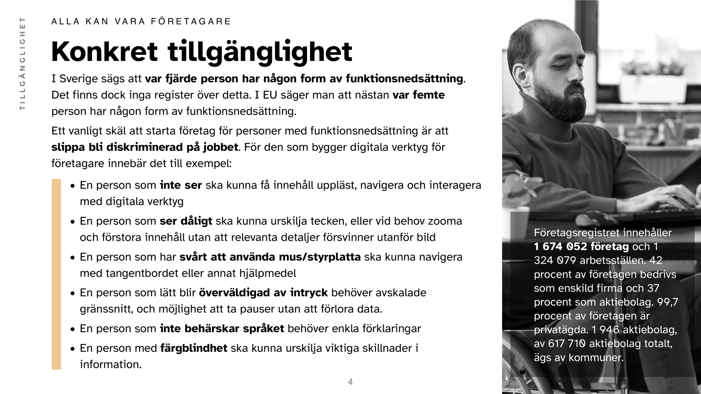
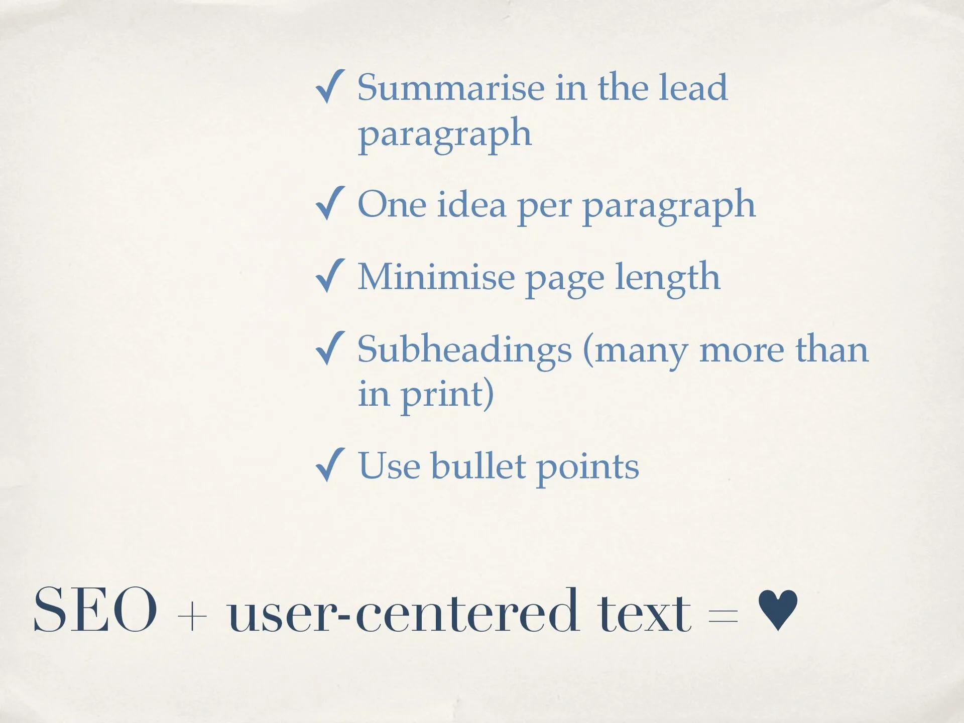
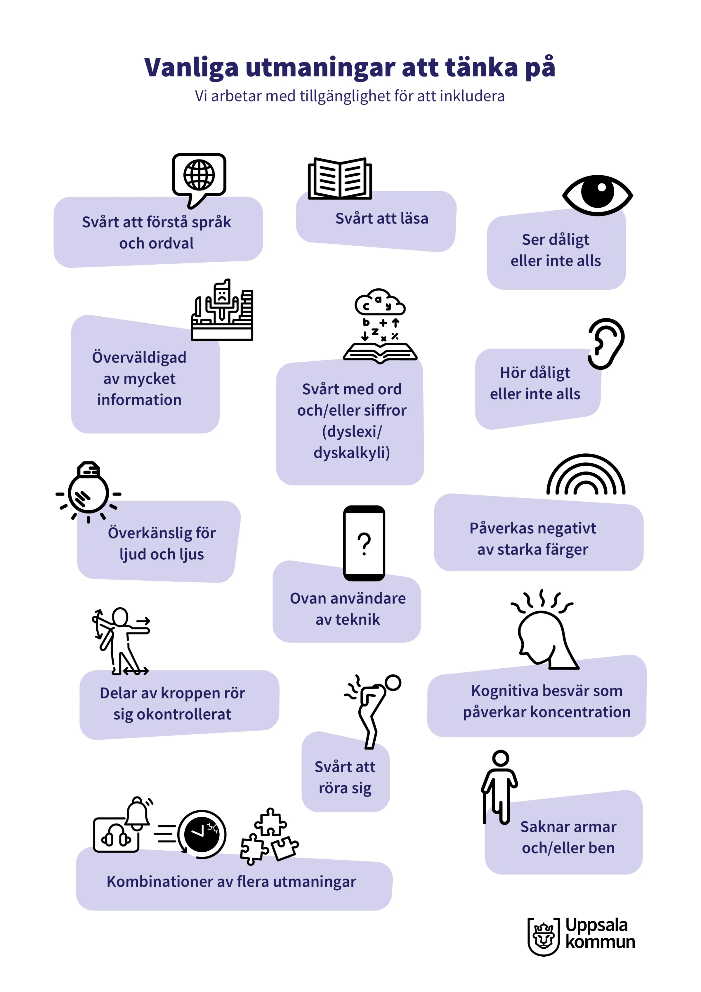
View larger: Slide: Concrete accessibility (in Swedish)What accessibility means for people who build digital tools for business owners: someone who can't see must be able to have content read aloud and navigate; someone with low vision must be able to zoom without losing details; someone who can't use a mouse must be able to use the keyboard; someone easily overwhelmed needs calm interfaces and pauses without losing data; plain explanations; and differences that don't rely on color alone. With a photo of a man in a wheelchair working at a computer.
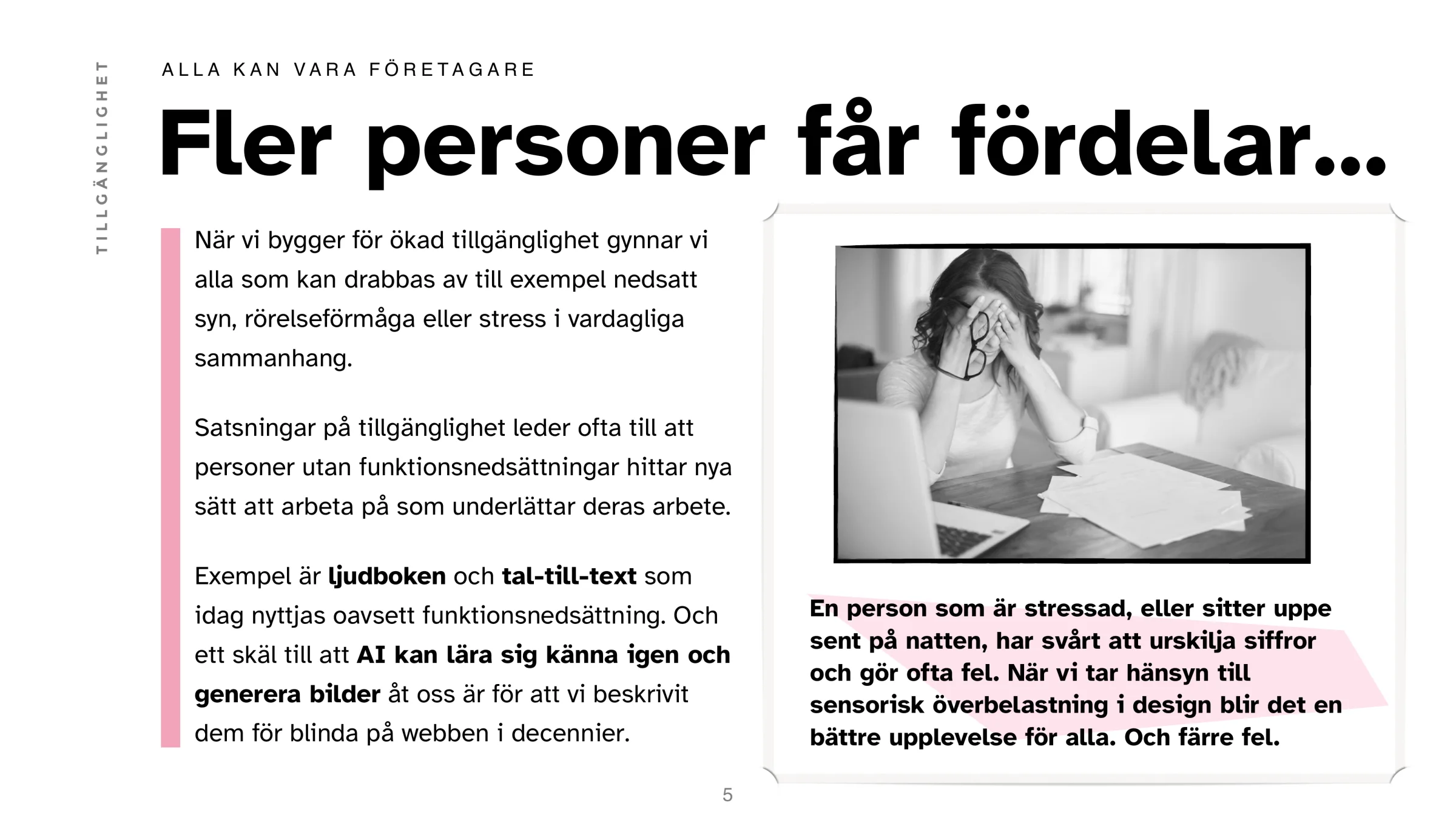
View larger: Slide: More people benefit (in Swedish)Building for accessibility helps everyone affected by, for example, poor sight, limited mobility or stress – audiobooks and speech-to-text are used by everyone today. With a photo of a stressed woman at a laptop: someone stressed or up late struggles to tell numbers apart and makes mistakes; designing for sensory overload gives a better experience for all, and fewer errors.
The company was aware of digital accessibility, but it wasn't yet a capability built into its services as part of everyday work processes. Together with Ambition Group, we proposed four steps on “the road to improved digital accessibility”. Step 1, an initial review, was to provide a basis for improvements and build awareness of strengths and weaknesses that would help adjust future ways of working.
Read more
A review guide and checklist based on the characteristics of the company's products, the criteria in the European Accessibility Act, and the insights from the reviews themselves.
Reviews of a selection of existing products and services, to get concrete examples of challenges and areas for improvement.
An action plan based on the results, with recommendations for next steps and a suggested order of priority.
Coaching the team: going through the findings together, helping them use accessibility review tools, and planning their own accessibility reviews.
The aim was to meet the coming accessibility requirements and future shifts in technology with processes already in place – and to reach more people.
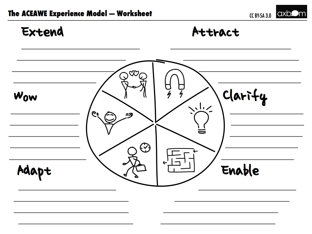
View larger: The AceAwe worksheetThe ACEAWE worksheet: a circle in six segments – Attract, Clarify, Enable, Adapt, Wow and Extend – each with a small drawing and lines to write on.
An experience model for designing digital services in a holistic, structured way – by truly helping the people you want to reach. AceAwe (“Ace your service, awe your users”) describes the whole experience as a circle in six steps: Attract, Clarify, Enable, Adapt, Wow and Extend.
Read more
I had used versions of the model in workshops and presentations for more than two years before sharing it on my blog in January 2013.
A series of blog posts, one per step, became a free e-book in Swedish and English in October 2013; later also sold as a Kindle e-book.
From the foreword: people trust their intuition when they can't be bothered to read all the information, make poor decisions when they're emotional – and want to buy from you because you're nice and also like cats.
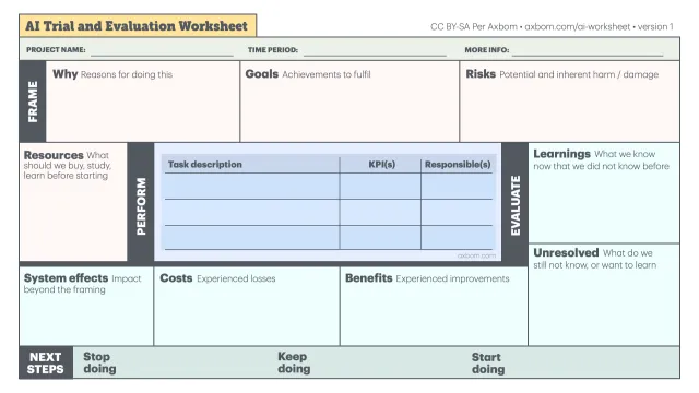
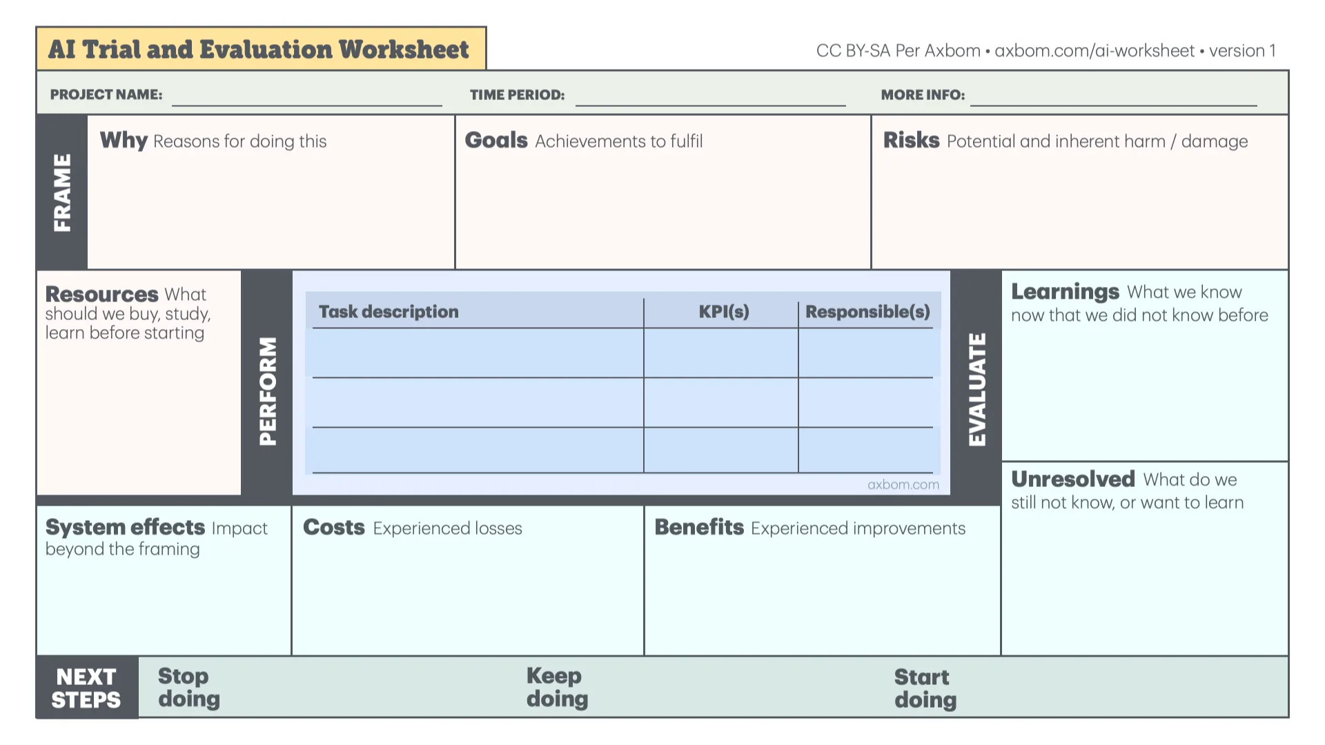
Comes with a free worksheet template (CC BY-SA) for using the model in your own projects.
A poster answering the claim that AI is “just a tool”, no different from a hammer. Nine harms of generative AI and deep learning, shown as a hammer you would never buy. The page explains every topic and has the poster as PNG and PDF. Free to use under CC BY-SA.
Read more
Made in response to a common argument in AI ethics discussions: “It’s really no different from a hammer.”
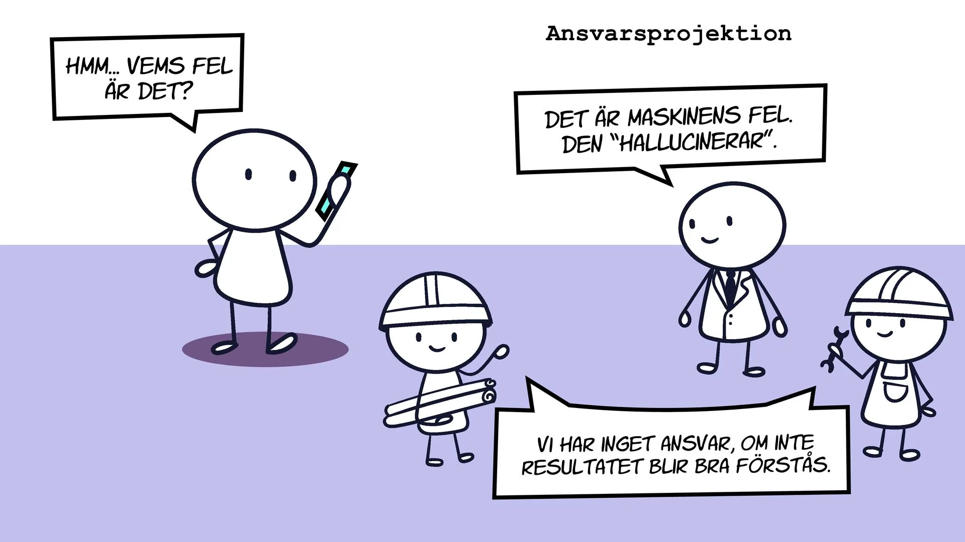
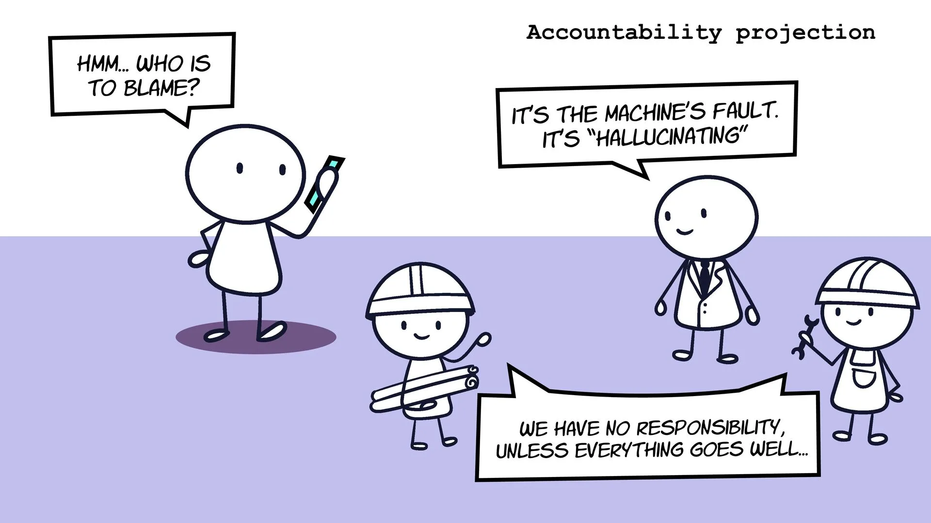
Nine topics: obscured data theft, bias and injustice, carbon cost, monoculture and power concentration, invisible decision-making, accountability projection, jerry-building (misinformation), data and privacy breaches, and moderator trauma.
Mainly about generative AI and deep learning, the technologies getting the most attention in 2023.
Every topic is explained on the page and connects to The Elements of AI Ethics.
“Steal it, share it, print it and use it where you see fit.” It has also been translated into German.
A diagram showing the relationships between everyone involved in developing and using AI: who finances the systems, who builds and feeds them, who regulates them, and who benefits or suffers. Something to point at in discussions. The page explains every group and has the diagram as PDF. Free to use under CC BY-SA.
Read more
Eleven groups, from incentives (financial backers, governments) and construction (owners, engineers, data suppliers) to use (procurers, beneficiaries, sufferers).
Makes the hidden people visible: creators whose work is taken, classification workers, and “the forgotten”, all the human knowledge that never makes it into training.
Shows misuse (trolls, deceivers, influence operators) alongside regulation and the people working for human rights, climate and sustainability.
New data and social influence: how everyday use feeds text, images, sound and biometrics back into AI, and how it can affect values and the rule of law.
Helps you ask the right questions, leading to better choices for you and your organization. Also in Swedish.
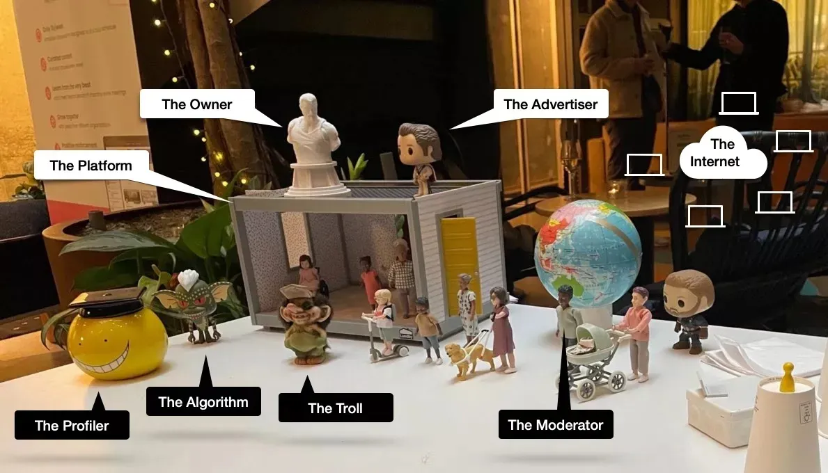
View larger: Photo: Pia LöfvingPer's stage setup: a small dollhouse with arrows pointing to the actors – The Platform (the house), The Owner (a Greek statue), The Advertiser (an Evel Knievel figure), The Profiler (a mug), The Algorithm (Stripe from Gremlins), The Troll (a troll figure) and The Moderator (a doll).
A 15-minute talk at an Ambition Empower event in 2022, after I had left Facebook, Instagram, Twitter and LinkedIn: why I left algorithm-based social media, and how that works for a small business owner. Told with a dollhouse full of figures – and a Winnie-the-Pooh.
Read more
Caryn's story: a friend died, and she never saw his post from the hospital because the algorithm didn't rank it. What algorithms choose not to show us matters as much as what they show.
The current situation, acted out with a dollhouse: the Platform, the Owner, the Advertiser, the Profiler, the Algorithm, the Troll and the Moderator.
The tipping point: having to game the algorithm and care more about it than about the people you're trying to reach.
Asking “What would Pooh do?” – with a stuffed Pooh bear brought out on stage – and challenging the truth that no one can grow a business without the big platforms.
The alternative: my own domain since 1997, open-source publishing, federated social media, and no tracking of readers. “I'm not primarily moving away from something. I'm moving towards something. Towards wellbeing.”
Track leader for “Design Ethics = Good Business” in Ambition Empower, a year-long professional development program in bite-sized steps, from August 2021 to June 2024 – alongside Kim Goodwin, Susan Weinschenk and Chris Noessel, who led the other tracks.
Read more
Self-guided learning for members, averaging less than ten minutes a day, combined with regular live video sessions with the track leaders.
Managing ethical decision-making and leading with compassion: a safe space to recognize and discuss difficult choices, with practical tools for making them.
Digital ethics and accessibility, adapted continuously to the members' needs over three years.
What people said
Per doesn't shout, and he doesn't judge. Per is a problem solver, and a toolmaker. Instead of ranting, he continuously provides tips, tricks and tools that enable us to have those really difficult discussions, and make informed decisions.
— Johan Berndtsson, CEO of Ambition, announcing the track
Not work, but a glimpse of how early computers, animation and communication caught my interest: three short films I made as a teenager in 1988 – a stop-motion film starring a stuffed gorilla, and two animations drawn on my Atari 600XL home computer.
Read more
“The gorilla”: stop-motion, filmed frame by frame.
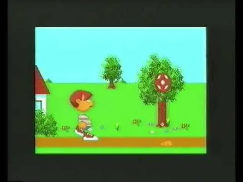
“Never-ending ball kick”: a boy, a tree and a ball that keeps coming back, animated on the Atari 600XL.
A short table tennis animation, also on the Atari.
My blog and newsletter on the human impact of tech, with essays on digital ethics, UX, accessibility and the real-world consequences of design decisions. I started writing online in diary form in 1997, a few years before the word “blog” was coined. Today I publish in English (axbom.com) and Swedish (axbom.se), with nearly 1,000 posts between them.
Read more
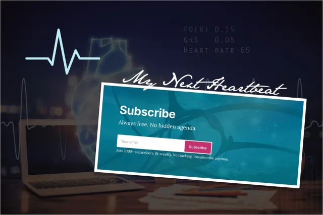
The newsletter goes out every other week: My Next Heartbeat in English, with 2,400+ subscribers, and Mitt nästa hjärtslag in Swedish, with 2,000+ subscribers.
Popular early on: “The difference between an interaction designer and a user experience designer” (2011).
A 2013 series on accessibility, “Koll på tillgänglighet”, grew into the free e-book and website Digital tillgänglighet (digitill.se), a Swedish introduction to WCAG.
Templates and models shared freely and widely used: from a 2009 mini guide to answering comments about your company online, via the Inclusive Panda (2018), to Explaining responsibility, impact and power in AI (2023).
No tracking, no cookies and no ads – only anonymous visitor statistics on my own domain: “A voice means infinitely more to me than a bar graph.”
Bought axbom.com in 1997 and added axbom.se in 2001.
What people said
I just want to say thank you for your insightful and important newsletter! Thank you for always striving for collective improvement. Your experience and knowledge is invaluable to someone like me, who is new to the industry.
— H.J., newsletter reader
I work in the field of medical and policing ethics. I’m struck by your deeply thoughtful, values-based and person-centered approach to digital/UX ethics. You’ve encouraged me to reflect on my own approach to working in the fields I do, and what sorts of ethics discourses we need.
— S.S., newsletter reader
I could not thank you enough for this newsletter. I feel you heard my thoughts and what has been sucking the living life out of me for the last 3 years. Beating the algorithm game.
Where it started: a small side business building web pages. Three clients – among them a travel agency and Compatec – whom I helped put their brochure material online.
Read more
Compatec came back fourteen years later: in 2010 they were one of the first clients of Axbom Innovation AB.
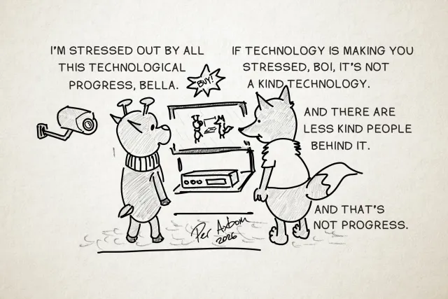
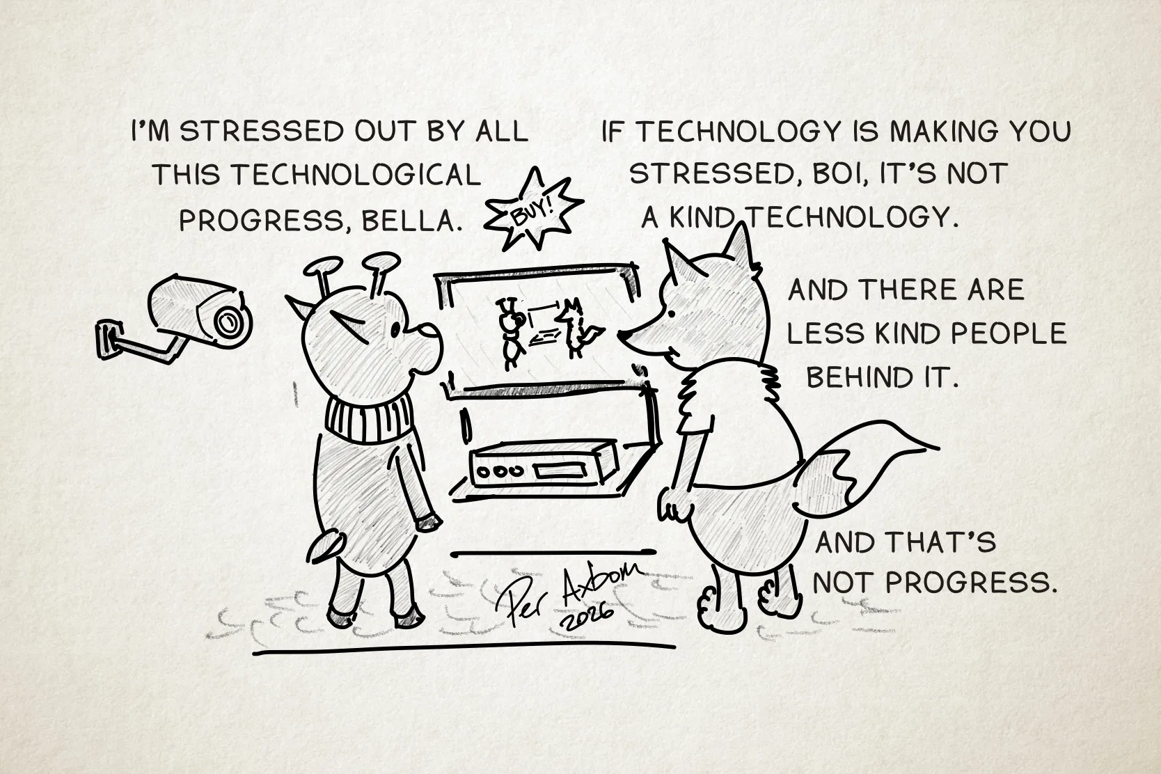
Progress. You keep using that word. I do not think it means what you think it means. Meet Bella & Boi.
Image description
A monochrome drawing of two figures (anthropomorphic animals), a deer and a fox, standing and looking at a TV and a rectangular device beneath it, like a VCR or DVD player. Above the TV hangs a star-shaped sign with the command "Buy!" On the TV screen, they see themselves in real time, standing there and watching the TV. The deer (named Boi) is wearing a neck warmer, and the fox (named Bella) is wearing a short-sleeved top. Behind the deer, to the left, is a surveillance camera.
Boi: I’m stressed out by all this technological progress, Bella.
Bella: If technology is making you stressed, Boi, it’s not a kind technology.
Bella (cont’d): And there are less kind people behind it.
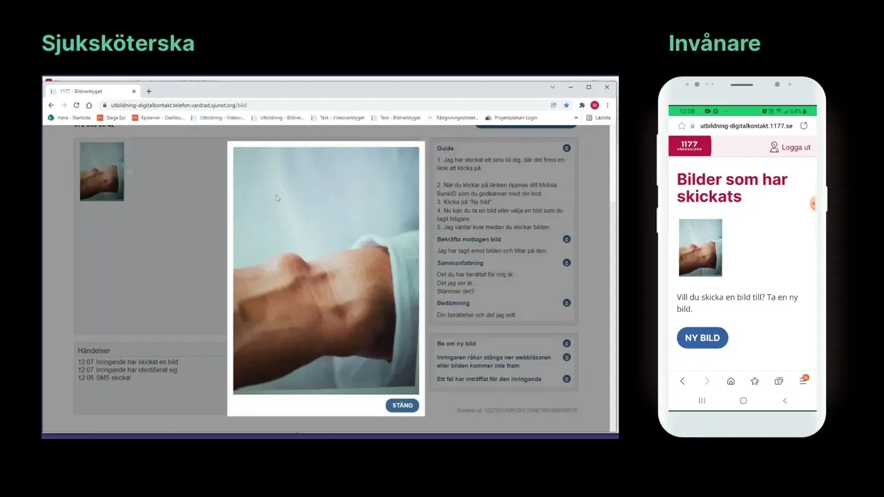
View larger: Still from the training film (in Swedish)The nurse's image tool on the left and the caller's phone on the right: the caller has sent a photo of their arm, the nurse views it next to a guide for the call.
Part of the program for first-line digital care (Första linjens digitala vård): letting nurses at 1177 Vårdguiden på telefon, the healthcare advice line, ask callers to send a photo or start a video call – straight from the call, with the caller logging in on their own phone.
Read more
A clickable prototype of both sides – the nurse's tool in the browser and the caller's view on the phone – used to show and test the idea early.
A film where I walk through the prototype on camera, explaining how images and video would work in the advice line (in Swedish, 10:44).
A training film for the advice-line staff on the image tool, showing the nurse's screen and the caller's phone side by side through a whole call (in Swedish, 9:43).
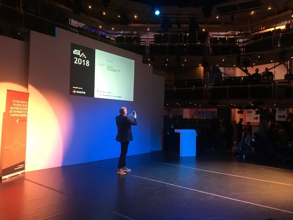
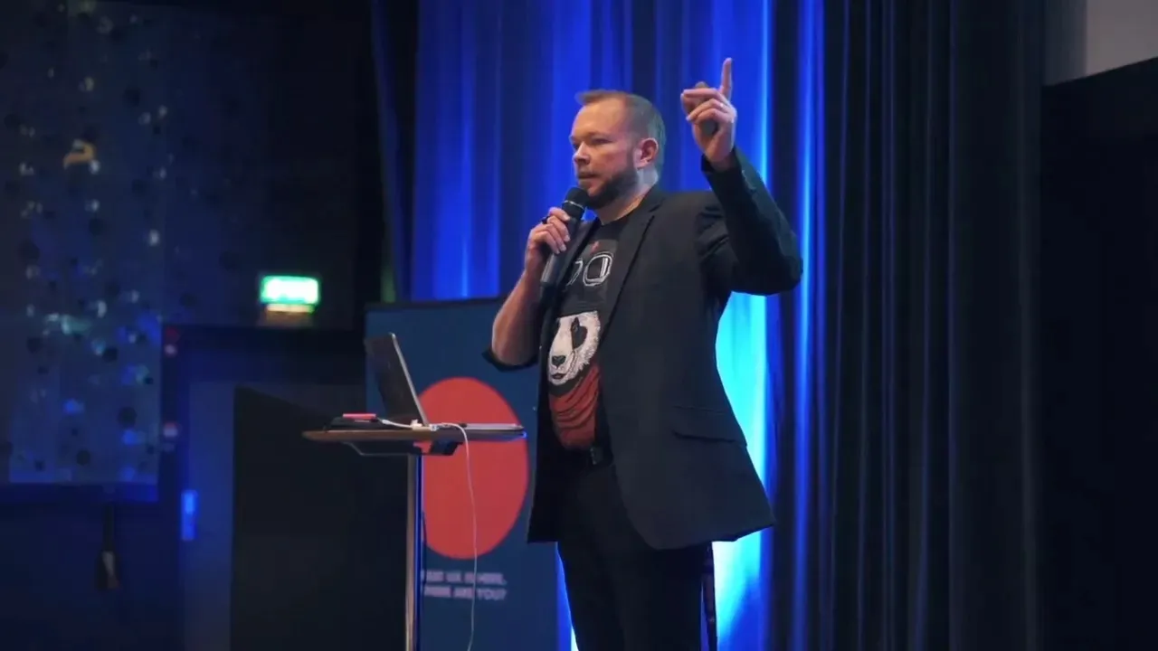
View larger: Photo: Katy ArnoldPer Axbom on stage taking a photo of the audience, with the Camp Digital 2018 slide behind him.
View larger: Photo: Sue KeoghPer Axbom pointing at the “Inclusive panda” slide: a diagram of included people, participants, non-participants, the excluded and the unwanted.
Talk on how designers can take responsibility for the negative impact of their work, by building a moral framework into the design process.
Read more
From usability to harm: how a friendly notification, triggered across a week, could raise stress for doctors responsible for patients at risk of suicide.
Negative impact comes in many forms: anxiety, misogyny and racism, worse mental and physical health, lost privacy, deception, loss of trust – even death.
A critical look at nudging and behavioral economics, used to influence decisions without a full grasp of the consequences.
Nextdoor’s work against racial profiling on its platform as an example of designing with a conscience.
What people said
Absolutely fantastic talk by @axbom at #CampDigital. Really thought provoking, and gives me hope that there are good people trying to make positive changes in the world.
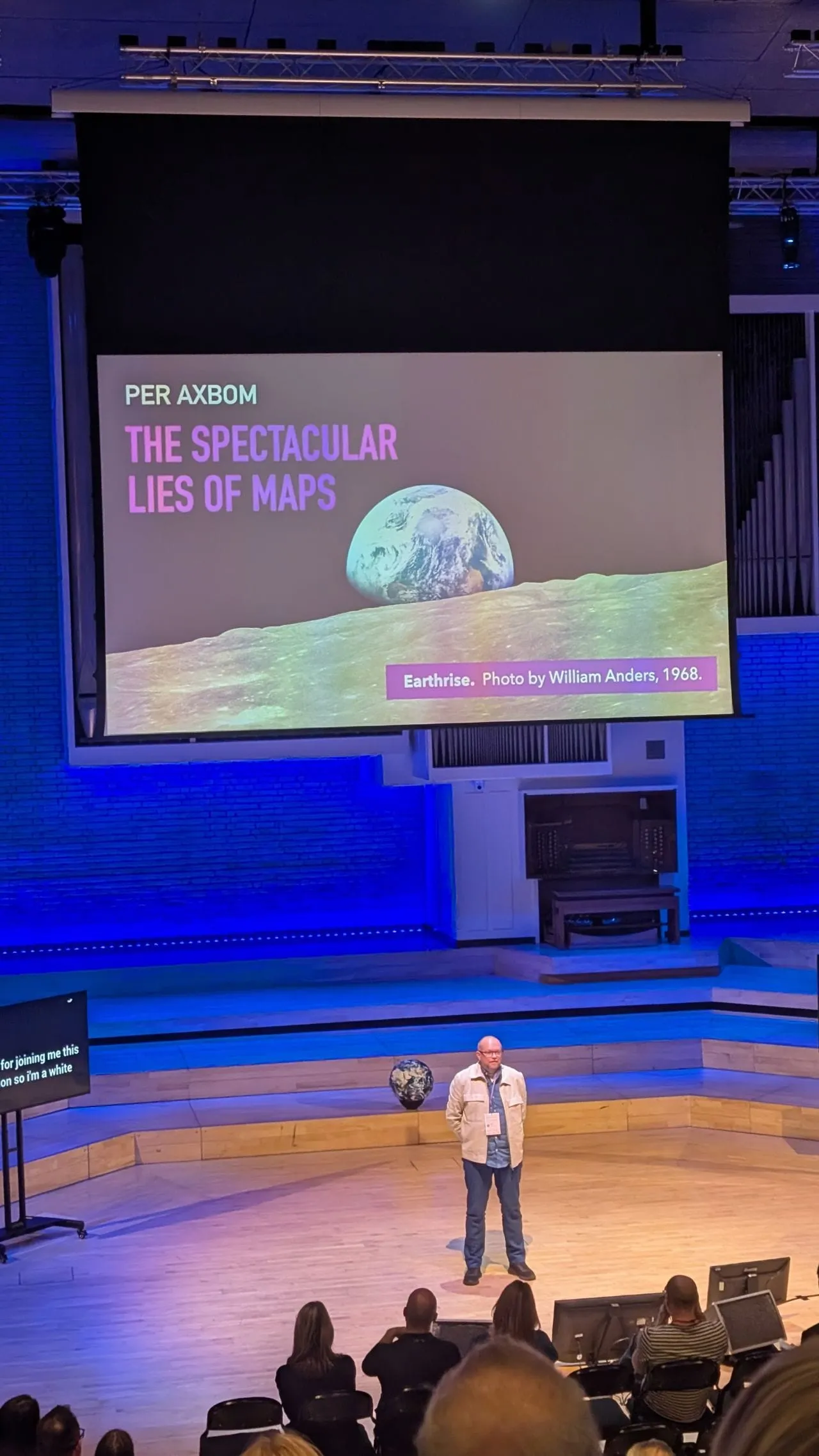
View larger: Photo: James WinstonePer Axbom on stage at Camp Digital 2025. The opening slide: The Spectacular Lies of Maps, with the Earthrise photo.
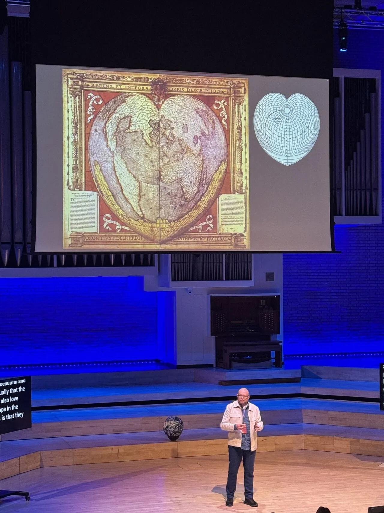
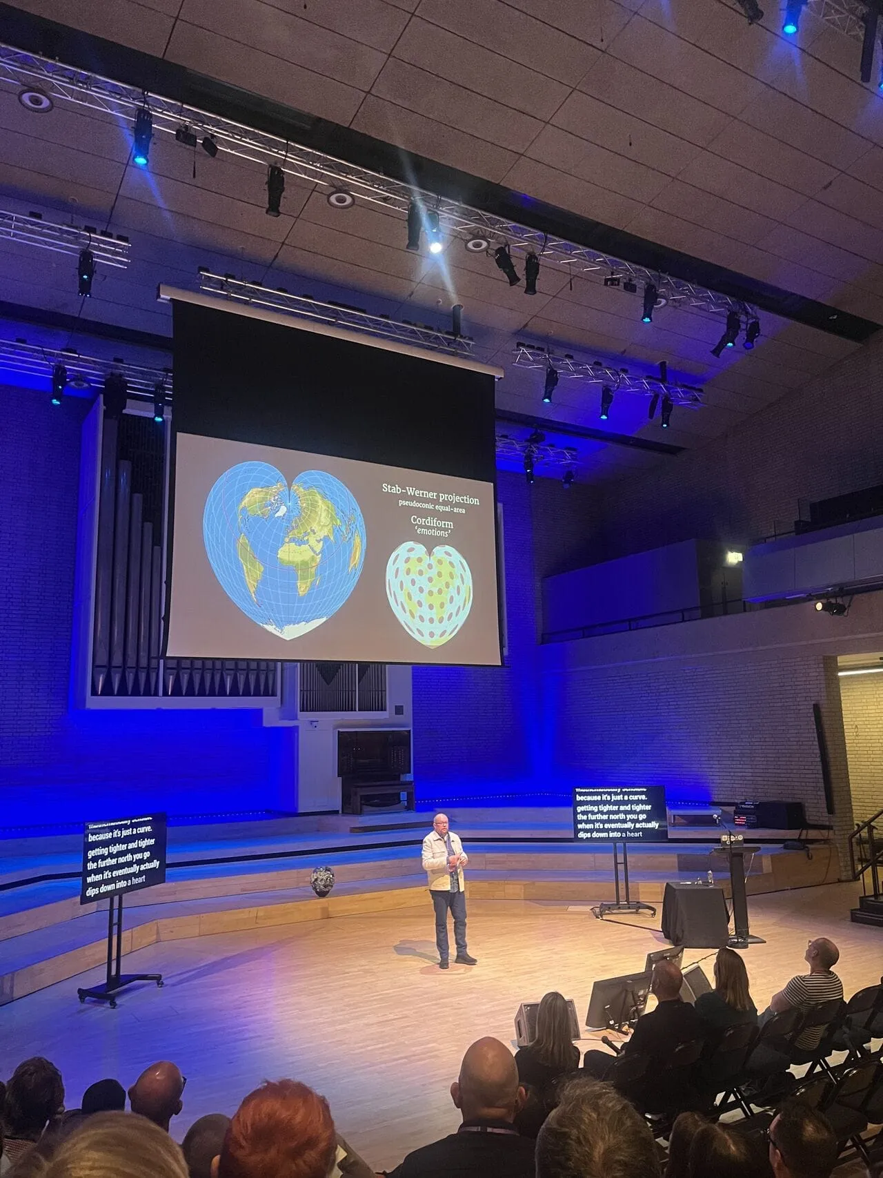
View larger: Photo: Joanna CzutkownaPer Axbom on stage at Camp Digital 2025. A heart-shaped historical world map next to its projection grid.
View larger: Photo: Megan L.Per Axbom on stage at Camp Digital 2025. Comparing heart-shaped map projections.
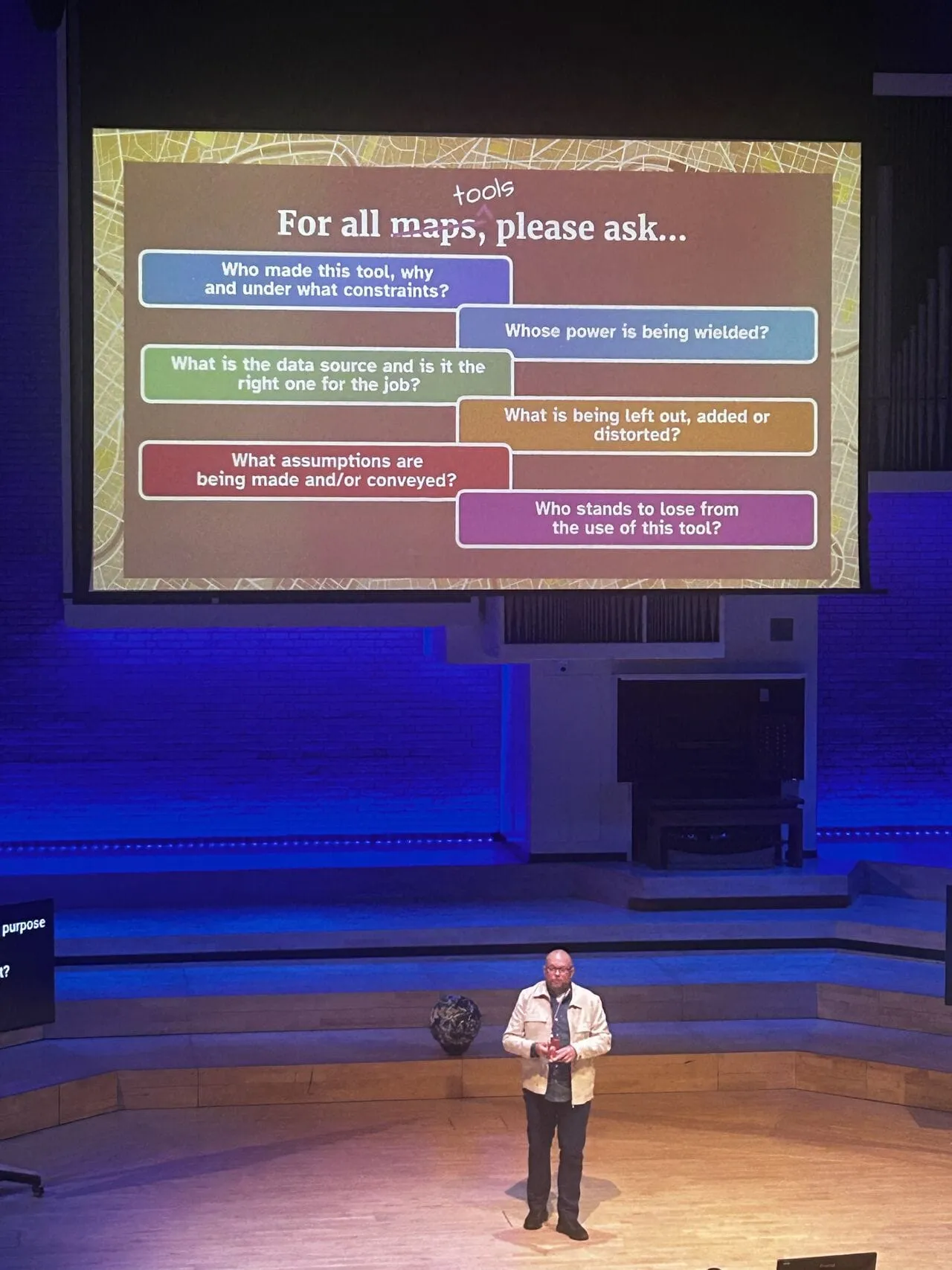
View larger: Photo: Aleksandra SielaffPer Axbom on stage at Camp Digital 2025. “For all tools, please ask…”: questions about who made a tool, whose power it serves and who stands to lose.
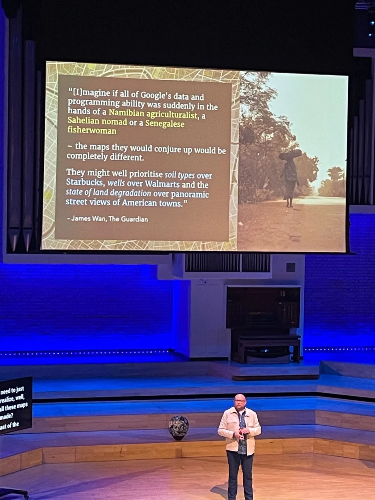
View larger: Photo: May ViratikulPer Axbom on stage at Camp Digital 2025. A quote from James Wan in The Guardian on how differently maps would look if made by others.
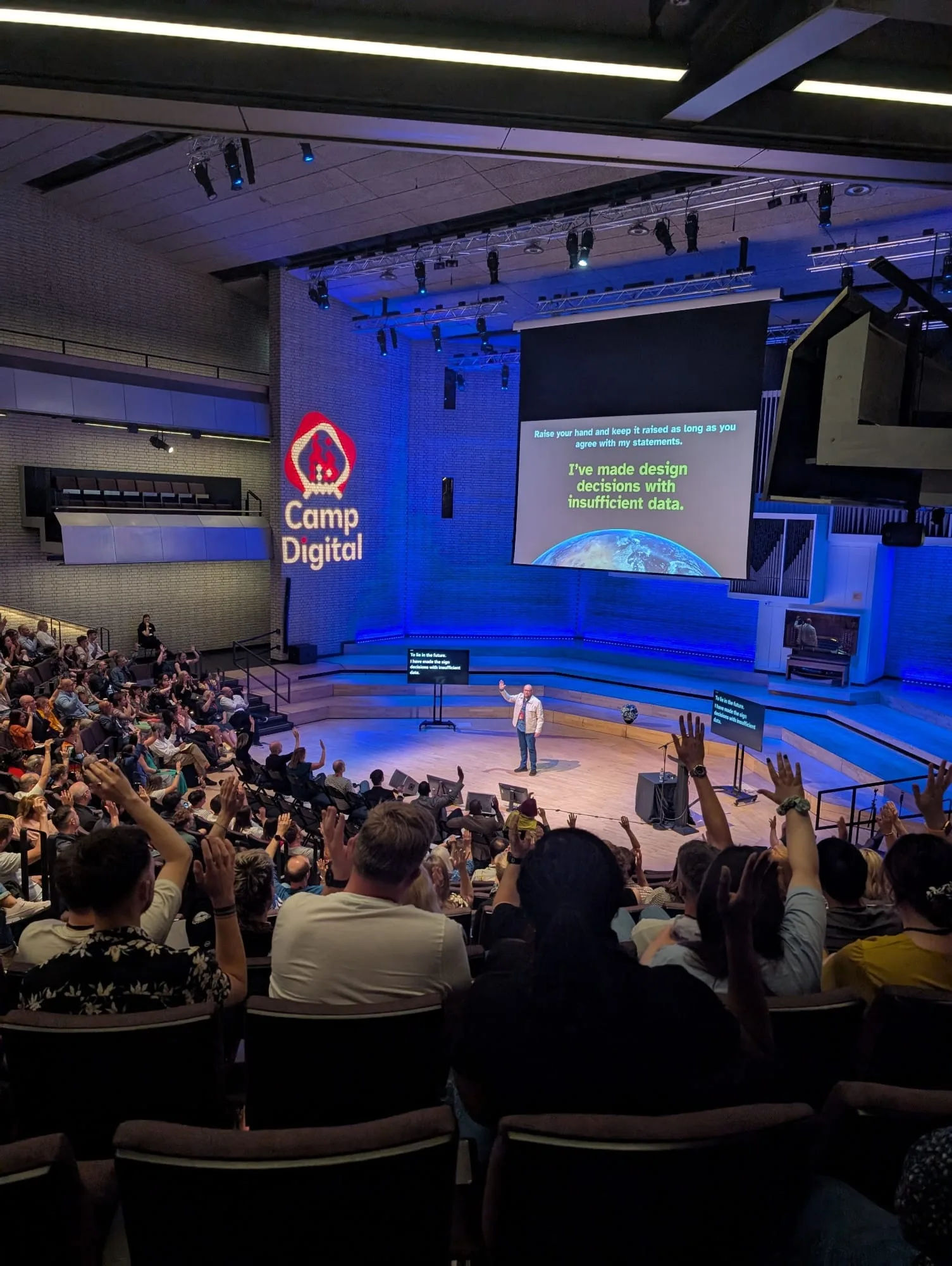
View larger: Photo: Becky ColleyPer Axbom on stage at Camp Digital 2025. The audience raising their hands at the slide “I’ve made design decisions with insufficient data.”
Closing keynote at Camp Digital on 3 July 2025, at the Royal Northern College of Music in Manchester: a brand new talk on how maps and models simplify the world in dangerous ways, and what gets lost when we trust them too much.
Read more
The premise: what you see in a map can never be the complete truth. Many choices go into making it, based on intent, values, real-world constraints, bias and budget.
The world map as a lens on how we deceive and are deceived – and on the inherent responsibilities of designers.
Questions to ask of every map and tool: who made it, whose power is wielded, what is left out or distorted, and who stands to lose.
“I won’t trust maps from today. I will peel an orange and try flattening it out. I know it won’t work 🍊” – Nataliya Mykhalchenko, in the audience.
Before founding Axbom Innovation AB in 2010: fifteen years of employment in web, communication and usability – and the studies that came first.
Read more
2006–2010: web strategist and UX designer at XLENT Consulting Group.
2000–2006: web strategist and usability consultant at Lumano – part of building the business, hosting seminars, and representing the company at User Interface East in Cambridge, Massachusetts, in 2002.
2000: usability consultant at IT Management.
1998–2000: web designer, developer and communications consultant at Ericsson Data and Ericsson Business Consulting.
1996–1998: information officer at Stockholms Studenters Idrottsförening, including the organization's first website. 1995–1996: information officer at the student union at Stockholm University.
1992–1995: Bachelor of Arts in media and communication science at Jönköping University. The bachelor's dissertation (autumn 1994), “Den omöjliga översättningen” (The impossible translation), compares The Catcher in the Rye with its two Swedish translations, by Birgitta Hammar (1953) and Klas Östergren (1987), to show how literary translators adapt a text to a new culture – and change its meaning. It got a top grade. Before that, the International Baccalaureate at SSHL in Sigtuna.
My personal podcast about new technology and human rights: selected blog posts read aloud and enhanced with sound effects and source material, so the writing reaches people who prefer to listen. A Swedish twin, Omtanke med Per Axbom, carries the Swedish posts.
Read more
Episodes include voice cloning, AI responsibility in a hyped-up world, the creepy sound of online trackers and how your typing rhythm can reveal your identity.
Made this way to make my content more accessible: not everyone reads.
Fraud with cloned voices is becoming more common: the voice at the other end of the phone can be one you know, even one you share a home with. Your safest option is to hang up and call back.
It’s never easier to get scammed than during a hype. March 2023: why it’s time to shake off the mass hypnosis and examine what’s in the new bottle of AI that so many have started sipping.
The trailer: why I want to boost knowledge about harmful impact and encourage balanced and honest conversations about possible, plausible and desirable futures.
As early as 1860, telegraph operators could recognize each other by their tapping rhythm. The more you type, the more of your unique qualities can be collected.
Trained as a coach in Leapfrog’s ACC-accredited coaching program. I coach individuals and teams, in leadership as well as junior positions, working by the ICF (International Coach Federation) code of ethics.
Read more
A goal-oriented process built around the client’s own goals, with no predefined program: questions and self-discovery rather than advice.
Common themes: how well work aligns with personal values and ambitions, imposter syndrome, and finding your voice and way forward in your role.
Individual coaching: about one hour every other week, over 4, 6 or 12 sessions.
Team coaching for design and development teams: one day a month for at least six months, mixing one-to-one talks with group sessions.
Confidential, including after the coaching has ended.
Assignments include ongoing group coaching for a design team at Bouvet (2022), and coaching through Version 2 of Me (2023).
A fixed-price assignment in 2010: a new WordPress website connected to social media, with image publishing through Flickr – from setup and design to moving the content and the domain.
Read more
Installing WordPress, the design, and migrating the content from the old site
Registering the company's social media accounts and setting up monitoring services
Installing a statistics tool and moving the domain name
A debate article in Computer Sweden on 24 March 2004: a web survey is good for finding out about attitudes, but says nothing about how usable a website is. When I watched people use a web service, what they said and what they did were often two different things.
Read more
Survey answers can paint an overly positive picture: Anna spent minutes trying to understand the menu but called the site “easy to navigate”.
Ten questions to ask before “user testing” with a web survey – from whether you want to know what visitors think or how they use the site, to whether it makes sense to evaluate one web solution with another.
Meet a handful of users instead: an open dialogue, follow-up questions on specific details – and the basis for a relevant action plan.
Written during my years at Lumano, where an earlier version was published as “Enkäten ersätter aldrig en användartest”.
A debate article in the trade paper Computer Sweden, printed on page 2 on 31 October 2007: search engine optimization is ugly, because manipulating results stops search engines from giving people what is most relevant – and risks turning them into just another advertising channel. Usability and accessibility should come first.
Read more
I first sent it in, heard nothing, and posted it on my blog in September 2007 – then found it printed a month and a half later.
It sparked a heated debate across Swedish blogs and SEO forums, including pages calling me an idiot. I spent three days and nights answering in the forums.
The turning point, as I told it at World Usability Day 2016: a respected SEO consultant, Nikke Lindqvist, wrote that he agreed with everything I said – except the headline.
A year later I looked back and noticed how much support I had missed while the personal attacks gave me tunnel vision.
Monthly articles for Datormagazin, Sweden's largest magazine for computer users – the magazine I devoured every month as a young computer nerd in the 1980s. Each article described a current interactive Web 2.0 phenomenon and how to apply it, complete with code examples, and put the Ajax solution in a context that mattered for usability and accessibility.
Read more
September 2005: picked as one of about 30 new freelance writers – a childhood dream come true.
The first article was published in issue 11, 2007, and then one every month, building on the JavaScript libraries Prototype and jQuery.
No. 11, 2007: forms with built-in error handling · No. 12, 2007: tabs created automatically from anchor links · No. 1, 2008: autocomplete in forms · No. 2, 2008: Thickbox as a replacement for pop-ups · No. 3, 2008: highlighting, show/hide and table handling with jQuery · No. 4, 2008: more inspiration for subtle user experiences on the web.
Combining my interest in user-centered design with my interest in technology – and actually sitting down to program now and then.
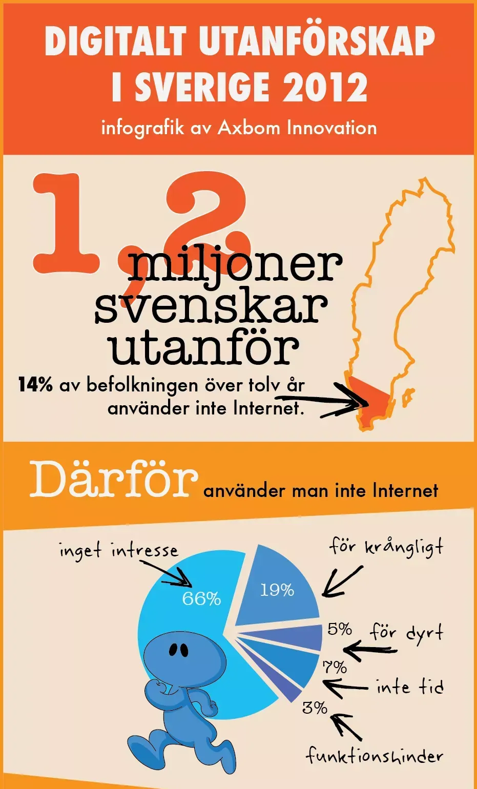
View larger: Part 1: 1.2 million outside, and why“Digital exclusion in Sweden 2012, infographic by Axbom Innovation.” 1.2 million Swedes outside: 14% of the population over 12 do not use the internet, beside a map of Sweden. Why people don't use the internet, as a pie chart: no interest 66%, too complicated 19%, too expensive 5%, no time 7%, disability 3%.
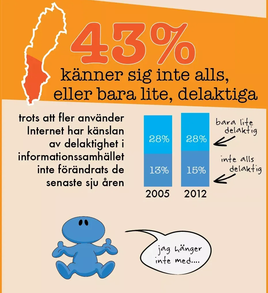
View larger: Part 2: 43% feel left out43% feel not at all, or only a little, included. Bars for 2005 and 2012: 13% and 15% not at all, 28% and 28% only a little – the feeling of inclusion has not changed in seven years. A blue figure shrugs: “I can't keep up…”
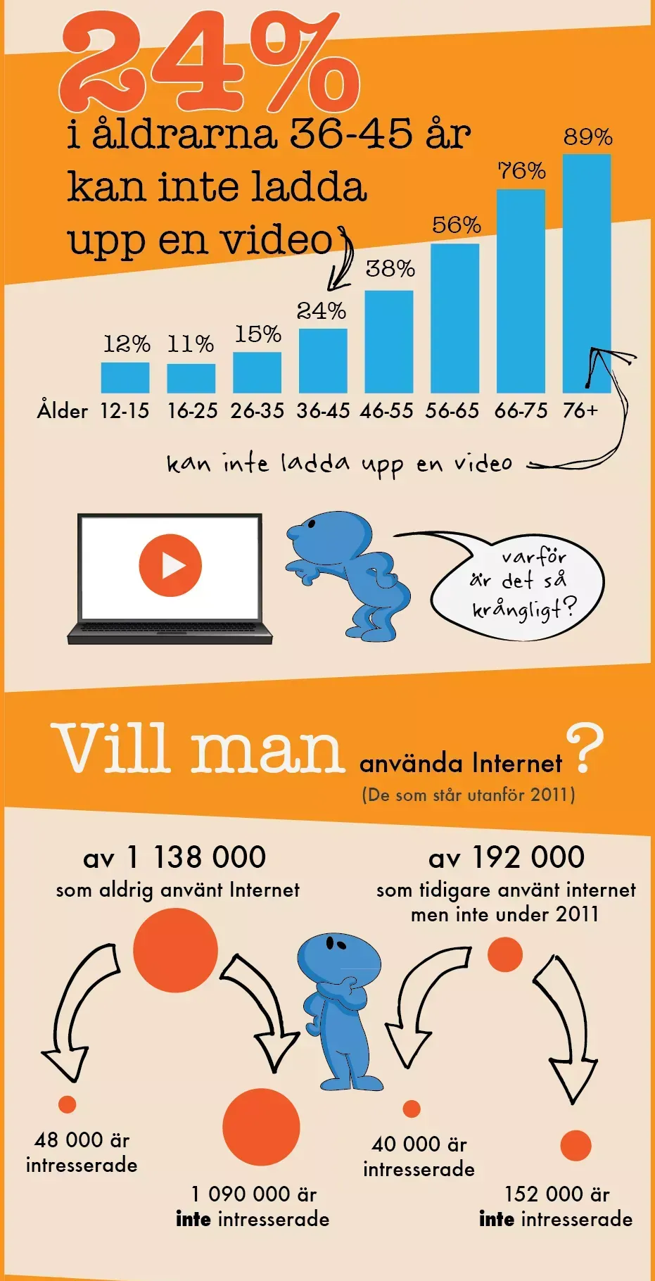
View larger: Part 3: Uploading a video, and wanting to24% of 36–45-year-olds can't upload a video; a bar chart rises from 12% (12–15) and 11% (16–25) to 89% (over 75). A figure at a laptop: “Why is it so complicated?” Then: do people want to use the internet? Of 1,138,000 who never used it, 48,000 are interested; of 192,000 who stopped in 2011, 40,000 are interested.
View larger: Part 4: What can you do?“What can YOU do?” The share using the internet grows each year, but more slowly; the more we tie products and services to the internet, the more we must invest in reducing digital exclusion. You can get involved in digital inclusion at digidel.se – as a company or as a private person. Data sources: .SE's Svenskarna och Internet 2011 and 2012, and two reports on non-users.
View larger: The whole infographicDigital exclusion in Sweden 2012, an infographic by Axbom Innovation (in Swedish).
1.2 million Swedes outside: 14% of the population over 12 do not use the internet.
Why people don't use the internet: no interest 66%, too complicated 19%, no time 7%, too expensive 5%, disability 3%.
43% feel not at all, or only a little, included. Even though more people use the internet, the feeling of being part of the information society has not changed in seven years: in 2005, 13% felt not at all included and 28% only a little; in 2012 it was 15% and 28%. A cartoon figure says: “I can't keep up.”
24% of 36–45-year-olds can't upload a video. Share who can't, by age: 12–15 12%, 16–25 11%, 26–35 15%, 36–45 24%, 46–55 38%, 56–65 56%, 66–75 76%, over 75 89%.
A cartoon figure points at a laptop and says: “Why is it so complicated?”
Do people want to use the internet? Of 1,138,000 who had never used it, 48,000 are interested. Of 192,000 who had used it before but not in 2011, 40,000 are interested.
What can you do? The more we tie our products and services to the internet, the more resources we must put into reducing digital exclusion.
An infographic on the people who stand outside the internet in Sweden – 1.2 million people, 14% of the population over 12 – built on .SE's yearly surveys. My contribution to spreading knowledge about the people who keep risking being forgotten, published with a full image description and free to download, and later commissioned by the campaign for digital inclusion, Digidel 2013.
Read more
Why people don't use the internet, why 43% feel only a little or not at all included – a figure unchanged for seven years – and who can't upload a video, from 11% of 16–25-year-olds to 89% of those over 75.
A reminder that it's not just a matter of waiting for the stragglers: the more we tie services to the internet, the more we must invest in reducing digital exclusion.
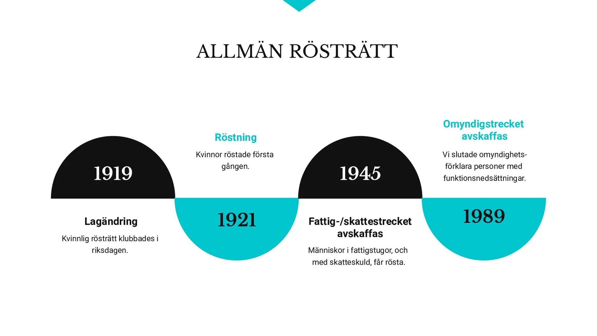
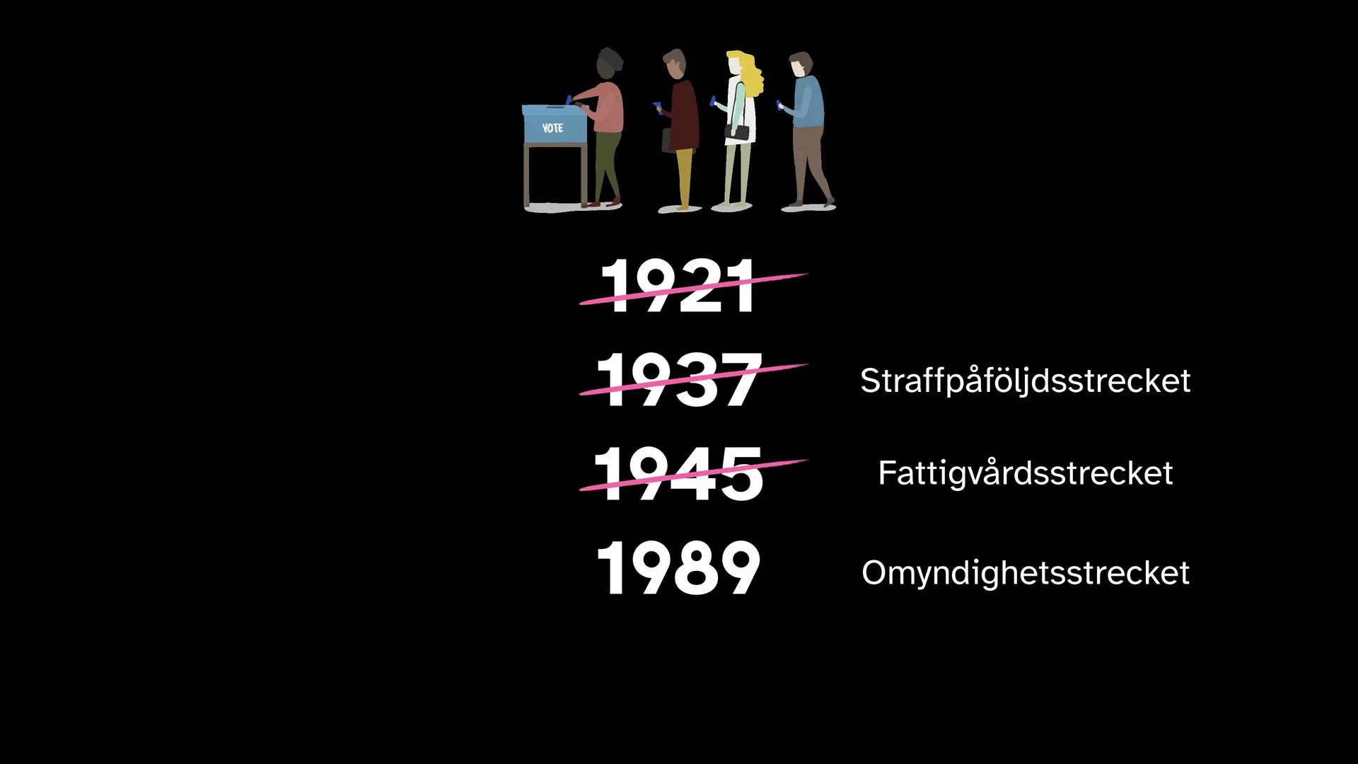
View larger: Universal suffrageA timeline: 1919, the law change on women’s suffrage passed in parliament. 1921, women voted for the first time. 1945, the poverty and tax bars were abolished, so people in poorhouses and with tax debts could vote. 1989, the guardianship bar was abolished: Sweden stopped declaring people with disabilities legally incompetent.
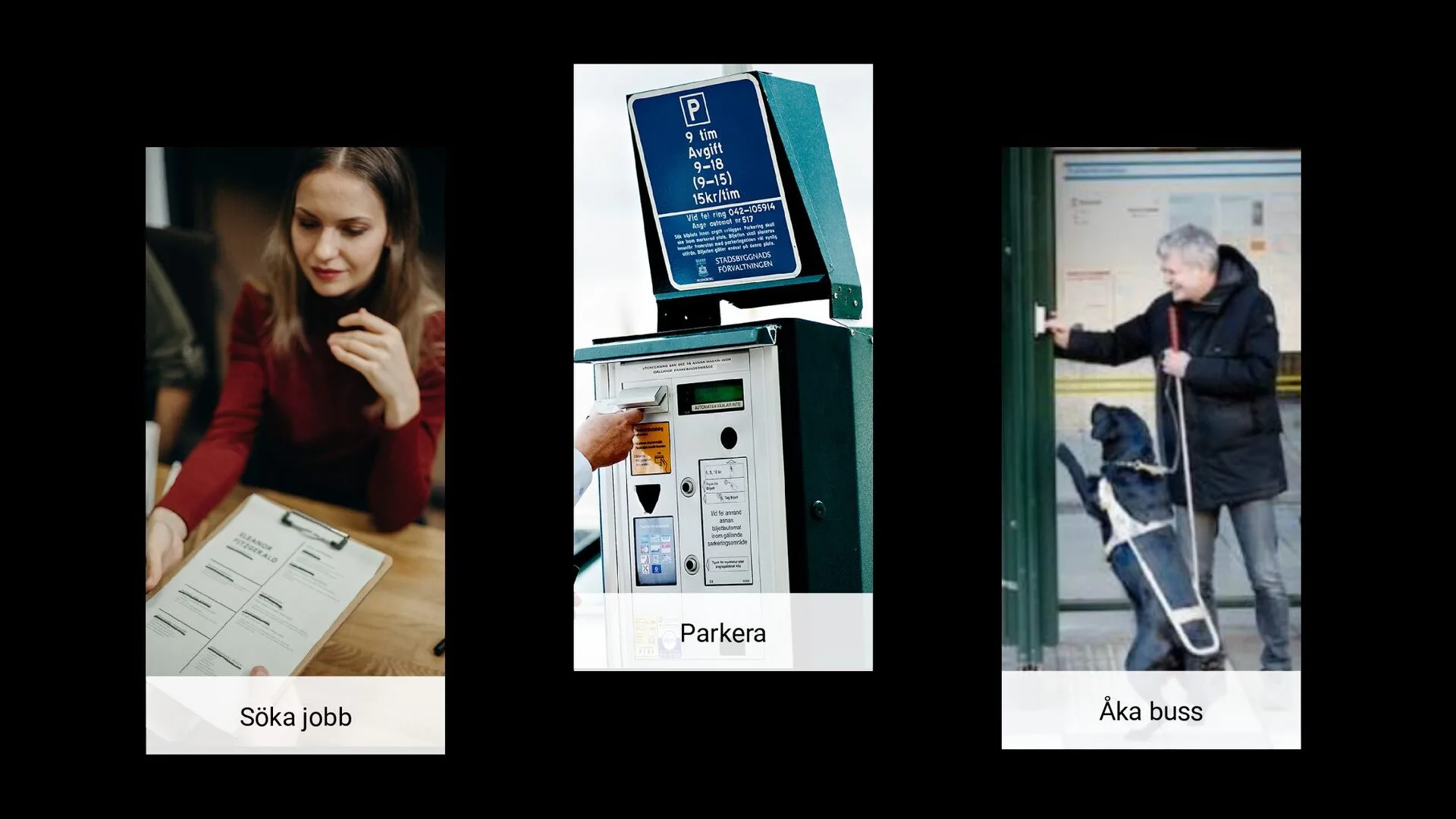
View larger: Everyday digital hurdlesThree photos labelled Söka jobb (applying for jobs), Parkera (parking) and Åka buss (taking the bus): a woman with an application form, a parking meter and an older person with a rollator at a door.
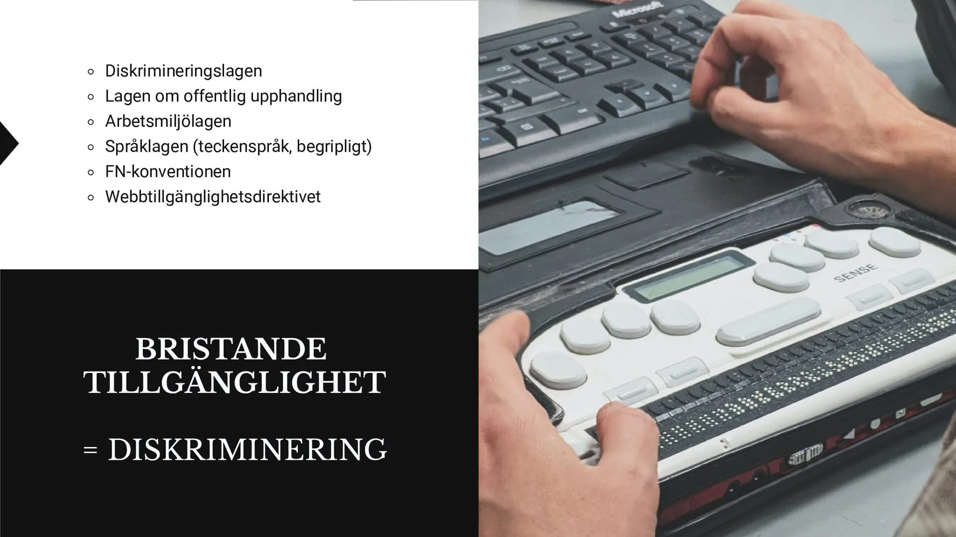
View larger: Inaccessibility = discriminationThe text “Bristande tillgänglighet = diskriminering” (Inaccessibility = discrimination) beside a photo of hands on a braille display, and a list of Swedish laws: the Discrimination Act, the Public Procurement Act, the Work Environment Act, the Language Act (sign language, plain language), the UN Convention and the Web Accessibility Directive.
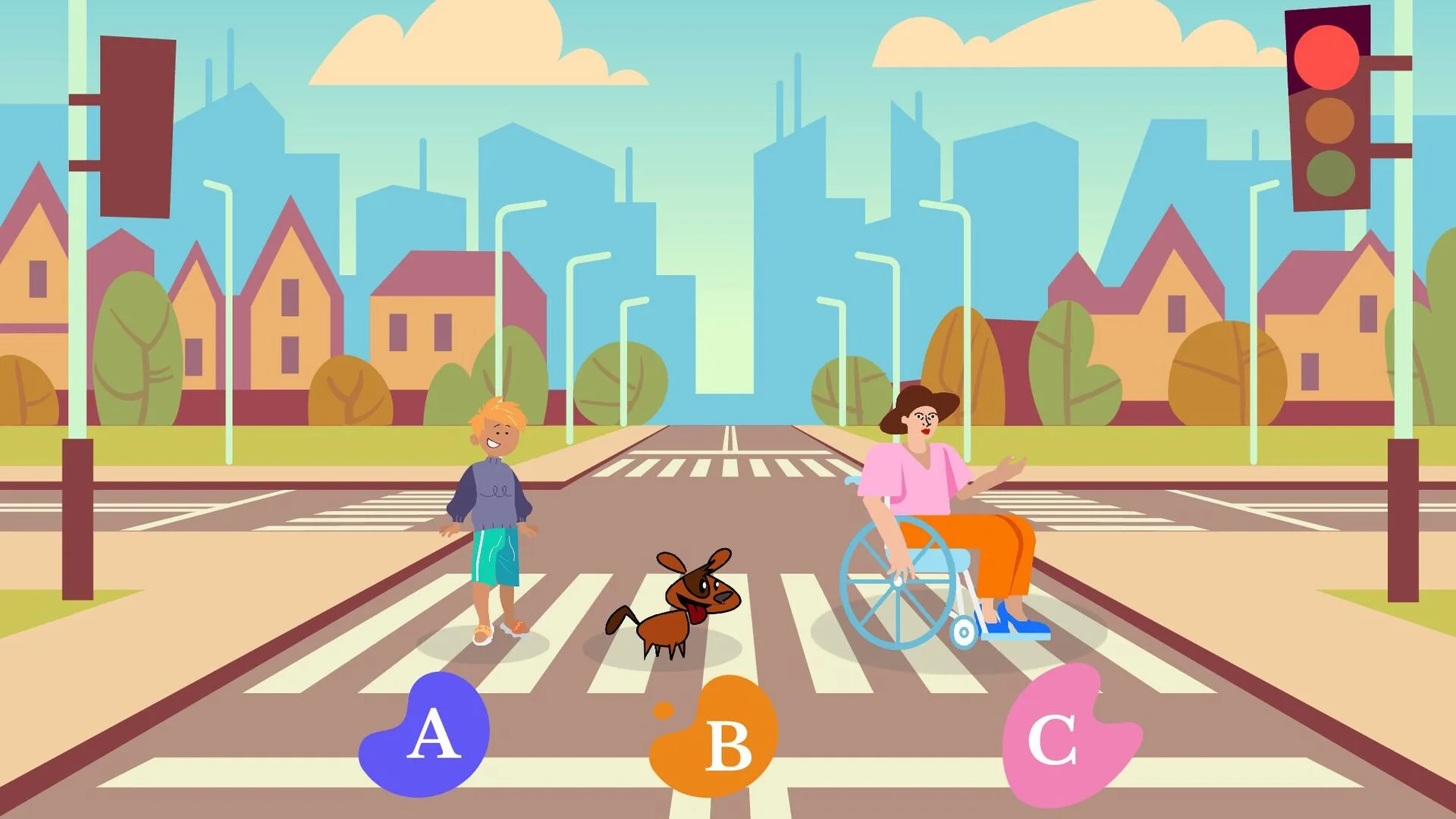
View larger: Who should the car choose?A cartoon street with a crossing and a red light: a child, a dog and a person in a wheelchair, labelled A, B and C – the dilemma of whom a self-driving car should choose to hit.
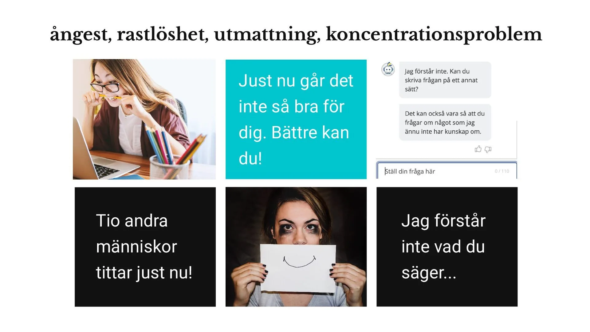
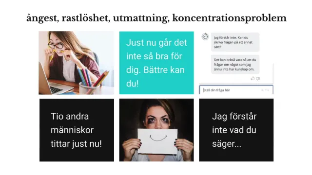
View larger: Anxiety-inducing designThe heading “anxiety, restlessness, exhaustion, concentration problems” above six panels: a stressed woman at a laptop, “You’re not doing so well right now. You can do better!”, a chatbot that doesn’t understand, “Ten other people are looking right now!”, a woman holding up a drawn smile, and “I don’t understand what you’re saying...”.
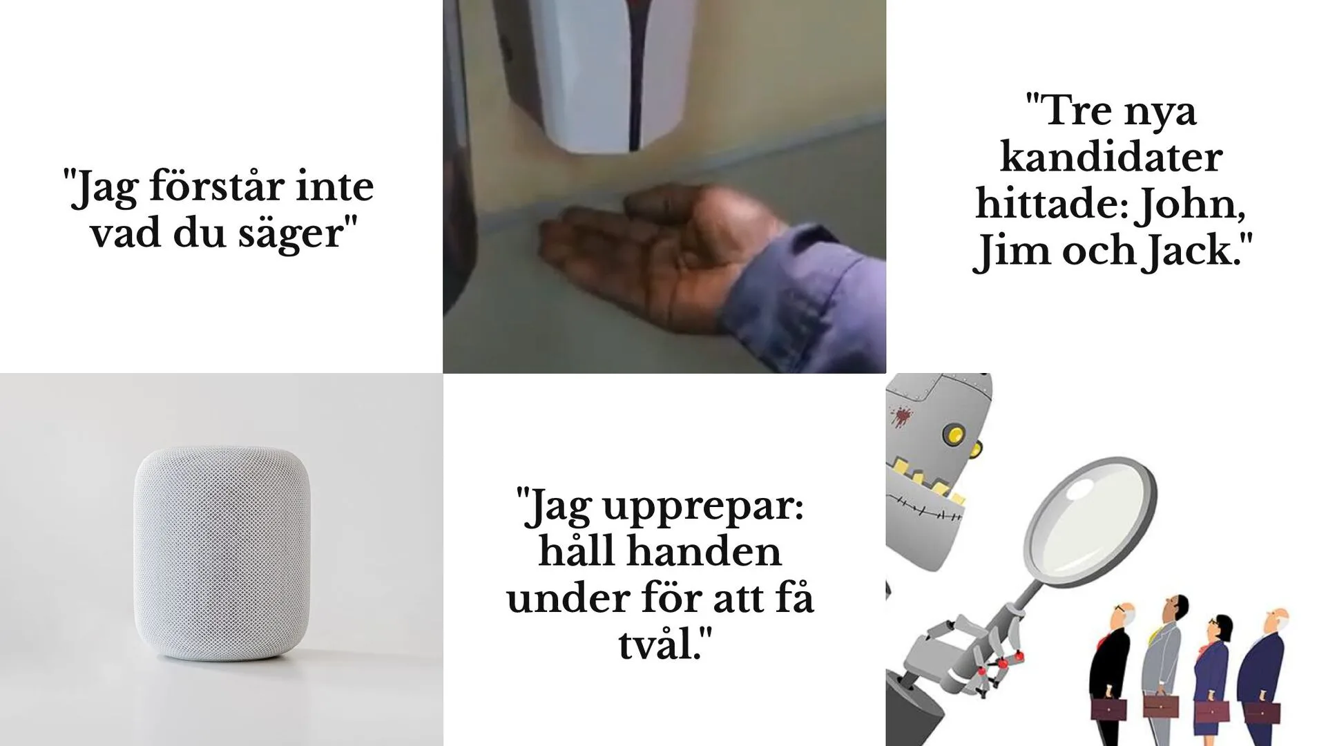
View larger: Technology that doesn’t see everyoneA collage: “I don’t understand what you’re saying” beside a smart speaker, a dark-skinned hand under a soap dispenser that doesn’t respond with “I repeat: hold your hand underneath to get soap.”, and “Three new candidates found: John, Jim and Jack.” beside a robot with a magnifying glass in front of a row of applicants.
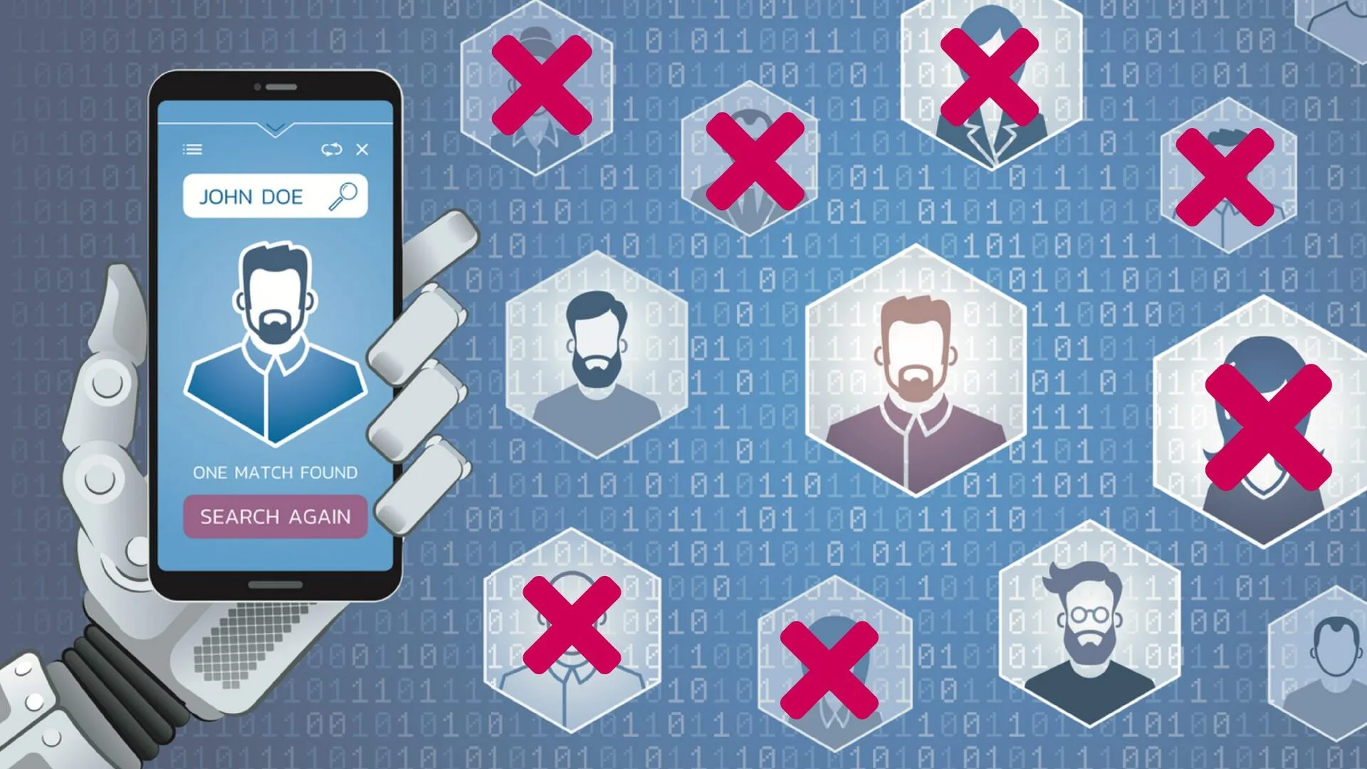
View larger: Automated recruitmentA robot hand holds a phone searching through faces in hexagons – several of the faces are crossed out with red crosses.
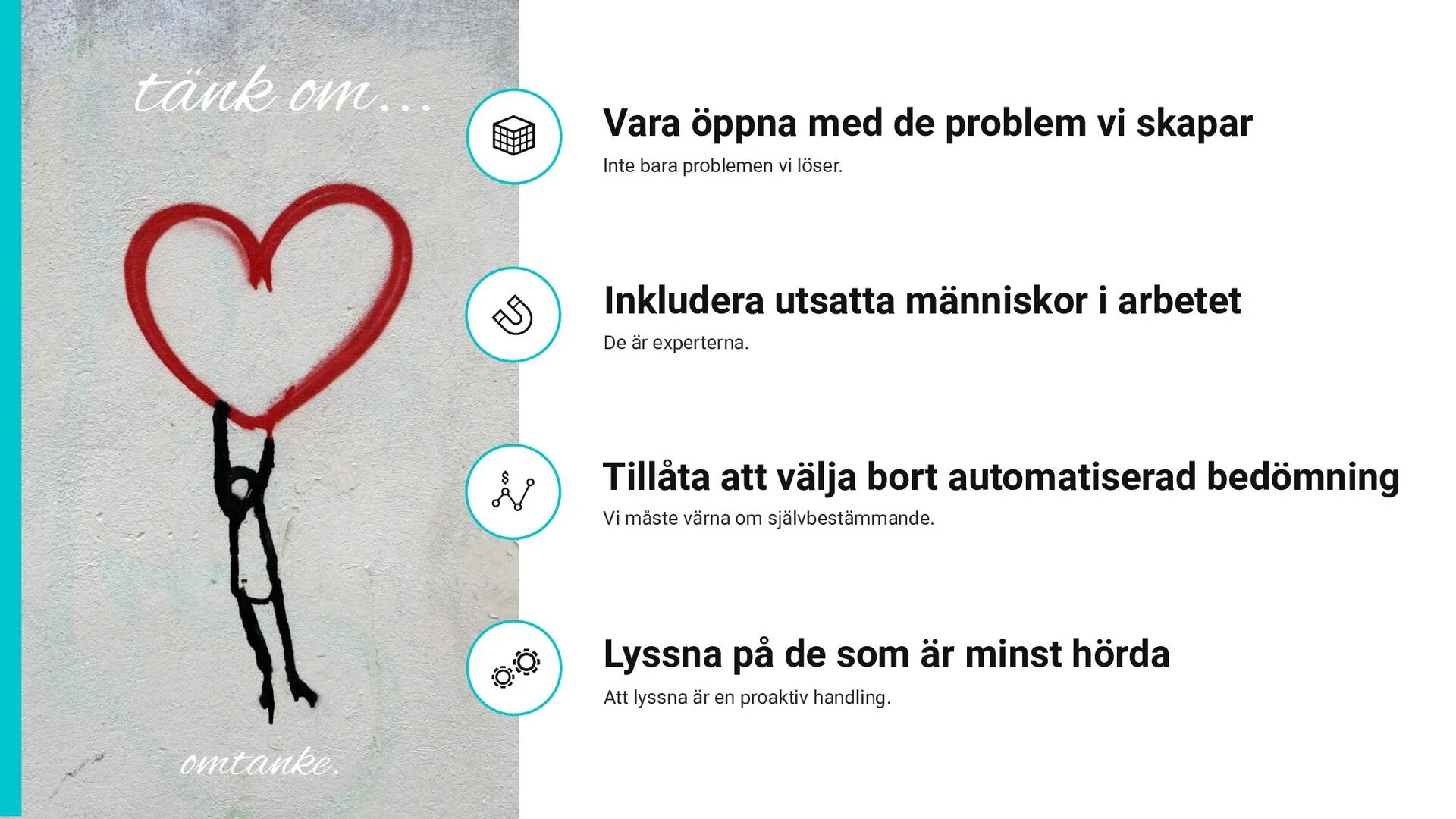
View larger: Rethink – four mustsA graffiti figure holding on to a red heart, with the words “tänk om...” (rethink...) and “omtanke” (care), beside four points: be open about the problems we create, include vulnerable people in the work (they are the experts), allow people to opt out of automated assessment, and listen to those who are least heard.
A recorded expert lecture in Swedish that opened one of the theme tracks at Digin, PTS’s network day on digital inclusion and accessibility, in spring 2020. I talked about the challenges, pitfalls and risks – and the opportunities – when technology changes faster than legislation. Then I took part live as the participants continued the discussion.
Read more
Universal suffrage in Sweden: most people answer 1919 or 1921. Few know about 1945, and even fewer about 1989 – when Sweden stopped taking away the vote from many people with disabilities.
People who managed fine ten years ago now struggle to apply for jobs, pay for parking or buy a ticket. The landscape changed without support for the transition.
Accessibility is not just equal access to information: “at its core, accessibility is about the right, and the ability, to a dignified life.”
Anxiety-inducing design (“Ten people are looking at this hotel room right now!”) and government chatbots that keep repeating “I don’t understand what you’re saying”.
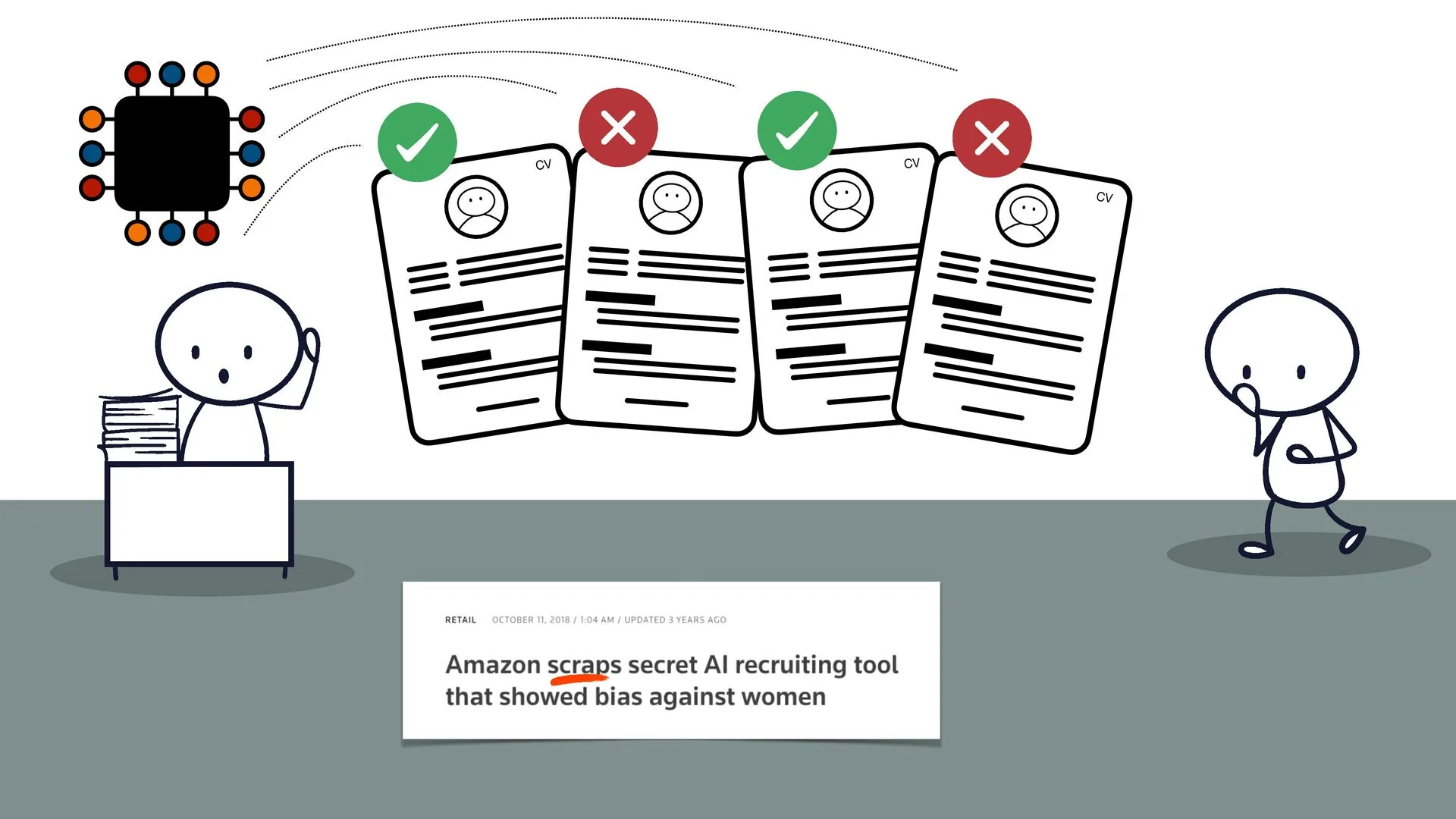
AI systems that can cement prejudice “in the guise of being superior”.
Ended with four musts, among them including vulnerable people in the work, the right to opt out of automated assessment, and that “those who are least listened to are listened to most”.
PTS published the film with Swedish captions, and also in an audio-described version.
What people said
The track “How to work accessibly when technology and digitalisation move faster than the law?” at #Digin opened with a BRILLIANT film by @axbom. PLEASE SAY IT WILL BE PUBLISHED SOMEWHERE SO I CAN WATCH AND SHOW IT AGAIN AND AGAIN AND AGAIN! #design #inclusion #rallyingcry
— Terese Raymond, during Digin (translated from Swedish)
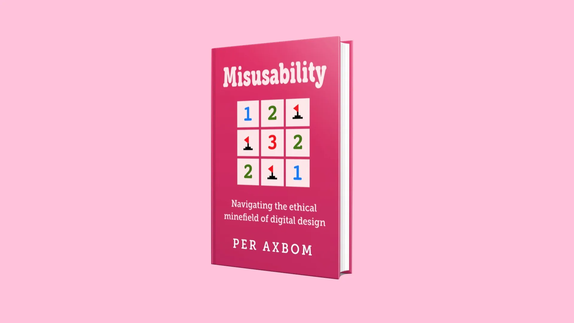
A handbook for everyone who wants digitalization to better address wellbeing, inclusion and social impact – with practical tools to start using in projects right away. Published in 2019 in Swedish, as Digital omtanke in the series Kunskap på nolltid, and at the same time in English, translated by Neil Betteridge.
Read more
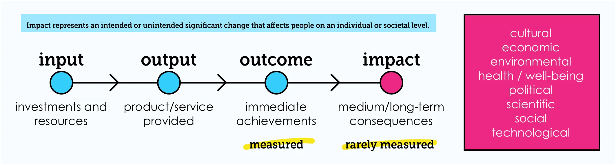
All digital services affect people, society and nature, yet we rarely measure how wellbeing changes because of what we create.
Digital enablement, AI and virtual realities are praised for the problems they solve, while the problems they create are kept from view – and harm hits the already vulnerable hardest.
A handbook that helps companies and creators manage their responsibility rather than avoid it.
Supplementary material: the Inclusive Panda and the Impact Flowchart as free PDFs.
Available in print and as an e-book, in both languages, through Adlibris, Bokus, Apple Books, Storytel, Bookbeat, Nextory and Amazon (Kindle).
What people said
Per Axbom offers teams a set of essential questions and concepts to get started on a better path.
— Kim Goodwin, author of Designing for the Digital Age
A handy, easy-to-read handbook on sustainable digital development for anyone who builds digital services – whether you're a developer or a CDO. Compassion as a competitive advantage, writes Axbom. Brilliant!
— Anette Novak, former CEO of RISE Interactive (translated from Swedish)
A great book with a lot of gold nuggets and great insights. It brings a much-needed heart to the digital design world that sometimes just feels stressful and all about the sales numbers.
— Anna Wikström, UX game designer
Good content, easy to read and straight to the point! Recommended for practically anyone who influences how something is designed.
— Web strategist and analyst (translated from Swedish)
Lots of small, often razor-sharp reflections that help you question things some of us do out of old habit… Personal takeaway: sometimes friction is good. I think about that too rarely.
— Reader review on Goodreads (translated from Swedish)
A free Swedish guide to digital accessibility at digitill.se: all 13 guidelines of the Web Content Accessibility Guidelines (WCAG) explained simply, with examples – so anyone can start contributing to more accessible digital services, and make demands on the people who build and maintain them.
Read more
Began in 2013 as a series of blog posts written for the #blogg100 challenge – a post every day for 100 days.
Compiled into a free e-book in 2018.
Rebuilt in 2022 as a reference site in sections that are easier to maintain, update and link to: the four principles, each guideline, a checklist, a glossary, references and an FAQ.
Free to use and share under a Creative Commons license (BY-NC-SA).
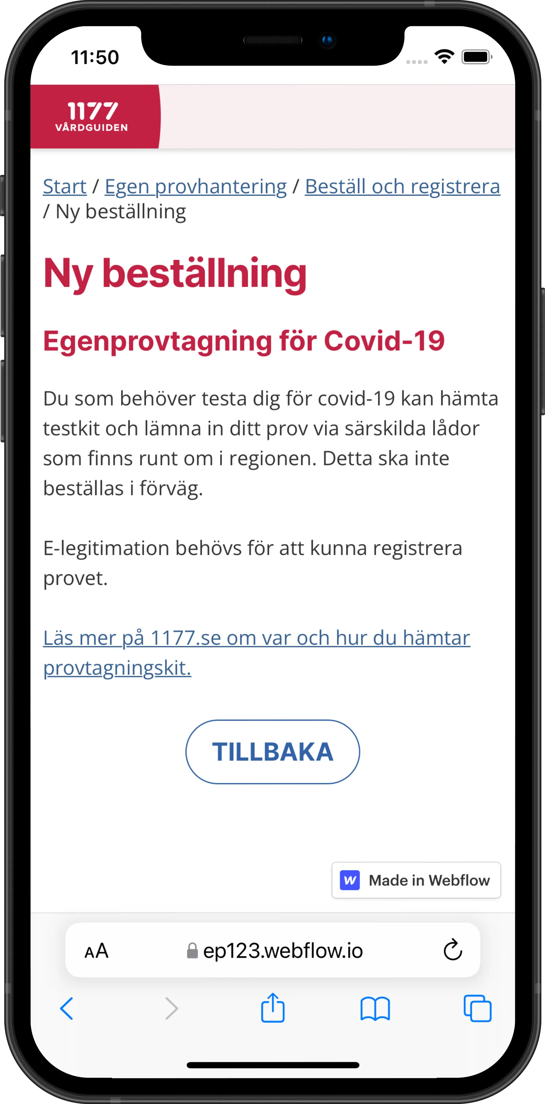
View larger: Prototype: New order (screens in Swedish)The Webflow prototype on a phone: ordering a covid-19 self-test.
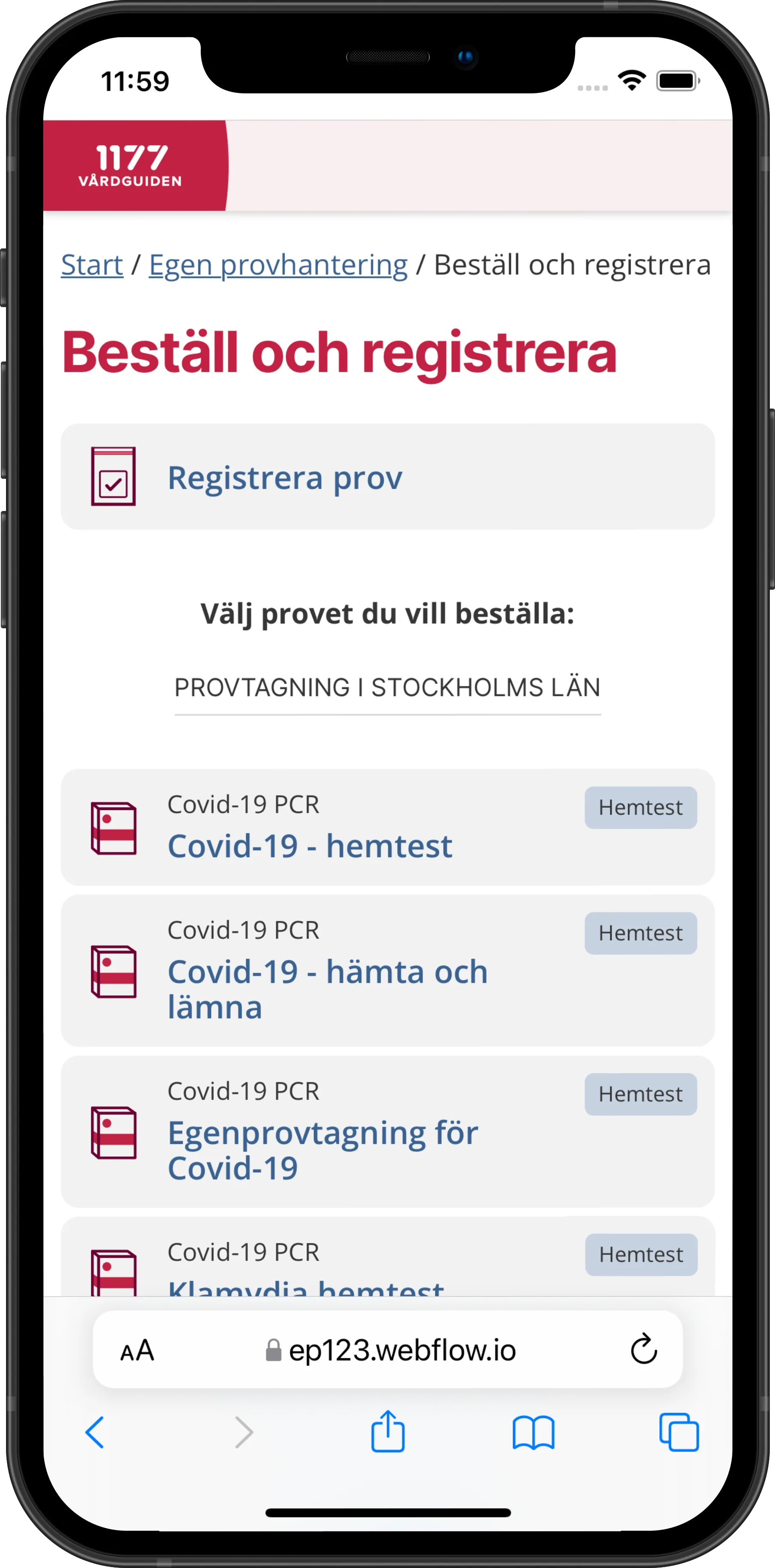
View larger: Prototype: Order and register (screens in Swedish)Choosing which test to order or register.
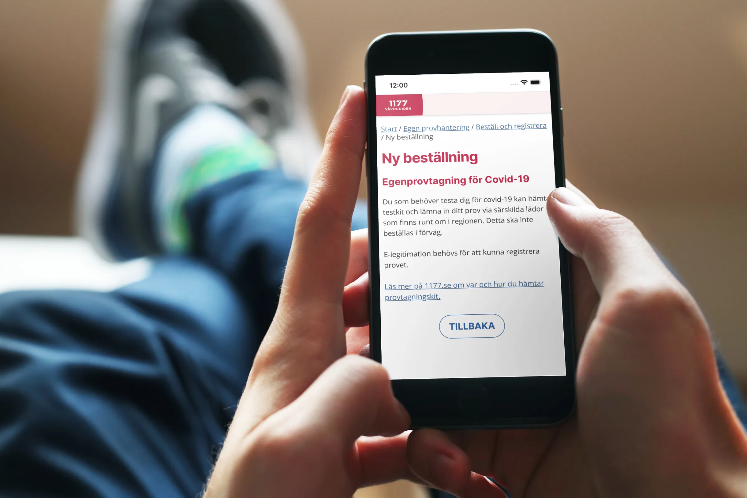
View larger: Ordering a test on a phoneA person relaxing on a sofa, ordering a self-test on their phone.
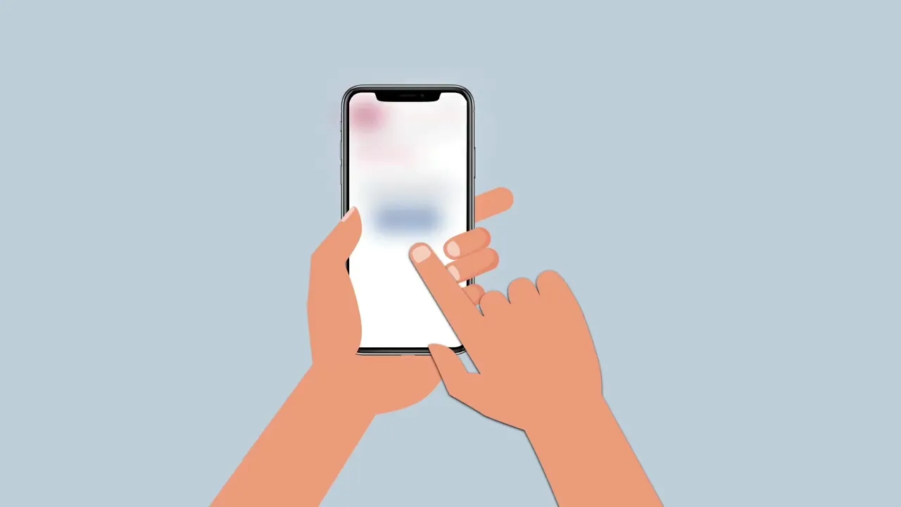
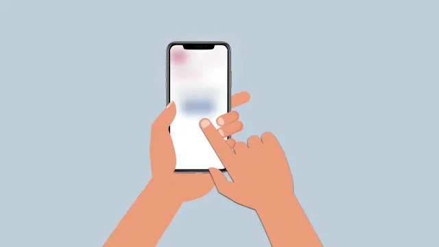
View larger: Instruction film, step 1: work in progressThe draft: animated hands tap a phone whose screen is still a blurred placeholder, on a light blue background, no text yet.
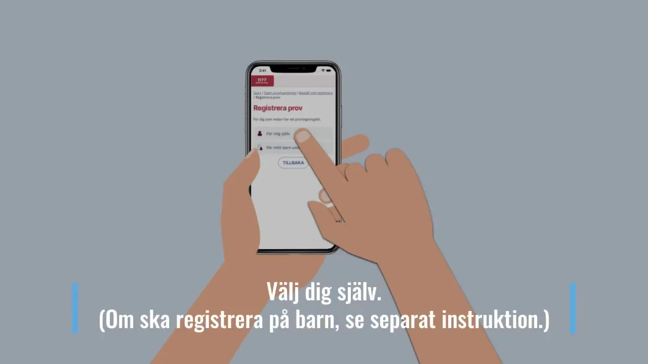
View larger: Instruction film, step 2: finishedThe finished film at the same moment: the real 1177 screen “Registrera prov”, adjusted colors, and the instruction “Välj dig själv. (Om ska registrera på barn, se separat instruktion.)”
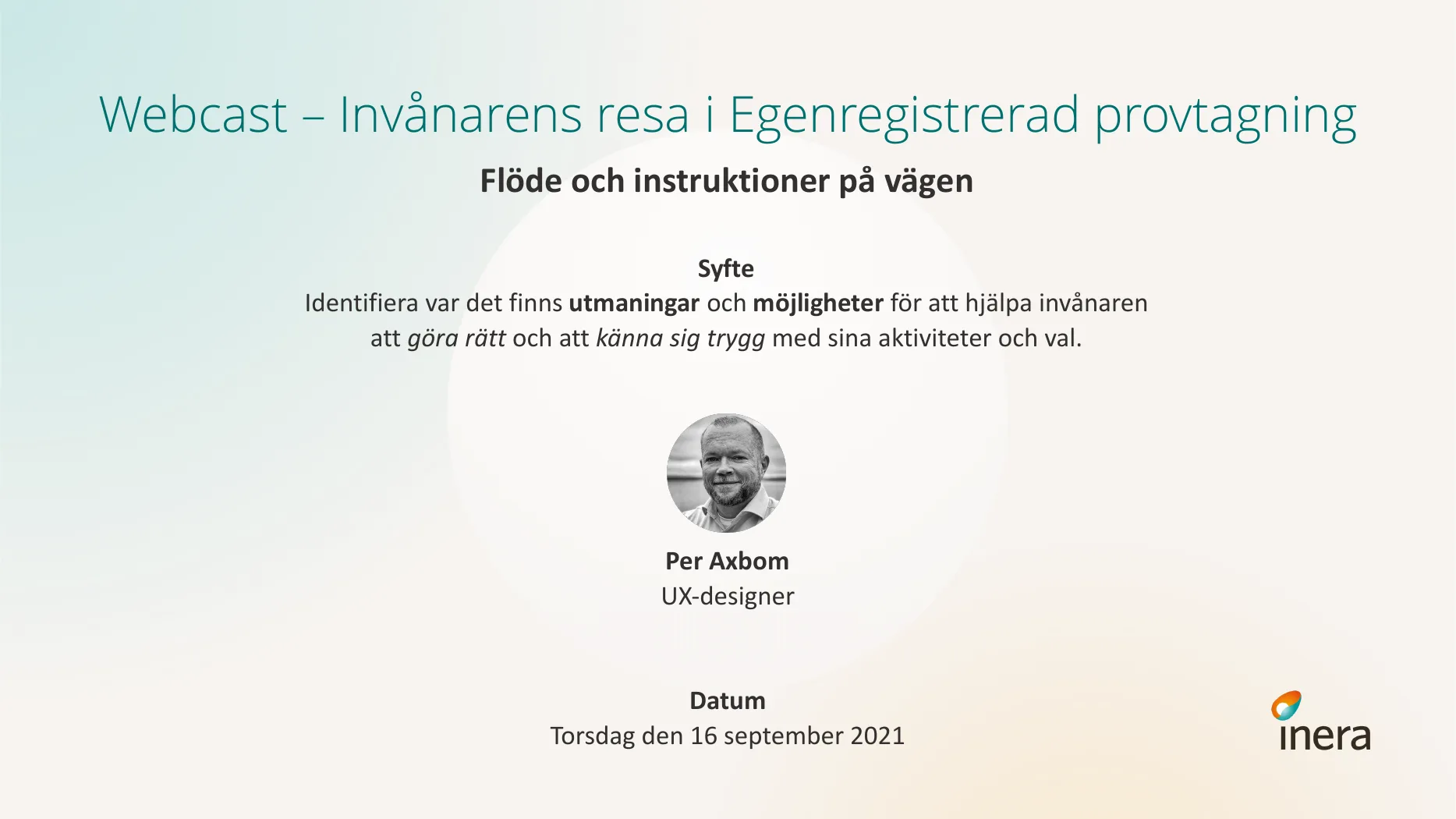
View larger: Webcast, 16 September 2021Title slide: “Webcast – The citizen's journey in self-registered sampling. Flow and instructions along the way. Purpose: identify where there are challenges and opportunities to help citizens do the right thing and feel safe in their activities and choices.” With a round black-and-white photo of Per, UX designer, and the date, Thursday 16 September 2021. Inera logo.
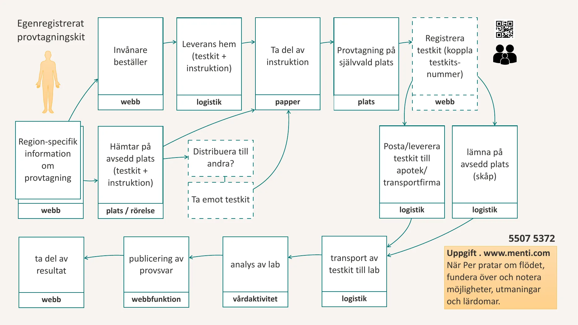
View larger: The citizen’s journey, step by stepA flow diagram in Swedish of the self-registered sampling kit: region-specific information (web), the citizen orders (web) and gets it delivered home, or picks it up at a set place (place/movement) – perhaps passing kits on to others; read the instructions (paper), take the sample at a place of their choice, register the kit by its number (web), then post it at a pharmacy or courier, or leave it at a set place (logistics); transport to the lab, lab analysis (care activity), publishing of the result (web function) and reading the result (web). In the corner, a Mentimeter task for the participants.
Responsible for user experience (UX), workflow descriptions, and instructional materials (both digital and printed) for the “Self-sampling” service during the covid pandemic.
Read more
Prototyped the ordering and registration flow in Webflow and tested it with people who would use it.
Step-by-step instructions with illustrations for the test kit, in print and digital, in Swedish and English.
Workflow descriptions for the whole service, from ordering a test to getting the result.
Short animated instruction films, for example how to register a test kit by scanning its QR code. I work in steps: a first version with placeholder screens to agree on pacing and gestures, then the finished film with real screens, instruction texts and adjusted colors.
A webcast presentation on 16 September 2021, “The citizen's journey in self-registered sampling – flow and instructions along the way”, to identify the challenges and opportunities in helping people do the right thing and feel safe. I walked through the citizen's journey step by step – from ordering and taking the sample to registering it, transport, lab analysis and results – and what makes paper instructions easy to follow, while participants answered in Mentimeter as we went. The insights were to feed into better instructions, interfaces and flow descriptions, and recommendations for all regions.
The starting point of the webcast: “By making self-registered sampling kits possible we create more flexibility and freedom for the citizen, but we also shift more of the work onto them. That gives us a responsibility to help people do that work in a safe and secure way.”
A chart of 18 harms that we are already seeing with AI, to help teams prioritize their work with “smart” tools and plan how to mitigate harm. The page explains every element and links to a PDF. Free to use under CC BY-SA.
Read more
Builds on The Elements of Digital Ethics (2021), focused on the harms growing with AI, especially general-purpose and generative tools.
18 elements in six sections: Organisation, Machine, Society, Human, Supervision and Environment.
Sets the imagined harm (“It will kill us all!”) apart from the real harm that is actually happening.
Every team that deploys or uses AI needs a strategy for mitigating many different types of harm.
The hopeful part: all of these harms are under human control, so we can talk about them and address them.
A chart of 32 elements in six sections that sum up the many ways digital can cause harm, to support moral considerations in the tech space. The page explains every element, and links to a high-resolution PNG and PDF. Free to use under CC BY-NC-SA.
Read more
Six sections: Organisation, Machine, Society, Human, Supervision and Environment.
Not meant to dissuade, but to make people aware and encourage more careful choices.
Use it to spark discussion, as a reference in risk assessments and to plan teaching.
Workshop tip: each group picks 3–4 elements from different sections and talks about the harms that combination brings to mind.
Or start from services you use every day and find the elements that apply to them.
I started as a web designer at Ericsson in 1998: early web work inside the company, including the first time Ericsson streamed its press conference live over the internet.
Read more
Built the website, interface and slide synchronization when CEO Sven-Christer Nilsson’s press conference was streamed live, Ericsson’s first webcast (1998)
Web editor for Ericsson’s global guidelines for web-based information (1998)
Ran Eriweb, an intranet magazine and knowledge center for web developers: commissioned, edited and translated articles and wrote columns (1999). Columns from that time are still on my blog, among them “What's the Deal with WAP?”, written for an Ericsson e-zine
Interface for an office ordering system, Click-to-buy, adapted to the existing order flow (1999)
Content and interface for the WAP campaign on the web, with the agency Cappucino (1999)
Internal communication support when Ericsson Consumer Services introduced new support processes (1999)
Evaluating publishing tools (1999) – the start of a long interest in how much they differ, not just in license costs
HR (2000): a web-based recruitment tool from an outside supplier failed badly in the tests we set up, mainly on performance, and the project was terminated. After three months working closely with the recruiters, I reinvented the solution in Microsoft Outlook in a matter of weeks – everyone already had it open all day, most applications already arrived there, and there was no costly migration. I wrote the instructions, designed the interface and tested it.
View larger: Students at work, February 2019Four students kneel around a large sheet of paper on the floor, drawing and writing a poster headed “Etik inom design”.
View larger: Group work, September 2022Students around tables covered in paper, colored markers and sticky notes, working on a large poster.
View larger: Student poster: “Jag, Konflikt, Verktyg”A collage poster in three parts – me (human-centered, asking questions, collaborating), conflict (harms, data, no time, money) and tools (risk management, sharing, measuring effects, the Inclusive Panda) – around a two-faced profile in red and orange.
View larger: Student poster: “Etik inom design”A poster where a green path (inclusion, empathy, listening, knowledge, cooperation) and an orange path (nudging, addiction, exclusion, stress, surveillance) frame a drawn face, built with pipe cleaners, pompoms and cut-out pictures.
View larger: A wall of reflectionsA long paper banner covered in the students' drawings and notes from the course, including a panda, scales and the words “data är inte sanning”.
View larger: “Manifesto of Planet Uranux”A student manifesto on pink tissue paper with a rocket and speech bubbles: “Design is not neutral”, “Ethical design is continuous, not binary”, “Problem solver might mean problem creator”, “Don't design for addiction, deception or control”, “Make space for yourself to consider your decisions”.
View larger: Manifestos on the wall, February 2020Several student manifestos hang together: balloons, sticky notes, drawings and the pink Uranux manifesto.
View larger: My poster: “Innovating is messy”Per's hand-drawn poster: a timeline from need through idea, pitch, resources and build to impact, with the actors involved – investors, owners, money, expertise, competence and understanding.
View larger: My poster: “The 4 pieces of seeing negative impact”A circle in four quarters: obvious potential for negative impact; negative impact predicted by involving more people with relevant experiences; predicted by speculative and critical design, futures and strategic foresight; uncovered only after it occurs.
View larger: My poster: “The power to promote ethical & sustainable tech”“Ethics influencers” in the middle, surrounded by owners, lawmakers, activists, consumers, contributors and makers.
View larger: “What have I learned today?”Three grid sheets full of sticky notes in which the students sum up each day – GDPR, involving the vulnerable, listening in interviews, the panda – and a note asking for it to be left on the wall until Monday.
Teacher of design ethics in Nackademin's vocational program for UX designers from 2018 to 2025, with the course Ethics in Design. The Digital Ethics mindmap started out as the syllabus for the course.
Read more
First given in autumn 2018 as “Ethics in UX” (Etik inom UX); from 2023 the course is called “Ethics in Design” (Etik inom design).
A talk on ethics in design at the EuroIA Summit in Stockholm in September 2017. Sixty years after Vance Packard's classic The Hidden Persuaders exposed “motivation research”, many of the same techniques are used without hesitation to make users of digital products subscribe, click, scroll, buy and invite.
Read more
The same people who claim a user-centric mindset have no second thoughts about using psychology to steer users toward desired behavior.
Growing problem areas, and why designers need to take more responsibility for the wellbeing and autonomy of users – with practical ways it could play out.
There is a cost to doing the right thing, but also rarely measured human costs we are already paying dearly for. Showing the costs of the different paths can boost the incentive for conscious, moral decisions in the design process.
A workshop at the EuroIA Summit in Dublin on 28 September 2018: how to incorporate ethical, sustainable and inclusive thinking into the design process. I gave “Mostly Harmless” again at World IA Day Zürich in February 2019.
Read more
Why we do risk assessments for the product itself but rarely for the people using it – and how to start predicting and managing harm.
Framing as a choice: “How you frame the problem will tell you if you are human-centric or organization-centric.”
Cognitive bias, machine bias and the replication crisis in research, with real-world cases like Nextdoor reducing racist posts.
Hands-on worksheets from a workbook, including the Inclusive Panda for mapping the people you might exclude or hurt with your design.
Slides, workbook and reading list shared openly under Creative Commons afterwards.
What people said
So much to reflect on after a great workshop about how to incorporate ethical, sustainable and inclusive thinking into the design process.
— Workshop participant
Just finished the first workshop, “Mostly Harmless”, and I have mixed feelings: existential crisis / motivational injection.
— Workshop participant
Amazing and incredibly cute tool to map the people you are excluding or hurting with your design.
— Workshop participant, on the Inclusive Panda
A EuroIA highlight! He unpacked an overloaded term and shared with us practical tools to actually design ethically and inclusively.
In 2025 I was part of Folkets AI-kommission, a newly formed network that wants citizens to have much more participation and influence over the ambitions to shape the future with new technology. On June 4, 2025 we submitted our consultation response to SOU 2025:12, the Swedish AI Commission's “Roadmap for Sweden”.
Read more
I wrote the response together with Fia Ewald, Jonna Steinrud, Maria Ottoson and Terese Raymond. Researchers and practitioners in informatics, human rights, digital cultures and media literacy, among others, signed it – and anyone who agrees can add their own name.
The response covers, among other things, the narrow, techno-economic framing of the problem, the hurry factor as a democratic problem, privacy and security, the relationship between business and public administration, power, democracy and participation, and the definition of AI.
When the Roadmap says that introducing “AI” in society will be system-wide, that should be recognized as a signal calling for calm and for tightening the processes – not as a starting gun to rush and run faster.
As one of the writers, the ethics questions are naturally close to my heart. But there is also an overarching political responsibility to scrutinize: the message of urgency, which routinely overlooks the most vulnerable; large sums of money, without reported calculations or follow-up, used to paint a “truth” about big gains in the future; and systems that require enormous amounts of personal data, with huge consequences for privacy and security.
What I worry most about is a misanthropic view of humans. The view of human beings as collections of numbers to run calculations on, to determine their access to society.
View larger: System map: care flows todayToday: a patient starts by phone or online; referral happens verbally and it's up to the patient to follow the advice or not.
View larger: System map: new digital, guided flowsThe future: the symptom guide and online waiting rooms guide the flow all the way to the right care, with the patient's information following along.
View larger: 1177's e-services todayThe problem: people dip into separate e-services – booking, video meetings, records, prescriptions, Stöd och behandling – and struggle to get an overview or move between them.
View larger: A concrete exampleHow booked appointments from the web booking could show up inside Stöd och behandling, instead of building the same function twice.
View larger: The visionWhen patients can move easily between services based on their own needs, they get quality-assured tools that solve their problem efficiently.
View larger: Target pictureSketch of a shared “recently used services” bar across 1177's e-services.
View larger: The overall mapA detailed system map: from 1.177.se and regional entrances, through log-in and automatic symptom assessment and referral, to waiting rooms and communication with care staff by chat, video, image and booking – with the national services underneath and the regions' own channels on the right.
View larger: Four user journeysBetty (urinary tract infection), Fabian (breathing problems), Isabel (acute stomach pain) and Leila (long-term sore throat), each with a short story and their path step by step through phone screens – from searching or getting a text message to reaching the right care.
UX lead in Inera's program Första linjens digitala vård (first-line digital care), 2018–2022: design strategy, needs research and analysis, and visual explanations in images, films and prototypes – to help people find the right care, digitally, for their needs and urgency.
Read more
“Sammanhållen integration mellan tjänster” (2018): why people get lost between 1177's separate e-services, alternative ways to connect them, and a vision where patients move easily between services based on their own needs.
System maps of care flows (2020): today, referral is verbal and up to the patient; in new digital flows the symptom guide and online waiting rooms guide people to the right care, with their information following along.
Projects in the program include the symptom guide, images and video in the advice line, and self-sampling for covid-19 – each with its own card – as well as requirements for a chatbot, a new interface and new channels for the advice line, and the UX framework (UX-ramverket).
Films to explain and agree on the program: a walkthrough of the overall flow, a visualized roadmap, and a scenario followed from first sketch (May 2019) to finished film.
My second podcast (2009), in Swedish: every Friday, a short interview with a topical, exciting person “in the bubble” – Swedish internet entrepreneurs, developers and thinkers. The follow-up to Webbtrender, and the step before UX Podcast.
Read more
Guests included Jonas Lejon, Emil Stenström (Kundo), media historian Pelle Snickars, Jonathan Sulo, Jonas Karlsson (Förstakapitlet.se), Klaus-Peter Beiersdorf and Sandra Wissting.
Some guests were found at short notice: Jonathan Sulo after I asked on the microblog Bloggy who to interview next, and Klaus-Peter Beiersdorf, an old study friend from Jönköping – I got his number late on a Thursday afternoon, and an hour later I had the interview.
Jonas Karlsson, en av entreprenörerna bakom Förstakapitlet.se, som gör första kapitlet ur böcker tillgängligt så att du kan avgöra om en bok är läsvärd.
Emil Stenström om Kundo, en svensk motsvarighet till Get Satisfaction: att vara entreprenör på kvällar och helger och att bygga en webbtjänst i ett distribuerat team.
View larger: Photo: Roland SailerPer Axbom on stage at Front Conference 2022, seen from the audience. The Inclusive Panda diagram is on the big screen.
View larger: Photo: Mario KaufmannA full room at Front Conference 2022 watching Per Axbom present the Inclusive Panda.
View larger: Photo: SnowflakePer Axbom at the lectern, with the audience filling the hall at Front Conference 2022.
Keynote at Front Conference in Zürich on 26 August 2022: a practical, concrete introduction to digital ethics and responsible innovation for everyone who designs and builds digital products.
Read more
Why ethics is important and valuable – and why we so often build the wrong thing.
How to predict and manage harms to wellbeing, with models such as the Elements of Digital Ethics, the trouble diamond and the Inclusive Panda.
Ways to give power, autonomy and justice back to the people we wish to help.
How to be a voice of reason and gain traction for ethical thinking in your organization.
Lots of real-world examples: hostile design, AirTag stalking, smart-home devices used for domestic abuse, and the falsehoods programmers believe about names.
Shorter lectures and training sessions on digital media and tools.
Read more
KTH Royal Institute of Technology (21 October 2010): talk at the Suniweb conference
IBC Euroforum (2010): talk at a conference on Intranet 2.0
Rachel Wilson AB (2011): lecture on social media and apps in a digital media course for production managers
Unikum (February 2011): online talk at a user meeting for teachers and school administrators, at the invitation of Unikum, which builds web services for schools – on the e-delegation's new guidelines for social media, and a wider view of what was happening with the internet and mobile networks
Jönköping University, School of Education and Communication (April 2011): lecture on web projects and design in the media and communication program
Uppsala kommun (2012): inspirational talk on digital media and web trends
Karolinska Institutet (19 September 2012): lecture on UX and digital trends
Sitevision (2012): talk at Sitevisiondagarna
Västerås stad (30 November 2012): inspirational seminar
Karolinska Institutet (2013): training in the interactive presentation tool Powtoon
Länsstyrelsen i Örebro län (2013): “Betaltjänster och människor” (Payment services and people) at a seminar on basic payment services – how people are affected by modern payment services, and what can make the experience and the economy better for everyone
A visual aid for discussions and learning about the impact of AI development on everything from individual to global to planetary wellbeing. Free to use in your own presentations, training and meetings, and to download as PDF in English, Swedish and French.
Read more
18 islands of harm, from data theft and mineral mining to black box judgment, undermined security and electronic waste.
Made to support conversations and decisions on how to relate to, and regulate, the technology – and to make a reluctance to embrace it easier to understand.
Helps people see the full picture without getting lost in the many tentacles of the technology.
Drawn over two months, weighing every word, every illustration and what to leave out.
Translations are welcome: the image description on the page has the full text of the graphic.
A communication model for human-AI interaction: what shapes the input from a person, the output from the computer, and what the person then does with it. Useful in implementation planning, design decisions, communication and training. The diagram is free to download as PDF or PNG, and to use under CC BY-SA.
Read more
Follows an interaction from left to right: the operator’s expectations, ability and context, the question or input, the computational model, the answer, and the action it leads to.
The computational model is a “black box” that calculates the most probable answer, not the truth: a language model, not a knowledge model.
Shows the information store the model was trained on, with its bias, errors and constraints, and the feedback loops where the operator adjusts, expands or undoes.
Every part comes with questions for the team, such as “How do we help the operator phrase their intent?”
Formerly called Communication Model for AI-Powered Chatbots (renamed in 2025).
A model for mapping everyone your design affects, not just the people you design for. Drawn as a panda face: participants, included, excluded, unwanted, and the people who are hurt despite your best intentions. Made for my ethics workshops and later part of the handbook Digital Compassion. Free to use, with credit.
Read more
The head holds everyone who uses the solution: participants rather than “users”, since people don’t always use things the way you intended.
The snout is the people you design for on purpose: your personas and target groups, the people you invite to usability tests.
The left ear is the excluded: people who could benefit but aren’t designed for. Some get in anyway and can be thrown out at any time.
The right ear is the unwanted: people who could get hurt, or hurt others, by taking part. A reminder to design to keep some people out.
The nose is the people you designed for who are still worse off. You can’t foresee every impact, so keep listening and measuring.
Why a panda: a symbol of peace and compassion. I often wear a panda t-shirt when I talk about ethics and design.
More than ten healthcare projects for 1177 and Inera, including the e-service for online support and treatment (Stöd och behandling), Högkostnadsskydd, Tidbokning and, during the covid pandemic, self-sampling (Egen provhantering).
Read more
Especially appreciated: quick prototyping. I could turn ideas into clickable prototypes very early, so they could be shown, tested with the people they were for, and used to make sure the design was heading in the right direction.
Interaction design for several pioneering projects that introduced new capabilities in healthcare.
Extensive interviews and pilot studies for behavioral therapy programs, including chatbots and a child impact assessment.
Explainer and training films, for example for Stöd och behandling and for images and video in the 1177 advice line.
Web strategist for Högkostnadsskydd, the high-cost protection service, hired directly by Inera (2017).
Animated explainer films such as “Den röda tråden” (The common thread) about UX-ramverket, the UX framework, and “Josefin och energin” about accessibility.
The assignments, in order: 2011–2012 for Stockholm County Council via Valtech: concept design, UX lead, focus groups, usability tests and interaction design for web health services, including a complete review of minavardkontakter.se with a Scrum team of about ten people. See its own card, Mina vårdkontakter and Virtuell Portal 2.0.
2013–2018: the national e-service for online support and treatment (Stöd och behandling), from the pre-study to strategic adviser after launch – see its own card.
2018–2022 for Inera via HiQ: UX lead in the program for first-line digital care. Design strategy, the UX framework (UX-ramverket), needs research and analysis, visual explanations in images, films and prototypes, and workshop facilitation. Requirements for a chatbot, a new interface and new channels for the 1177 healthcare advice service, images and video in the advice line, and needs research for self-sampling (Egen provhantering).
View larger: Slide: From input to impactInput, output, outcome and impact: outcomes are measured, but medium- and long-term impact – cultural, economic, environmental, health and wellbeing, political, scientific, social, technological – is rarely measured.
View larger: Misusability – navigating the ethical minefield of digital designCover of the planned book, a pink book with a grid of numbers like a minesweeper game. The book was never finished.
A half-day workshop at Interaction 18, the Interaction Design Association's conference in Lyon, on 5 February 2018: how to incorporate ethics thinking into your current design process in a very practical way – and feel immensely better about the work you do. More than half of it hands-on.
Read more
Lectures on misusability and negative impact, risk assessment, designing with friction, and promoting misusability awareness in an organization.
Exercises: interviews in threes on “how are you harmed by digital solutions”, a risk assessment of a use case, adding friction to a design, and mapping inclusion and exclusion.
Two free templates participants could start using straight away: a model for impact risk assessment, and a canvas for mapping inclusion and exclusion.
For anyone in digital design or development struggling with the cognitive dissonance of doing things the right way but not always doing what's right.
Built on material from Misusability, a book on ethics in digital design I was working on at the time – a separate project I never finished.
View larger: Slide: TriangulationA map with three overlapping red circles – “Target is 100m / 200m / 350m away” – showing how a dating app's distance feature can be used to pinpoint where a person is.
View larger: Slide: The double diamondThe double diamond – discover, define, develop, deliver – used to show where in the design process impact should be mapped.
View larger: Slide: The Inclusive Panda (in Swedish)The Inclusive Panda: the included at the center, participants and non-participants around them, the excluded and the harmed as the ears, and the zones of risk and negative impact.
A talk tailored for Internetdagarna 2019, in the track on digital ethics and morality, on the invitation of Social by default (Sarah Larsson Bernhardt and Niclas Strandh). It is the most emotionally powerful talk I have composed and given: about what happens when people stop questioning the systems they build – and what it takes to act as a human.
Read more
Stanislav Petrov, who in 1983 dared to question a Soviet early-warning system and probably averted a nuclear war.
From the Dewey Decimal Classification to IBM's role in the Holocaust: how classifying people, and automating it, can become terror – and how the right way of doing things is not always the right thing.
Invisible people and designs that discriminate – and how measuring increases visibility.
Tools for impact: mapping impact across the design process, and the Inclusive Panda for seeing everyone a digital service affects, not just the target group.
The ending, from the Dresden Peace Prize citation for Petrov: “It turned out right because he did not act as a technician, nor as an officer, but as a human being.”
View larger: More than 7,000 languages and dialectsA world map full of speech bubbles. 98 percent of the web’s pages are published in just 12 languages, so most of humanity is missing from what AI is trained on.
View larger: Bias in recruitingAn AI sorts CVs with ticks and crosses. Headline: Amazon scraps secret AI recruiting tool that showed bias against women.
View larger: The ELIZA effect“It really understands me!” says a person at the computer. On screen: a conversation with ELIZA, the 1960s chatbot that only mirrors what you type.
View larger: Projecting accountability“Hmm… whose fault is it?” The boss: “It’s the machine’s fault. It’s hallucinating.” The developers: “We’re not responsible, unless the result is good of course.”
View larger: How a language model guesses the next wordAn AI reads Strindberg’s The People of Hemsö and works out the probability of which word usually comes next.
View larger: Probability distributionStick figures along a bell curve: the most common ends up in the middle, and people at the edges risk not being counted.
View larger: The report nobody wrote“Write a 10-page report on the risks of AI” becomes a pile of paper, which the next person asks an AI to “summarize in 10 points”.
View larger: Principlism: a model for applied ethicsAutonomy (give people information and choices), beneficence, non-maleficence (setting limits) and justice.
View larger: Heart and technology can coexistLost trust can wipe out your AI investments in seconds. Show early how and why you invest in safety and care. Don’t worry. Heart and technology can coexist.
View larger: Before the talkThe sketch I shared to invite people to the session.
A talk at Internetdagarna 2023, Sweden’s big internet conference, given on location at Internetstiftelsen and broadcast to the online audience, in the track “Get to know the most important tech trends”: how ordinary people are affected by AI, what tools like ChatGPT actually are, and how to avoid creating new problems while trying to solve others.
Read more
If we become experts at caring for machines that care for people, instead of experts at caring for people, what cracks in society should we watch out for?
Whose knowledge AI is built on: more than 7,000 languages, but 98 percent of the web in just 12 of them.
How a language model guesses the next word from probabilities, and why people at the edges of the bell curve risk not being counted.
Bias and its consequences (Amazon’s recruiting tool, Google Photos), the ELIZA effect, and “projecting accountability”: blaming the machine for “hallucinating”.
Ended with principlism as a model for applied ethics, and the advice to show early how and why you invest in safety and care. “Heart and technology can coexist.”
Told with stick-figure drawings, while making sure every point is clear to people who can’t see the slides. Slides (PDF) and all reference links are on axbom.se/ind2023.
Moderated by tech journalist Elin Häggberg (Teknifik), alongside Emelie Fågelstedt. Keynote speakers that year included Abeba Birhane and Cory Doctorow.
Talk at Internetdagarna on 25 November 2025, in the session “Digital transformation with new perspectives – power, art and caring innovation”, put together by Terese Raymond of Digidel, putting me alongside Simon Lindgren and Anne Kaun, moderated by Johanna Koljonen. Starting from ego depletion, I used smart lamps to show how digitalization multiplies the micro-decisions and worries of everyday life – and how efficiency and simplicity often turn into their opposite.
Read more
What smart lamps bring: dependence on the internet and wifi, a power imbalance when one person has admin control, unclear data storage, and new skills needed just to turn on the lights.
Higher risk of abuse in close relationships and of intrusion, plus lost remotes, unpredictable behavior and ever more add-on products.
The same patterns in organizations: we invest in efficiency, simplicity and security, and often get the opposite.
The people building the big digital services are largely a monoculture, making assumptions about what others need.
“If innovation makes many people feel worse, can we really call it innovation?” People with lived experience of exclusion and discrimination should be involved as experts.
View larger: Web strategy overviewA diagram: an end-customer and a potential customer linked through “Information / Collaboration” to a webmaster, who connects to web metrics and evaluations and to the organization. Three numbered steps: 1. Bring motivated users to the website – a single point of entry for advice on debt management. 2. Offer user-centric tools and information that help the end-customer. 3. Respond to user requests, generate content proactively, suggest new content and tools, and feed back to the organization.
View larger: Proposed sitemapThree columns. Prevent debt: household budget, saving money over time, investments such as car and house, insurance, and sudden events like illness, a death in the family, unemployment, bankruptcy or divorce. Prepare for a loan or credit: understanding what a loan is, interpreting conditions, paying the loan, types of loans, and a calculator – what is the real cost of this loan, and how long before I am debt free. When in debt: the process, contacts with authorities, how Intrum can help, and when everything feels hopeless – “there is nothing wrong with you”. Below: a blog commenting on what media and other blogs write.
View larger: Wireframe: start pageA labeled wireframe of the start page: logo and tagline, affiliation to Intrum, navigation bar, a large awareness area for brand building, core sections, highlights, user space and footer.
View larger: Wireframe: content pageA wireframe of a content page with sub-navigation and an awareness area on the left, the article in the middle and highlights or user content on the right.
View larger: Concept: the blogThe blog in the same concept, with categories, popular posts, recent comments and other blogs alongside the posts. A callout shows the post footer: comments, bookmark, send to a friend, permanent link, categories and publishing date.
View larger: Roles for running the siteA diagram of the recommended organization: a steering group for business strategy; a site owner and a web editor (editor-in-chief) for operations and site strategy; and support functions – subject area experts, design support, technology support, strategic advisers and user experience support.
View larger: Dashboard exampleAn example dashboard in tables: site usage, popular pages, traffic sources, business intelligence from articles and blog posts about Intrum with an importance rating, search keywords, a content calendar and planned evaluations – a usability review, a survey and a focus group.
Most visitors to Intrum Justitia's Swedish website were people in debt. In 2008 I did the feasibility study for a new site just for them – about preventing debt, preparing for a loan and coping when in debt – and then supported the project until it launched as My Money (mymoney.intrum.se).
Read more
The feasibility study: a web strategy built on bringing motivated people to one place for advice, offering tools that actually help, and listening and responding – a blog commenting on what media wrote, a calculator for the real cost of a loan and how long until you are debt free, anonymous discussion groups and SMS/e-mail reminders.
Site structure, wireframes and concept sketches for the design agency, working name “sundekonomi”.
Interaction and information design for sharing the site's short films – send to a friend, embed on your blog, send as MMS. The three films, starring the monkey Alejandro Fuentes Bergström, were made by Saatchi & Saatchi and Verymuchlogo to draw young adults to the site, and won a silver egg in the film category at Guldägget 2009.
A recommended organization and steering model for running the site: steering group, site owner, web editor and support functions, with a shared dashboard of statistics, business intelligence and content planning – which became reality.
Ongoing client-side support in contacts with the PR agency, design agency and developers; advice when the blog tool was set up; guidelines for working with the site; and help hiring a suitable web editor.
Member of the advisory board for a master's program in information architecture at Jönköping University – the university where I took my bachelor's degree in media and communication studies in 1995, and later taught a course in digital communication (2010).
I planned, taught and examined a 7.5-credit course in digital communication, given in English to 120 students in the Media and Communication Science program. It was the first assignment for Axbom Innovation AB, the company I founded in 2010 – at the university where I took my own bachelor's degree in 1995.
A clickable prototype for Katalogadministration, which became a real tool: the view where a care unit – here Vivalla vårdcentral in Örebro – keeps its details up to date, fetching data from the national HSA directory and reporting information that is wrong or missing. In the film I explain the prototype myself (in Swedish, 8:43).
Read more
One long, sectioned form: address and area, phone numbers (including unlisted ones), email addresses and links, areas of care, regular and exceptional opening hours, age limits, pregnancy and search keywords.
Data fetched from the HSA directory with one button, and a separate box for reporting deviating information to an administrator.
User research and usability testing for the tool. The narrated film walks through the whole form, so the idea could be shown and discussed early.
View larger: Slide: Title slide“Mostly Harmless – Design for digital with a conscience”, with the short link axbom.eu/feirapdmanaus.
View larger: Slide: The Mercator projectionThe familiar world map in the Mercator projection – the starting point for asking how much we can trust the maps we use.
View larger: Slide: Conversion is not care“A higher conversion rate is not equivalent to ‘better for the person’.”
View larger: Slide: Doing the right thingA grid of what we do and how we do it: doing the right or wrong thing, the right or wrong way – with “doing the wrong thing the right way” highlighted.
View larger: Slide: Why we make bad decisionsFive reasons: self-awareness, time, resilience, understanding and health.
View larger: Slide: Framing the problem“How you frame the problem may indicate if you are human-centric or organization-centric”: “We must stop people from abandoning their shopping cart” versus “We must assist people in making a relevant purchase-decision”.
A talk at the first Feira do Polo Digital de Manaus in November 2018, in the middle of the Amazon rainforest: on digital ethics, and why we must re-evaluate the maps we are using if we want to reach the destination we want.
Read more
Maps as a metaphor: from the Mercator projection to the maps and tools we trust in design – how much do they distort?
Bias, machine bias and “gentle nudges” that aren't so gentle when everyone is pushing you. A higher conversion rate is not the same as better for the person.
Why we keep doing the wrong thing the right way – and why we make bad decisions: self-awareness, time, resilience, understanding and health.
Framing as a choice between human-centric and organization-centric, and a call to measure and evaluate how people are harmed by our solutions.
During the same visit I also ran a small internal workshop at Samsung Digital in Manaus.
Member of the steering committee (ledningsgrupp) for Nackademin's vocational program for UX designers, 2016–2022 – helping shape what future UX designers learn. I also taught design ethics in the program from 2018 to 2025.
View larger: Phorum's start page, June 2001 – image: Lumano (CC BY-SA)Screenshot of Pharmacia's intranet Phorum in June 2001: a blue and gray page with the Pharmacia and phorum logos, a menu on the left, news items in the middle and a poll on the right.
View larger: Publishing and categorizing a news itemThe publishing tool in Internet Explorer: a news item from the occupational health service announcing winners of a points competition, with fields for editor and author, a list of available categories and the chosen ones (Staff/Occupational health; Staff/Exercise and leisure), and keywords. Names are hidden here.
View larger: A template for an application inside PhorumA Phorum page template for e-räkning (e-invoicing): the Pharmacia and phorum logos, a navigation box with placeholder links and a link back to Phorum Online, and the text “Här hamnar SAP-applikationen” (the SAP application goes here).
Pharmacia's Swedish operations brought their printed and digital internal channels together in one shared information system, Phorum Cross Media. Together with the client, Lumano helped formulate the project, then start, staff, run and evaluate it.
Read more
The goal: make the company's information, resources and tools easier to reach, and give employees more power over information – so everyone could influence and take part in decisions, share knowledge, learn from each other and build communities of practice.
Tools, methods and training, built on thorough surveys of how employees saw internal communication and what motivated them.
Four months and about eight person-years of work from several suppliers.
Reviews, training, action plans and plans for running the system over time.
What people said
The project was carried out extremely well. Both time and budget were kept according to plan.
— Jan-Erik Larsson, Director of eRelations / Public Affairs, Pharmacia (translated from Swedish)
View larger: The four decksThe start page of Axbom's Playing Cards: “Interactive card decks for critical thinking”, with four decks – Elements of Digital Ethics (32 cards, 6 categories), 13 Principles for Good Technology (13 cards), Elements of AI Ethics (18 cards, 6 categories) and Being strong (in development, 15 cards).
View larger: A deck, ready to useThe Elements of Digital Ethics deck: filter, search, favorites, share and slideshow buttons above a grid of blue cards, each with an emoji, the category “Organisation” and a title – Lack of Ethical Ownership, Ethicswashing, Monoculture, Power Concentration.
View larger: A card turned overIn the Elements of AI Ethics deck, the card Monoculture is turned over: a short text on how few of the world's nearly 7,000 languages are reflected online, and a question for discussion – how does our “AI” reinforce the worldview of a small subset of humanity while appearing neutral and universal?
Interactive card decks for critical thinking, free to use in work meetings, workshops and teaching: topics, challenges and questions that support better decisions in digital development. In English on cards.axbom.com and in Swedish on kort.axbom.se.
Read more
The decks: Elements of Digital Ethics (32 cards), 13 Principles for Good Technology – inspired by a 1987 essay by Wendell Berry – and Elements of AI Ethics (18 cards). A fourth, Being strong, is in development, on building the stamina to cope with the meta crisis.
Turn cards over for the text and a question to discuss, filter by category, search, mark favorites, run a slideshow – and share a selection of cards with a link.
Built from scratch in 2026, with an admin for decks, cards and categories – so customized decks can be made for an organization.
A Swedish conversation about bias in generative AI: why AI is so often seen as objective, how it reinforces and recreates prejudice, and how we can stay critical of the AI that increasingly affects important decisions.
Read more
What bias in generative AI is and why it arises: flawed data, missing representation and the biases of all the people involved in building and using the systems.
Why so many people think AI is objective – trust in calculating machines, science fiction and aggressive marketing.
Can we ever build an AI that is free from bias? How users can spot it, and what it takes to make AI fairer.
Afterwards I wrote a longer companion post with my main points, answers to the questions there wasn't time for, and sources.
A Swedish conversation about digital ethics at a time when everything spins faster: exploitation as the basis of the technology, copyright as a coming battleground, and why AI is more than just a hammer.
Read more
Real and imagined dangers of AI, and the risk of building Western bias into it.
The New York Times lawsuit against OpenAI, our data being used to train AI tools, and whether laws keep up.
Why ChatGPT should stop apologizing: the risks of AI mimicking human expression and empathy.
Where the biggest opportunities with AI are, and why I left social media.
A Swedish conversation about digital ethics in design and UX: the risks of completely frictionless services, built in companies’ hunt for as many conversions as possible, and how to create more inclusive services.
Read more
Examples of my own, and from bigger companies such as Amazon, Facebook and Klarna.
How friction can protect people in a media landscape optimized for conversions.
A Swedish conversation about digital compassion, the idea behind my book Digital omtanke: taking responsibility for what you create by understanding everyone it affects, not only the intended users.
Read more
Users are more than the target group: people who use the service unintended, and people in the target group who for various reasons can’t.
Understanding consequences by including every kind of user in the development work.
Mentions my Internetdagarna talk in the autumn of 2019 and the Inclusive Panda.
An interview for the Slovenian podcast Citizen D, about ethical tech development and promoting design ethics. Citizen D features experts on pressing topics in the information society and media.
Read more
Advice for techies: start implementing ethical development from the start.
For decision-makers: start developing enforceable tech regulation. For users: vote with your wallets.
Links to The Elements of Digital Ethics, my lecture on AI and human rights, and my guide to embedding YouTube videos without cookies.
A Swedish conversation about responsibility and ethics in digital development: who is responsible when something goes wrong, the people who built it or the people using it? And how can those of us in UX, often first to notice, raise it in a team or organization?
Read more
Digitalization in everything, from facial recognition and e-commerce to parking apps, BankID and social media, places big demands on everyone, with little help.
A Swedish conversation, just as the whole country went ChatGPT-crazy, about what the problem with ChatGPT really is: an AI bot that talks to you like a human and can write anything from business plans to school essays.
Lisa Welchman and Andy Vitale talk with me about my research and work in design ethics, my first computer, and my experiences on Clubhouse, one of the newer social media platforms at the time.
Read more
Digital ethics is not about hindering digital progress, but about choosing the best direction for it.
From a childhood with computers in the early 1980s to the internet professionally since the mid-90s.
Touches on GDPR, nudging (Richard Thaler) and the myth of the “digital native”.
A conversation about the complexity of ethics in design, recorded when UX Copenhagen 2020 moved online. The first in Tech for Good Live’s “Making Friends With…” series with the conference’s speakers.
Read more
Why an ethical mindset doesn’t hold back innovation and creativity: even medical ethics encourages risk-taking, and innovation in that field is booming.
What digital design can learn from thousands of years of medical ethics, the theme of my UX Copenhagen talk.
Builds on my work with the handbook Digital Compassion and its workshops.
For UX Podcast’s 200th episode the tables were turned: Lisa Welchman and Anna Dahlström hosted, and my co-host James Royal-Lawson and I were the guests. Almost five days of podcast content, recorded over seven and a half years.
View larger: Managing the fact that users dieThree rows of sticky notes. Top: inform users, empower users, listen to users, inform stakeholders. Middle: know that someone is dead, trust the messenger, know what to do with the data, default settings for data management. Bottom: communicating with designated caretakers, data retention, data access, data usage.
View larger: Strategic foresightFour green notes: acknowledge risks, rights, responsibility and power. Across the middle: practice talking about death. Below: commit to helping users, do the research, make policies clear and accessible – and proactive, offer user-controlled options, offer support channels, educate users on how they can prepare for the future, evaluate and update regularly, regularly update informed consent.
View larger: What a person leaves behindA gravestone in the middle with the words access, usage and participation. On one side, turquoise circles: family, friends, partners, co-workers, audience. On the other, pink circles: artefacts, experiences, memories, photos, voice, likeness, cloning. Labels in the corner: apparent, virtual/elusive.
View larger: It’s not just about social mediaYellow sticky notes with questions: if someone who writes for your intranet passes away, how is their account managed? Do you keep sending newsletters forever? Do bought books, music and playlists disappear? Do photo services delete everything when the bills stop? Plus receipts, voice and image, medical records, contacts, email, dating profiles and what others have written about the deceased.
View larger: Questions for the participantsTwo hands reaching in on a purple background, with the questions: What is your responsibility as a designer? What can providers of digital services do better? What feels difficult?
A 90-minute interactive guest lecture at Berghs School of Communication, in Joe Macleod’s course built around his concept Endineering. He asked me to talk about data, privacy and the importance of deletion and endings. I focused on designing for the fact that users die: how information can be managed, accessed and treated with care after someone passes away, how people can get more control over their content, and how the needs of close relatives can be met.
Read more
Real stories of what’s left behind: playlists, game profiles, Facebook accounts that keep sending birthday reminders, and families locked out.
GDPR doesn’t apply to deceased people, so the rules are left to each country’s own laws.
A model for what services need to manage: knowing that someone has died, trusting the messenger, knowing what to do with the data, and default settings. Behind these are data retention, access and usage, plus communication with designated caretakers.
Strategic foresight for organizations: acknowledge risks, rights, responsibility and power, practice talking about death, and offer user-controlled options.
Wider than social media: intranet authors, bought music and books, photo services that delete when the bills stop, medical records, voice cloning.
Ended with questions for the participants: What’s your responsibility as a designer? What can providers do better? What feels difficult?
I first developed it as a session in Ambition Empower, with more workshop elements: participants went off to do an activity, then came back to present and discuss.
View larger: Review: creating an account (in Swedish)The sign-up form with notes: a lot of text just to create an account, asking for company instead of password is unusual – and “Register” could get a voice, like “Create your awesome 30-day free account!”.
View larger: Review: getting started (in Swedish)The first view after logging in, with notes: Where am I? What am I expected to do? The icons aren't explained, the video takes too much space, and why not create a search term for the company name automatically?
View larger: Idea sketches: design principles (in Swedish)Less is more. Minimize the number of menu choices. Tone down the icons. Highlight what helps me move forward. Think “flow”. Simplify the menu, fewer pages.
View larger: Idea sketch: a new start page (in Swedish)Wireframe of a calmer start page: three clear benefits, one “Try free for 30 days” button and a single customer quote.
View larger: Idea sketch: search phrases (in Swedish)Wireframe of the search phrase view: a simple form for a new phrase with checkboxes for sources on the left, and a clear table of existing phrases with edit and pause actions.
View larger: Idea sketch: sorting hits (in Swedish)Wireframe of the sorting view: hits listed with source and sentiment faces, and clear actions per row – answer, create case, archive.
Expert review, new interaction design and an action plan for Prosocyal, a web tool companies used to monitor and manage their social media.
Read more
The tool let companies listen to what customers said about them in social media, answer in real time and handle each conversation as a case that could be delegated.
In January 2012 I walked through the tool as a new customer would – from the start page and sign-up to search phrases, sorting and cases – annotating every screen, then sketched a simpler flow in wireframes.
I reviewed the existing tool and redesigned the interaction for the rebuilt version – “decisive in creating an easy-to-use experience”, according to Andreas Ahrens at Prosocyal.
View larger: The problem: a typical loginThe fictional service Demoverket with the heading Inloggning (Login) and buttons for BankID and Freja eID. Per Axbom is visible in the corner of the film.
View larger: The QR code appears at onceThe QR-kod page: a QR code that changes every second, with numbered instructions below and a Cancel button – the time limit has already started.
View larger: Zoomed in: the QR code ends up off screenThe page is zoomed in so that the QR code fills the screen and its lower part disappears out of view. Below, only the start of the instruction “Öppna appen för BankID” (Open the BankID app) is visible.
View larger: Small window: the code doesn’t fitA shrunken browser window, as a screen reader user might have without knowing it. The QR code is too big for the window and only part of it is visible.
View larger: The solution: instructions firstThe page BankID på en annan enhet (BankID on another device): the instructions to read in peace, a note that you have 30 seconds once you choose to show the QR code, and a Visa QR-kod (Show QR code) button. No QR code and no time limit yet.
View larger: Zoomed in: the code always fitsThe same zoom as before, but now in the solution: the QR code sits in a box on top of the page and is large, yet the whole code fits within the visible area.
View larger: Tiny window: the code shrinks alongA very small browser window where the QR code has shrunk with the window and is still fully visible, so it can be scanned.
My own initiative: a solution for making QR-code login (BankID, Freja eID) work for people with visual impairments. In a film I show the problems and a possible solution, with a clickable demo – the idea can be put to use today. After this, many variations of the solution started being implemented across many sites.
Read more
The problems: when you zoom in, parts of the QR code end up off screen, a screen reader user with a small browser window can’t know that the code doesn’t fit, and time limits can be as short as 30 seconds.
The solution: no QR code until you’ve read the instructions in peace, and no time limit before then. Plus extra instructions for screen readers, such as how to hold the camera and at what distance.
The QR code is sized with vw/vh and can never be larger than 95 percent of the visible area – it shrinks with the window and never ends up out of view.
The resizing QR code was Daniel Göransson’s idea, and many of the thoughts grew out of conversations with Daniel and Hampus Sethfors at Axesslab. I showed how it can be applied in practice, in a solution for 1177.
And a demand on the Agency for Digital Government (DIGG): “It doesn’t matter if we build accessible services when they sit behind inaccessible login.”
The first speaker in Raoul Wallenberg Talks, a lecture series on human rights at the new Stadshallen in Lund, on 20 January 2022. Technology is often the driving force that keeps society moving – so what does it have to do with human rights, and how is it being used to hold human rights back?
Read more
It starts in Mozambique, where a young farmer explained how food aid made it impossible to build a business – the seemingly benevolent act that creates more harm.
From the printing press to the internet: who wielded the power and who was erased. Only 7% of the world's languages are reflected online, and keyboards and autocorrect are built for dominant languages.
As we start relying on AI for information, decisions and predictions, we build another layer on top of that history instead of fixing it.
Full transcript, slides and reading list published on axbom.com.
Shorter assignments from around the start of my own company, Axbom Innovation AB (founded 2010): expert reviews, interaction design, workshops and support when buying web services.
Read more
Apoteket (2010, as subcontractor to XLENT): workshop lead on a new web strategy for internal communication
Cinteros (2010–2011): advice and development of a new WordPress website
SuperOffice (2010): production of the campaign site ensparkibaken.nu
LBi (2010–2011): work on integrated needs guides, as subcontractor
Unifaun (2011–2013): workshop, advice and interaction design for advanced parcel ordering forms, including a design pattern website
Västra Götalandsregionen (2011): design and user tests of a mobile entrance to the intranet for iPhone and iPad, as subcontractor to Monator
Naturhistoriska riksmuseet (2011): review and interaction design of the booking flow for Cosmonova
NCC (2011): new login flow to the intranet from outside, prototyped as a clickable PDF
Statens musikverk (2011–2017): client-side support when procuring a new web presence
Search Integration (2011): review and suggestions to raise conversion on landing pages
A Swedish bank (2011): interface for a new iPad app, as subcontractor
Qmmunications (2011): review for Covidien, as subcontractor
Riksutställningar (2011): working meeting on recruiting a web communicator
Region Skåne (2011): groundwork for a mobile web strategy
Handelsbanken (2012): survey design for evaluating intranet services, built and run in SurveyMonkey – after the intranet work in my XLENT years
Financial sector (2012): review and interaction design of web forms in a new payment concept
Swedish ICT (2012): workshop and advice before procuring a new technology and design supplier
HittaMäklare (2012): expert review, new interaction design and action plan
Hobart Scandinavia (2012): a spare-parts ordering system for Sweden and Denmark
Statskontoret (2013): workshop on developing the public website
View larger: Writing for the web, February 2005Lumano title slide: “Att skriva för webben”, Per Axbom, usability consultant, 2 February 2005.
Reviews, user tests, focus groups and structure work for a long list of organizations in the early 2000s, usually ending in a concrete action plan.
Read more
Skanska Facilities Management (2000): mapped several web-based services and applications and brought them together in one information design, with recommendations for a new information structure, project organization and way of managing the information
Oriflame (2002): review and user test of the website, then early review of paper prototypes that removed problems in structure, navigation and shopping logic
Arbetslivsinstitutet (2002): user needs analysis and navigation and content structure for a training website
SEB (2003): user tests of a web service for bank customers, combining interviews, observation and surveys
Skanska (2003): review of the website navigation, with improvements shown in design sketches
Cementa (2003): information structure and usability action plan for a customer extranet
Utbildningsradion (2004–2005): user tests of the media library with test protocols, surveys and group discussions
Vägverket (2004): focus groups with creativity exercises on the future of the library services
God Smak (2004): requirements, interaction design and development of a food e-commerce website
Folksam (2005): pre-study for a new intranet, with workshops, interviews, expert review and design sketches
RFSU (2005): client-side support in choosing and procuring a new content management system
Lumano's free breakfast seminars, which I held regularly: an introduction to usability (including how to spot common problems with an expert review), writing for the web, and accessibility on the web.
Articles for Lumano's website (2001–2003): on choosing a publishing tool, the power of web statistics, usability trends from User Interface East in 2002, ten common usability problems, and why a web survey never replaces a user test – a text that also ran as a debate article in Computer Sweden in March 2004.
View larger: Target journey: applicant and recipientThe same kind of hand-drawn journey from the applicant's side: reading about possible grants, getting information about current grants, applying, signing with Freja, supplementing, being notified of decisions via Kivra, receiving payment and reporting back – with notes such as “Important to recognize things year to year”.
View larger: Target journey: LOK grant for a clubThe journey for a club applying for LOK grants (for local activities), from registering attendance and applying to the decision, payment and possible follow-up checks.
View larger: Current state: who is responsible for what (2023)A map of today's systems split between the special sports federations, RF/SISU with districts, and the clubs – log-in, statistics, grant management, central registers, education and club administration – resting on shared data about organizations, people, activities and courses.
View larger: Target picture 2028: “Idrottsportalen”A sketch of a single new entrance with Freja eID, where RF/SISU staff reach roles and permissions, a new BI tool for statistics, a new grant tool replacing Idrottsmedel, central registers, education, LOK back office and communication – all on shared sports data.
View larger: A scenario: the analystA scenario template in four steps for an analyst at RF/SISU who must report statistics to the government: log in, choose the application, work in the BI tool, share the report – with rows for interface, system, experience and data sources.
View larger: Workshop: in five yearsA workshop exercise: an empty diagram of the future operations system, with instructions to reason about what has changed in technology and processes in five years, and to agree on the three most important changes.
My first assignment for Riksidrottsförbundet, from autumn 2023: the overall strategy for a new operations system for the sports movement, and specifically a plan for the future of grant management (Ekonomiska stöd) – how federations, districts and clubs apply for, receive and report on grants.
Read more
A plan for future grant management, built on interviews and earlier reviews of how the grant process worked.
Presentations and workshops to build a shared picture of where grant management should go – among them an exercise at RF/SISU's operations days in September 2023: what has changed in five years?
Visualizations: a map of today's systems and who is responsible for what, a target picture for 2028, scenarios for different roles, and hand-drawn user journeys for caseworkers, applicants and clubs – delivered in the pre-study in spring 2024.
A prototype to make the ideas concrete and testable.
The work led into Idrottsarenan, the new operations system that replaces IdrottOnline.
UX strategy and design for Idrottsarenan, the Swedish sports movement’s new operations system, which replaces IdrottOnline in November 2026. It brings together member and organization data, popular education, analysis and financial grants for 72 national sports federations, 19 districts and around 18,000 clubs with some 3.1 million members.
Read more
User interviews, surveys and field studies
Interaction design for two separate systems
Explainer videos for communication and screencasts for support
View larger: Slide: The AceAwe wheelHand-drawn wheel with the six steps: Attract, Clarify, Engage, Adapt, Wow and Extend.
View larger: Slide: Hurdles on the staircaseThe six steps drawn as a staircase, with a small figure struggling over the hurdle at Attract.
View larger: Slide: Web formsTwo hand-drawn web forms side by side – one of the form examples in the talk.
View larger: Slide: Can I get this delivered tomorrow?Two answers to the same question: “No, I'm afraid that costs extra…” versus “Yes, of course! How would you like to pay for that?”
View larger: Slide: #7: Solve the right (user's) problemThe seventh step, after the six in the model: solve the right (user's) problem.
A talk on 16 April 2012 in the new track on usability and interaction design at Scandinavian Developer Conference: getting into the mindset of pleasing the user, so a digital service can become “the beginning of a beautiful friendship”. Built on the AceAwe experience model – six steps and one more – with plenty of web forms as examples.
Read more
The model, then from the book I was writing: Attract, Clarify, Engage, Adapt, Wow and Extend – and step seven, solve the right (user's) problem. In the e-book the following year, Engage became Enable.
How companies use the steps all the time, often without realizing it, and how focusing on the steps others overlook makes a superior service.
Every slide hand-drawn by me: hurdles, staircases, sign-up forms and delivery dialogues.
The model was published the following year as the e-book The AceAwe Experience Model.
Making companies findable at a time when search engines were still new territory.
Read more
Outokumpu (2003–2004): search optimization for the launch of a website that merged five companies’ sites, including an extensive topic guide to make sure everything was indexed
Part of the same assignment: a taxonomy for AvestaPolarit's intranet (2003), in a group-wide knowledge management project – categories and subcategories in the style of Yahoo, used to organize documents and information for topic search and “more on the same subject”.
Biovitrum (2003): improving the findability of Biovitrum's websites, so they got more relevant hits in search engines and topic guides on the internet
Protelma (2004): findability review with suggestions to raise visibility in search engines
Outokumpu (2005): action plan to make one of the group’s brands easier to find
My approach then, as on my blog: findability through good, relevant content, well-written page titles and accessible code – the same things that help people using screen readers or other browsers. When Google removed BMW from its results in 2006 for pages built only to trick the search engine, I applauded.
What people said
You have been very skilled and handled the relationship in a humble and professional way that you don't see in many companies. I look forward to working with you on more projects!
— Anders Candell, Manager Web Communications, AvestaPolarit, about working with Lumano (translated from Swedish)
Lumano carried out the assignment professionally, with great commitment and punctuality. That they are also a pleasant and competent bunch makes them a possible consultant in our web projects in the future too.
— Åsa Kramers-Edlund, Web Manager, Biovitrum, about working with Lumano (translated from Swedish)
View larger: The idea, page 1 (in Swedish)“A robot friend that keeps track for you”: classic problems like late payments and unexpected costs; the solution, a robot that looks for patterns in payments; and the robot telling you what lies ahead this month.
View larger: The idea, page 2 (in Swedish)The robot asks smart questions – “Do you expect to pay Telia every month?” – and shows simple diagrams of spending over time.
Won SEB Innovation Awards in October 2012 – the bank's yearly award since 2010 for an idea that can develop customer experience in banking. My idea: “a robot friend that keeps track for you” – solve everyday money problems that cause stress, using information the bank already has.
Read more
Instead of a two-page essay, I sketched the idea as eight drawings on my iPad, and put a larger version behind a link on a newly registered domain to spark curiosity.
The concept: remove interfaces. A robot looks for patterns in payments, asks smart questions, warns before you overspend and shows simple diagrams – so the customer doesn't have to make an effort.
My own conclusion: it was the way the idea was presented, through visualization, that won – a little more than the idea itself.
View larger: UXLx 2019 workshop: Brittney Dunkins, Strategic storytelling“Storytelling goal = audience need + business objective”, broken down into core value, content area and three concepts. Guardrails – tone and voice: express your brand, what do you want people to feel and do, what are you not? Sourcing: who can you tap into internally and externally, what are your standards for a source “expert”? A process map from research, ideas and strategy via outreach, pre-interview, content capture, draft and creative edit cycle to review, finalize, publish and distribute. Mission, vision and values; content drivers; digital value – decide what you want to track, metric, learning objective, value: why it matters.
View larger: UXLx 2019 workshop: Kristin Skinner, Design OpsKristin Skinner: “All design is service design.” The three-legged stool: product/service resting on business, tech and design. Centralized partnerships: design, product management and engineering leadership across product/concept teams. Org charts with head of design, design director, creative director, creative technologist, product designers, content strategists, UX researchers and design practice manager. “Design management: our mission is to be strategic partners who ensure cross-functional collaboration to create an environment that best supports human-centered design.” Design generates value, tames software complexity, coheres service experiences, enhances all practices, defines new offerings and informs planning. Design practice, design programs, design operations.
View larger: UXLx 2019: Denise Jacobs, Unfold your brainA colorful brain, “your most important tool”, and a gift box, “What's in the box?” The inner critic: “Paradox: people with impostor syndrome are the most competent.” FEAR as “false evidence appearing real” – or something ruder. “Multitasking is multi-taxing.” “You can not compare your inside to someone else's outside.” “Constraints help you perform!” “It's not so much what you make but the process of making it.” Gamma, beta, alpha, theta and delta brainwaves, and a gateway to creativity. “Decouple your performance from who you are.” A short story: a monster with blue eyes, “and then she kissed him”, “the aliens conquered the world!!” – better together.
View larger: UXLx 2019: Val Head, Animating the user experienceWhy motion? User expectations, screen real estate – “because we can”. “Great animation has purpose and style”: squash and stretch. Skeleton content gives a “hint” of content, making things seem faster; setting the stage with anticipation. “The way things move can convey emotion.” “Exaggerate to pull attention”: a bouncing save button. Cause and effect, showing you how things work, direct attention – with an owl pointing at a form field. Brain benefits: reduce cognitive load, prevent change blindness, better recall of spatial relationships, lower perceived load times. “Use prototypes to test, and help people understand!” Links: cubic-bezier.com and the 12 principles of animation.
View larger: UXLx 2019: Pamela Pavliscak, Marc Rettig, Kate Rutter, Farai Madzima and Tom KelleyPamela Pavliscak, “Next-generation empathy”: relationships as ethics – consent, boundaries, give and take, make meaning, complexity/ambiguity, social conventions, failing endearingly – beside a small robot. Marc Rettig, taking “participatory” seriously: “The people living it now are the people living it in the future.” Kate Rutter, “Escaping the stagnation sandpit”: a knowledge map, and 1. set an intention, 2. start simple, 3. share progress. Farai Madzima, “The only one of your kind in the room”: “Who is UX? Let's be less confident in the plans, tools, structures, organizations… that created the inequality we see today”, with the word Hip Hop in graffiti letters. Tom Kelley, “Creative confidence”: “Make big change via small experiments”, and Elmo.
View larger: Braindump after UXLx 2019: what I took homeMy own take-aways, dated 25 May 2019, around a simple standing figure: write shit down, listen without prejudice, “yes, and…”, coach co-workers, ask reflective questions, engage in participatory design, work more together across disciplines, remodel meetings – fewer briefings, more together-learning – empower humans, not machines, ask for specific feedback, trust the coaching process. Personal and team OKRs: what do I/we want to learn more about? Knowledge, beliefs, gaps. Trust humans more, trust algorithms less. Consider digital services as valued relationships. Share more! Establish my toolset.
View larger: UXLx 2012: the first setA stack of sketchnote pages on a yellow background. The top one: Steve Portigal, “Discover and act on insights about people” – “Use many methods”, “Research is a limiting word, we create the new”, “Exploring ≠ testing, be provocative!”, “Broaden the source groups: early adopters, adjacent users, ‘lost users’”, “Use drama”, “Time is not a limitation”.
View larger: SSMX 2013: Therese Reuterswärd on Scandic's Facebook campaignsIn Swedish. Therese Reuterswärd (@TrulyTherese), Scandic, Facebook advertising and sponsored ads: 6,000 new likes (to two pages); “it wasn't until we started advertising that the campaign took off”; “it had to have content, something you could do”; “we used a film that already existed (cost-effective)”; “keep the pot boiling”; “take care of everyone”; targeting; bursts.
View larger: SSMX 2013: Johan Lange on LeanIn Swedish. Johan Lange: “Seen, heard, confirmed”; “If you don't believe people mean well, avoid Lean”; Lean: 1. a heart, 2. rational; no blame; the brain – smart versus reptilian (defend, flee, attack); goal; “people change behavior when they feel they want to”; “we send passwords all the time”; “a bad company culture eats good decisions for breakfast”.
View larger: SSMX 2013: @deeped on KloutIn Swedish. @deeped on Klout: 400/90/40 (signals, days, median); find influencers; understand relationships; benchmark content; doesn't measure positive or negative; risk of errors; “it all depends on how we use it!”
View larger: UXLx 2015: Lisa Welchman, Architecting the information agea portrait of Lisa beside a speech bubble, “Who is accountable for the information design? We are.” Around her: a truck and oil barrels – “Who decided fossil fuels was a good idea?” – a baby with a walkie-talkie and a ball of yarn, “Internet of things”, “Who is responsible?” Along the bottom: “We may not be intending to design the future society, but as makers, we are.”
View larger: UXLx 2015 workshop: Abby Covert, How to make sense of any mess1. Ontology (mess): choosing words to be used within any given context – the hamburger menu, “words we don't say”. 2. Taxonomy: agreeing is the hard part. 3. Choreography: context/channel. “Obsession with messes in the world.” “There is academically no correct way to architect your information.” “We can't control the information our users perceive.” A beaver: “This is a fish.” “Let people go through the exercise.” “4 copies of every photo.” “Defining words with words!” Location, alphabet, time, category, hierarchy.
View larger: UXLx 2015 workshop: Nicole Fenton, Interface writingContent first, content last – both crossed out: “Your content will change.” “Play around, try different versions.” “Understand non-binary people – not just male/female, married/single.” “I don't like this box!” Nomenclature audit. Consistent (not uniform). Collaborative, iterative, inclusive, generous, thoughtful. Consider: main interactions? What are people trying to do? What's important for the business? Friendly-sounding links, even if users don't click (“Flying with us”). “If your website was a person, what would it sound like?”
View larger: UXLx 2015: Josh Seiden, Innovation in real time“We pretend we can scope projects efficiently.” “Design experiments, not wireframes.” “Start the conversation early.” “We've got this live system that's generating learnings for us” – a static HTML prototype. A timeline where “go live” comes before “start/build”. “Are you creating the outcomes the client is paying you for?” “Have a conversation about what success is.”
View larger: UXLx 2015: Stephen Hay, The art of deception“Deceipt works short term. Making users happy works forever.” A pedestrian-crossing button: “So yeah, turns out this button doesn't do much.” “Eliminate time lags.” “Every step we put between thinking and doing is an obstacle.” “Don't make the audience work.” Clippy, the old Office assistant: “Don't interrupt people!”
View larger: UXLx 2015: Nicole Fenton, Words as materialWriting ⟷ designing. (Re)write → share → discuss → agree → repeat. “I solve problems with language.” “Sketch with words.” “#1 obstacle for good design process: lack of product vision.” “Writers are the fastest designers in the world” – Matt Jones. “Writing is the material of intent” – Abby Covert. “We can't read minds. Words remedy unspoken assumptions.”
View larger: UXLx 2015: Brad Frost, Atomic designAtoms, molecules, organisms, templates, pages. Overlapping bands of IA, design and dev. “…and it looks like crap… but, that's OK!” Devices showing the same layout: “Waste of a talented designer's time!” A 400×300 placeholder and code brackets.
View larger: UXLx 2015: Abby Covert, IA for everybody“Agreeing is the hard part!” A map: “An artefact gives us something to talk about and agree upon.” Rabbits popping out of holes: uncertainty, politics, history, fear. “8 out of 10 doctors do not recommend” beside “doctors recommend”. Jam, an empty space, jelly: “People's brains fill the gaps. Information can be made from the absence of information.” A tomato, ticked as both fruit and vegetable.
View larger: UXLx 2015: Mike Atherton, Designing with linked dataLinked data across “your data”, the BBC and the New York Times. “The web was designed to build bridges of understanding.” A dancing hamster. 1. Use web addresses to represent real-world things (mychair.com). 2. Return useful data in a standard format. 3. Provide links to related phenomena – my house, IKEA cushion: located in, created by, contains.
View larger: UXLx 2015: Stephen Wendel, 3 strategies for behavior changeA Nest thermostat showing 36. “Habits take time to form. Don't let people drop out from the funnel.” The habit loop: cue triggers routine, routine may provide reward, reward becomes associated with cue. A funnel: cue, reaction, evaluation, ability, timing, experience.
View larger: UXLx 2015: Josh Clark, Magical UX and the internet of things“Maybe engaging interfaces shouldn't be the goal. Rather: get the interface out of the way!” “You all have a magic wand!” Unobtainium. Glanceability. “The world is a canvas.” “Click your heels 3 times to trigger a call (and escape the date).” A translator/coach for your car. “Let devices be happy together.” “Interfaces are an illusion. Their purpose is to hide the tech.”
From 2012 to 2019 I drew sketchnotes live at conferences – usually one talk per iPad screen, published straight after the session. The first set, from UXLx 2012, had more than 34,000 views on SlideShare by February 2013. My favorites are the most recent, from UXLx 2019.
Read more
UXLx 2012, Lisbon: the first full set, drawn in Paper on an iPad 2 with a Wacom Bamboo stylus.
SSMX 2013 (Stockholm Social Media Exchange), an unconference: the day's sketches published during the dinner break.
February 2013: interviewed by David Stark for the conference magazine Svenska möten about sketching as a work tool.
UXLx 2015: two workshops (Abby Covert, Nicole Fenton) and a full day of talks – 11 sketches, each with a key take-away on the blog.
UXLx 2019, Lisbon: two workshops (Brittney Dunkins on strategic storytelling, Kristin Skinner on Design Ops) and talks by Stephen Anderson, Jessica Outlaw, Denise Jacobs, Val Head, Pamela Pavliscak, Farai Madzima and Tom Kelley, among others – and a braindump of my own with everything I wanted to take home.
For years I was stuck in the usual, crazy belief that I couldn't draw – that you needed training, and that an adult can't learn to draw comics. Scott Adams, the creator of Dilbert, showed me that you can switch tracks completely, and xkcd showed that stick figures are enough to get intricate messages across.
The turning point came when I started my own business and finally read Dan Roam's The Back of the Napkin. It changed how I take notes in meetings and at talks and how I sketch experience maps – and pictures, I found, created an engagement none of my classic reports had come close to. In my workshops, everyone draws.
At UXLx 2012, with the new Paper app on my iPad, I sketched my way through all three days and posted each drawing on Flickr as soon as the talk ended. The response kept me going.
My method, as I described it in a 2013 interview: spend the first three or four minutes drawing the speaker while listening; let the audience choose the key points – whatever gets the most murmurs, whispers or laughter goes in; don't hesitate, and dare to erase. Much of what looks like drawing is text, in color and hand-drawn letters. A sketch doesn't say more than a thousand words – it makes the words understandable and interesting.
For me as a freelancer, sketching became marketing, a competitive advantage and a source of income.
SKL’s web team ran usability tests, but often ad hoc, spending a lot of time working out how. They asked me for a simple manual or checklist to get started quickly. I created a guide to user insights, built as a website: a reference for choosing the right way to gather information for design decisions, hypotheses and evaluations, which could be shared with everyone running digital initiatives in the organization.
Read more
Methods sorted by the time you have: a day, a week, a month, more than a month – or ongoing.
Organization: being prepared for testing, recruiting and compensating participants, planning, “test your test”, and a short section on GDPR.
What to test – links and teasers, menus, content, forms, search – and why: satisfaction, understanding, risk assessment, conversion and the user’s own goals.
Qualitative studies (remote, when the user comes to you, on site with the user) and quantitative ones (A/B tests, five-second tests, surveys).
From information to insight: documenting, reporting, sharing and using the results – and saving them for the next round.
Concrete examples and step-by-step descriptions, with advice for when time is short. A first presentation with feedback in December 2019 and a final presentation in January 2020.
A website rather than a PDF, so the guide was easy to share and updates benefited everyone.
View larger: Further down the start pageBelow the large image: latest news in two columns with small photos, and sections further down.
View larger: Slide: DataA collage of the statistics, surveys and test results the work started from, including click heatmaps, a top 20 list of pages on skl.se and task-success charts.
Wireframes and a prototype for SKL's new public website, with usability tests, idea sessions and workshops. The new skl.se was named Sweden's best public website at the Sitevision Days on 7 October 2014.
Read more
The starting point: an old site that already worked well – so the task was to take a good site and make it better.
Starting from SKL's own data, then a prototype – not just a deliverable, but a way to show that the data and the needs were understood, and to agree on the solution.
Quantitative and qualitative testing: around 60 people in the target group click-tested the wireframes online, on their own computers, all over the country.
A start page that deliberately does not show everything: a large image, eight clear entry points, and just enough friction to guide people – because usability doesn't mean everything should be easy, and a thousand needles can't all be on top of the haystack.
After the award, Tomas Johansson Haavik and I presented the work on stage at Webbdagarna Offentlig sektor (27 November 2014) under the title “Enklast vinner!” (The simplest wins).
Interaction design of Stockholm public transport’s online journey planner, and interaction design and coding of the web-based planner used by customer service.
Read more
Adviser on accessibility and usability as new functionality was developed
The then brand-new web interface for SL's customer service – the people who answer phone questions about routes, times and disruptions. Built for speed: keyboard shortcuts to jump between search fields and choose routes and modes of transport, using access keys plus JavaScript commands. I knew exactly who would use it, could test on their computers, and everyone was used to shortcuts.
A coffee-break lesson that stayed with me: the station platforms had to balance blind and partially sighted travelers, who need edges and texture in the floor, against wheelchair users, who need no edges at all. No single solution works for everyone – which is why I argue against “certifying” a website as fully accessible.
Ten years later (2014), on my own initiative, I recorded a video review of SL's new journey planner with a quick design proposal.
View larger: Frescatihallen, May 1998The sub-site for Frescatihallen, the sports hall next to Stockholm University where SSIF had its office: a red “Frescati Hallen” logo with a badminton racket and net, a red menu (A and B halls, E hall, badminton, tennis, solarium, strength training, changing rooms), the heading “Välkommen till Frescatihallen!” (Welcome to Frescatihallen), a short description of the 5,000-square-metre hall, and opening hours in a red box.
I built the first website for Stockholms Studenters Idrottsförening, the sports association for students in the Stockholm area – on ssif.su.se, with information for 30,000 students, from registering the address to building contact forms and training the people who would publish.
Read more
As information officer I was responsible for the association's graphic production – advertisements, brochures, posters and the website – as well as editorial writing and PR.
I also built the sub-site for Frescatihallen, the sports hall at Frescati where SSIF had its office.
A talk at the first STHLM Xperience Conference, on World Usability Day 2018 and its theme “Design for Good or Evil”. Told with a Gremlins theme – Gizmo and Stripe, which I drew myself in Keynote with the path tool.
Read more
We have never been better at increasing efficiency – but how do we make sure we make the right things, and know what gremlins our designs create?
Examples from map projections and road space to ride-sharing, a passport photo rejected because “the eyes were closed”, and the fitness app that gave away the location of secret army bases.
Tools for doing better, including the Inclusive Panda and the worksheets from my book in progress, Misusability.
View larger: The diploma (in Swedish)“STIMDI tilldelar härmed Per Axbom STIMDIs 2016 stora pris”, followed by the jury's citation.
STIMDI, the Swedish interdisciplinary society for human–computer interaction, has awarded its Grand Prize since 1997 – earlier recipients include Jonas Löwgren, Kia Höök and Jan Gulliksen. I received it on World Usability Day, 10 November 2016, two minutes after stepping off stage from a talk on ethics.
Read more
The evening was STIMDI's World Usability Day event in Stockholm, themed on sustainability. I had been invited to talk about ethics and the responsibility of UX practitioners – a talk with personal reflections and some criticism of the industry. The talk has its own card, with the recording.
The jury's citation: “As a long-standing and appreciated UX practitioner, speaker and podcaster, Per has helped raise awareness of good usability. He has also shared his experience as a mentor in STIMDI's mentoring program. With his background in media and communication science, he has constantly found new ways to communicate UX, entirely in line with STIMDI's ambitions.” (translated from Swedish)
The four words “new ways to communicate” went straight to my heart – my whole life has been about learning and never being done with learning.
View larger: Idea seminar: a landing pageIn Swedish. A sketch of a landing page for the Bachelor's Program in Linguistics, 180 credits, with an introduction and buttons to recommend, tell a friend, get a call back, remind me and newsletter. Below: a video where “Anna tells you what to think about!”, “Ask a student directly”, “Ask, talk and share ideas on our Facebook page!” and “How to apply”.
View larger: Idea seminar: concrete ideas, ratedIn Swedish. A table of five ideas with descriptions and star ratings: student ambassadors (five stars – “high feasibility and expected high effect”), a photo competition, “The face in the city” (four), project blogs (four – “with the right prize this could generate enormous visibility”), a forum for the public and future students (three) and Bambuser live broadcasts (three).
View larger: Idea seminar: what other universities doIn Swedish. A comparison table of 14 Swedish universities – Linköping, Linnaeus, Umeå, Karolinska Institutet, Karlstad, Örebro, Mid Sweden, Uppsala, Lund, SLU, Gävle, Chalmers, Gothenburg and KTH – with columns for Facebook, YouTube, student blogs and other activities, such as question boxes, students telling their stories, campaign sites and student chat.
Strategist and experience designer for the Faculty of Science, on its printed catalog and on recruiting new students through other channels: I mapped the whole journey of future science students, from fifth grade to admission, and turned it into a strategy and new digital services.
Read more
Experience map built on interviews with future students, with focus groups as a control group (2011)
Strategy workshop, a prioritization exercise across all new ideas, and new interaction design for digital services
Strategic adviser when the university closed its internal blog network for staff and students and moved to wordpress.com (2010)
Inspirational lecture on copywriting for digital media for the university’s network of editors (2010)
An idea seminar for the faculty (2011) and training in writing for the web (2012), as subcontractor to XLENT
The idea seminar on 28 November 2011, together with Gustav Degerman at XLENT: how to reach future students online and on mobile, a comparison with what other universities do, landing pages that take visitors from information to action, and the customer journey – Attract, Clarify, Engage, Adapt, Wow, Extend. Group work on where contact begins, where it leads and how to get people to stay or come back – and concrete ideas rated for feasibility and expected effect: student ambassadors, a photo competition, project blogs, a forum and live broadcasts.
Copy for the university website su.se, for the communications office (2012, through my own company)
Five years on the national e-service for online support and treatment (Stöd och behandling), from the pre-study in 2013 to launch: a platform where healthcare providers build support and treatment programs, such as internet-based CBT and psychoeducation courses, for their patients. The project that steered me toward digital ethics.
Read more
2013: key person in the pre-study, mapping requirements and needs for the interface. Interviews with people who had been through online treatment, and an early prototype of the platform.
2013–2017: UX lead, leading the interface and user experience work in daily contact with designers and developers. Ongoing interaction design, usability studies, workshops with stakeholders, and evaluations of pilots with care providers and patients.
At the project kickoff I made an explainer film on my own initiative, following the patient Anna and her therapist Lisa through a treatment. It became the shared picture of the goal that the whole project worked toward, all the way to the finished product.
In 2015 I made two more explainer films for the service: an introduction to internet-based support and treatment, commissioned by SKL, and a guide to getting started with internet treatment – plus a film on roles and administration for the care staff.
2017–2018: strategic adviser on the further development of the platform – integration with medical records, apps and video meetings, care plans for cancer care, and a design guide for everyone in healthcare who produces programs for it.
The turning point toward ethics: realizing how skewed responsibility is. Developers could build a tool that makes communication between clinician and patient harder, yet the responsibility for any resulting maltreatment would lie with the care provider – never with the people who built the technology. Those who build the tech should bear far more accountability. I began speaking about it in the talk “The Invisible Problem with Fairy Tale Experiences”, first at UX Open in 2015 and then at UXLx in Lisbon in 2016.
View larger: Photo: Simon AxbomThe portrait published with the article: Per in a lilac shirt, arms crossed, smiling, by a lake under a cloudy blue sky.
My reply on SvD Debatt on 9 July 2023 to Mathias Sundin's “Vi behöver inte någon AI-paus” (“We don't need an AI pause”): it is not written in stone that the benefits of AI will outweigh the drawbacks. That is why we need regulation – to set a direction that mitigates harm and creates value for the many, not the few.
Read more
I agreed with Sundin that AI is not about to wipe us all out – but not that it therefore needs no regulation. The line that bothered me most: “AI har orsakat få verkliga problem” (“AI has caused few real problems”).
Sundin answered with a final reply on 14 July 2023: “AI-reglering blir broms för viktiga innovationer”.
I wrote it at the breakfast table on the first day of my summer holiday, while the coffee went cold.
Regulation isn't driven by fear of an AI that wants to wipe us out, but by harm that is already happening: artists whose work is used without consent, innocent people held in custody because of facial recognition, applicants screened out by recruitment tools, patients given the wrong treatment – and the systems' use of energy and water. That is what the EU AI Act addresses. Considerate innovation benefits from clear frameworks.
Adviser and subject expert, through my own company Axbom Innovation AB, in recurring workshops and working meetings, supporting web development projects and web strategy decisions.
Read more
Through XLENT: a review of Byggkatalogen, the searchable catalog of building products and suppliers used across the construction industry, after visits had started to decline. I analyzed findability, search engine optimization and usability – statistics and the statistics tool, conversion tracking, visibility in search engines, structure and interface – and drew up a prioritized action plan, which Svensk Byggtjänst implemented. Afterwards the trend turned, and visits were increasing month by month.
View larger: Guerrilla testing, round 2 (in Swedish)Title slide: “Gerillatestning av Symtomguiden (omg. 2) – Per Axbom, Anja Folkman och Rikard Bodin, Inera, mars 2019”.
View larger: How the test was donePhone interviews with eight people around Sweden, of different ages and genders, looking at a PDF of the mobile views. Purpose: does the user understand how the chatbot works, what to do, and how to read the chatbot symbols?
View larger: Interview resultsThe interview notes as rows of color-coded sticky notes, one column per screen.
View larger: Screens with quotesMobile screens of the symptom guide with participants' comments in speech bubbles, such as “Should I talk or write with the robot?” and “This text makes me wonder if I can trust a bot. Feels scary.”
View larger: ResultsIn a crisis the user is often blocked and can't reason logically – so the text about when not to use the service must come first. The amount of text, plus logging in, makes the start long; users expect to get into the chat straight away.
View larger: Round 1 versus round 2Comparison of the two test rounds: in February users couldn't tell whether they were talking to a person or a bot; in March it was clear it was a bot, but the start had become long.
View larger: A user journey across servicesScenario “suspected respiratory infection”: a woman with a long-lasting cold calls the advice line, is referred to testing she books herself, and gets the result through 1177's e-services – no infection, rest at home.
View larger: The right care for needs and urgencyIllustration of the services between self-care and acute care – app, symptom guide, personal advice, testing, booking, digital and physical visits – on top of shared medical decision support, catalog, documentation and records.
Part of Första linjens digitala vård: a digital symptom guide where people describe their symptoms to a chatbot and are guided to the right level of care – from self-care to 112. In 2019 a first proof of concept was built and tested with people across Sweden.
Read more
Two rounds of guerrilla testing of the chatbot, in February and March 2019. For the second round I and two interns I supervised from Nackademin's UX program, Anja Folkman and Rikard Bodin, interviewed eight people of different ages and genders around Sweden by phone, while they looked at the mobile views.
Key findings: in a crisis people can't reason logically, so the text on when not to use the service must come first – and every extra text and log-in step makes the start too long.
My overview of how an impersonal and a personal symptom guide connect to the advice line, digital waiting rooms and physical care, and user journeys showing how one person moves between the services.
Talks, lectures and training sessions for companies, agencies and schools – from podcasting and design thinking to accessibility, inclusive design and the ethics of AI. The larger conference talks have their own cards.
Read more
Sveriges Kommuner och Landsting (2017): talk on podcasting
Skatteverket (2018): talk for the agency's accessibility network, a version of “Tillgänglighet och konsten att bry sig om människor” (Accessibility and the art of caring for people)
Omegapoint (11 October 2019): talk on digital ethics
Familjen (2019): lecture
Inspektionen för vård och omsorg, IVO (2020): training in design thinking
Post- och telestyrelsen, PTS (2020): expert lecture at Digin
Arbetsförmedlingen (2020): lectures on inclusive design
Föreningen för arkiv och informationsförvaltning, FAI (13 October 2020): lecture on metadata
App Shack (2020): lecture on accessibility and ethics
Inviqa (2020): talk at CXCon
Nyla Design (2021): lecture and workshop on Digital omtanke
Hogia (2021): inspirational lecture
Bouvet (2022): inspirational lecture on digital ethics
B3 Consulting Group (2022): lecture on digital ethics
Stockholm University (2023 and 2024): lectures on digital ethics
Västra Götalandsregionen, Förvaltningen för kulturutveckling (2023): lecture on AI and human rights
Cygni (2023): lecture and workshop on ethics in design and UX
Human Rights Festival, with Altitude Meetings (9 December 2023): “AI och mänskliga rättigheter” (AI and human rights)
Berghs School of Communication (2024): teaching in the Digital Design & Strategy program
Per has an enormous knowledge of usability. When we were rebuilding our web tool, Per’s input was decisive in creating an easy-to-use experience. If simplicity and intuitive interfaces matter to you, hire Axbom Innovation!
— Andreas Ahrens, Prosocyal AB
Translated from Swedish
As originally said
Per har ett enormt kunnande inom användbarhet. När vi skulle göra om vårt webbverktyg var Pers input avgörande för att skapa en lättanvänd upplevelse. Är enkelhet och intuitiva gränssnitt viktigt för er, anlita Axbom Innovation!
Per Axbom has a rare and valuable combination: he can talk to techies in their own language while capturing, understanding, translating and conveying the communicators’ perspective. Worth its weight in gold! He is also curious about everything – a cool, decent and competent guy!
— Eva Stattin, Vattenfall AB and Universum Communication AB (has hired me several times)
Translated from Swedish
As originally said
Per Axbom har en sällsynt värdefull kombo i att kunna tala med teckisar på teckisarsvis samtidigt som han fångar, förstår, översätter och förmedlar från kommunikatörernas perspektiv. Guld värt! Dessutom är han nyfiken på allt – en cool, schysst och kompetent kille!
You can't ask for a better outside perspective than you get from Per Axbom. He's been extraordinarily helpful to me in providing the type of insight that only someone with his particular mix of real-world experience and natural inquisitiveness can.
As a consultant, Axbom has brought key expertise to several web projects in recent years. He has supported and guided development projects and acted as adviser on various web strategy questions.
— Jonas Berg, Product Manager, Svensk Byggtjänst
Translated from Swedish
As originally said
Axbom har som konsult tillfört nyckelkompetens i olika webbprojekt de senaste åren. Han har suttit med som stöd och vägledare i utvecklingsprojekt samt agerat rådgivare i olika webbstrategiska frågor.
Over the past year Per Axbom has helped us develop services that make sure people who have been victims of crime get information about their rights. In this work Per has been not only knowledgeable and creative but also deeply committed. We are very happy with his work and warmly recommend him!
— Magnus Lindgren, Secretary General, Stiftelsen Tryggare Sverige
Translated from Swedish
As originally said
Per Axbom har under det senaste året hjälpt oss att utveckla olika tjänster för att säkerställa att personer som utsatts för brott får information om sina rättigheter. Per har i detta arbete inte bara varit kunnig och kreativ utan även djupt engagerad. Vi är mycket nöjda med hans arbete och kan varmt rekommendera honom!
We hired Per to review our web structure and recommend improvements in usability, navigation and clarity. Per was an enormously knowledgeable and efficient resource and delivered input of the very highest quality, which has been of the greatest value in our work for change.
— Magnus Nylander, CEO, Vroom Stockholm AB
Translated from Swedish
As originally said
Vi anlitade Per för en översyn av vår webstruktur samt rekommendationer avseende förbättringar med avseende på användarvänlighet, navigation och tydlighet. Per var en enormt kunnig och effektiv resurs och levererade input av allra högsta kvalitet som varit av högsta värde i vårt förändringsarbete.
On the copywriting lecture at Stockholm University
1996200620162026
Per got “top marks” from the university’s web editors and social media editors at an internal training within Stockholm University’s communication network.
— Marie Jackalin, Content Manager for su.se, Stockholm University
Translated from Swedish
As originally said
Per fick ”högsta betyg” av universitetets webbredaktörer och redaktörer för sociala medier vid en internutbildning som gavs inom Stockholms universitets kommunikationsnätverk.
Per has a fantastic ability to think interactively. To turn ideas into usable solutions online, and into modern ways of communicating through the noise.
— Mikael Hägglund, CEO, Compatec AB
Translated from Swedish
As originally said
Per har en fantastisk förmåga att tänka interaktivt. Omsätta idéer till användbara lösningar på nätet och moderna sätt att kommunicera på i bruset.
I have engaged Per several times as a subject expert when our networks for owner-managers have taken on social media and communication strategy. Per’s strength is that he listens, reflects and shares his knowledge in a matter-of-fact way. That he does it with a humble manner makes him all the more credible in conveying value.
— Ulf Mattebo, CEO, ÄgarLedare
Translated from Swedish
As originally said
Jag har anlitat Per vid ett flertal tillfällen som sakkunnig, när vi i våra nätverk för ägarledare har berört social media och kommunikationsstrategi som temafrågor. Pers styrka och förmåga är att han lyssnar, reflekterar och sakligt delar med sig av sin kunskap. Att han dessutom gör det med en ödmjuk framtoning ökar hans trovärdighet att förmedla värde.
The power we wield as digital creators is significant, as is the potential for harm. By taking responsibility for our power we can not only mitigate negative impact but also build knowledge for advancing our digital services in novel and caring ways.
Asking the right questions for moral management at each stage of the design process. The Trouble Diamond makes ethics assessment a natural part of the Double Diamond, with one question per stage. Download it as a PDF or high-resolution image, and put it up on the wall.
Read more
Discover: Who are we not talking to?
Define: What needs did we not understand?
Develop: What did we fail to communicate?
Deliver: Who are we not including?
Use it in retrospectives, workshops and sprint planning, and document the answers as part of delivery to guide future work.
View larger: The problem: crime managementA graph over time: needs (orange) rise steeply past “today”, while resources (blue) grow only slowly.
View larger: Police vs citizensA large blue circle full of black dots with a few green ones at the edge, and a single red dot outside.
View larger: The real question“Den riktiga frågan borde vara: Hur använder vi sociala medier för att bekämpa brott?” (The real question should be: how do we use social media to fight crime?)
View larger: Police and citizens togetherTwo overlapping circles: a smaller one full of green dots joins the large one with black dots – police and citizens together.
View larger: Film still: the crime triangleFrom the explainer film on situational prevention: a triangle of three conditions for crime – motivated offenders (two burglars), suitable targets (a house, a woman, a car) and the absence of capable guardians (a security camera, a guard).
View larger: Film still: social preventionA run-down schoolyard with broken windows, graffiti and litter, young people on a bench and a burglar running past – under the heading “Social prevention”.
View larger: Film still: the football analogyA free kick on a football pitch: the defenders' wall creeps forward while the referee looks the other way.
View larger: Film still: a simple changeThe same free kick, now with a line sprayed on the grass from a can held by a magic hand – a small change in the situation that solves the problem without more referees.
View larger: Film still: a checklist for preventionA figure ticks off a checklist next to the crime triangle, signed Tryggare Sverige.
A new website, new social media channels and training for the team, followed by responsibility for all digital media during the Almedalen political week.
Read more
Built a new WordPress website and set up new social media accounts (2011)
Trained the team that runs every channel, in both the tools and the strategic choices behind publishing
Responsible for digital media during Almedalen week in Visby, including live streaming all six of the foundation’s seminars (2012)
An animated explainer film on situational prevention – new solutions to old problems (2015), published on the foundation's YouTube channel.
Interviewed at the security fair SKYDD in September 2012 about social media and crime.
Helped develop services that make sure people who have been victims of crime learn about their rights
Talk at the foundation's annual meeting in February 2012: “Trygghet och sociala medier” (Safety and social media)
From 2014 to 2018: ongoing development, support and strategy for the foundation's digital services – among them digital activities during Almedalen week, a site for online courses (2014) and the setup for a podcast (2015)
View larger: A question for the audience“What percentage of Universum users are coming from search engines?”, with tick boxes for 10, 30, 50, 70 and 90 percent.
View larger: The long tailA green dinosaur as a graph: the number of results is high for generic search terms and tails off toward more specific ones.
View larger: Title checklistMost important keywords first, because people read only the first words in lists; understandable outside of their context; predictable, because people like to know what to expect after they click.
View larger: SEO + user-centered text = ♥Summarize in the lead paragraph, one idea per paragraph, minimize page length, many more subheadings than in print, use bullet points.
View larger: Common ways to vary keywordsSingular vs. plural, alternate word order, synonyms and acronyms, keyword modifiers.
View larger: What did you learn?Write down 1–2 things you will start doing, 1–2 things you will stop doing, and 1–2 things you will keep doing.
Hired as the external lecturer when Universum wanted to develop how the whole organization worked with search engine optimization and writing for the web: training for about 40 people, on site in Sweden and by video link to the other markets.
Read more
Everyone who added content to Universum's career sites was invited – editorial teams, the online team, promotion and more – to build shared knowledge and shared goals.
25 May 2011: an inspirational lecture and workshop on SEO. The plan was to follow up with brainstorming in groups to find the keywords worth working with, a prioritization vote, and a cheat sheet for how to work with the chosen words.
17 August 2011: a follow-up workshop after the summer, part of a plan for ongoing improvement where everyone keeps learning about SEO.
View larger: Poster: Digital content that includes (in Swedish)A4 poster: nine points for digital content that includes, for web, apps and all other ways of reading, listening to, seeing and using digital content. 1 Available as text on a web page – avoid PDFs. 2 Offers alternatives to information in images, sound or video: captioned and audio-described films, transcribed audio, images and diagrams described in text. 3 Broken into manageable amounts with clear structure and headings. 4 Uses careful, simple language – avoid metaphors and idioms that can confuse. 5 Assumes no prior knowledge and doesn't refer to other content without linking to it. 6 Has reliable contrast – watch out for text over video. 7 Clarifies numbers with explanatory text (1 in 20 people has dyscalculia). 8 Has clear button and link texts that explain what they do and where they lead. 9 Offers different ways to get in touch.
View larger: Slide: Tillgänglighet och konsten att bry sig om människorTitle slide of the accessibility talk, “Tillgänglighet och konsten att bry sig om människor” (Accessibility and the art of caring about people).
View larger: Slide: Who got to vote?A timeline of when Sweden's universal suffrage actually became universal: 1921, 1937, 1945 and 1989, each year crossed out in turn.
View larger: Slide: Permanent, temporary, situationalA table of disabilities that are permanent, temporary or situational – for example blind, cataracts and distracted, or non-verbal, laryngitis and a noisy room.
View larger: Slide: Atkinson HyperlegibleThe characters B8 1Iil shown sharp and blurred, demonstrating how the Atkinson Hyperlegible font keeps similar characters apart.
View larger: Slide: Simulating low visionA page from the City of Uppsala's website shown with simulated low vision and zoom.
View larger: Slide: The right to access“The right for it to ‘look nice’ is no greater than the right to have access to the information at all.”
View larger: Slide: Design ThinkingTitle slide of the design thinking talk: Design Thinking, Service Design, Experience Design, 6 February 2023.
View larger: Slide: Lillian GilbrethLillian Gilbreth, the world's first industrial psychologist, and how time-and-motion studies turned into improving the experience of work.
View larger: Slide: Touch screensA wall of red parcel lockers with touch screens – an example of the problem with touch screens.
View larger: Slide: The design thinking processSeven steps: observe, interpret, understand, ideate, prototype, test and deliver, with questions for each step.
View larger: Slide: Double diamond, moral dilemmasThe double diamond with ethical questions added: who are we not talking to, whose needs don't we understand, what are we missing, who are we not including?
View larger: Slide: Exploring needsFour kinds of questions: open, probing, confirming and solution-oriented.
View larger: Slide: A user journey in UppsalaSticky notes mapping the journey of someone who has just moved to Uppsala and wants to find the nearest recycling station.
Training material, inspirational talks and strategies for digital accessibility work across the municipality.
Read more
Inspirational talk on accessibility at the city's Kafé kommunikation (January 2023)
A longer talk on design thinking, also at Kafé kommunikation (February 2023), and a design thinking workshop
Two A4 infographic posters: common challenges to think about, and nine points for digital content that includes
Documented ways of working with accessibility
Advice on shaping ways of working and user involvement
Templates that help teams design websites that meet accessibility requirements
An emotional talk at UX Copenhagen 2020, held online because of covid. It starts in a story of abuse – hazing at a boarding school – and the systems that support it. As designers we have the power to abuse; how aware are we of when it happens? And what can design learn from medical ethics?
Read more
A common misconception: that an ethical mindset constrains innovation. Even medical ethics encourages risk-taking – and innovation in the field is booming.
Lessons from medical ethics: don't treat all users the same, take risks with users' expressed consent, allow people the autonomy to make conscious bad decisions, and be transparent about the unknown.
The video here is a four-minute excerpt; the full talk is sold by UX Copenhagen, and my full transcript is free on axbom.com.
A lightning talk at UX Open, an unconference for the UX community in Stockholm, on 16 October 2015 – one of 16 lightning talks in front of 180+ participants. The start of the fairy-tale talk: when we design away every barrier, we may stop helping people choose what's best for them.
Read more
Red Riding Hood buys a green hoodie in three easy clicks at Ulf's Hoods – and only afterwards discovers the cost and the late delivery. The site works, the tests pass, conversion is great. So why is she sad?
Born out of a nagging feeling that making technology ever easier sometimes encourages behavior that harms the very person you're trying to help – a hard insight after 20 years of improving digital interfaces.
I gave the talk again at UX Open on 20 October 2017. In between it grew into the English version at UXLx in Lisbon (2016) and the full version at WSA-dagen (2018).
View larger: Goodpods: Top 10 podcastThe Goodpods badge “Top 10 Podcast”, with the Goodpods headphones logo and a trophy.
Co-founder, producer and co-host of UX Podcast with James Royal-Lawson, 2011–2025. 339 episodes and more than 3 million downloads, with interviews with many of digital design’s most interesting minds.
Read more
Started on the flight home from UXLx in Lisbon in May 2011. The pilot episode was about the conference.
Formats: guest interviews, link shows, topic shows and quick-turnaround recordings from conferences such as UXLx, Conversion Jam and From Business to Buttons.
From 2023 it ran one season a year, with an episode every other Friday. Season 3 wrapped up in July 2025.
A recurring theme in later years: ethics, harm and the responsibility of designers.
Featured on many lists of the best UX podcasts – from UX Design Institute (number one of its top 10) and User Interviews to Designlab, UserTesting, The Fountain Institute and Lyssna, which calls it “one of the oldest and most popular podcasts in its genre”.
At one point ranked number 6 in Goodpods' all-time top 100 of indie podcasts in the Strategy category.
Kim Goodwin on lessons from many years of healthcare design: design principles that carry across industries, and why designers should be more accountable.
Sometimes we knowingly design for stressful situations, and sometimes our designs are used by people under stress without us expecting it. Katie Swindler, author of Life and Death Design, joins us.
People will abuse our products to hurt, control and stalk others. It’s not an “if”. Eva PenzeyMoog on designing for safety, preventing harm before it happens and helping survivors.
Cyd Harrell on her book A Civic Technologist's Practice Guide: the projects, partnerships and people of civic tech, why the way to succeed there is a way we all ought to work – even in the private sector – and recognising and managing your own privilege.
Amy Bucher, author of Engaged – designing for behavior change, on how psychology influences the design of digital products: behaviours and attitudes, motivation and goals, persuasion, moments and journeys – and why a moment of reflection is sometimes important.
Imagine drawing a concept on a whiteboard and everyone just gets it: that’s a design-infused organization. Jared Spool on the growth stages of UX in organizations.
Organisational culture, or values, is our design medium rather than pixels or code. Kim Goodwin, after her UXLx 2018 talk “Values are the experience”, on how organizations can make the decisions that let great UX happen.
A lightning talk at User Experience Lisbon in May 2013: jumping head first into sketching wireframes makes us fail the user and lose sight of the real problem. The screen should not be singled out as the primary medium for human-centered design – and it is the UX lead's job to make sure it isn't. Recorded on an iPhone from the audience.
Read more
The case for removing design: shifting from designing interfaces to solving real user problems with the least friction and pain.
UX professionals promise to take responsibility for the complete user experience – and then don't. An early version of my argument about responsibility, years before my work in digital ethics.
Presented in Auditorium II; the full talk and part of the Q&A are in the recording (18 minutes).
View larger: Title card from UXLx's recordingUXLx title card: a round portrait of Per Axbom smiling, with the text “Per Axbom – Fairy Tale Experiences” on a red and black background.
View larger: Red Riding Hood dreams of a green hoodieLittle Red Riding Hood in her red hoodie, next to a tower, dreaming of a new green one – the start of the story.
View larger: Three easy clicksA green hoodie, an arrow to a wicker basket, an arrow to a scroll from “PreyPal: money owed” – the frictionless purchase.
View larger: What she found out afterwardsA dove carrying a letter labeled “confirmation”, stacks of gold coins labeled “shipping + taxes” and a pumpkin carriage labeled “delivery time”.
View larger: So why is she sad?Red Riding Hood, frowning.
View larger: The brain on auto-pilotA colorful brain next to a lever switch labeled “Auto-pilot”, set between OFF and ON.
View larger: Profit and the reptilian brainA graph: profit rises steeply the more the buyer uses their reptilian brain.
View larger: Caring doesText: “Making something easy does not create loyalty. Understanding people's real story does. Patience does. Caring does.”
View larger: Off courseRed Riding Hood's path veers away from the goal – Grandma, and Red Riding Hood in her green hoodie – via basket, PreyPal, the confirmation, the coins and the carriage.
View larger: Moments to thinkThe path to the goal now winds past five auto-pilot switches, each labeled “Think.”
View larger: Where your loyalty liesText: “You must decide where your loyalty lies.” Red Riding Hood labeled “user”, the wolf labeled “business” and Grandma labeled “goal”.
View larger: A conversationSpeech bubbles. Red Riding Hood: “I'm looking for this…”, “Thanks! I get it…”, “Ok, I'll do this…”. The wolf: “We work like this…”, “You can think like this…”, “You decide if you move on…”.
View larger: Happily ever afterText: “Only then can we live happily ever after.” The wolf giving a thumbs-up, Red Riding Hood in her green hoodie, and Grandma, all smiling.
A talk at UXLx in Lisbon on 26 May 2016, the English version of a talk that began as a lightning talk at UX Open in Stockholm: when we remove every barrier and design the fairy-tale experience, we may abandon our promise to help people choose what's best for them.
Read more
Once upon a time, in the land of Carefree, Red Riding Hood bought a green hoodie in three easy clicks – and only afterwards discovered the shipping cost and that it wouldn't arrive in time. The website worked; usability tests and conversion were terrific. So why is she sad?
Our common view of UX: get the user from A to B with as much delight as possible. But doubt, friction and even confusion can be what helps people make better decisions.
The case for adding friction at the right moments – “brain workouts for your users”, as UX Podcast co-host James Royal-Lawson put it from the audience.
During the talk, tweets I had scheduled in advance went out automatically, with images from the slides and the key points I was making. Lots of people were impressed by this.
The recording, 16 minutes, is from UXLx's own channel.
What people said
This talk was so good! Make sure you look at the slides.
— Melissa Perri
Your talk was my favorite. Try to catch up more of your fresh thoughts in the future.
— David Blum, in the audience
Thanks for the awesome reminder that friction is not always bad!
View larger: More than 7,000 languages and dialectsA world map dotted with colored speech bubbles, and a note: 98 percent of web pages on the internet are published in just 12 languages, more than half in English.
View larger: Bias in recruitmentA machine sorting CVs into approved and rejected while a stick figure looks on, with the headline “Amazon scraps secret AI recruiting tool that showed bias against women”.
View larger: Ghost projectionA stick figure facing a dark, gnarled tree whose shape looks like a face – labeled “Ghost projection”.
View larger: The ELIZA effectA person at a computer saying “It really understands me!”, with a dialogue from the 1960s chatbot ELIZA on the screen.
View larger: Accountability projection“Hmm… who is to blame?” A man in a suit answers “It's the machine's fault. It's ‘hallucinating’”, while the engineers say “We have no responsibility, unless everything goes well…”
View larger: Principlism – a model for applied ethicsFour panels: autonomy (“Give people an informed choice”), beneficence (“I'm here to help!”), non-maleficence (a restriction sign) and justice (a balanced seesaw).
An online talk for Vattenfall on 14 November 2023, through my own company – back with the energy company where I had worked as a consultant from 2005 to 2010. The human rights perspective on AI: what can go wrong, who is responsible, and how to ensure safe and beneficial use.
Read more
Whose world AI is built from: more than 7,000 languages, while 98 percent of web pages are published in just 12.
How bias ends up in tools, from recruitment to image recognition – and how we project understanding (the ELIZA effect) and blame (“it's hallucinating”) onto the machine.
Principlism – autonomy, beneficence, non-maleficence and justice – as a model for applied ethics, and why showing ongoing work for safe, compassionate technology builds trust.
Slides and reference links were published for the participants on learn.axbom.com.
Five years with one of Europe’s largest energy companies: usability and accessibility for vattenfall.com and vattenfall.se, then adviser to Group Communications on web strategy and social media.
Read more
Through Lumano: usability consultant for the new vattenfall.com: usability, accessibility, content management, writing for the web, interaction design and Flash development (2005–2006)
Through Lumano: benchmarking study of 20 corporate websites, with a written report and action plan (2005)
Through XLENT: quality assurance of usability, accessibility and interaction design for the new vattenfall.se, plus training in the publishing tool (2006–2007)
Through XLENT: adviser to Group Communications on web strategy, UX, accessibility, analytics and search; evaluations and support for the country sites; internal trainer in user-centered web development (2007–2008)
Through XLENT: adviser on social media, blogging tools and communities of practice: research, comparisons, staff training and support for new social services (2009–2010)
Through my own company, as subcontractor to XLENT: consulting on external web communication (autumn 2010)
In Halvarsson & Halvarsson's Webranking, vattenfall.com was named the best corporate website among state-owned companies.
View larger: Design review: reminders (2014, in Swedish)The built Reminders page with Per's pink notes: more space between content types, link labels that don't follow the brand, and dates better written out as “1 March”.
View larger: Web booking checked against the prototype (2015, in Swedish)The built “Boka tid” (book an appointment) page in a test clinic, with Per's blue notes where it differs from the prototype: the print button too far in, text too large, the wrong font in the button. The tester's name is hidden.
View larger: Remote usability test with Loop11Loop11 results for the task “Boka en tid”: 79% success, 20% fail, 1% abandon, an average of 6.8 page views and 207 seconds.
From 2011, via Valtech: a complete review of minavardkontakter.se – the e-services where people log in to contact their healthcare – as part of Virtuell Portal 2.0, the next version of 1177 Vårdguiden's e-services: the start page, booking appointments, logging in, and acting on someone else's behalf.
Read more
Mina hälsotjänster (November 2011 – July 2012), as subcontractor to Valtech: after the analysis and concept phase in step 1, I worked in team Mikro in step 2 (from December 2011), building pilot services in a new version of minavardkontakter.se – in the project's own words, “a first step in rebuilding the MVK plane while it is in the air” – while another team worked on a holistic concept for the future.
Together with Anna Leckström I drew up the project's backlog of user needs as user stories – “As a citizen I want to … so that …” – from seeing all my current cases and renewing prescriptions to knowing how my information is used and helping relatives with their e-services.
Interaction design and prototypes for the logged-in start page, messages, records and medication services, together with a development team of about ten people working in Scrum.
The “ombudsfunktion”: how a guardian can act on behalf of their child once logged in.
Workshops, check-ins with a reference group, and user testing – including a remote test with Loop11 where about 90 people tried to book an appointment and 79% succeeded.
Later, as the booking service was built (2014–2015), I reviewed the implementation screen by screen against the prototype – layout, typography and WCAG requirements for content that loads dynamically.
View larger: Digital Ethics – the mindmap (July 2020)A colorful mindmap with “Digital Ethics” in the center and branches for applied ethics, digital challenges, the human condition, how digital harms, tools, topics, self-regulation, regulation and ownership.
View larger: The many branches of the Fediverse (2022–2023)A tree whose trunk is the ActivityPub protocol, with overlapping circles for networking, multimedia, music, books, writing and events, each holding services such as Mastodon, PeerTube, Pixelfed, Lemmy, BookWyrm, WriteFreely and Mobilizon – and smaller trees for other federated protocols. Version 3.0, CC BY-SA.
Drawing to understand, and to help others understand: systems maps, mindmaps and models I have made and shared freely – from the complexity of managing a pandemic to the many branches of the Fediverse. More of them have their own cards.
Read more
Systems maps show how factors affect each other, so that people can reason about consequences rather than single causes.
During the pandemic I also made a short film thinking aloud about the coronavirus and why it matters to follow the official recommendations – such as staying at home when you are ill.
Shared openly – most under Creative Commons – and used in teaching, workshops and articles.
View larger: Finding the target group (in Swedish)Flow sketch: start, search, advanced search with filters, results, then processing the results, exporting to Excel or saving as prospects.
View larger: The logged-in start page (in Swedish)Wireframe of the start page after logging in: “Välkommen Karl! Vad vill du göra idag?”, with saved searches and alerts.
View larger: Galaxer i mina braxer! (in Swedish)The same page with a confirmation dialog in red: “Galaxer i mina braxer! Vill du radera ‘Set volutpat’?” with the choices “Nej, behåll den” and “Ja, ta bort den”.
View larger: A lightbox for more choices (in Swedish)Wireframe of a lightbox for choosing car makes and models, framed in green, with a clear list of what has been chosen.
View larger: Design pattern: hide the extra options (in Swedish)Design pattern: hide “superfluous” options in drop-down menus.
View larger: Form design (in Swedish)Form design: field labels on top rather than to the left – work in height, not in width.
A new interface for the digital tool that most car salespeople in Sweden used to map customer needs and send out campaigns.
Read more
Sketched a new interface for the sales tool (December 2010): flows for finding a target group, a personal start page, lightboxes instead of pop-up windows, and design patterns like hiding superfluous options and putting form labels on top.
A personal tone of voice: “Try to see the text on the page as a conversation with the user. How does Vroom talk?” – down to a delete confirmation that opens with the playful exclamation “Galaxer i mina braxer!”.
Led internal workshops to set requirements and development processes
Reviewed the web structure, with recommendations on usability, navigation and clarity
View larger: Agenda for the dayThe day's program: introductions, target-group profiles, Web copy 2.0 – what is it?, the business value of web copy, differences between paper and print, challenges (with discussion), weighing redundancy against readability, headlines (with exercise), writing for different levels of engagement, the parts of body text (with exercise), driving people toward conversion (with a discussion about images), SEO, social media and inbound links (with exercise and demonstrations), a checklist for success and a closing discussion.
View larger: A target-group profileA persona, “Henrik”, with sliders marked for demographics (age, humor, patience, education, political interest, decision-maker) and behavior (social media habits, shares, comments, likes to criticize, searches on Google, reads blogs), plus where (a map of Sweden), when (Mon–Sat 08–23, at work and at home) and how (Firefox/Chrome, iPhone).
View larger: Web copy 2.0Nested layers with content at the core, then presentation, navigation and medium – repeated for other channels such as Facebook and mobile.
View larger: “But copy is just text, right?”Sixteen boxes of what copy on the web includes: headlines, articles, help and support text, interface copy, maps, data, tables, product and service descriptions, nomenclature in menus, link text, metadata, image captions, Flash films, alt texts, error messages – and “more…?”
View larger: How does web copy create business value?Increase conversions: drive people toward conversion. Reduce costs: help people help themselves, happier customers. Increase market share: more visibility in search engines and social media. Increase engagement: responsive, personal texts. Increase the organization's value: build understanding of the organization, internally and externally.
View larger: The five most important differencesBetween web copy and traditional copy: hyperlinks, multimedia content, the chance to get feedback, syndicated content and screen-reading behavior.
View larger: Reading angle: 15–30 degreesA silhouette looking down at a sheet of paper, at an angle of 15–30 degrees.
View larger: Reading angle: 85 degreesThe same silhouette looking straight ahead at a screen, at 85 degrees – one reason reading on screen is harder.
View larger: Information overloadA curve: the quality of decisions rises with the amount of information, peaks, then falls – information overload.
View larger: Checklist for headlinesShort, because people don't read much online. Informative, a clear summary of the text. Lead with the most important keywords, because people often only read the first words in lists. Understandable out of context, because headlines are often shown without the text, as in search results. Predictable, so people know whether they'll like the article before they click, because people don't return to sites that promise more than they deliver.
View larger: Writing for different levels of engagementThree readers with no, weak and strong interest, and an arrow to the layers a text must offer: title only, one sentence, a paragraph, main points, sub-points, detailed interest, a taste for more.
View larger: Five steps to successful web copyA cycle around a reader's face: What is the problem? Why isn't the problem solved? What is possible? What is different? What should you do now?
From 2010 to 2011 I was responsible for Webbcopy 2.0, a two-day course in writing for the web given twice a year by the training company Ability Partner. The course was in Swedish.
Read more
The day moved from who you write for to how the web differs from print, and on to headlines, body text, conversion, search and social media.
Hands-on throughout: participants interviewed each other in pairs, built target-group profiles, and wrote headlines and body text for a new product from the fictional bank JUX Bank.
A recurring theme: people read differently on screen – headlines are often shown out of context, and people often read only the first words in lists – so a text has to work for readers with no, weak or strong interest.
The slides, 111 of them, are on Speaker Deck (October 2010).
Around 2009–2012 web forms were one of my specialities: the part of a website where a visitor goes from window-shopping to actually doing something – buying, booking, getting in touch. I wrote about them, redesigned them and gave talks on how to design forms so more people fill them in and send them.
Read more
SEB (2011): seminar on optimizing web forms for conversion.
Berghs School of Communication (November 2011): lecture on experience design, mobile and web forms in the Digital Management course.
Valtech (2012): inspirational talk on web forms.
January 2011: launched a free offer on the blog – each month I picked one or two forms and redesigned them for free, publishing the interaction design and my reasoning. Among them DB Schenker's private parcel booking and Veidekke Bostad's sign-up for news about building projects.
For Veidekke I turned the process around – moving the sign-up closer to the project and the complexity further away – and explained it in a short film (in Swedish).
A talk at WSA-dagen, the Web Service Award day, on 31 January 2018: inspired by behavioral science, digital designers have become ever more focused on steering people to act as we want them to. But when we remove every barrier and deliver the fairy-tale experience that takes minimal brain power to move forward, we abandon our promise to help people choose what's best for them.
Read more
Told as a fairy tale: Little Red Riding Hood in the land of Carefree, who buys a new hoodie with a single click – and what that frictionless journey hides.
The case for adding friction: making technology ever easier can encourage behavior that harms the very people we try to help.
The talk began as a lightning talk at UX Open in 2015; I also gave it at UXLx in Lisbon in 2016 and again at UX Open 2017. This recording, 24 minutes in Swedish, is from WSA-dagen.
View larger: How we did skl.seThree steps on a black background. Step 1: What does the visitor need to do on SKL’s website? Step 2: How can the visitor solve their task in the simplest possible way? Step 3: How do we make sure the visitor gets the best possible service?
View larger: PrototypeThree greyscale wireframes of the same article page on skl.se, with the heading “Viktigt att ge bredband fortsatt hög prioritet” (Important to keep broadband a high priority) and a map of Sweden.
View larger: Quantitative data: click testA wireframe of the Events page with the task “You have now come to the events page. You want to know which courses you can take directly on the web. Where do you click?” and red dots where the participants clicked.
View larger: “I learn quickly where to go.”SKL’s main menu at the top, and a blue speech bubble with the quote from one of the interviews: “Jag lär mig ju snabbt var jag ska in.” (I learn quickly where to go.)
View larger: The start pageThe heading Startsidan (The start page) and three speech bubbles from the interviews: “Ja… nej… jättesällan…” (Yes… no… very rarely…), “jag går nog ganska snabbt förbi…” (I probably go past it quite quickly…) and “Tittar inte så mycket där…” (Don’t look there much…).
View larger: Listen to what people doThree speech bubbles: “Man kanske borde…” (Maybe you should…), the question “Är det något du någonsin gjort?” (Is that something you’ve ever done?) and the answer “Nej…” (No…).
On 27 November 2014, Tomas Johansson Haavik, web strategist at SKL, and I presented the new skl.se, which I was lead designer for, and how we worked strategically with content and design to give users what they need. Sitevision gave us the speaking slot after skl.se was named Best public website at the Sitevision Days. The talk was in Swedish.
Read more
Three steps: what does the visitor need to do on SKL’s website, how can they solve their task in the simplest possible way, and how do we make sure they get the best possible service?
Usability doesn’t mean everything should be easy: a thousand needles can’t all be at the top of the haystack. Friction that guides, rather than removing all friction.
The start page: a large image and eight entry points. The first click is a first step towards a relationship.
Quantitative and qualitative data: around 60 people click-tested the wireframes online, and I visited six people at their workplaces. “A click on the wrong link isn’t a failure if the user feels she is still in control of the situation.”
Listen to what people do, not what they say.
The mobile menu button was placed where the thumb reaches, in collaboration with Limepark.
View larger: The problemA clipboard headed Problem – vården i Sverige (healthcare in Sweden): mental ill-health going up, care queues going up, and the number of healthcare staff per resident going down.
View larger: Organization, people, technologyA Venn diagram with three circles: Verksamhet (organization), Människa (people) and Teknik (technology). Fail at the technology and the solution is inefficient, at the people and it’s unusable, at the organization and it does no good.
View larger: The target picture – and what it isn’tThe intended use of Stöd och behandling beside a medicine bottle, with four red labels: not a records system, not a research database, not scheduling, not self-help.
View larger: The sweetsA wavy line from start to goal, with sweets above and below it – all the ideas that pull a project away from its target picture and cost time and money.
View larger: The results in autumn 2016Three red bubbles: more than 230 care units, more than 1,000 patients and more than 34,000 logins a month (patients).
View larger: All the stakeholdersFour apples in coloured layers with labels: content owners, network group, reference group, product owner support, product owner; the market, media, politicians, steering group, project owner; medical conditions, administrators, designers, clinicians; four business systems and an architecture board.
View larger: Pilot(s)A paper plane, a hot-air balloon, a plane and a rocket – and a telescope. After six months everyone expected the rocket, but what existed was the paper plane.
View larger: Nine lessonsA winding road with nine signs: a clear target picture; clear responsibility for organization, technology and people; sit in the same place; the development team must have the right tools; all stakeholders at the right distance; share often, welcome feedback; never finished; make it cosy; use video.
View larger: First aidA first-aid box and the tools: recording and publishing (Screenflow, Camtasia, CamStudio, Vimeo), planning (StoriesOnBoard), collaboration (Jira, HipChat, Google Docs, Dropbox) and feedback (Jotform, Typeform).
Starting from the development of the new national care platform Stöd och behandling, in October 2016 I shared experiences and tips on how to make big projects work over time and become truly user-centred. The talk was in Swedish.
Read more
The stakes: a national medical information system for 21 county councils, with politicians, lawyers and risk analyses – “because people must not die”. Behind it: growing mental ill-health and care queues, with no more people to provide care.
A clear target picture, including what the platform is not: not a records system, not a research database, not scheduling, not self-help. “If we had been a records system, it would have taken five more years.”
The proof: an advanced, Medium-like editor that had taken five to six months to build was scrapped in three weeks for a standard solution once the maintenance cost became clear – possible thanks to the target picture and a management organization that was ready.
The same room: the first project team placed on site at 1177 Vårdguiden, 8–10 people from seven consultancies over three years. We bought our own router and printer when the county council’s network blocked our tools. “If we hadn’t done this, there would have been two years left.”
Stakeholders at the right distance: a product owner, psychologists as product owner support, reference groups, a network group from every county council, content owners and a main project manager as gatekeeper. Some 15 integrated systems, and the management organization involved from the start.
Video above all: an explainer film from the first workshop, played thousands of times before meetings, every three-weekly demo filmed and published so all county councils could give feedback, and 47 films that new team members watched to get up to speed. “That way you clone yourself.”
Pilots after six months – everyone expected the rocket, but what existed was the paper plane. Plus “tech cosiness” and a tight group across company boundaries.
The results in autumn 2016: more than 230 care units, more than 1,000 patients in treatment and more than 34,000 logins a month.
View larger: We are uniqueA wireframe for “Din webbplats” (your website) with a carousel and the heading VI ÄR UNIKA (we are unique), the text “We are tremendously unique and stand out from all our competitors. Even though our website looks the same.” and three columns: Always. Three. Columns. The idea borrowed, with respect, from Dave Ellis.
View larger: The user’s journeyA curve from start to goal with signposts along the way and sweets scattered around it – our job is to put up the signposts, but we’ve become experts at laying out sweets.
View larger: Content defines structure“Innehåll definierar struktur.” (Content defines structure.) Beside it: “Inte tvärtom!” (Not the other way round!) – its letters squeezed into a narrow box.
View larger: What is a content prototype?“A content prototype: a document with the content the user needs to achieve their goals.” Below, a text document with the start page content: Förälder (parent), Sjuk (ill), Arbetssökande (job seeker).
View larger: The qualitiesNotes around a document: based on real needs, quick and cost-effective, doesn’t invent features, doesn’t have to fit a structure, makes us work iteratively with content, understood by everyone, open for everyone to contribute (users too), worth its weight in gold to a visual designer, future-proof – support for accessibility, platform independent, mobile first.
View larger: Even a tweet“A content prototype can be used for a web page, an app… yes, even a tweet.” The same purpose and audience, and three versions of the text that get clearer with each round.
View larger: Purpose, value and benefitThe header of a content prototype: page, purpose, for whom, what the person wants to do, message, what should happen, value offered, measurable benefit for the organization and last updated – above the page’s content.
View larger: Content works everywhere“By first producing good, structured content you cater for the lowest common denominator in how the user consumes it, whether that’s a small screen, a screen reader or a TV. The content works everywhere.”
View larger: From prototype to formMy idea prototype at enwebbsida.se/fk, built from the content: Försäkringskassan’s four areas – parent, ill, job seeker and disability – as large tap targets, each with its own colour.
View larger: Your content will change“With a content prototype you work collaboratively, iteratively, inclusively, generously and thoughtfully. Content comes neither first nor last, it happens all the time – the content is your business. The content shows your intent.”
On the problem of producing visual design before the content is ready, so the content has to be squeezed into an ill-fitting suit. The solution: start with a content prototype that gives the visual form something to build on. In September 2016 I showed how far you can get by working with text alone as design material, together with all the stakeholders. The talk was in Swedish.
Read more
I opened in lorem ipsum. Nobody shoots Stranger Things and adds the dialogue afterwards, and nobody builds GTA without a script. Yet websites often get approved, built and tested before anyone has written a word.
The user’s journey needs signposts, not sweets – teasers, icons and ads that distract. Like an agility dog getting lost among the treats.
Content defines structure, not the other way round. Otherwise you get right-hand columns that editors have to fill just to keep the page looking balanced.
The content prototype: a shared document, often in Google Docs, with the content users need to reach their goals. Quick, cheap, understood by everyone and testable with users – and good for accessibility, with mobile first thrown in.
Purpose, message, value and benefit written at the top of every page, and the text rewritten iteratively – as when I improved a tweet live on stage.
A worked example with Försäkringskassan’s content (the Swedish Social Insurance Agency): design that reinforces the content instead of being filled with it. Colour rather than icons for the areas, full news headlines and large tap targets on mobile.
“There is always content” – the old site, the competitors’, or start writing. “If you don’t have an intent and can’t communicate it in text, you’re just very good at wasting money.”
My first podcast (2007–2008), in Swedish: interviews with internet and design profiles about building better experiences on the web, produced and mixed by me.
Read more
The first episode was an interview with an idol, Brandon Schauer of Adaptive Path – the agency that led the way in experience design.
Episode 5 was Don Norman, the man who coined the term “user experience”. He gave me his fax number instead of his phone number – an ironic usability slip.
Other guests included Jonas Hombert (JayCut) in episode 2, where Anna Simon joined me as co-host, Niclas Bergström (ReadSpeaker), Simon Sundén on search engine optimization after my debated article in Computer Sweden, and Ted Valentin.
What I discovered: the privilege of having an excuse to call up people who inspire me.
En intervju med Don Norman, professorn, företagaren och författaren som myntade begreppet user experience, inför hans keynote på Business to Buttons i Malmö. Jag avbröt ett kundmöte för att hinna ringa Chicago.
Efter min omdebatterade artikel om sökmotoroptimering i Computer Sweden: ett samtal med Simon Sundén om sökmotoroptimeringens utveckling och hur den förhåller sig till resten av branschen.
Ett samtal med Niclas Bergström, vd på ReadSpeaker, med många exempel på hur uppläsningstjänsten används till nyttiga saker som varit svåra att förutse.
Om konferensen From Business to Buttons, Slayerments 12 steg till en Webb 2.0-webb och en intervju med Jonas Hombert om videocommunityn JayCut. Tillsammans med Anna Simon.
View larger: #2 Pixel says helloFour panels. An impala (African antelope) speaking with an elephant.
Panel 1. Impala: It’s creepy how all the shops seem to know what I’m looking to buy.
Panel 2. Elephant: Is that an ant on your back?
Panel 3. Impala: Yeah, they asked for a ride between stores.
Panel 4. Close-up on the ant. It is wearing a headset and lightning is buzzing around its antennae, as if its communicating. The ant waves and says: What’s cookin’ good lookin’? Call me Pixel.
View larger: #3 Dodgy-Coin investorFour panels. An impala (African antelope) speaking with an elephant.
Panel 1. Impala: Vlad is telling me to invest in Dodgy-Coin before it’s too late.
Panel 2. Elephant: Do you understand how Dodgy-Coin works or why it’s worth anything at all?
Panel 3. Impala: No.
Elephant: Why do you think Vlad is telling you to hurry?
Panel 4. Vlad the vulture is standing in a tree above them, talking on the phone. He is saying: ”Mom? I need to borrow some more money.”
The impala answers the elephant: ”Love?”
View larger: #4 A familiar faceFour panels. An impala (African antelope) ”Pala” speaking to an elephant, ”Ellie”.
Panel 1. Pala wearing a shirt with many different deer faces.
Pala says ”Check out my new shirt, Ellie. I’m taking a stand against facial recognition.”
Ellie says ”Nice.”
Panel 2. Ellie standing under the sun. She says ”So the idea is that the system will be confused by all the different faces?”
Panel 3. Pala responds ”Exactly! Well I’m off to a concert now. Smell you later!”
Ellie says ”Bye”
Panel 4. Pala standing in a jail cell speaking into a phone on the wall. It’s night-time.
Pala says ”Uhm, Ellie, can you come bail me out? One of these faces was wanted for jaywalking…”
View larger: #5 Autonomous droneFour panels. An impala (African antelope) speaking with an elephant. A drone with a camera is hovering above them.
Panel 1. Impala: Check out my new autonomous drone that can follow and take pictures of me!
Panel 2. Elephant: Can it decide not to take pictures of you?
Impala: Uhm, no?
Panel 3. Elephant: So not very autonomous then… and where do the pictures end up?
Panel 4. The drone says ”Smile!”. In the sky in the distance one can also now see a communications satellite.
The impala looks surprised at the reader.
View larger: #6 Bird migrationFour panels. An impala (African antelope) speaking with an elephant. Three birds are standing on the elephant's back. The birds are visually similar to the Twitter logo. More birds are hovering in the sky above them.
Panel 1. Impala: Hey Ellie, what's with all the birds?
Panel 2. Elephant: As far as I can tell, they're all migrating because of climate change...(Above the birds' heads are symbols for exclamation mark, question mark and a lightning bolt)
Panel 3. Impala: Wow, so the weather is forcing them here?
Elephant: Well... not exactly.(Above the birds' heads are symbols indicating that the birds are cursing)
Panel 4. One bird to the other birds: And he's firing everyone but the kitchen sink!
A tree with a vulture standing on a branch and speaking on a phone is also now visible in this panel.
The vulture says: Good news mom! It's okay to harass snowflakes on the birdsite again.
View larger: #7 Blue checkmarkFour panels. An impala (African antelope) speaking with an elephant.
Panel 1. Impala: Vlad fired everyone in human rights and ethics at his company.
Elephant: Yes, and the people in PR, and his lawyers, resigned.
Panel 2. Impala: Wow.
Elephant: It makes you wonder who the consumer protection lawyers will meet with…
Panel 3. Vlad the vulture is revealed to be standing in a tree above them, talking on the phone.
Vlad: Mom? I could really use your help on Monday. I can pay for your blue checkmark.
Panel 4. Vlad is still on the phone.
Vlad: Yes mom, I know it’s a white checkmark on a blue background.
Expressions on the impala and elephant remain unchanged.
View larger: #8 Accountability outsourcingFour panels. An impala (African antelope) speaking with an elephant.
Panel 1. Impala: It's a relief I don't need to take responsibility for my decisions anymore!
Panel 2. Elephant: How do you mean?
Panel 3. Impala: Well, yesterday I told my girlfriend to make like a tree and leave.
Elephant: Oh no, what did she do?
Panel 4. Impala: Well, I don't know. The AI told me to, so no energy wasted on that decision!
Elephant: !!!
A free, independent comic I drew and self-hosted from May 2022 to June 2023: Pala the impala and Ellie the elephant talking about technology, while Vlad the vulture watches from a tree. Eight four-panel strips – each with a full image description – about surveillance, crypto, facial recognition, “autonomous” devices, the bird site and AI.
Read more
Published chronologically on its own site and by email – no algorithm, no trackers, no ads.
#1 Vlad the know-it-all · #2 Pixel says hello · #3 Dodgy-Coin investor · #4 A familiar face · #5 Autonomous drone · #6 Bird migration · #7 Blue checkmark · #8 Accountability outsourcing.
Image description
Four panels. An impala (African antelope) speaking with an elephant
Panel 1. Impala: How did Vlad see my chat conversation? It was peer-to-peer encrypted.
Panel 2. Elephant: Did anyone take a screenshot of the conversation?
Panel 3. Impala: It was peer-to-peer encrypted…
Panel 4. A vulture is revealed to be sitting above them in a tree, controlling a camera on a tripod. The impala looks straight at the reader. The vulture says: Dude…
View larger: Workshop title slide“Mostly Harmless – Design for digital with a conscience. A workshop by Per Axbom.” World IA Day Zürich, 22 February 2019.
Two days at World IA Day Switzerland, 22–23 February 2019, on the global theme “Design for Difference”: the midday keynote “So… you think you’re a good person” at Zürcher Hochschule der Künste, and the half-day workshop “Mostly Harmless: Design for Digital with a Conscience” the day before. Alongside Sarah Barrett and Jorge Arango, who gave the other keynotes.
Read more
The keynote: why we as humans make bad decisions, how empathy can sometimes be our enemy, and practical methods for bringing moral judgment into decisions – by weighing positive and negative impact, controlling not only efficiency but goal fulfilment.
The workshop: hands-on exercises for ethical, sustainable and inclusive thinking in the design process – task completion versus goal fulfilment, considering the people you are not designing for, and why a seemingly painful choice now can pay off later.
Participants worked with templates and worksheets from a workbook, including the Inclusive Panda.
My speaker bio told where it began: as UX lead for Sweden's national platform for online therapy I realized that patients can suffer while designers walk free from accountability.
A talk – or rather a rant – on ethics at STIMDI's World Usability Day evening in Stockholm on 10 November 2016, about the ethical responsibility of the people doing UX work. Two minutes after I stepped off stage I was awarded STIMDI's Grand Prize.
Read more
Given without slides on purpose: an experiment in how being fully present with the audience changes how the message lands. It felt personally exposing – and I felt more connected to everyone in the room.
Woven from stories: the labels we put on people (“users”), being the target of an online pile-on after an article titled “Search engine optimization is always ugly”, psychology and nudging, coaching, sustainability, the paradox of impact, change and freedom.
I later republished my notes for the talk as “Design som lyssnar till hela människan” (Design that listens to the whole human).
Recorded on an iPhone from the audience (in Swedish).
View larger: 118 100: review of the start pageScreenshot of 118 100's start page from 2008: the blue and orange 118 100 logo, the menu Sök, Branscher, Svar på allt, and a search field headed “Sök nummer och adresser till personer och företag”. Per has underlined the example line below the field in red: “Exempel: Pizzeria Malmö, Hundbutik Stockholm, Åke Olsson Växsjö”.
View larger: 118 100: the search fieldThe same start page with “Pelle” typed into the search field. Per has circled the field and its label in red and written “liten text?” (small text?) in blue below.
View larger: 118 100: a company pagePart of a company page. A box of financial information (organization number hidden here) showing turnover 201 tkr, 1 employee and an average monthly salary of 3,000 kr, which Per has underlined with an exclamation mark. Below, a list headed “Andra ord i brancherna” with “felstavning” (misspelling) written in red next to a circled word, and a list of companies other people also looked at – the same Stadium Drottninggatan entry three times in each list.
View larger: The 2011 website: overviewOverview: “group” at the top – business idea, management, jobs, contact; “if ‘business idea’ gets too long we could split the page into values and organization”. Below it four sites: strategy stockholm (+ in English), strategy oslo (Norwegian only), business integration and technology, each with services, projects, jobs and contact.
View larger: The 2011 website: a services page, annotatedSketch of a services page for XLENT Business Integration, with speech bubbles: “The page with the business idea can sit at the bottom under services. The left column on the start page is first of all for the business idea”, “The left column is important for navigation. The number of ‘areas’ is in principle unlimited. Subnavigation allowed (no more than 3 levels)”, and “Free space for contact person, banners/teasers. If there is no content, it should be images, or choose a full-width template without the right column. No long texts, only short, clear messages.” A contact box is blurred.
View larger: The 2011 website: six page templatesSix wireframe page templates in blue and gray blocks: group start / contact persons, unit start, unit start / wide content, header + sidebar, sidebar with no header, and page with map.
View larger: From my 2009 talk: focus to scopeSlide from Per's 2009 XLENT talk: a large arrow through four steps – focus (what is our job?), definition (what do we create?), customer value (what value does it give?) and scope (how do we deliver?) – above a row: set goals and how to measure, define web activities, launch web activities, measure results.
Consultant at XLENT from 2006 to 2010, then hired back as an independent consultant for the strategy and interaction design of the group’s new website (2011).
Read more
118 100 (2008): a directory enquiry service – central role in assuring usability and interaction design as the online service was developed. I commissioned the usability tests and mediated between developers and usability consultants. The screenshots below are from my review.
Intrum Justitia (2008): feasibility study, web strategy and client-side support for My Money, a site for people in debt – it has its own card.
Handelsbanken (2008–2009): pre-study and requirements for a new intranet and the migration from the old one – strategy workshop, interviews, a field study at bank branches and surveys of how staff worked and what they needed. The result: a new information structure, detailed principle sketches, a design grid and a primary persona used to make sure the right priorities were made in structure and design.
Sharp Electronics (2008): web strategy adviser, plus interaction design and web development in the open-source tool Drupal
ABF (2009): usability and accessibility (WCAG) adviser for a new website
XLENT's new website (2011), as an independent consultant: a concept for a group site with satellite sites of their own for the business units – XLENT Strategy in Stockholm and Oslo, XLENT Business Integration and XLENT Technology. Goals and audiences (first of all the recruitment market), structure, a URL strategy for findability, a careers strategy and image guidelines, annotated sketches of the pages and six page templates – presented in February 2011. According to the Internet Archive, the new site launched during 2011 with the concept's structure: a group start page leading to the four units, at the addresses from the URL strategy (xlent.se/strategy-stockholm, /strategy-oslo, /business-integration and /technology).
Talks during the XLENT years: “Bygg din webbplats med flit, inte av misstag” (Build your website on purpose, not by accident) at the conference Webbplatser som driver affärer (May 2009); “Long Tail i social media” at an XLENT breakfast seminar (August 2008); “Web trends, social media, viral marketing” (October 2008), on companies' online presence and online marketing, including the story of my critical article on search engine optimization; and “Public Service – introduktion till den sociala webben och morgondagens utmaningar” (December 2009), an introduction to the social web and tomorrow's challenges.